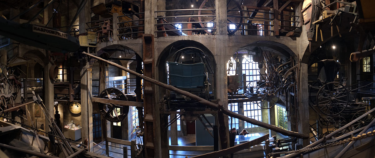
The University of Cincinnati is also a bit of an architectural petting zoo. Apparently at some point the dean of the architecture school convinced the university that they should hire prominent architects to do signature buildings. Predictability, the results are in the good, bad and ugly categories. The juxtapositions are radical, as can be seen in the photo above, where you get Morphosis, Michael Graves, and one of the strangest brutalist buildings I’ve ever seen (is it a science building or full of telephone switching equipment?)
The Graves building is pretty darn nice. It makes sense, it has a simple clear plan, and the scale of it fits in well. (At least, we old folks from the 80s will probably like it.)
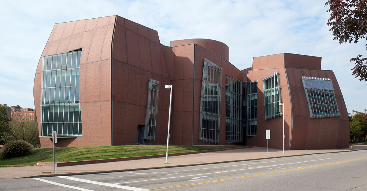
The Gehry building is not technically on campus, but a few blocks away, and is part of the general self-conscious milieu. It sits by the side of the road, and it made me think of Venturi’s analysis of Las Vegas, a building which is trying very hard to create an impression as you glimpse it from a moving vehicle.
Of course, the building that must be talked about is Eisenmann’s addition to the design school. Seldom is a building worse than I expect it to be (I have pretty low expectations for some people), but this is one. The exterior evokes recovered memories of all the bad color choices of the 80s – why was Eisenmann still doing this in the 90s? (and why couldn’t he have remembered that he was once one of the “whites”?)
The entrance pictured above feels even worse than all those parking garages in TV shows where bad things always happen. Perhaps Eisenmann was playing a joke with this, as an amazing amount of effort has been put into the extended entry stair which does indeed end up in a parking lot / service entry.
The interior has a couple of good spatial moves – a big void which goes through a few floors, a big stair which runs up alongside it, 
but these big moves have no impact on the building beyond themselves – they do nothing to organize the building spatially or conceptually. You come across them randomly – we actually wandered the building for quite a while before we found them. Most of the time you’re in corridors such as this: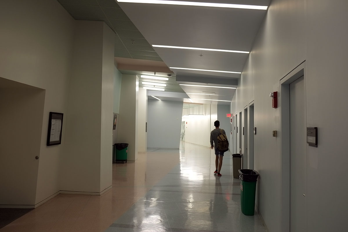
Fundamentally as boring and soul-destroying as any other internal double-loaded corridor, except that this one has cost an enormous amount of money in the pointless manipulation of gypsum board surfaces. Yes, it’s more entertaining than two parallel walls, but you get the feeling (actually you know) that Eisenmann was just playing games with diagrams and ideas, and not at all actually designing the space. These corridors meander through a solid mass, seldom touching the exterior wall or the interior void. There is no order to the building that one can intuit after a while, and the infrequent maps are not much help in finding anything either. The architecture department seems to have made a very good decision by staying put in the older building to which this is attached. Maybe they understood what it was going to be like, and the other departments didn’t. There is a tradition that the architecture building is usually the worst one on a campus, and here again we see Eisenmann manifesting his familiarity with architectural history and tradition.

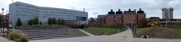
The part of campus which I unexpectedly loved was the relatively new “main street”, with the site plan by Hargreaves Associates, and which comprises some older Georgian buildings, some new buildings by Morphosis, Moore Ruble Yudell, Gwathmey Siegel and others, and which abuts and overlook the football stadium. It’s a spectacular bit of urban design, with well-contained spaces squeezed between very active building forms, constantly shifting perspectives, long and short views, and contrasting materials and styles.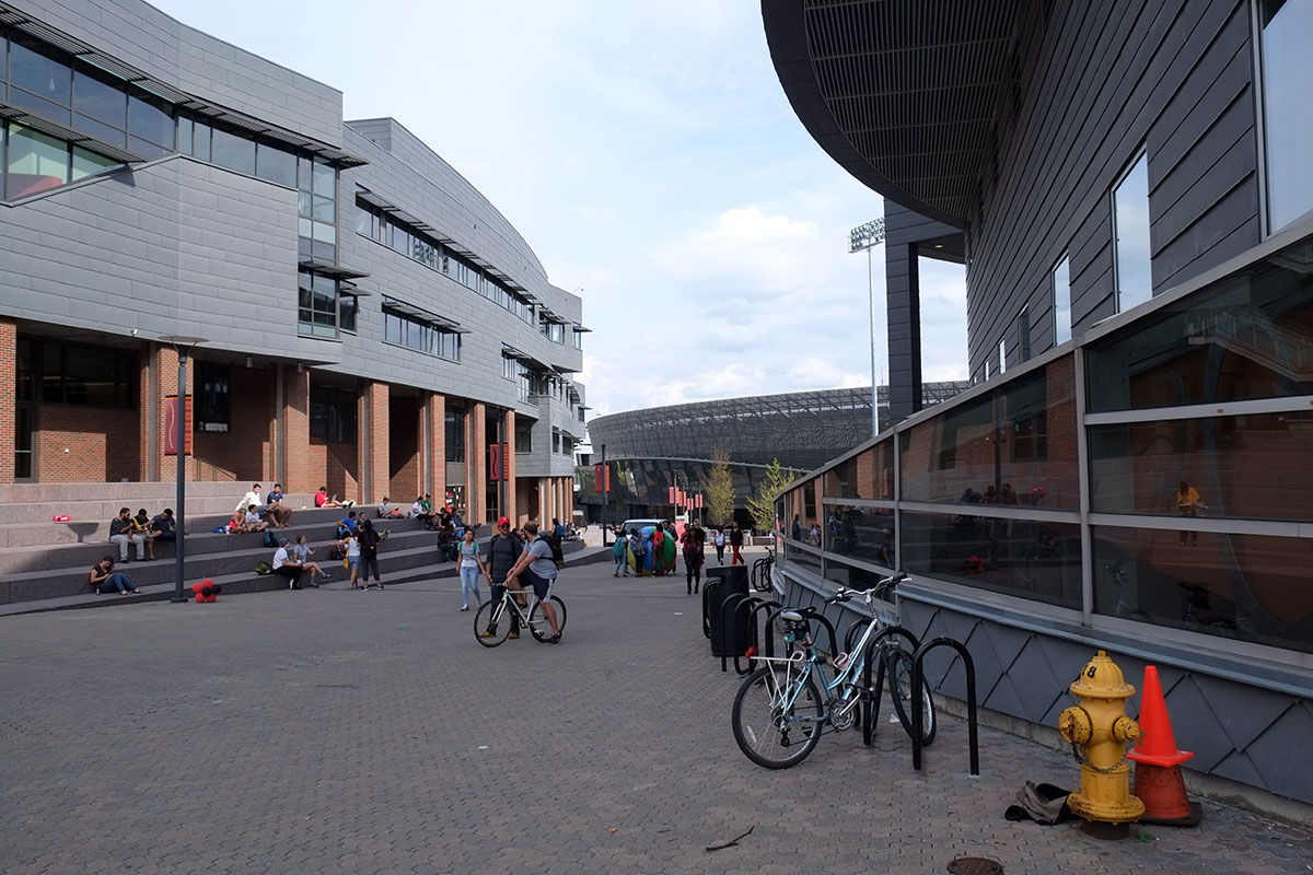
The radical change of scale that comes from incorporating the football stadium is brilliant, being able to look onto the field from above, rather than having the stadium be a looming solid wall that kills the space around it. The glimpse of Tschumi’s building (the white one with the triangular grid) across the field gives you the sense of distance and scale that you sometimes get in a dense city, but almost never on a campus.
It feels like a piece of a city, and although undoubtedly planned to the nth degree, it gives that sense of unintended juxtaposition and unanticipated revelation which are perhaps the greatest architectural pleasures in a city. 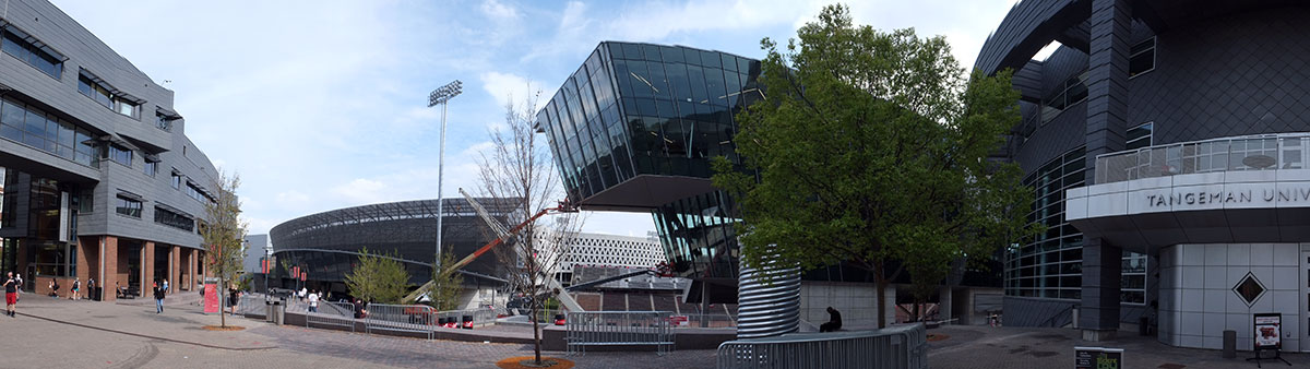
It seems fitting that this design is in Cincinnati; after weeks in the grid-universe of the American West, Cincinnati was was the first place we came to where the topography dominated the city’s organization, where the back and forth between the pre-human world and the order of the planned city achieved a satisfying balance. This design reflects that balance in a completely thought-through and beautifully articulated way.
Perhaps Eisenmann was trying to say the same thing, letting his building operate with more of a topological than geometric order. But a building is not a city (although that might be nice conceit to explore in a design studio). It can’t encompass all the complexity of a city and the contrasting set of ideas that develop over time. Trying to make a building that complicated seems very forced – there are only so many unrelated ideas that can comfortably co-exist in a small place.
A campus is not a city either – it is fundamentally a planned entity, and somehow the attempts to mimic the city-like development pattern (such as the Oregon Experiment) haven’t been very successful in creating a city-like environment. Lucien Kroll wrote about how to how to bring this sensibility into modern large-scale development (by allowing multiple voices and designers, and compressing the time-frame of city-building), and this part of the Cincinnati campus is probably the most successful example of that I’ve ever seen. I loved it even more than I hated the Eisenmann. 

Peter: Nice writing, I knew the dean who started the ball rolling there, Jay Chattergee, nice guy, wanted to use the university as an experiment. Of course, as in any experiment, somethings turn out better than expected and some not so much. I think Jay also did not like the Eisenman building, but once you hire a prominent architect you pretty much have to go with what they do regardless, too bad it was his own school! I have not been back there for some time so glad to hear that they are continuing to hire good architects, the Hargreaves work looks pretty amazing and quite appropriate for an urban campus. Thanks for sharing…
LikeLike
Hi Peter, re: Eisenmann crit, xoxo. (He charges his interns!)
LikeLike
RE: “Main Street,” glad they managed one tree ;^)
LikeLike