Perhaps the buildings in the center of the Stanford campus are so uniformly mediocre partly because they’re largely science and engineering buildings, built for two groups on campus for whom objective, quantifiable performance measurements are critical; the fuzzier objective of architectural quality probably doesn’t make the top ten list of their criteria. So we moved to the smaller arts-oriented district to see what might be there.
The university museum has recently been remodelled, expanded and renamed after the new primary donors, but it has maintained its older, neoclassical core. The entry hall is the most notable spatial feature, a compact, crisp Renaissance revival court, which resembles the atrium at the Fogg before that was remodelled by Piano. It is a small jewel, but due to its location, it really is just an entry hall, and doesn’t do anything to organize the larger museum, which sprawls away from it.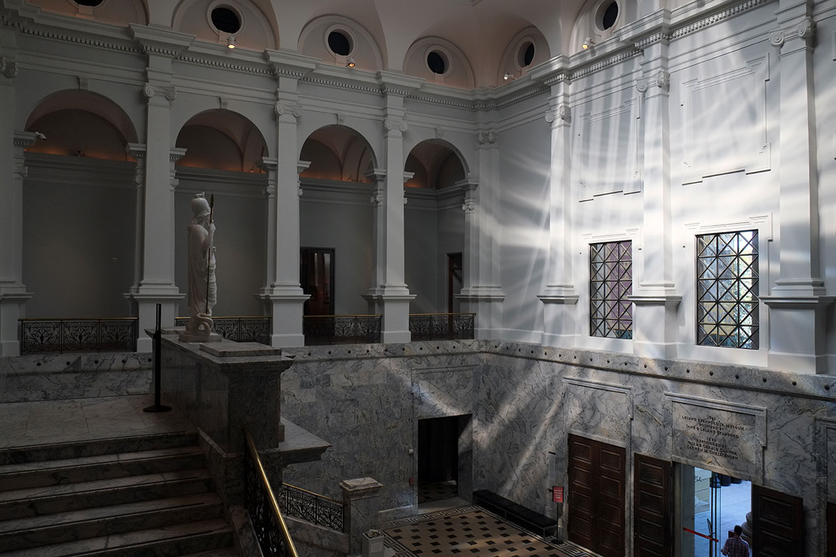
Beyond the formal entry, there are various wings and rambling later additions, including some of those wonderfully didactic wall decorations.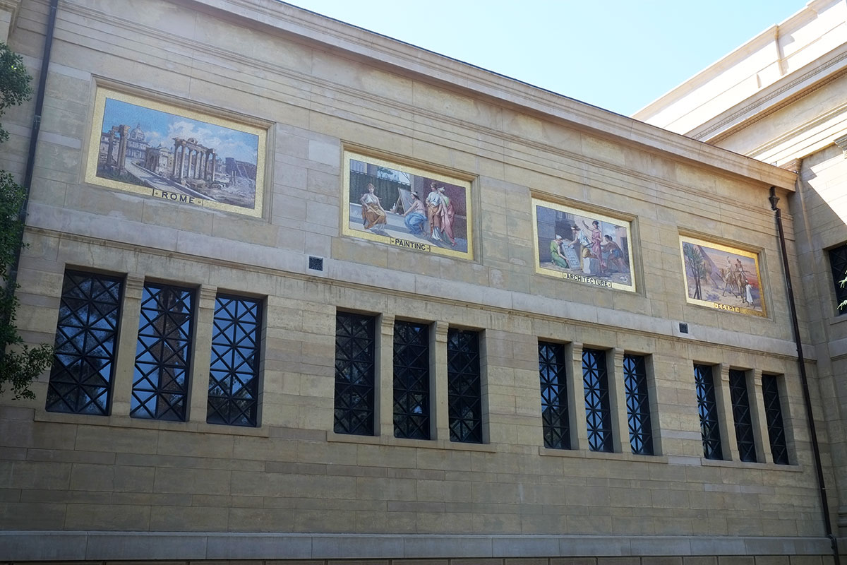
and a large court full of Rodins, much more than I can take in one visit. Why is it that so many places don’t have a Rodin or two, but seem to be trying to complete the set? Is it because they are multiples, and so a collector focuses on them, and then donates the whole collection to a museum? I feel the opposite way here than I did in Marfa, where seeing a lot of Judds together fostered an understanding of the body of work. Too many Rodins just makes me numb, there’s too much drama in one place; couldn’t he have done a few simple, geometric things?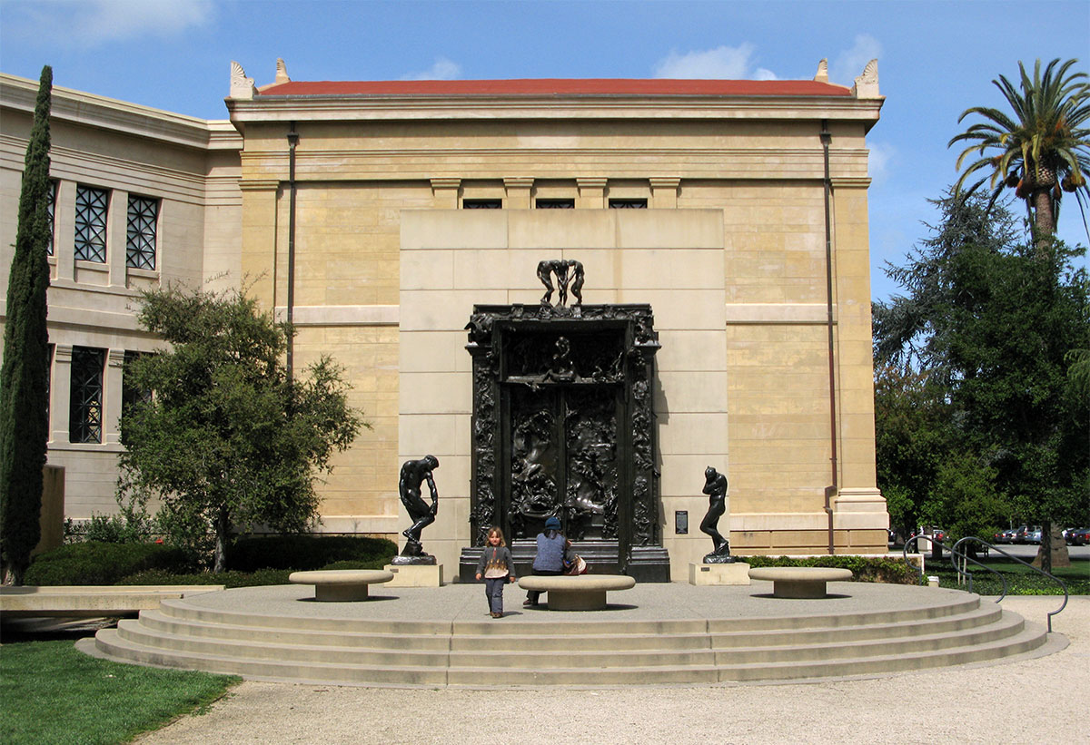
But the general spaces of the museum are fine, and the collection is very good. We didn’t have a lot of time here, but we saw a fantastic show on Diebenkorn’s notebooks (which are in Stanford’s collection), alongside a great small display of artists who influenced him, such as Hopper and The Eight.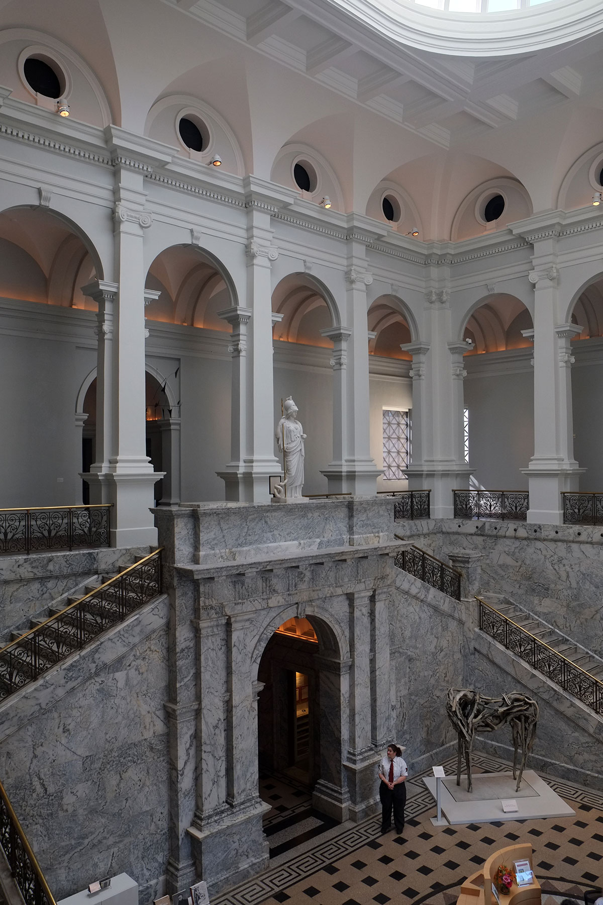
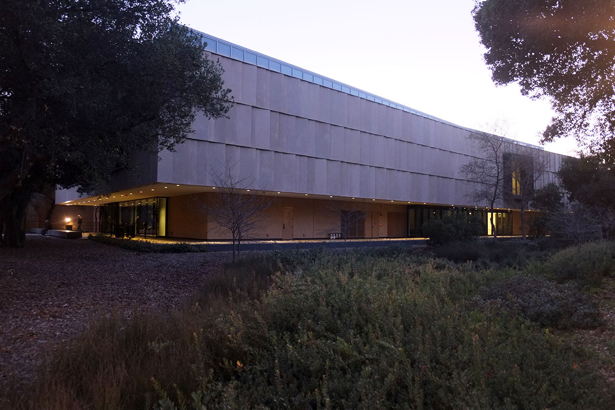
Next door is the new McMurtry Building, by Diller Scofidio Renfro, which comprises spaces for the art and art history departments. From the street, it is fairly innocuous, with a regular, repetitive façade, even using wall panels in the same mustard color which permeates the rest of the campus.
But as you move into or around the building, the regularity breaks down, and the building volumes become differentiated, expressing some distinctions within the program.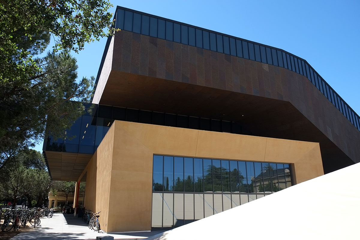
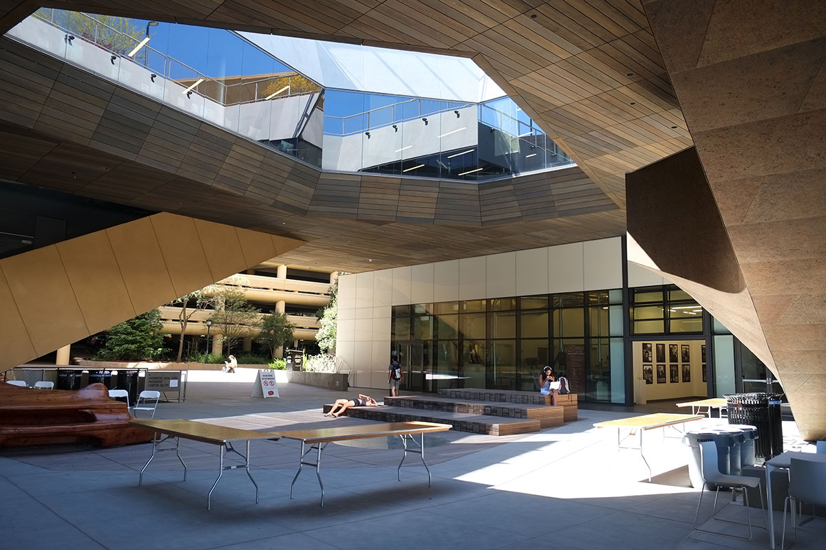
These large sloping elements appear on either side, and you can enter beneath them into a central courtyard.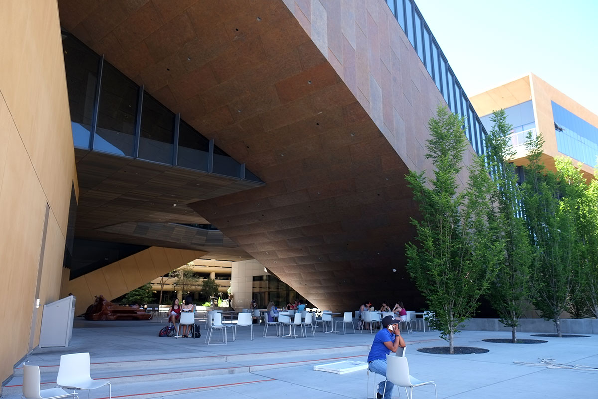
The courtyard is incredibly active, with sloping, crashing, angled pieces, which either contain parts of the program, or have program elements wedged in between them. It is a visually exciting place, and they seem to have found a good strategy for dealing with the Stanford building standards which make the campus so dull – an exterior aspect which is straightforward and respectful, while making an interior court which is a metaphor for the (relative) craziness of the artists at Stanford.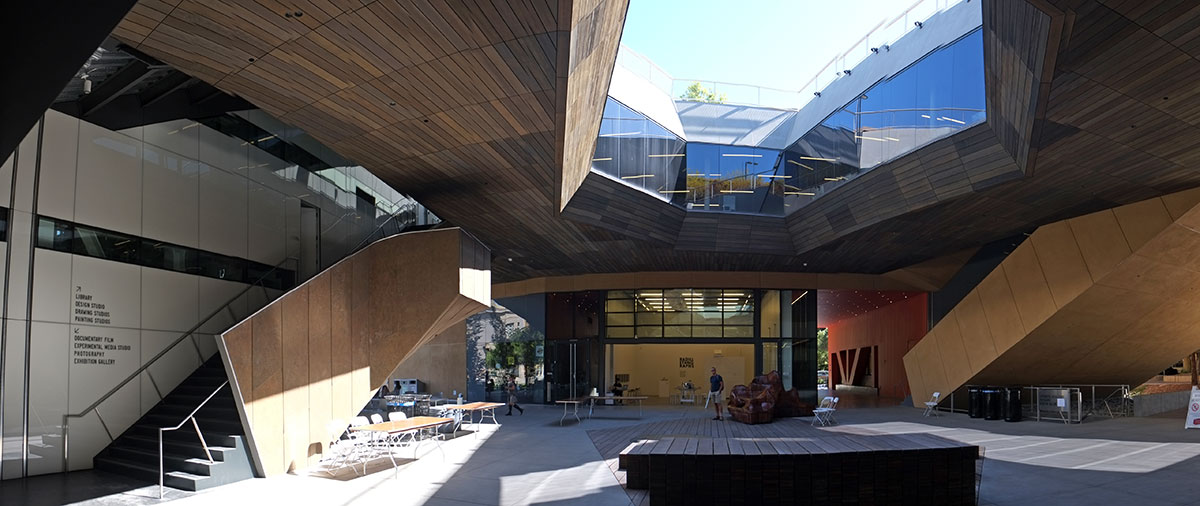
Since so much space is eaten up by the court and the areas beneath the slopes, there is not that much useful space on the ground level. The most visible functions are a large shop/maker space, which opens to the court so you can see Art in Action, and a gallery space for student work. All of this is an obvious homage to Corbu’s Carpenter Center at Harvard, where the exterior ramp through the center of the building is supposed to make visible the work taking place within. There were folding tables scattered around the courtyard while we were there, left over from some event, and it looks like this courtyard would work well for that – with big interior spaces opening to the court, and crowds of people being able to move freely among them – much better than at the Carpenter Center, where the entries are obscure little doors scattered around, and there is no large public space (which would have been an alien idea for an academic building way back then).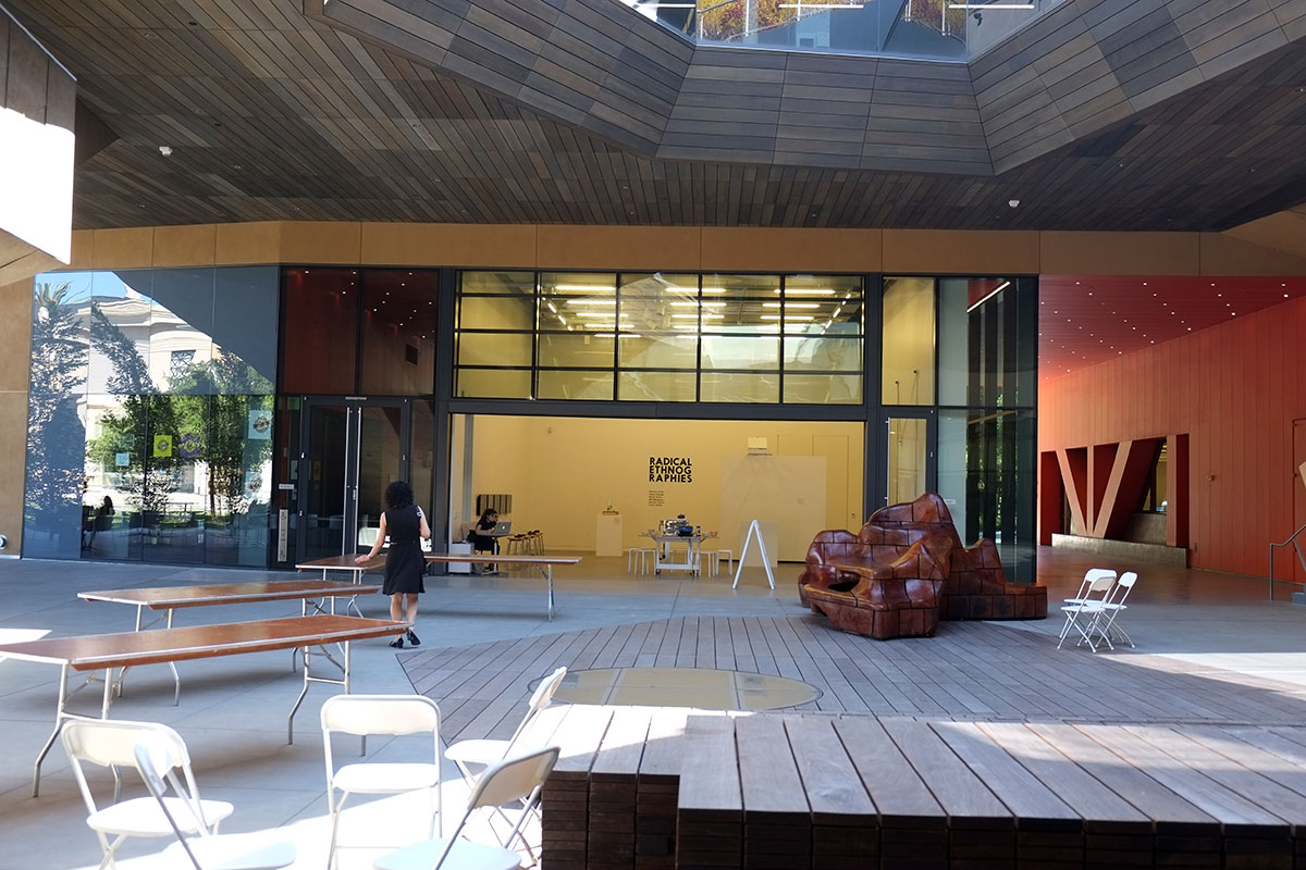
In this building the ramps aren’t through the building, but the building itself becomes a couple of ramps. A mustard volume and a brown volume spiral around each other in a double helix geometry (probably a metaphor for something like the duality inherent in the foundations for art or something else profound which I couldn’t discern). Each of these volumes contains an exterior stair which takes you past the second level library, and up to the third level, where the classrooms and studios in the volumes surround a central terrace and garden.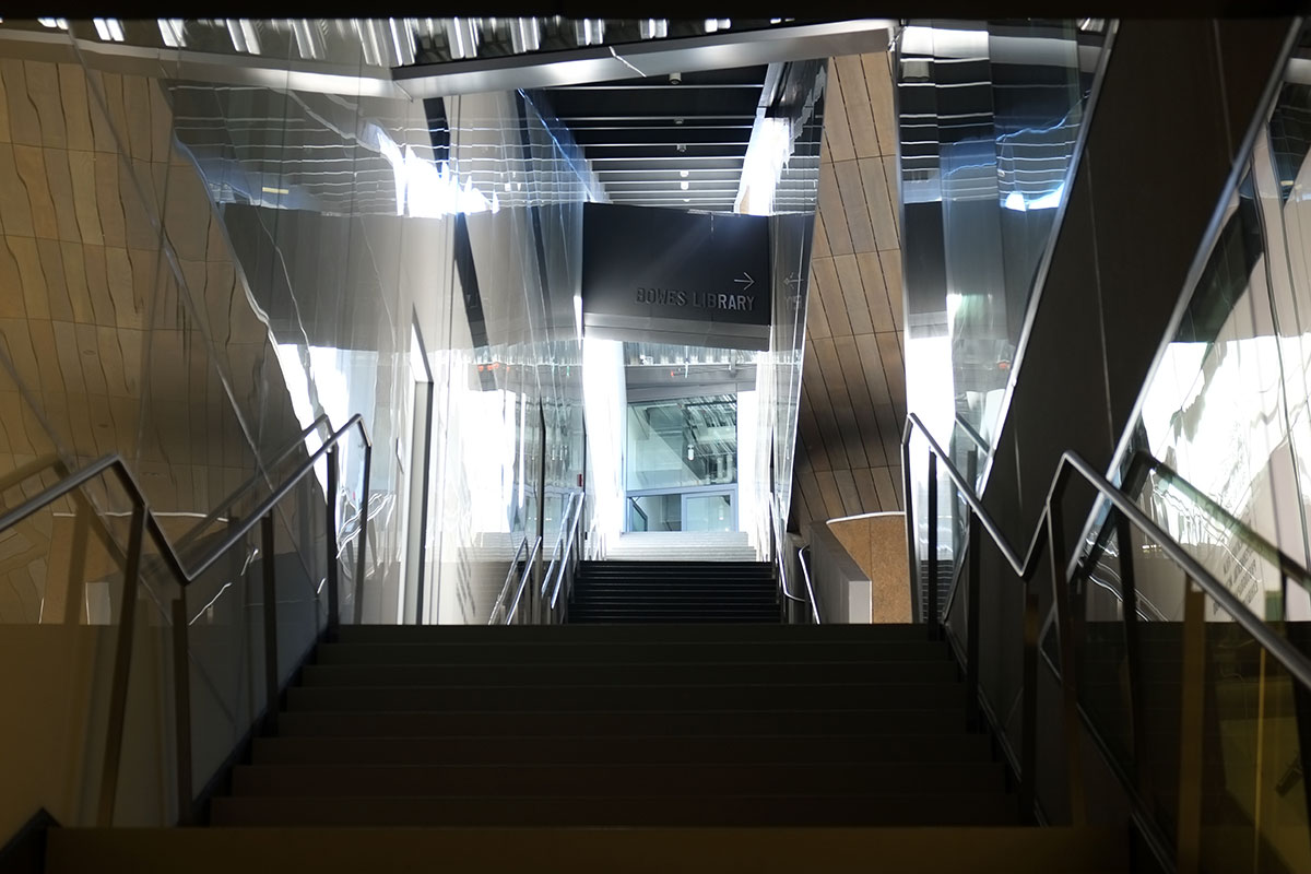
The terrace was quite nice, with plenty of casual places to sit and views across the campus, though pretty hot and bright in May (this may get better if the plants grow and provide some shade). 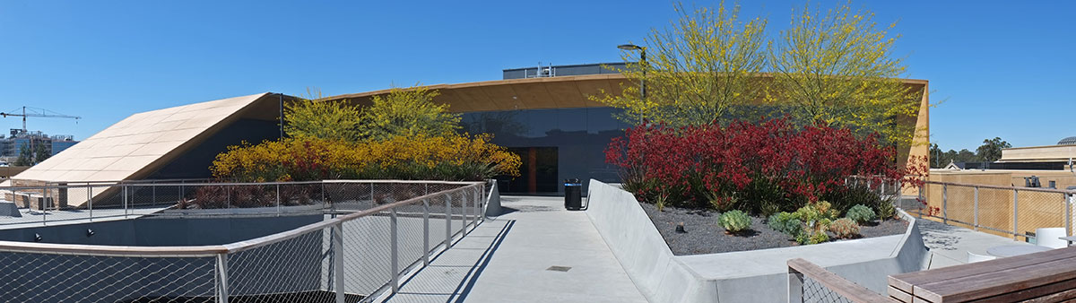
The strength of the building is the clarity of this parti / metaphor. The duality of inside and outside addresses the campus planning issues pretty brilliantly, and the intertwined double helix that determines the building shape is probably articulating differences in the programmatic elements. All of this is then expressed though material selection and detailing, very elegantly: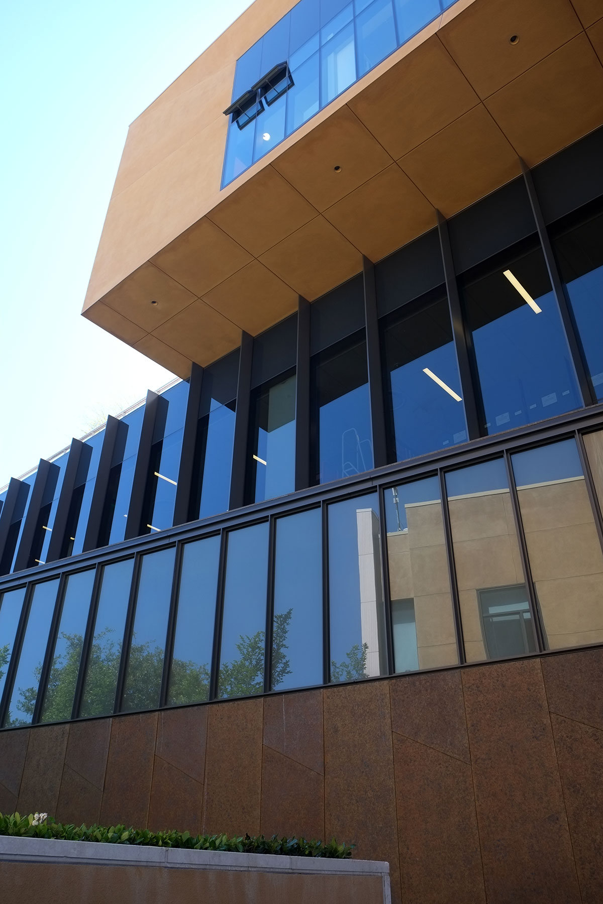
There is a precision to this expression, though there are places where it starts to look pretty fussy to me. You get yourself into a logic where there is a one-to-one correspondence between a concept and its expression (this material means this), and then points occur where all these conceptually differentiated pieces collide together. If you are going to stay true to your parti, you articulate each of these clearly, but it does all get to be a bit too much. It reminded me of the contrast between the detailing of the Kahn building and the Piano building at the Kimbell, where Piano’s obsessive expression and detailing of every tectonic element in the building (whether structure or enclosure) created an almost baroque building when compared to Kahn’s classical, geometric simplicity. But here there is not even any tectonic expression to give some order to this level of development – there are Big Formal Moves that embody the parti, and the technological systems and expression of the building are subservient to the fanatically pure expression of the Big Formal Moves. It is clear that this articulation is only skin-deep; these formal differentiations have nothing to do with the underlying tectonics of the building. 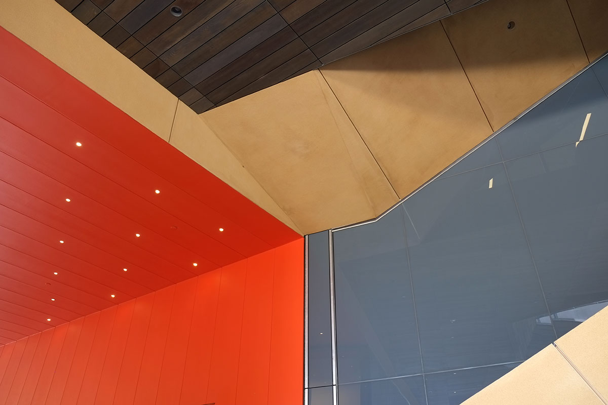
Kahn starts with space and light, and uses building systems to support this intention. Piano seems to start with the logic of the building systems, and manipulates them to shape space and light. Diller Scofidio Renfro start with a diagrammatic idea and uses the building technology to express the parti.
But here is the big problem with this approach – it leaves out space and light. I didn’t see one good room in this building. I saw some terrible rooms and spaces, and I saw some conventional rooms and spaces, but I never walked into a room and said, wow, this is a great space. The courtyard is obviously the big spatial move, but it matters mainly in a conceptual way – you can stand there and see all the elements of the parti diagram. It is an intellectually satisfying space (Ah, I get it!), but not a sensually satisfying one. It’s deep and dark, in shade all the time. The second floor library pokes in and constricts the space above you, and you get a glimpse of sky above, beyond a glimpse of the handrails on the third level.
But it gets much worse once you ascend the stairs. The stairways are dark and constricted – you expect the payoff of a big expansion into a great open space. And you get some of that if you go to the third floor terrace. But if you’re only heading to the library, which occupies the whole second floor, it is a big disappointment. The entries to the library are nasty little alcoves to the sides of the stairs. The doors have 8 1/2 x 11 sheets of paper taped to the doors by the librarians, the classic sign telling you what you need to know about the library because the building itself is so ambiguous. They really look like the fire exits.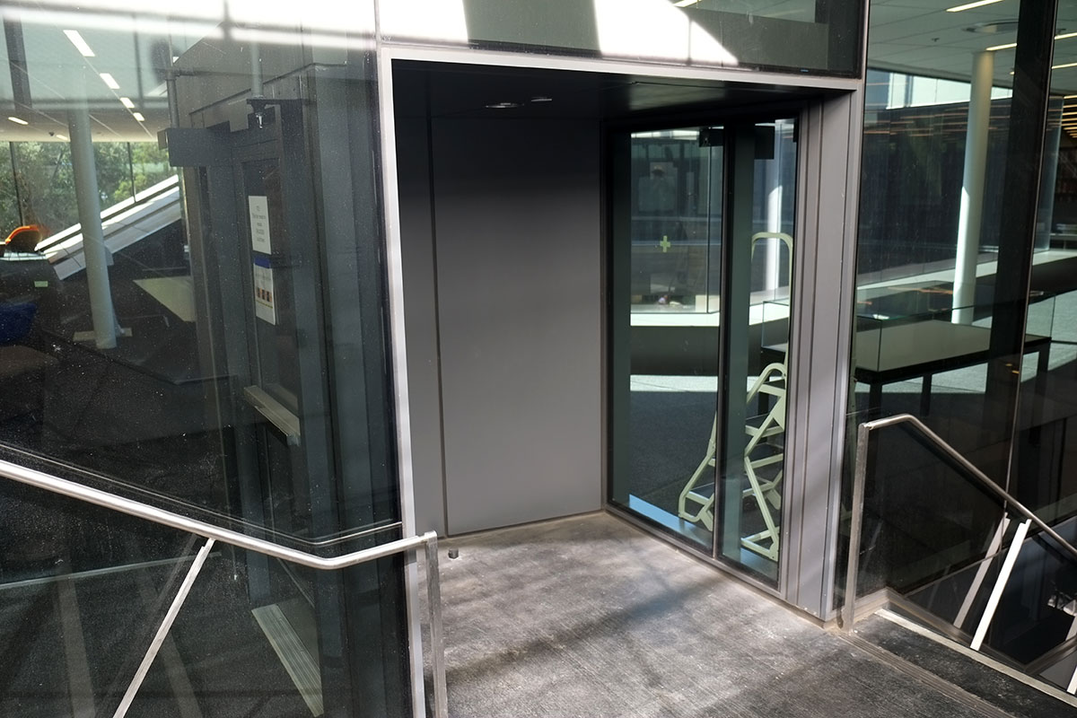
The library space itself doesn’t get better. Conceptually, it is the leftover space in the middle of the helix, and it feels that way. It just happened – no one designed anything. A big low space, with a lot of glare from the central court and the glazed edges of the building. An amorphous floor plan with random furniture scattered around, with a low, 2×4 grid hung ceiling. It really felt like one of those cheap municipal branch libraries that’s been retrofitted into a failed strip mall building.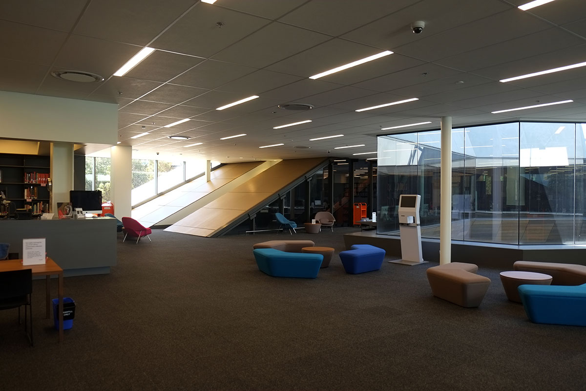
The sloping spiral elements make their presence felt, to the detriment of the space. I may begin a new photo series, on all the terrible ways architects deal with the space beneath a ramp or stairway, when they want to leave it open for expressive reasons, but can’t because it is a hazard for head-bonking reasons under the ADA. I get tired of lay people who always talk about “wasted space”, which usually means any space which is not purely functional, but this is truly wasted space – not useful, not inhabitable, and not even beautiful. It is a space which happens accidentally, without thought.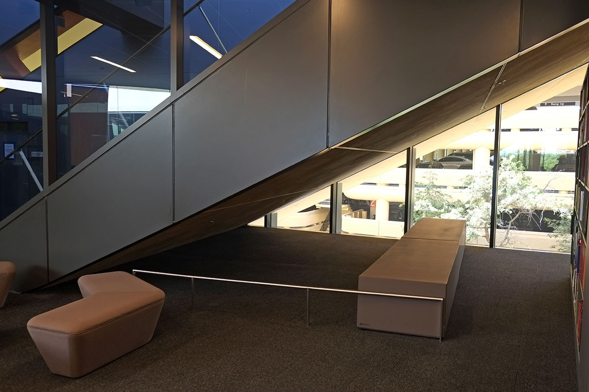
The other strategy for these oddly-shaped spaces is to figure out what uses can be shoehorned into them, and that may be even worse. Art history libraries need study carrels for grad students, and here they have been given a location which represents their status in the university’s hierarchy. The entry is a narrow slot cut into the spiral volume, which feels like entering a tomb in a pyramid; I assume the grad students will get the metaphor here.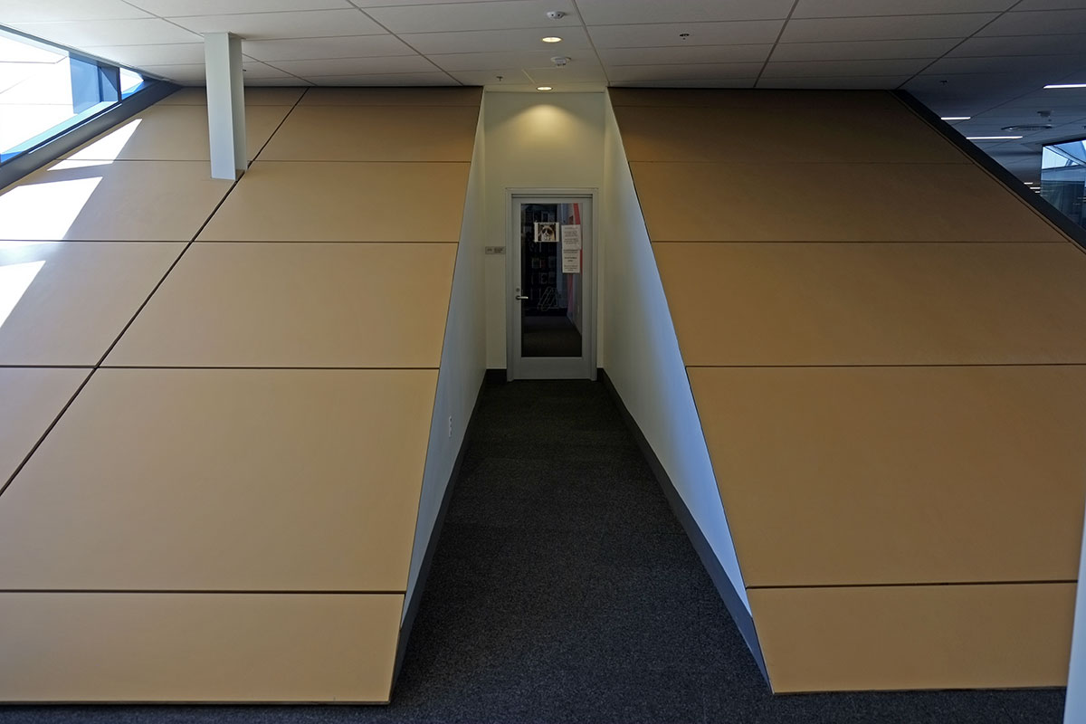
Then the room itself is stepped, with a couple of carrels at each level. When you sit at your desk, you look at the underside of sloped ceiling directly in front of you. It is truly one of the nastiest spaces in which I’ve ever seen students stashed.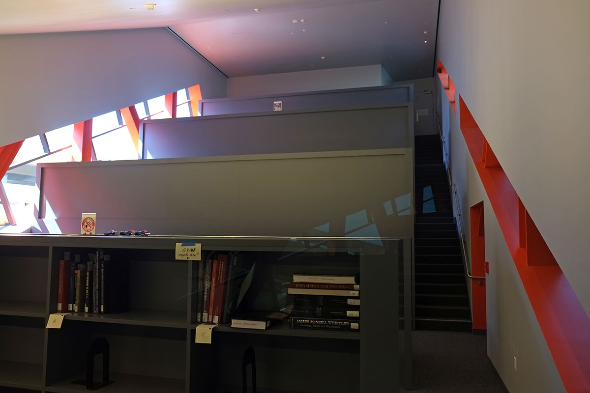
Given the dysfunctional geometry, and the big hole in the middle, this building does not have a lot of usable floor area. So where are all the computer labs, printer rooms, classrooms, and galleries? They’re in the basement. The big stairs of the spiral continue down below grade, where they end with a whimper. (Perhaps it is a reference to the gigantic book stack spiral in Koolhaas’s Seattle Public Library, which ends in a garbage can and some Xeroxed signs which tell you how to backtrack to the exit.)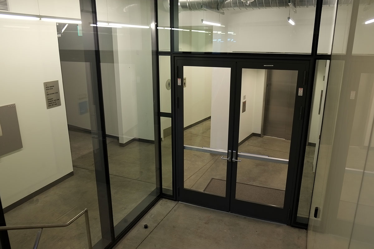
The basement is disorienting, conventional and banal. All the special effects have been exhausted above grade, and the basement spaces were clearly left to the space planner, who had to figure out how to efficiently house all the necessary functions for which the big concept had no room.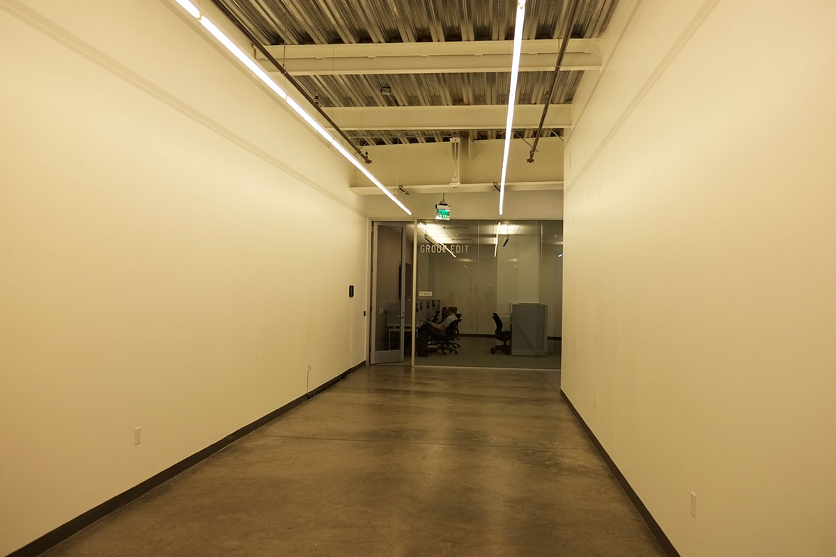
Like all architects, initially I was intrigued with the Big Shiny Object quality of this building – the cool diagrammatic parti expressed so clearly in the building form. I always tell my students that they have to start with an idea for a building – they can’t just start solving the functional problems and then try to insert an idea later. But this is what happens when you start with an idea, stay true to that pure idea, but forget to turn it into a building. An idea is important, but it must at least partially derive from addressing fundamental, inherent issues in the project. I’ve been very disappointed in the few DSR buildings I’ve seen (including the contemporary art museum in Boston). They have this very clear diagrammatic quality, but they don’t have any concern for the quality of spaces. They may not be as obviously terrible as Zaha Hadid buildings, as they are quieter and less jagged, with simpler spaces which seem modern and spare, until you realize that they are just not interesting or pleasant. I’m sure that if I saw the 1/64″ scale parti model of this building I would be very enthusiastic. I just don’t think they understood what had to be added when they blew it up to full size.
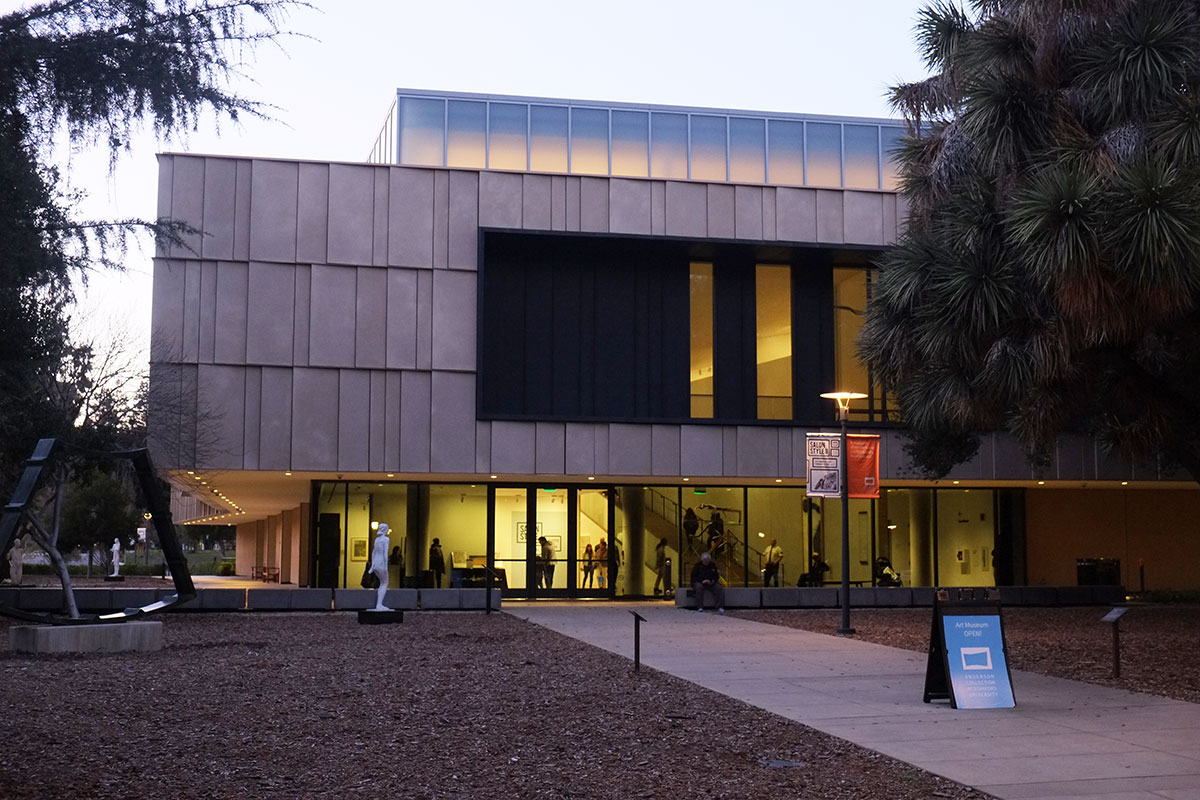
Fortunately there is another art building nearby which is the antithesis of the McMurtry Building in every way. The Anderson Museum houses the contemporary art collection of the Anderson family, and it was designed by Ennead, the successor firm to James Stewart Polshek. The parti is simple, almost boring: a two-story box, with a grand stair in the middle, between which and the perimeter there are galleries (and some support spaces on the first floor). The exterior is a simple, well-proportioned modernist composition, which is so unassuming that I forgot to photograph it, until we returned two years later. With the DSR building, I spent a lot of time wandering around the outside of it, getting different perspectives on the form, trying to figure out what it signified. The Ennead building clearly says that it is a typologically straightforward building, here’s the front door, come on in.
The collection is great, reflecting a family’s continuing relationship with many of the most important postwar American artists, particularly those based in California (Diebenkorn, Thiebaud, Irwin, Guston, etc.) There is a nicely-proportioned lobby, with temporary exhibit galleries behind it, and a small library/lounge, where you can view an introductory video. It is an actual room, where scale and furniture placement were considered, and not a vague space littered with objects.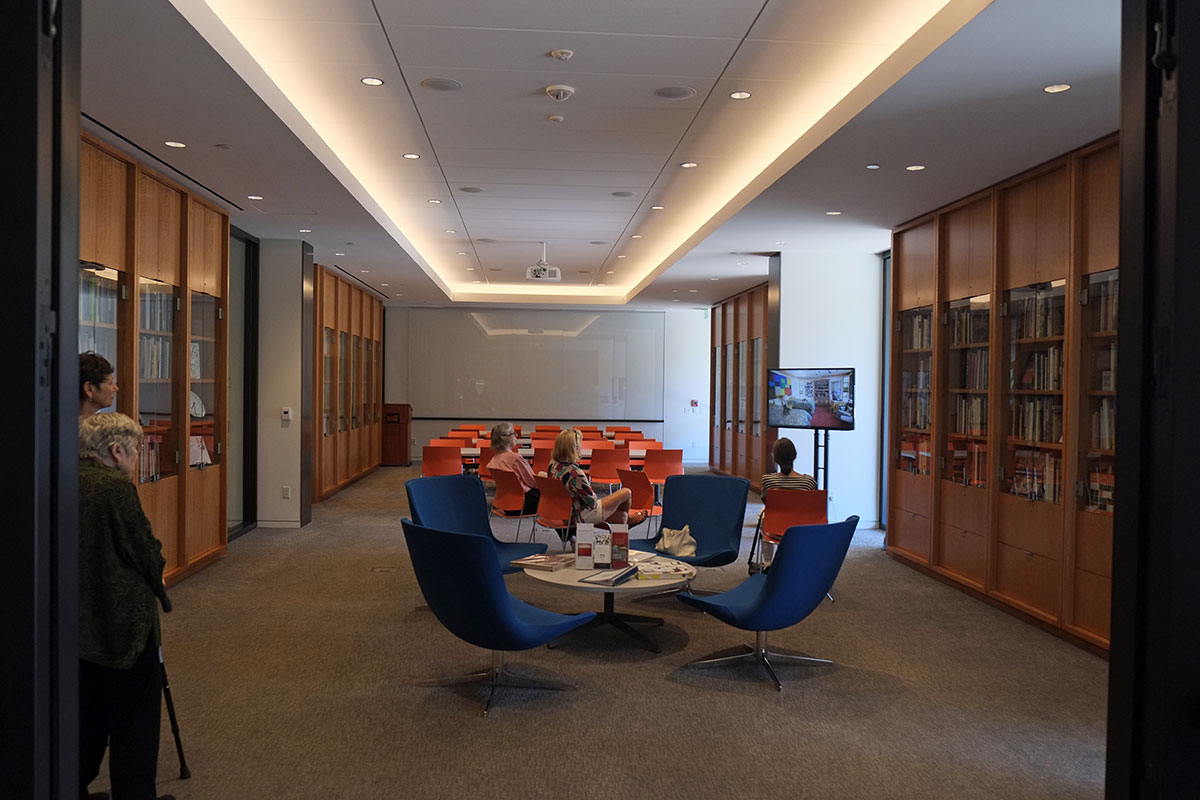
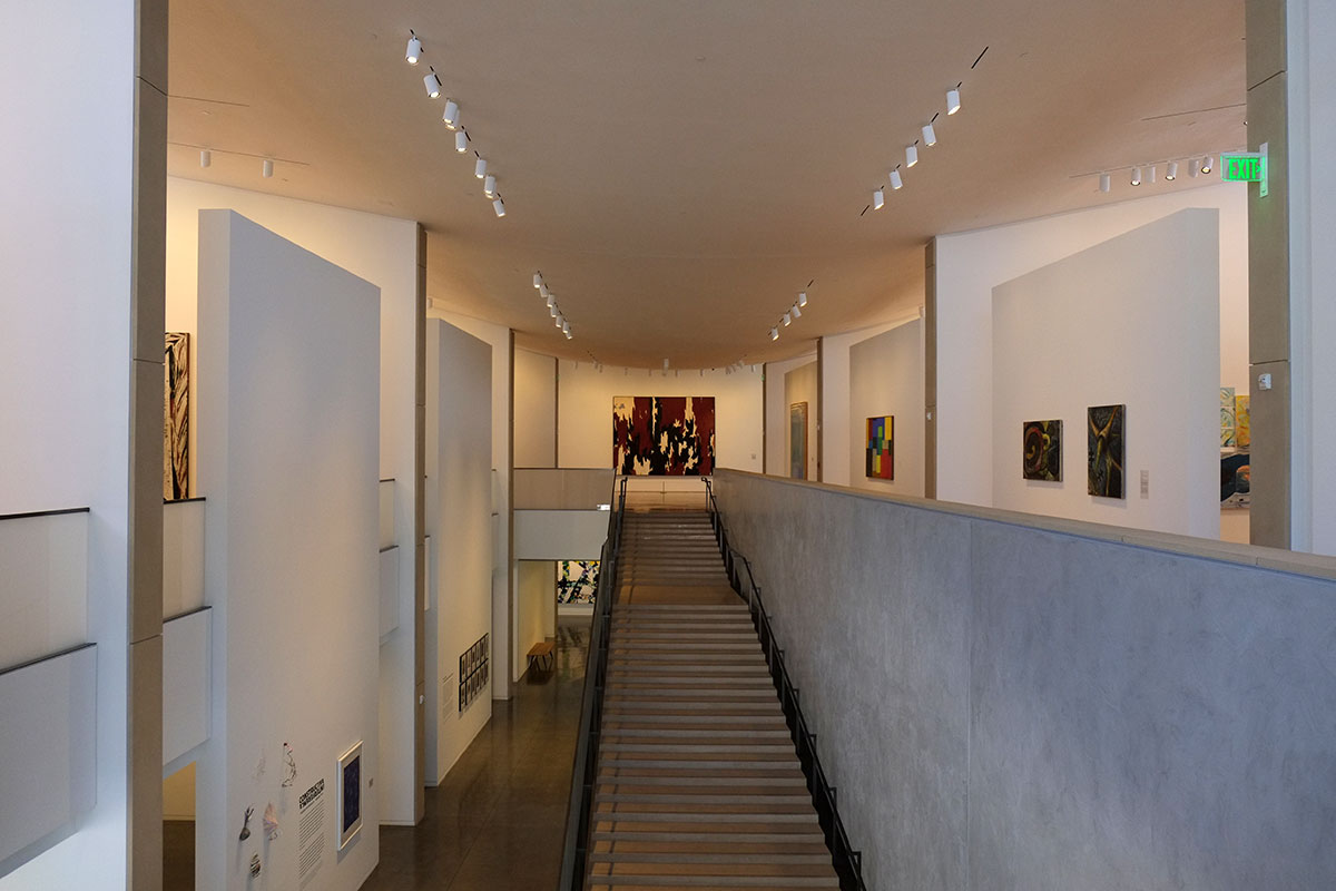
You move to the center of the plan, where the grand stair leads to the second floor of galleries. It is simple, it is clear, and you can see a large painting on axis at the top and light coming in from the sides.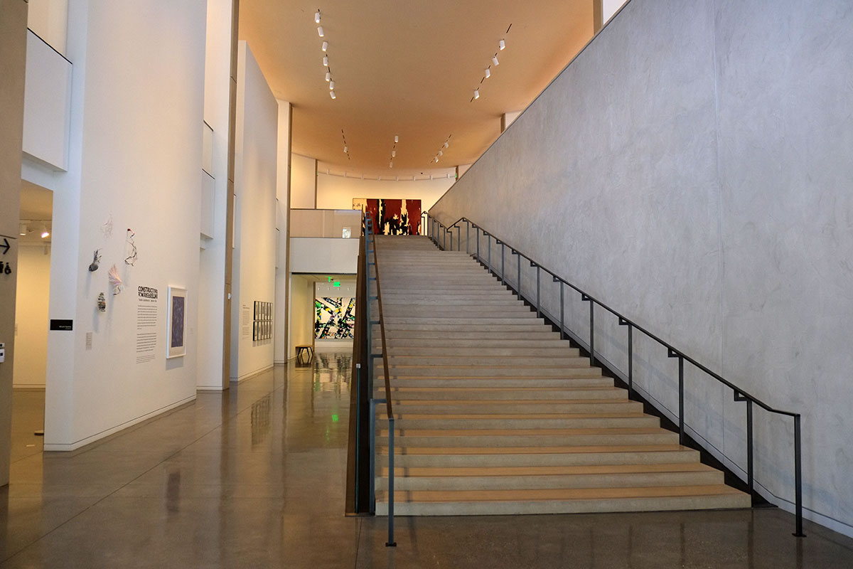
It is more like Kahn than like Piano (and certainly DSR), with simple abstract surfaces defining spaces and light flooding in. The roof is gentle curve which floats above partition walls, lifted up at the perimeter to let light in from the strip clerestory windows. There is a clear structural order and hierarchy among elements, with transverse bearing walls separating galleries, while longitudinal screen walls filter the light and allow space for hanging paintings. There is no expression of the tectonics (no exposed structure, no highly articulated skin) but the building doesn’t pretend to be made up of these highly-differentiated parts. They have designed an abstract space, then used technology to support this vision. 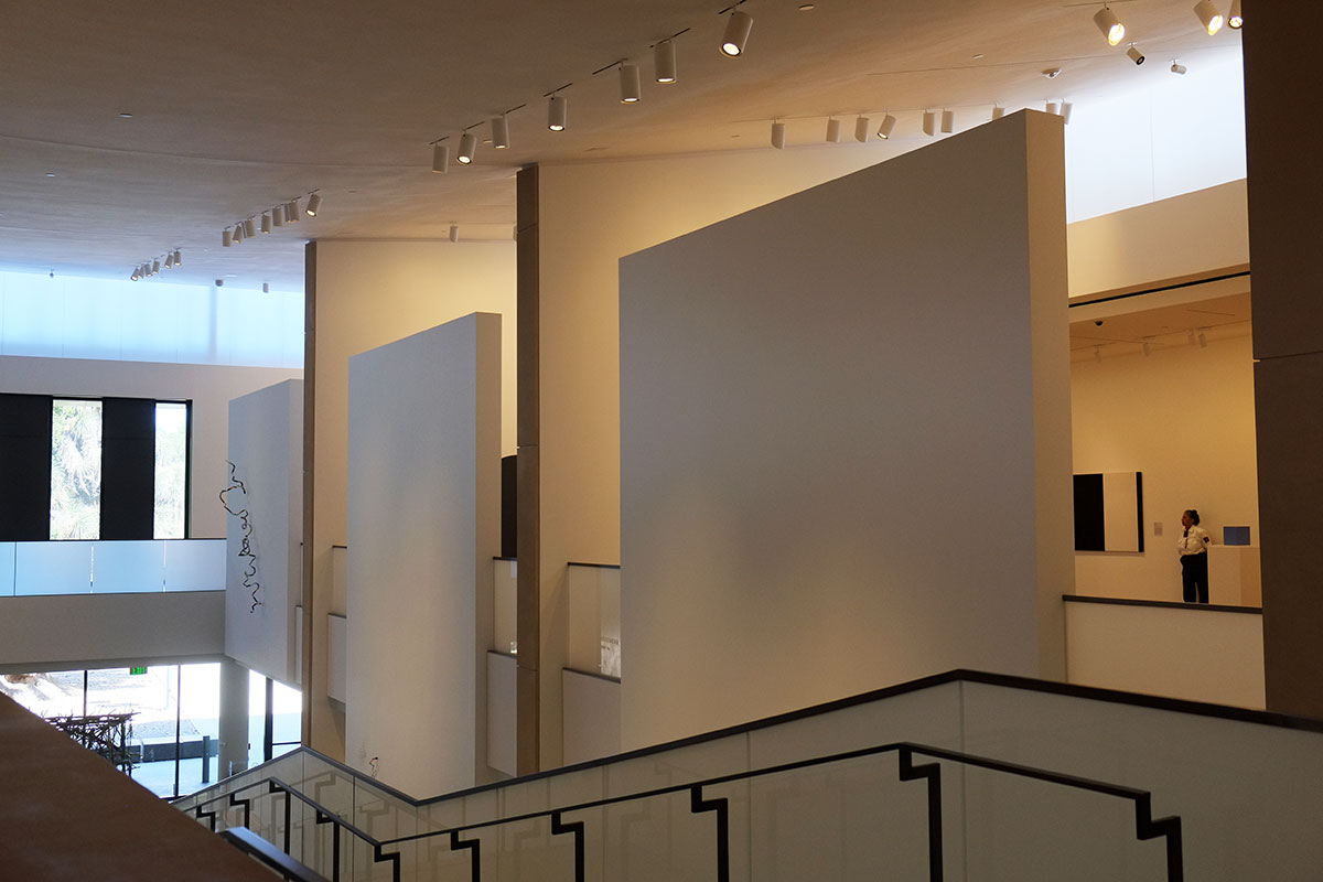
This wall works perfectly for displaying a Robert Irwin piece – it is obvious that the architects worked closely with the curators to create the setting for such a difficult piece, one where the light and surroundings determine whether it can really be experienced at all.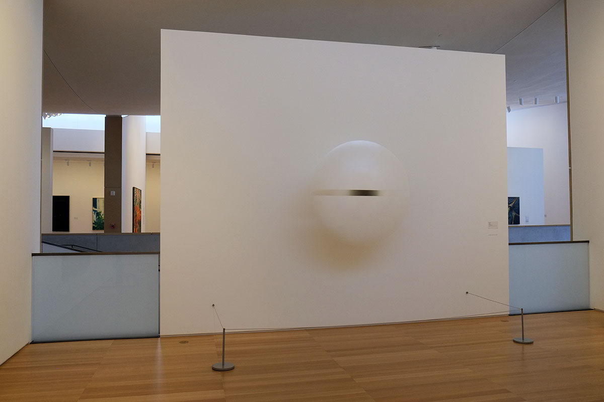
There is much discussion about contemporary museums, whether they should function primarily as ends in themselves, attracting crowds through their special effects and histrionics, and incidentally showing some art (Bilbao as the apotheosis of this). Then there are the museums that are about exhibiting the art, where the building stays in the background. This museum is obviously of the latter type, but it also illustrates an important point: just because a building is modest and defers to the art displayed doesn’t mean that it can’t be an excellent building. If you removed all the artwork from this museum I would still enjoy being there – the light, the clarity and hierarchy of the space, the experience of moving through a succession of different rooms, the complexity of views from room to room – all of them lead to a rich experience, and a series of spaces where you’re just glad to be.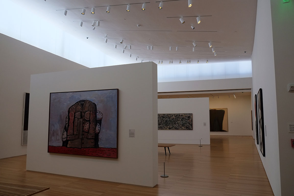
I think we’ve gotten to a point in our culture where the beauty of simplicity can’t be seen by many, and the hyperactive work of the last generation of starchitects has supposedly reflected the zeitgeist of our age, where we expect diverting new images and vistas to satisfy our fifteen-second attention spans. I’m hoping that there may be a reaction to this growing. This work by Ennead (and other buildings we’ve seen on this trip, such as those by Thomas Phifer) show a real affinity with and development of the underlying ideas modernism, and not just a reference to it as a style. We’ve had fifty years of Less is a Bore, and I hope the pendulum is swinging back.