

The Stanford campus is an outlier, seen by many to more resemble an Ivy League university than one on the West Coast. Part of it is institutional – Stanford is one of the few big, rich, elite, private, research universities that is not in the east, and part of it is the design – with a campus design by FL Olmsted, and the original quadrangle and buildings by Shepley, Rutan and Coolidge (the permutation in which their name existed then), the successor firm to HH Richardson’s practice.
Olmsted’s plan is truly wonderful – a clear hierarchical system of axes, malls, quads, and open spaces, which organizes the placement of buildings. It is a very big and spread-out campus, and the effect of the initial vision as the university grew from a relatively small core out to its current extent is evident. Although there are places where this system was not rigorously followed in the postwar boom era, and places where the preponderance of cars undermines the character of the campus, it is easy to imagine how much worse the campus would be if there had not been this underlying order, and instead the campus plan was typical of postwar, car-oriented, curving, formless planning (cf. Solomon’s analysis of Magic Marker bubbles).
Despite this brilliant planning, in prior visits I’ve always found the Stanford campus to be a pretty uninteresting place. I couldn’t understand why it didn’t impress me more (Olmsted! Shepley Bullfinch Romanesque!), and now I think I’ve arrived at an answer – almost all of the buildings on campus are deeply mediocre. The campus plan put them in the right places, and they form these fairly consistent building walls which enclose the open spaces, but the buildings themselves vary from banal to embarrassing. It’s hard to understand how they acquired such consistently bad buildings, given the obvious amounts of money and effort put into each.
There is an underlying similarity to the mediocrity, which certainly came from building development standards, which limited building height, and specified common vocabulary elements and strategies which had to be used, such as symmetry, hipped tile roofs, and punched windows in masonry walls (or solid walls which appeared to be masonry), that derived from the original core complex of the campus. But then each new building manages to be bad in its own, special way. There is the tame Brutalist building, which valiantly tries to hide its tile roof with a glazed, hipped porch at the perimeter.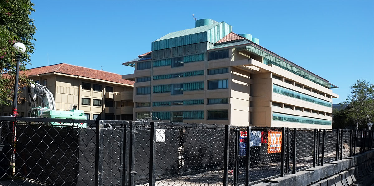
There is the one by Bob Stern that plays the game of the smooth skin emerging from the rusticated base (which mimics the original buildings); but it makes too big a deal out of the arched entry, and tacks on an unnecessary apse on the end, looking a lot like a bank building along a highway in Tampa.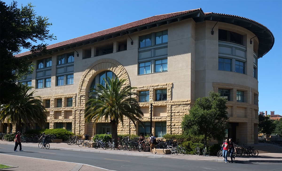
There is the modernist cliché pastiche building, by Pei’s office, where they have given up on making a coherent design, and have opted for a series of aedicular elements, breaking the façade into distinctly articulated pieces resembling a streetscape (but tied together by a feeble cornice element). Each piece is ill-proportioned, boring, flat and static, but then they attempt to punctuate the whole by inserting an overblown glass shard staircase, which appears to never be used.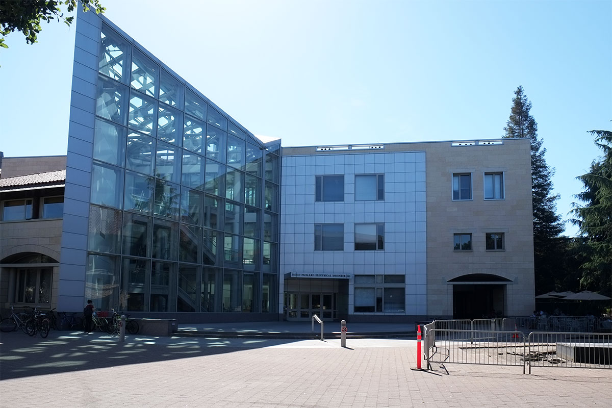
There is the hyper structurally-expressive Brutalist example, with its massive concrete frames superintending a hierarchy of secondary elements and curtain wall sections bounded by bays, a massive heavy building floating above a dematerialized base, in imitation of a Japanese temple on steroids (if Japanese temples had parking garages beneath them).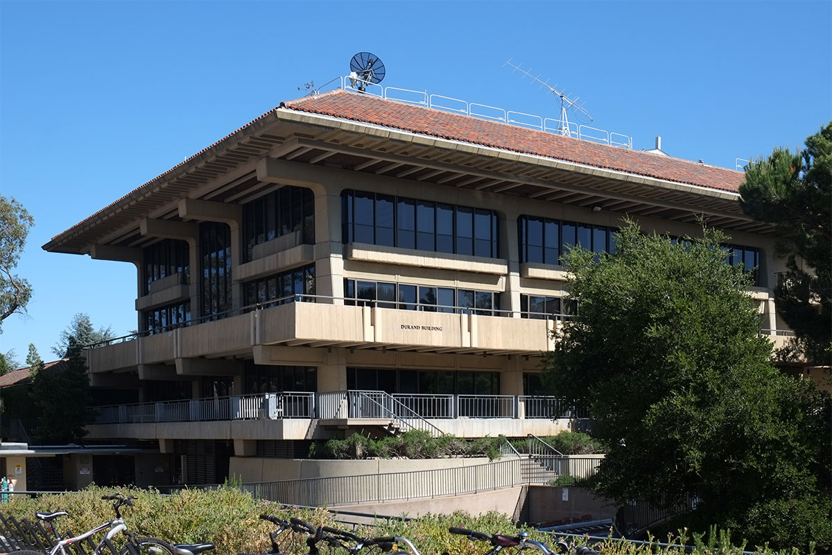
At the end of the axis is a fairly restrained building, a rather flat evocation of a precast Renaissance palazzo, but with a badly-proportioned and under-detailed central archway that looks like a remodel carried out under the auspices of il Duce.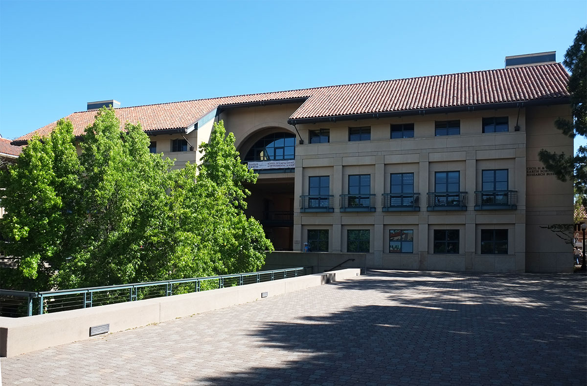
I thought this was the best of the lot – a strong, taut skin with a thoughtful rhythm of big punched openings, with the vestigial roof form articulated in steel and floating above the mass. (Note that this façade faces onto a depressed service road.)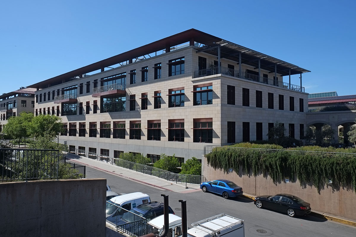
But when you come around to the front side facing the pedestrian axis, they couldn’t restrain themselves, and just crapped it up with a clip-on arcade topped by a pergola, with the now-visible tiled roof looking silly floating above, vainly trying to disguise the daylighting monitors poking up behind. It reminded me of a five-year-old who doesn’t know when to finish a drawing and keeps adding more and more until it is ruined.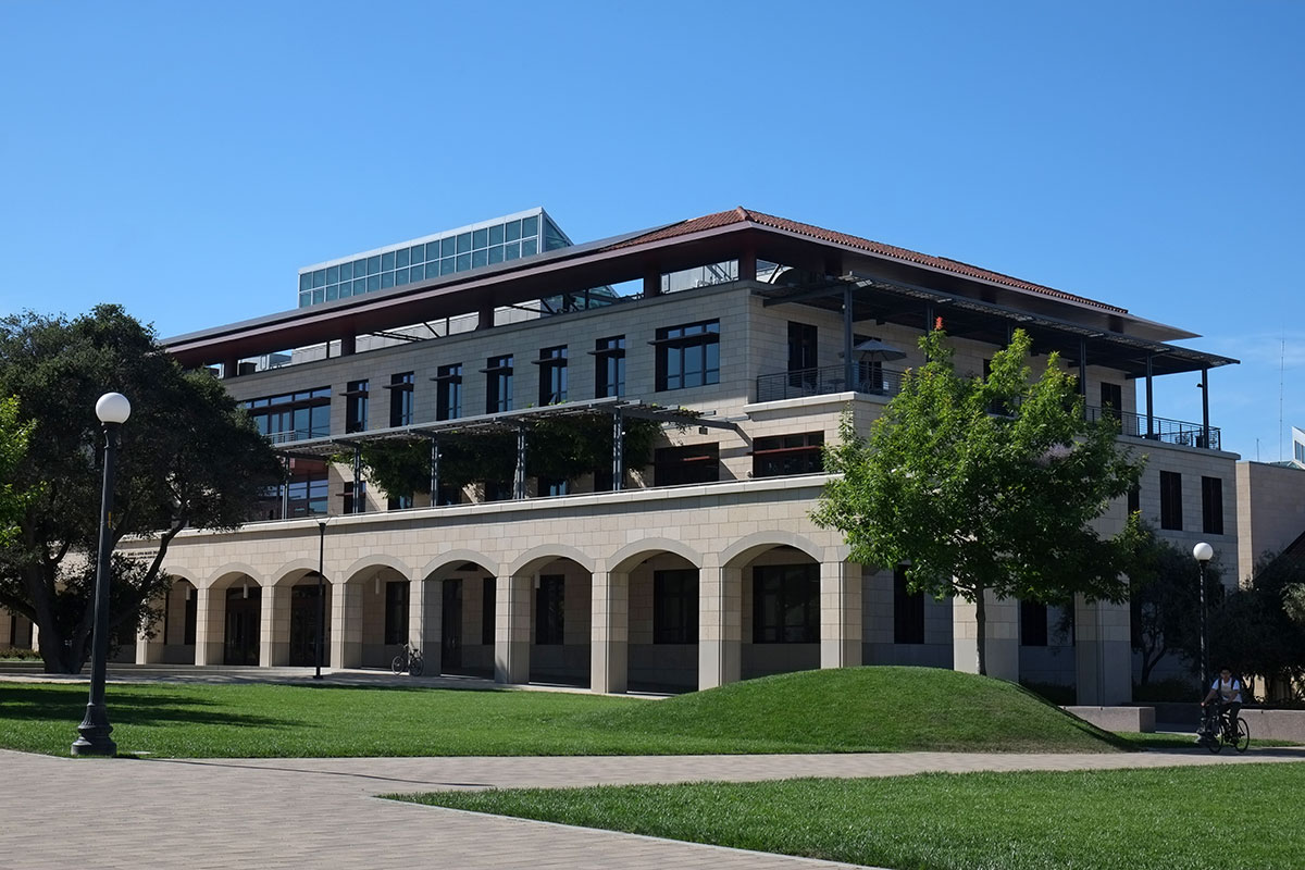
It gets even worse with the addition of a squat octagonal pavilion (I bet they were thinking of the Florentine baptistery), tenuously connected to the rest of the building, with flat arches on the verandahs at the top, trying to make them look “special”.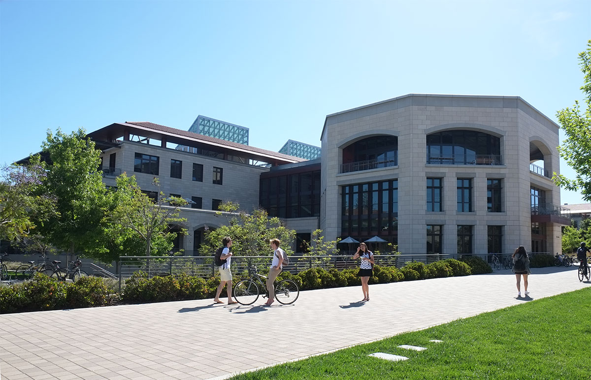
The clip-on arcade is a just-the facts space, that looks like no one ever got around to designing it. It reminded me of similarly-scaled corridors in high-end shopping malls, and I expected a Nordstrom at the end of the axis.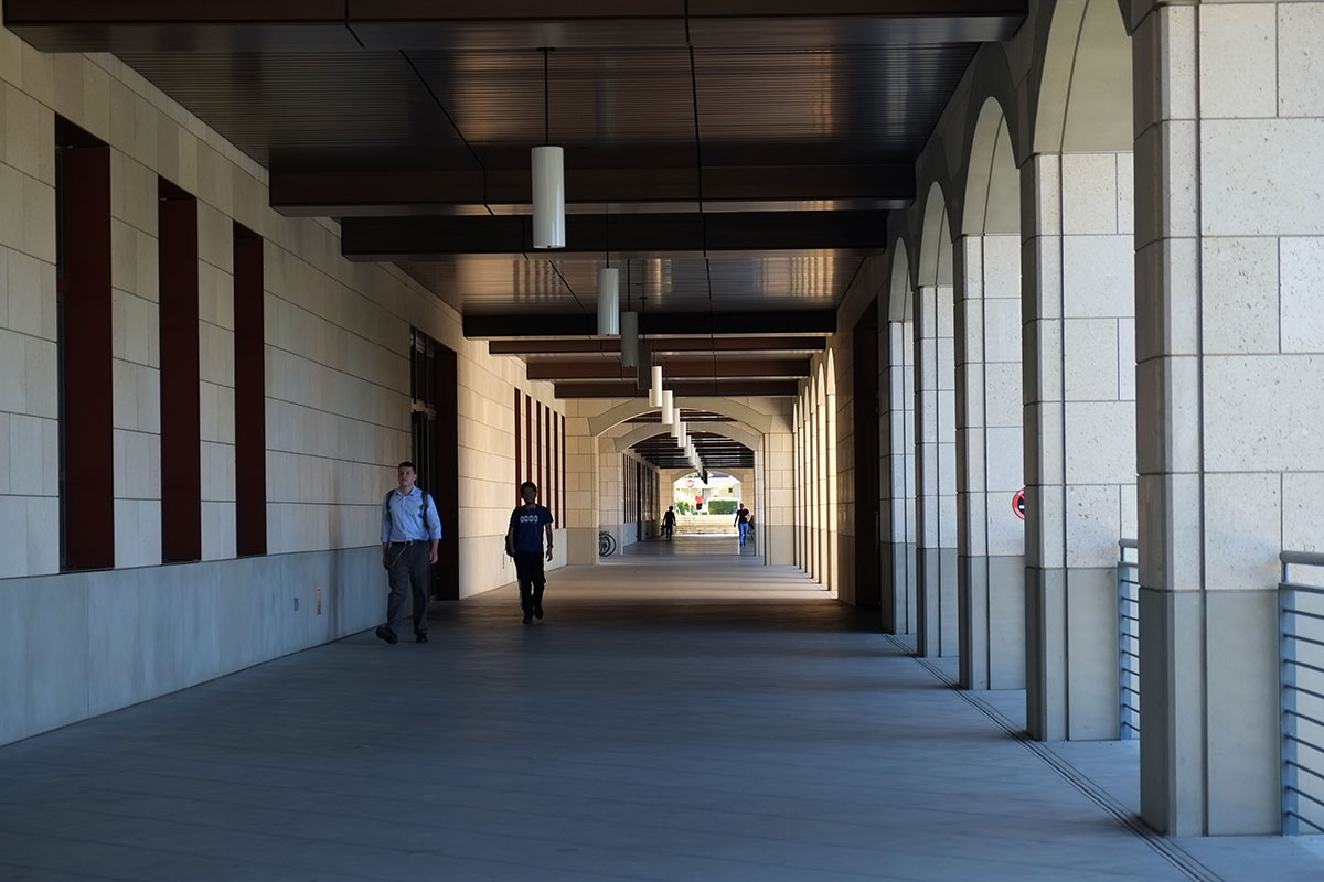
Compare it to the arcade from the original complex, in which all the four surfaces have a simple yet contrasting character – the smooth floor, the rusticated wall, the dark beamed ceiling, and the arcade with its degree of texture varying from rusticated arches of smooth columns, all of this held together by the pattern of light and shadow.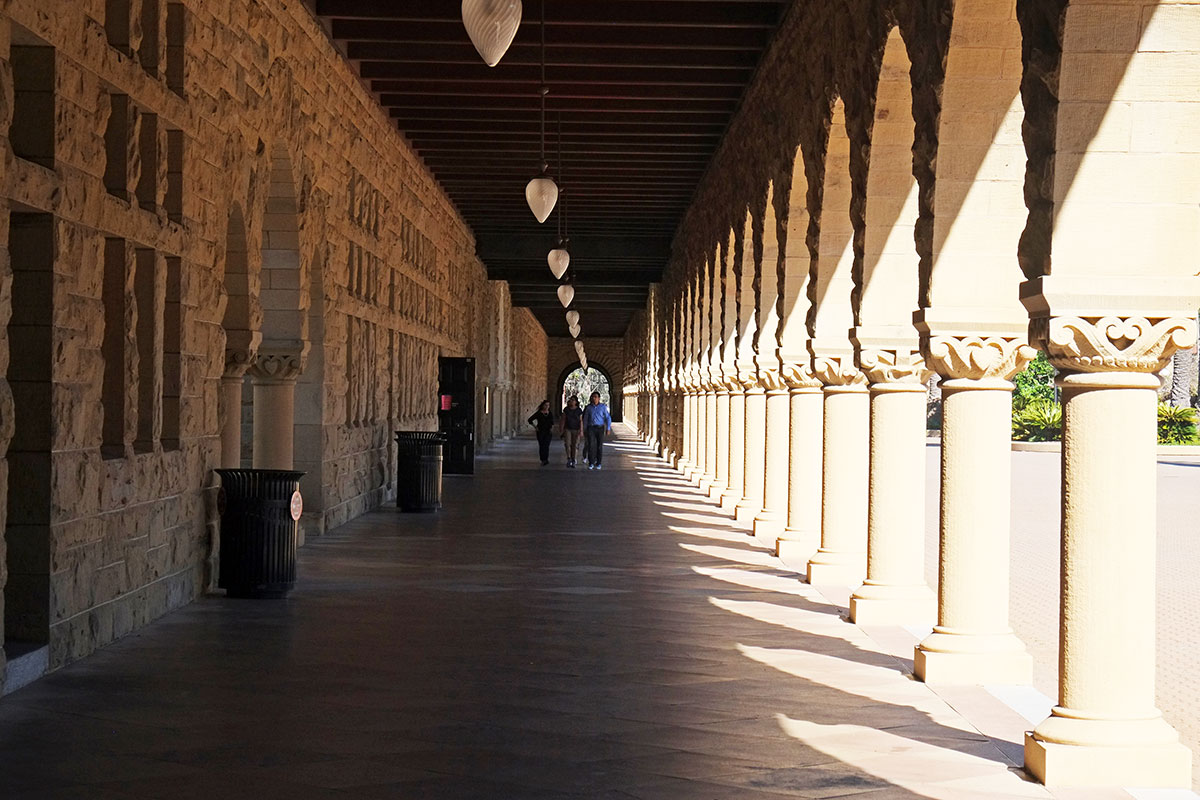
The new arcade has none of this richness, and a closer look at the materials and detailing highlights their lame reference to the original. They did notice that the original had wooden beams holding up the ceiling, so they imitate this with a dark, linear metal snap-in ceiling. Rather than closely spaced joists which give a rhythm to the space, there is a very wide and shallow (probably fake) beam cover made of the same metal, occurring only at the columns, never establishing any kind of rhythm. The arcade wall itself is dreadful, with the arches jammed up against the ceiling, so that the top of the already-flat arch is just lopped off. It is obvious that the stonework is less than an inch thick, and the overly-elaborate joints articulation shows that it was considered only in elevation, as a two-dimensional surface pattern, rather than with any consideration of it as a three-dimensional, sculptural element, as seen in the original. I was taught that when you’re designing an arch (yes, they used to teach those things back in the 80s), always look at the proportions of the spandrels (the wall spaces between the arches), not just at the arches – advice which might have helped here.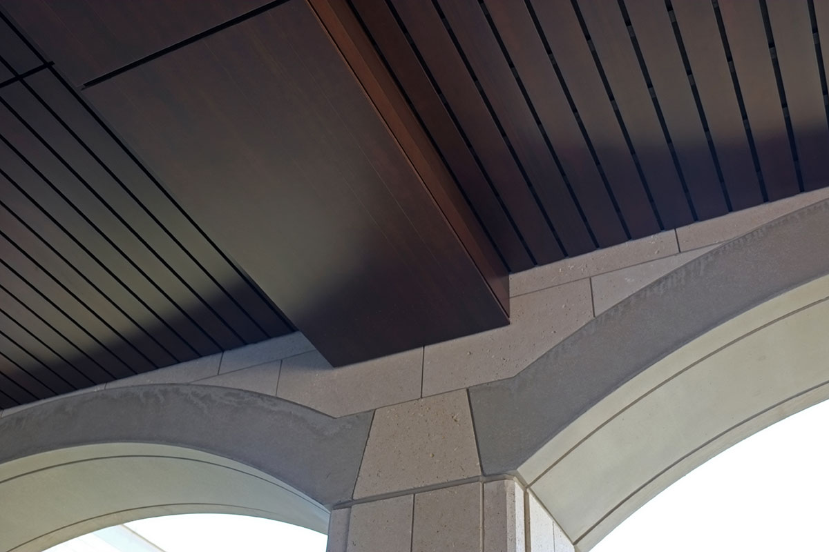
When I looked at this central mall as a whole, it reminded me of Washington DC, another place where brilliant site planning is undermined by mediocre buildings designed to comply with an overly rigid and simplistic set of guidelines and standards. When the demands of the program probably require building out to the maximum volume allowed by the standards, you end up with buildings that are almost identical in height and footprint, and the architects must jump through hoops to differentiate their work within this restrictive shape and limited vocabulary. I think that in any large ensemble there should be a balance between the common order and the individuality of pieces, but at Stanford the parameters have killed any meaningful differentiation among the parts.
Away from the center of campus, things apparently can loosen up a bit, and there are some okay buildings. I really like the stark geometry of this building by Antoine Predock, which does treat the arches and punched openings as elemental slices through a seemingly thick wall. There is a strong, asymmetrical balance to the whole, with some pieces (such as the side elevation of the “arcade”) creating a local rhythm. It reminded me of how when classical architecture gets too fussy, eventually someone such as Ledoux comes along and reasserts the underlying geometric basis of the system. And the playing with the expression of the vault is very subtle, showing a complexity of spatial imagination that is just not apparent in the other buildings.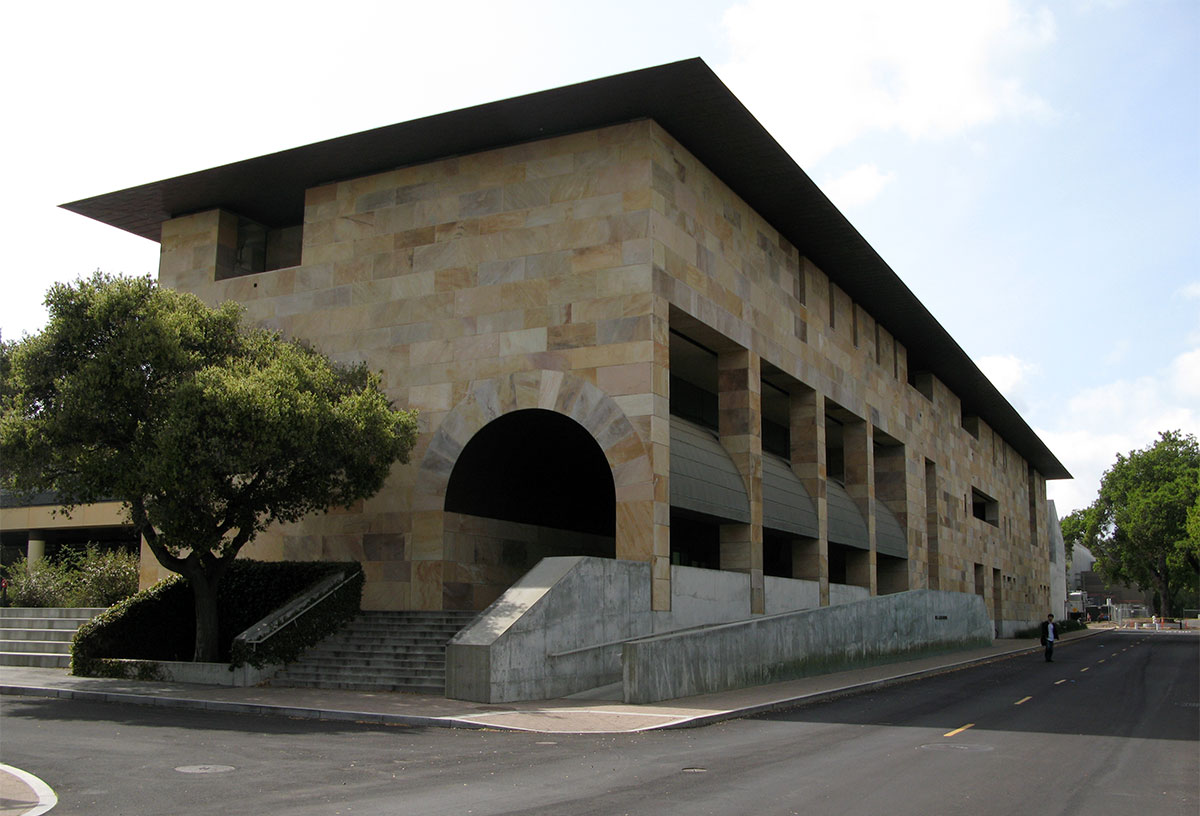
Some of the more recent buildings seem to acknowledge the new role Stanford plays in our culture, as the incubator for the tech geniuses who will move a few miles down the peninsula after graduation and join the Silicon Valley elite. This building by Forster and Partners looks like it might have been a rejected design option for the new Apple headquarters, so they just put it here to get the students acclimated to their anticipated milieu.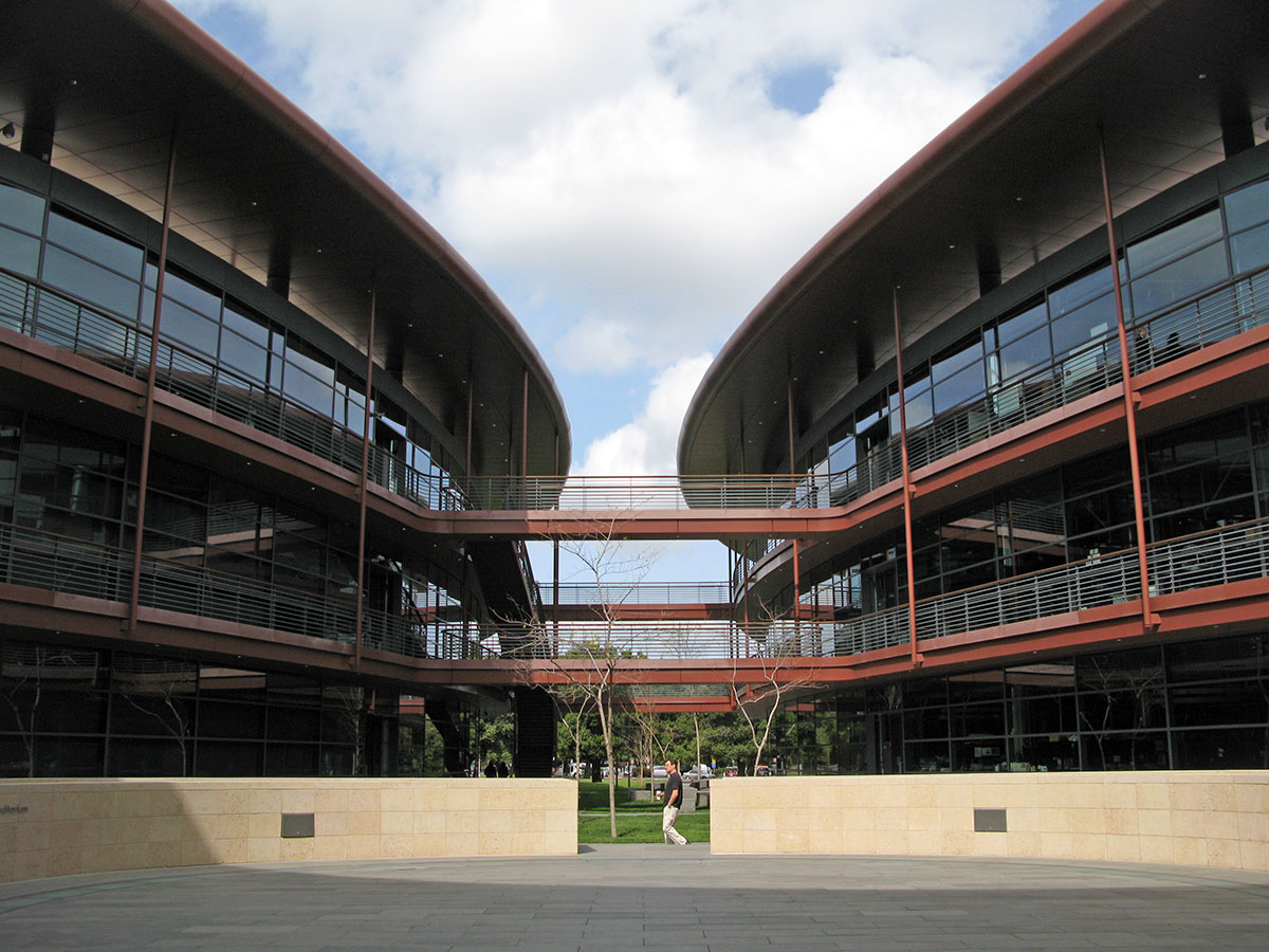
I’ve spoken with some people who are shocked by my opinion of the Stanford campus, as they see it as such a beautiful place, but after some discussion, they sometimes concede that the quality of the later buildings doesn’t match that of the original complex. I’d like to now compound my heresy by saying that I don’t think the original buildings are all that good either. The places where the building forms reinforce the big axial moves of the campus plan are superb, creating dramatic vistas and long perspectives that emphasize the immensity and simplicity of the vision. The big arch framing this view is powerful, and the two pavilions enclosing the space while framing the further view are perfectly scaled and proportioned. It is scenography, done very well.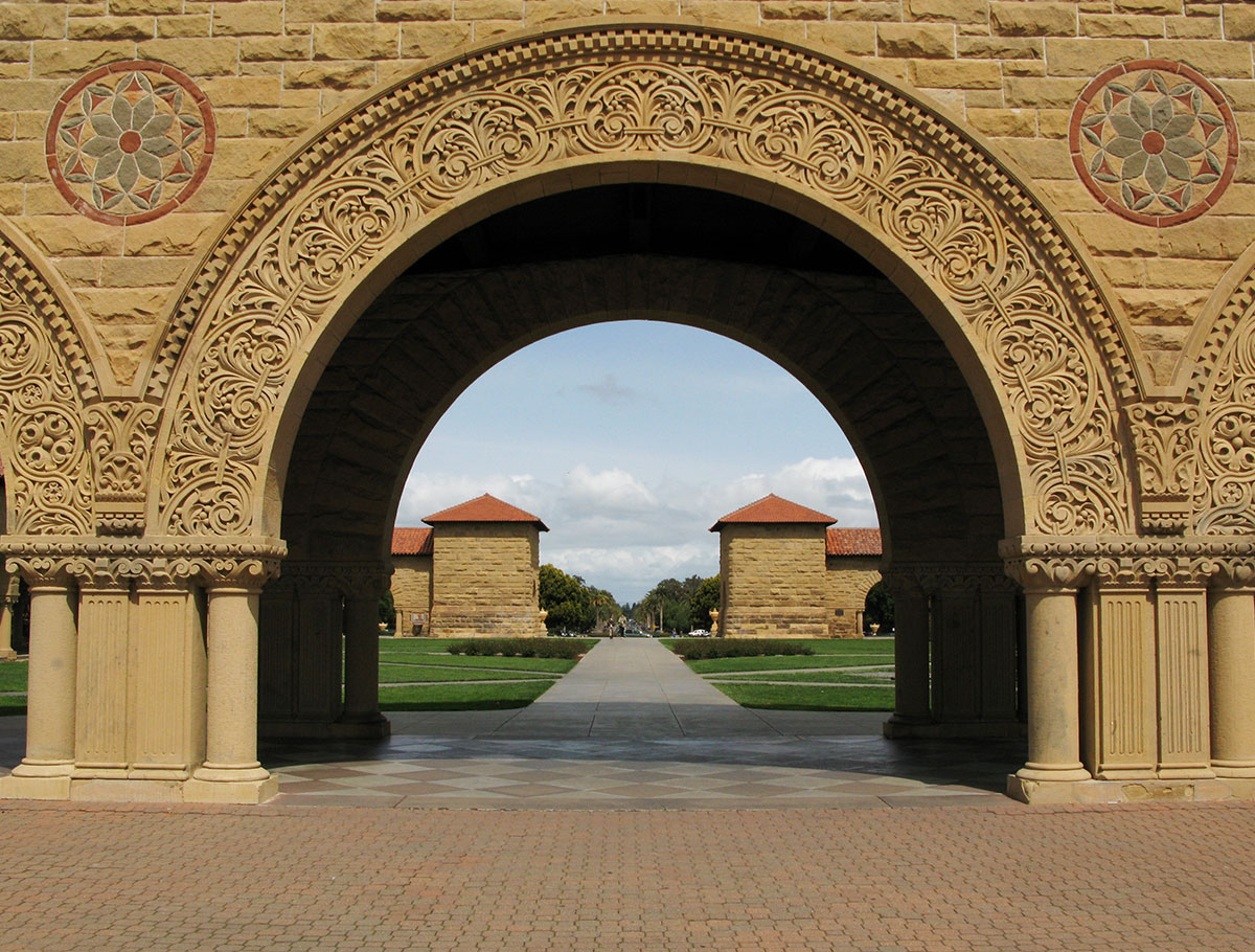
The gate pavilions on the cross axis assert their identity as objects beyond their functions of framing views. (Although the palm trees do give it a bit of a cheesy Hollywood studio / Mar-a-Lago ambience.)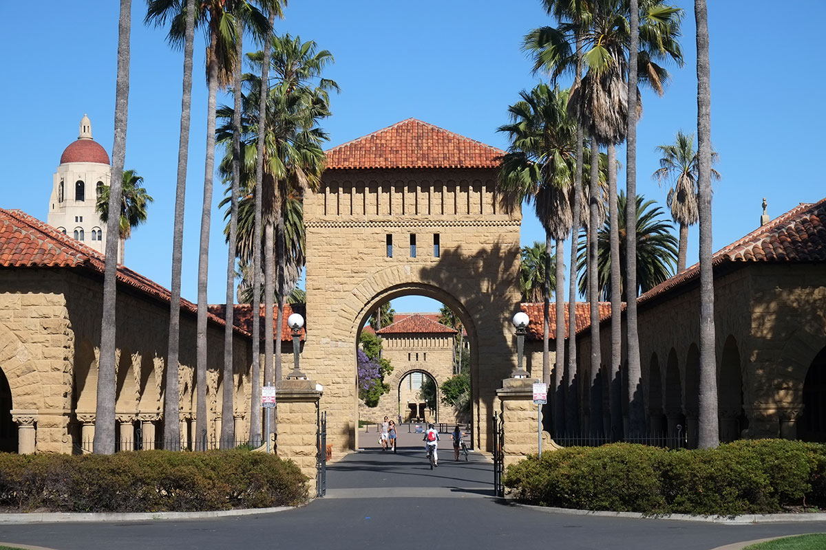
But the main court itself is a bore. Walking in the arcade is extremely pleasing, yet viewed from the court, the arcade is just too relentless, an unvarying wall enclosing a very big space which has some random planting beds scattered around to relieve the monotony. Even where special events occur, such as the big church on axis, the arcade is barely inflected to acknowledge them, and the essential flatness of the enclosure wall continues. The space is really overscaled, and the architecture is too minimal and uniform to stand up to it.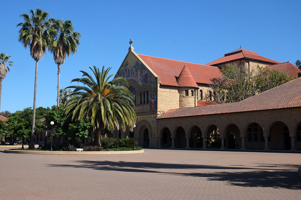
Even the individual elements in the system do not help. This may be mainly my irrational taste, but after decades of considering these buildings, I’ve concluded that this is about the ugliest color of stone I’ve ever seen, a sort of sick-dog mustardy khaki. After months in the Southwest, where the variety of stone textures and colors was an endless source of surprise and delight, I can’t understand how you could find such an ugly stone, and then use so much of it.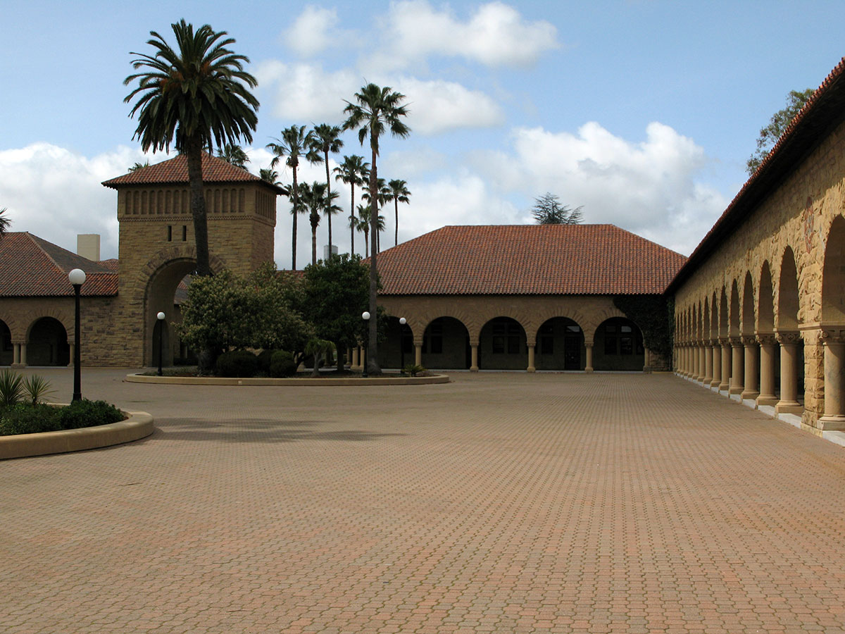
The rustication is also overdone and boring. It looks like many bad 19th-century armories and other military facilities, which wanted to project that sense of martial strength. It gives a three-dimensionality of about one inch in depth to the material, which stands in contrast to the overwhelming flatness, planarity and lack of three-dimensional spatial exploration at the larger scale.
The comparison to Richardson to inevitable, and I can’t help wondering what this might have been like if he hadn’t died so young. These were clearly his followers, and they had learned the elements of the Richardsonian Romanesque, but they were only able to apply that vocabulary in a rote and perfunctory manner. There is one uniform system of parts and vocabulary, but that limited vocabulary is not being used to say anything very interesting. Compare this arcade corner, with its weak rounding-off and embarrassingly conventionally stylized decorative panel of wreaths and cartouche signs,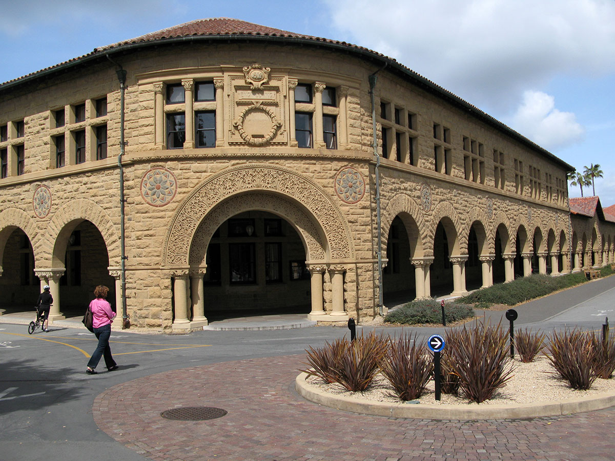
with Richardson’s mind-boggling stair at the New York State Capitol. The light and shadow are astounding, but more relevant here is the sense of three-dimensional play, the plasticity of the stone work, the recognition of stone as a material to be understood and shaped almost sculpturally, rather than a material that happens to be used to build an automatic and endlessly extruded space-enclosing system.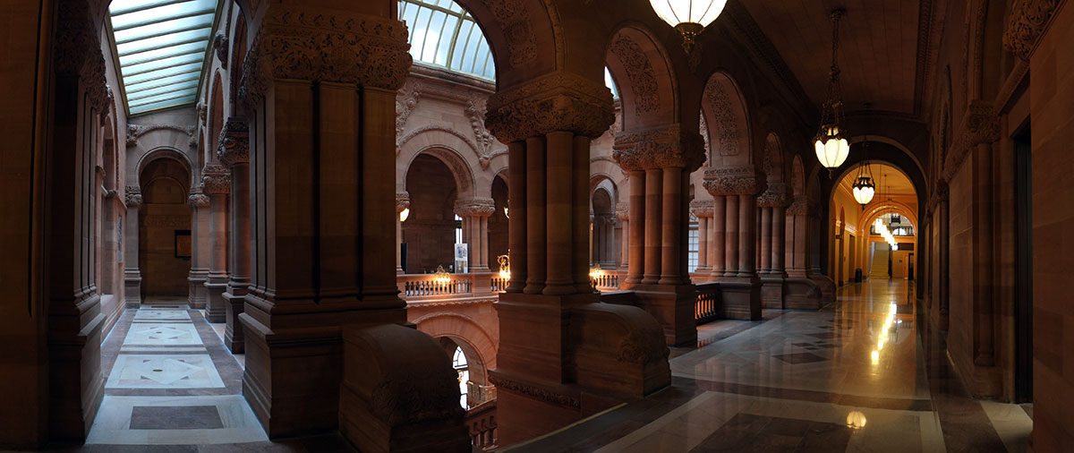
The argument might be that the arcade exists mainly as a system to enclose that court, and it should be a simpler, background element, as befits its role as just a wall. But look at the jail at the Allegheny County Courthouse, which has a literal wall running around it, and where Richardson somehow was able to play the continuity of the wall off the legibility of the individual pieces that interact with it.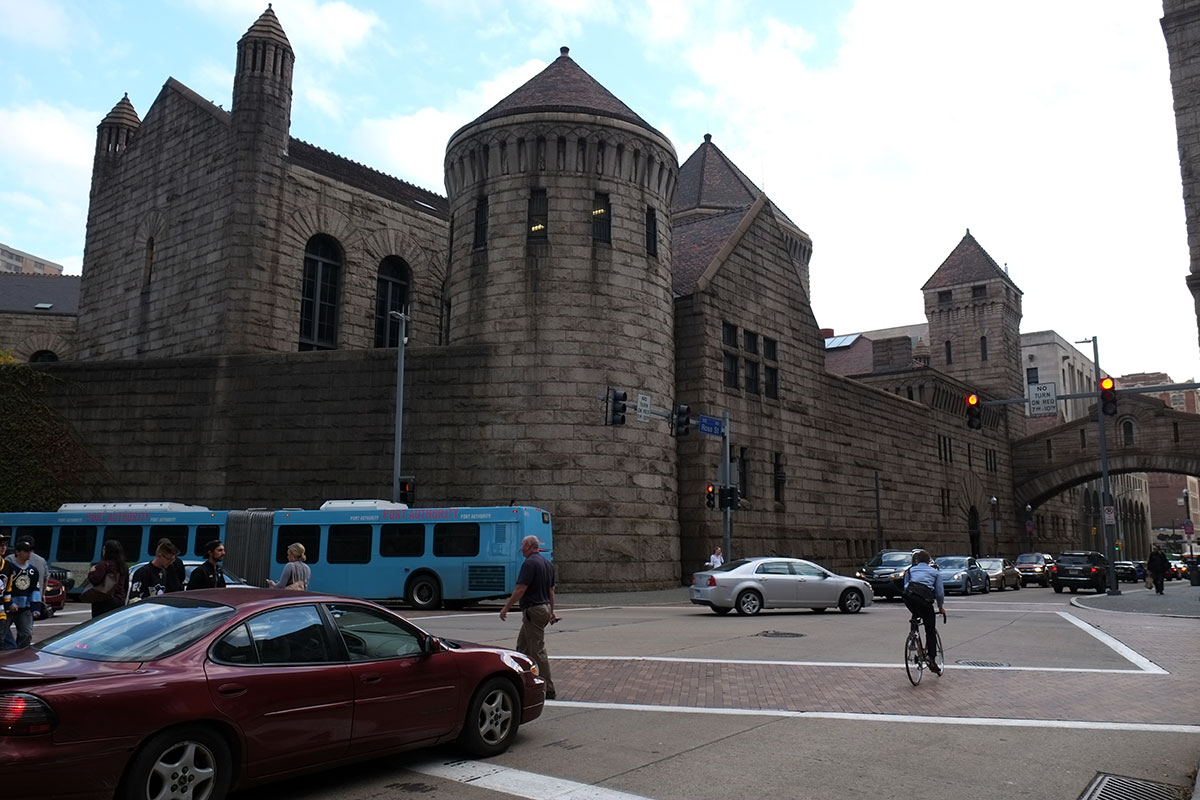
The basic problem is that Shepley et al were not Richardson, which is not really their fault. (Were they the employees who were responsible for contact documents and administration? This may be one of the first cases where an architecture firm had enough institutional solidity to continue on as an enterprise, after its founding genius has died.)
Strangely, there is a big difference between their take on this Richardsonian approach, and what all the other Richardson imitators did. I once thought of writing a book called Not by Richardson, which was to be a catalogue of all the Romanesque buildings around the country which the locals always tell you are by Richardson, but aren’t. What most of those faux-Richardson buildings have in common is that they’re overly exuberant, with too many colors, textures, forms and details all jammed together, without the incredible restraint and balance that Richardson had. But at Stanford, we see the opposite – the elements of the Richardsonian vocabulary, used in a timid and limited manner. It’s robotic Richardson, with a primitive algorithm.
By far the best part of it are the smaller-scale elements. The pattern of simple openings making a sort of stone screen wall is beautiful. It’s a detail Richardson used often, and it is used here very well.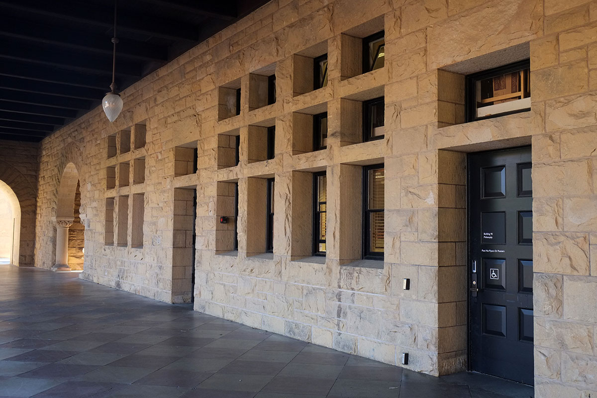
Or where the arcade becomes a pergola between two courts, and the landscape can be glimpsed though the arches. It reminds me of the little enclosed court at the rear of Trinity Church.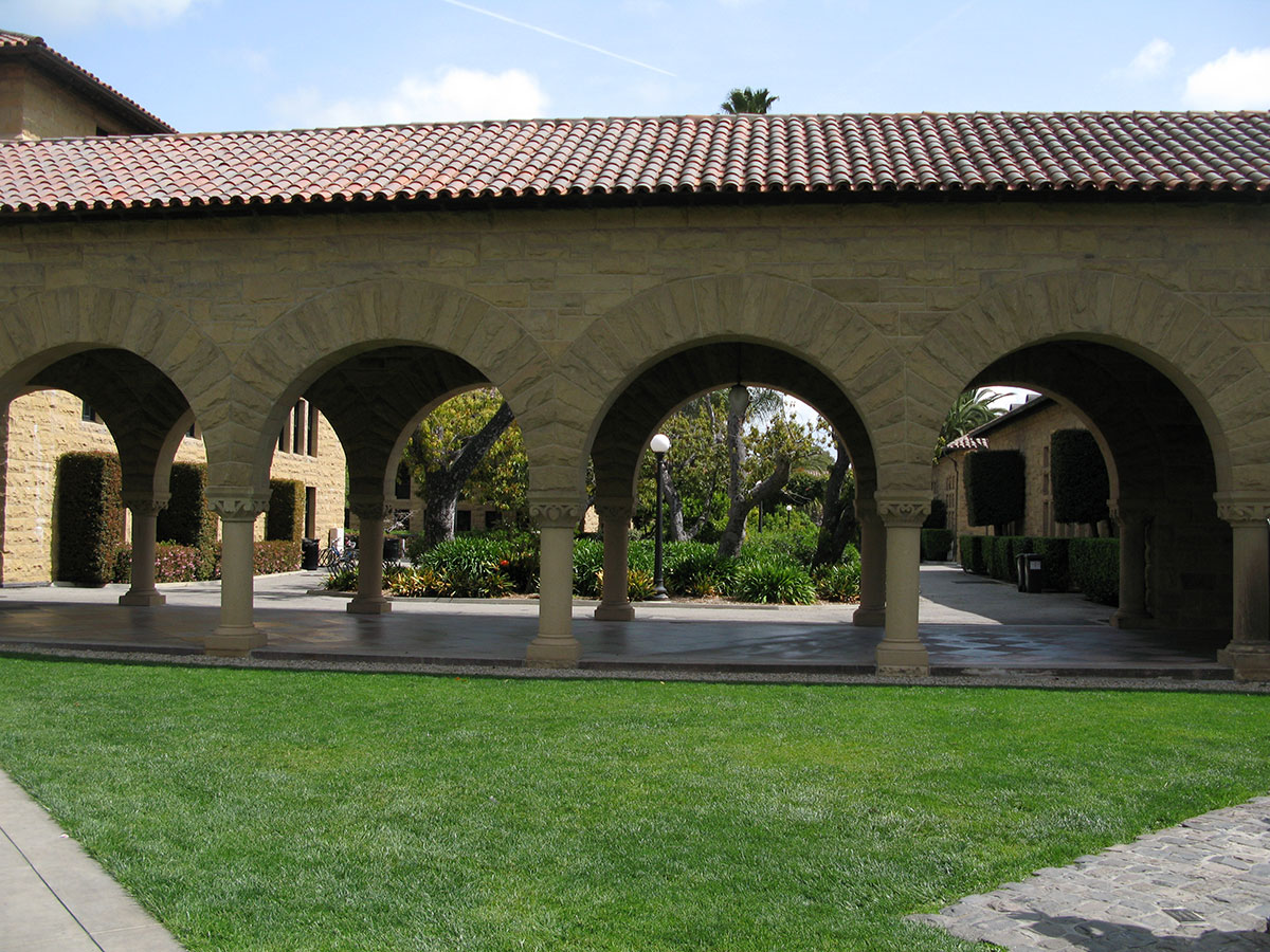
Or the narrow courts and passages formed by the elements of this system. They seem in scale with this intimate space, whereas the same architectural elements are overwhelmed by the scale of the main court. And just as the big moves in the architecture are best when they reinforce the big moves in the landscape, so the smaller scale architectural moves are best when they work with the small moves in the landscape. The architecture is just too boring to stand on its own. If the core of the campus had a clearer, systematic hierarchy of open spaces that drove the architectural design, it might have been more satisfying than what was built, where the landscape comes in two scales (very big and pretty small), while the architecture is always just at one scale.
It strikes me that the seed of the mediocrity of Stanford’s buildings was planted here, in the original core of the campus. The reliance upon architectural rules and uniformity was established, along with the subservience of individual pieces to the whole, and a distrust of any individual design expression or a big vision. We’ve learned that cities work better when there is contrast and juxtaposition among many buildings of different eras and styles. It is on a campus such as Stanford’s where we can see the effect of too much control and regularity, with the excessive integration leading to repetition and boredom.

I pretty much agree with all of this, good you brought in the original buildings on the campus with a comparison to Richardson. I have always felt the same way. I have a feeling that the order of the whole has drained the life out of the individual buildings. I think architects must have been a bit intimidated by the order of the campus, seems there may be value to some chaos where individual buildings are concerned. I also think that the demands of lab space for new buildings are just too overpowering to survive very well in an ordered setting like Stanford. The new buildings on the north side of the campus are what you would expect at any reasonable university, big, thick and amazingly clunky. The modern university is definately not the ivy covered scale of the Oxford/Cambridge university, but rather the scale of the modern suburban office park.
LikeLike