 The architectural high point of Houston is definitely the Menil Collection. After seeing so many Renzo Piano museums on this trip, it was instructive to visit his first in this country, from the mid 1980s. The overwhelming impression is that of simplicity and clarity, which sometimes has gotten obscured in his more recent buildings by all the fancy parts.
I still remember being fascinated by this building when it was first published. In a decade when major public works were either the last gasps of expressive late modernism, or the equally histrionic statements of Postmodernism in the ascendant, Piano designed a simple grey and white box. The architect who, along with his then-partner Richard Rogers, had provoked the whole architectural world with the Pompidou, was now working in an almost classical mode, reminiscent of Mies and Kahn. Museums want to be simple boxes with carefully-designed lighting, and Piano did this literally – a grey box with white colonnades all around.
What most impressed me then and now is how this large building fits into a residential neighborhood of small bungalows. The museum had been buying up those bungalows for a while, and then plunked this museum down in the middle of them, on a full-block site. They still own all the houses across the streets surrounding the museum, and they have been remodelled to house functions such as offices, the bookstore and a new cafe.  They are all painted the same shade of grey, and the landscaping of lawn and trees reinforces the residential scale. I always go back to Howard Davis’s response when a student asked him how much a building had to resemble its surroundings in order to fit in, and Howard said “about 30%”. A funny answer, which I think may be true (Howard now swears he said 50%). The Menil resembles its context in color, material (wood siding), simple flat walls, individual windows instead of curtain walls, steel channel detailing which refers to wood trim,
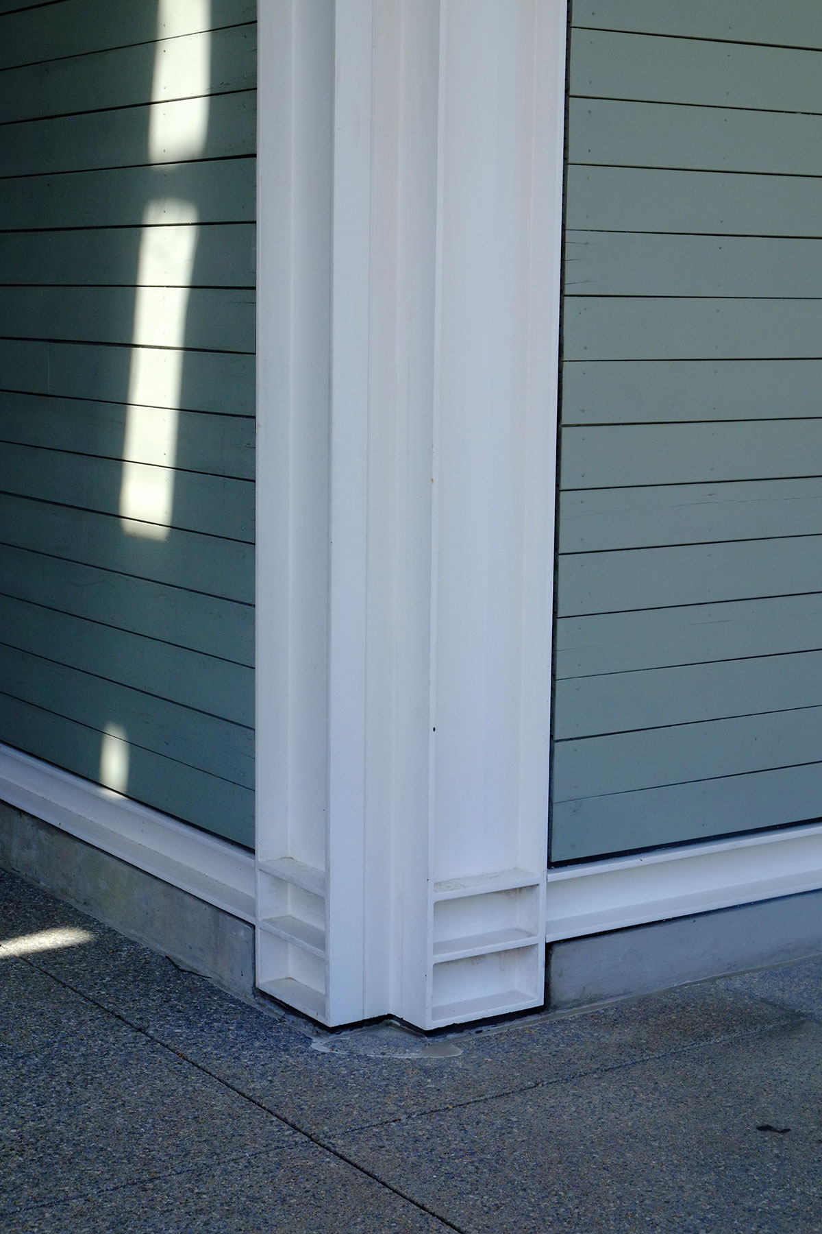 porches, and a lawn. Somehow this keeps the building from overwhelming everything around it. I like it that he made a building that feels monumental yet accessible, a temple with a colonnade that also reads as a big wood-framed house.
The colonnades surrounding the building show Piano’s first design for complex shading / daylighting devices. They are beautiful as objects, and they work very well at bouncing and modulating the light. 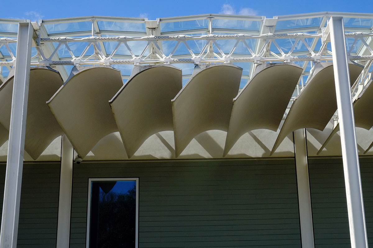
One could argue that this refined design isn’t necessary on the exterior – you just need a sunshade. But this roof is carried into the interior, where it daylights the circulation spaces and many of the galleries. The use of them on the exterior is a way to tie the building together, and state the key move of the building where all can see it. (And without them, it would just be big box.) They also create a gracious walkway around the building, a very pleasant place to stroll. The scale is intentionally deceptive – using wood cladding and a white porch makes one think the building is residential in scale, but the bays are actually very wide, and the columns are over two stories tall. Piano reinvents the colossal order. 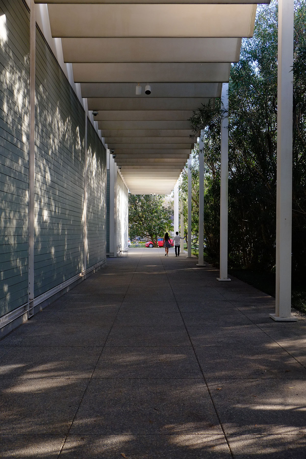
People were using the grounds as a park – reading in the grass, letting little kids play – another way in which the building is an amenity in the neighborhood.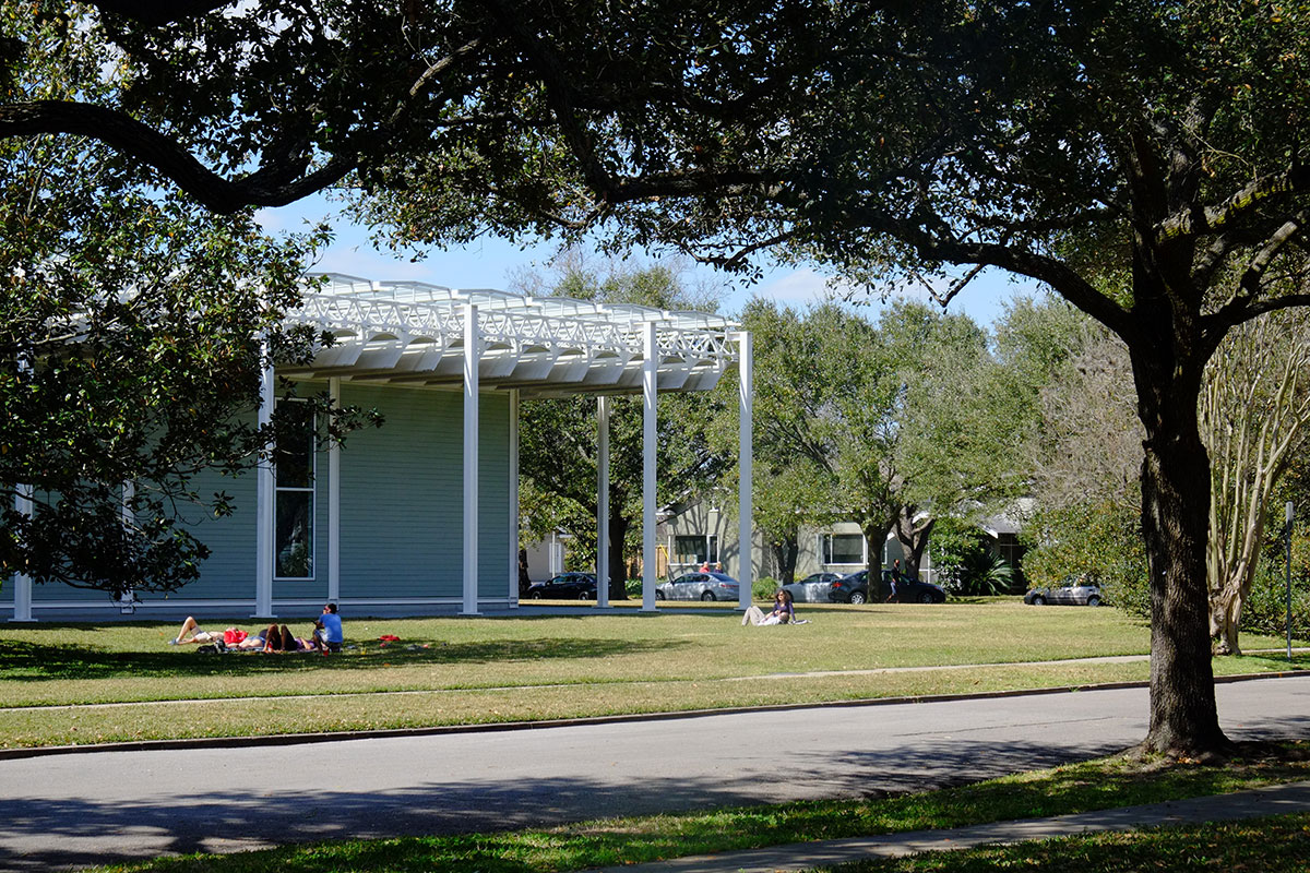
So the big problem with this post is that you can’t take pictures inside the museum. Too bad, as it is worth looking at. The plan is absurdly simple – a cross axis for entry in the middle of the two long sides, and a longitudinal hallway down the center which ends in a big window in a recess at each end. 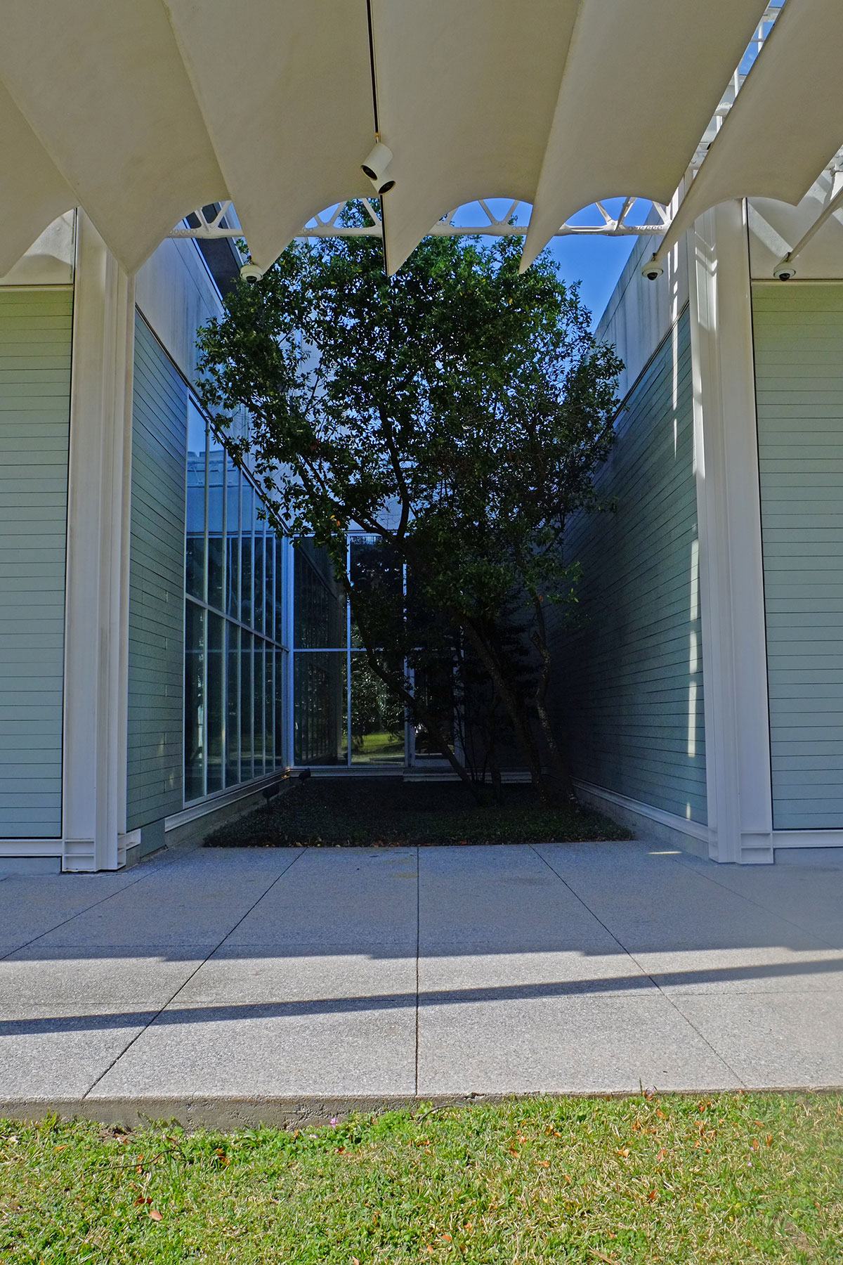
The galleries are to either side of the hallway, and are emphatically separated from it – no open plan here. it succeeds because of the light – the indirect light from the monitors above, and the big windows at the ends. The galleries themselves can be rearranged within this modular system, and the daylighting tuned to meet the needs of the current exhibit. The most interesting spaces architecturally were the galleries around an internal courtyard, which was very similar to Kahn’s Kimbell. A few bays of the grid are simply left open, the light comes down from above into a planted court, and the galleries around it have glazed walls. (These galleries house sculpture and other works which can tolerate these light levels.) Amusingly, this courtyard isn’t in the middle of the building, but is directly behind one of the exterior walls – you have to look hard on the exterior to see any indication of it.
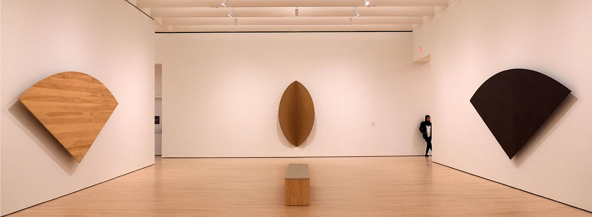
As at the Kimbell, the quality of the collection is a distraction from the architecture. It is a wide-ranging and excellent museum in many ways, but the Surrealist collection is astonishing. After walking through it all, I was having a hard time remembering any Surrealist masterpieces that weren’t here. Our favorite part was the room where they showed objects of tribal and folk art with had influenced the Surrealists. In any other museum, this work would be displayed in a scholarly manner, arranged according to place and time of origin and annotated with long, detailed labels. But the Surrealists didn’t really care about all that, they just thought these were really cool things that they found visually and conceptually appealing. So they are all mixed up in the gallery, with wildly varied objects juxtaposed and crammed together. It is fun, and it helps you understand their artistic processes.
The Menil has a few other buildings – a lovely, small Piano building housing a permanent installation of Cy Twombly paintings, and one with a Dan Flavin installation. It has also spun off two other buildings in the district – one that used to house Byzantine frescoes (long story), and the Rothko Chapel (a building which I found to be as uninteresting as the Rothkos; I’m a philistine). I think this little bit of Houston is better than all the rest of Houston put together.
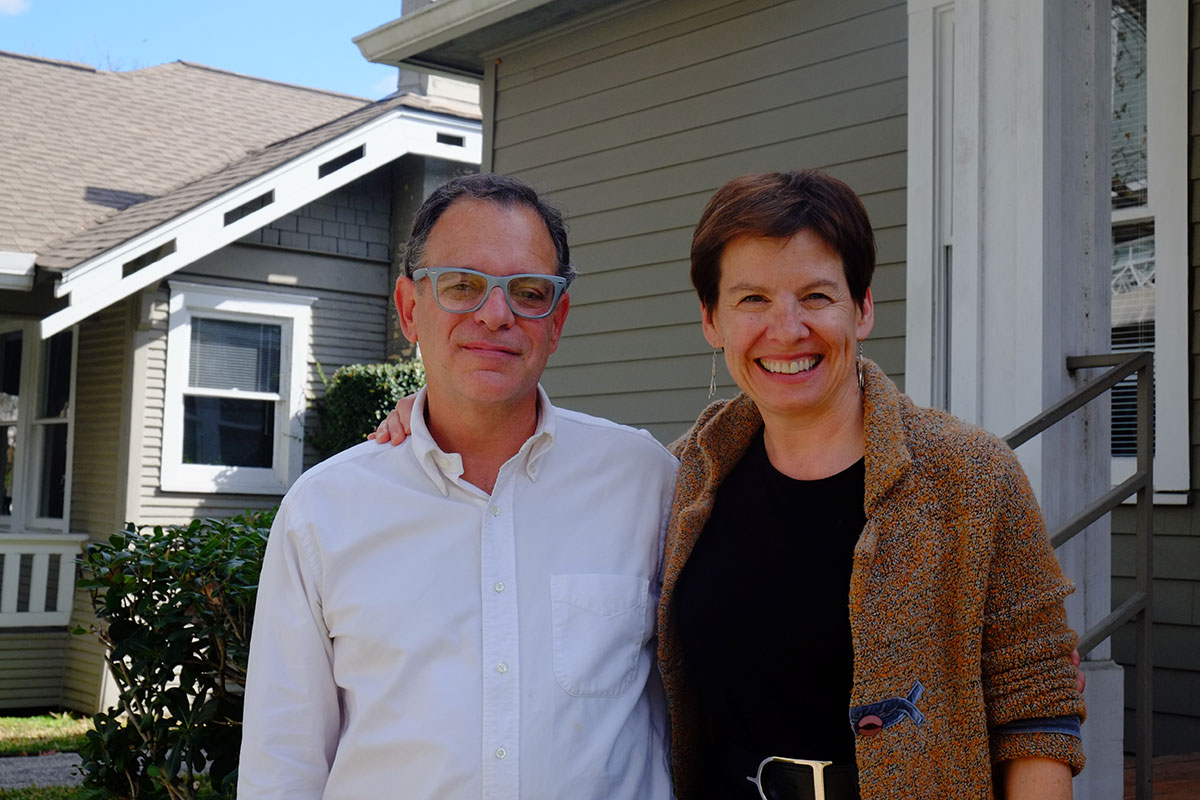 The other great thing about visiting the Menil Collection was seeing my old friend and classmate Sheryl Kolasinski, who is the deputy director and COO. Sheryl majored in art history at Brown, and then we attended grad school at Columbia together, where we formed the Ivy League art history cabal. She worked as an architect for a while, then joined the NYC government, where she eventually ended up as head of design and construction for all the city’s cultural institutions. She moved on to the Smithsonian for about 20 years, where she was deputy director for operations, and oversaw $1.5 billion in construction. She didn’t come out and say it, but I have to guess she got a little burnt out by the size of the operation (overseeing 1900 employees) and the range of issues she had to deal with, which was getting pretty far away from architecture. So she moved to a much smaller institution, where she can have a really direct effect upon its future, Sheryl is in charge of implementing the Menil’s masterplan, the next phase of which is a 30,000 sf drawing center for works on paper.
We had a great, short visit, catching up on the past 30 years or so, and talking about all the different directions in which an architectural career can veer. I’ve always thought that architects tend to have a breadth of vision and a skill set that’s often way out of proportion to the scale of projects they are called upon to administer, and it was wonderful to see how Sheryl’s talents have been recognized and appreciated, allowing her to accomplish a lot in an important context. And from now on, when someone says something snide about what you can do with an art history degree, I’ll just say that you could do something like manage the Smithsonian.
