One of the goals of this trip was seeing the Kahn buildings in out-of-the-way places that I had not seen before. An unintended theme that developed has been seeing most of the Piano museums across the country. The Kimbell is where these two came together, in what must be the ultimate compare-and-contrast question for a modern architectural history exam. After seeing the two together, I’m more convinced than ever that having Piano design the addition to Kahn’s Kimbell was the best possible choice. There is no other living architect whose work could pay homage to Kahn without imitating him, and who could simultaneously complement Kahn’s work while taking an archetypally different tectonic approach.
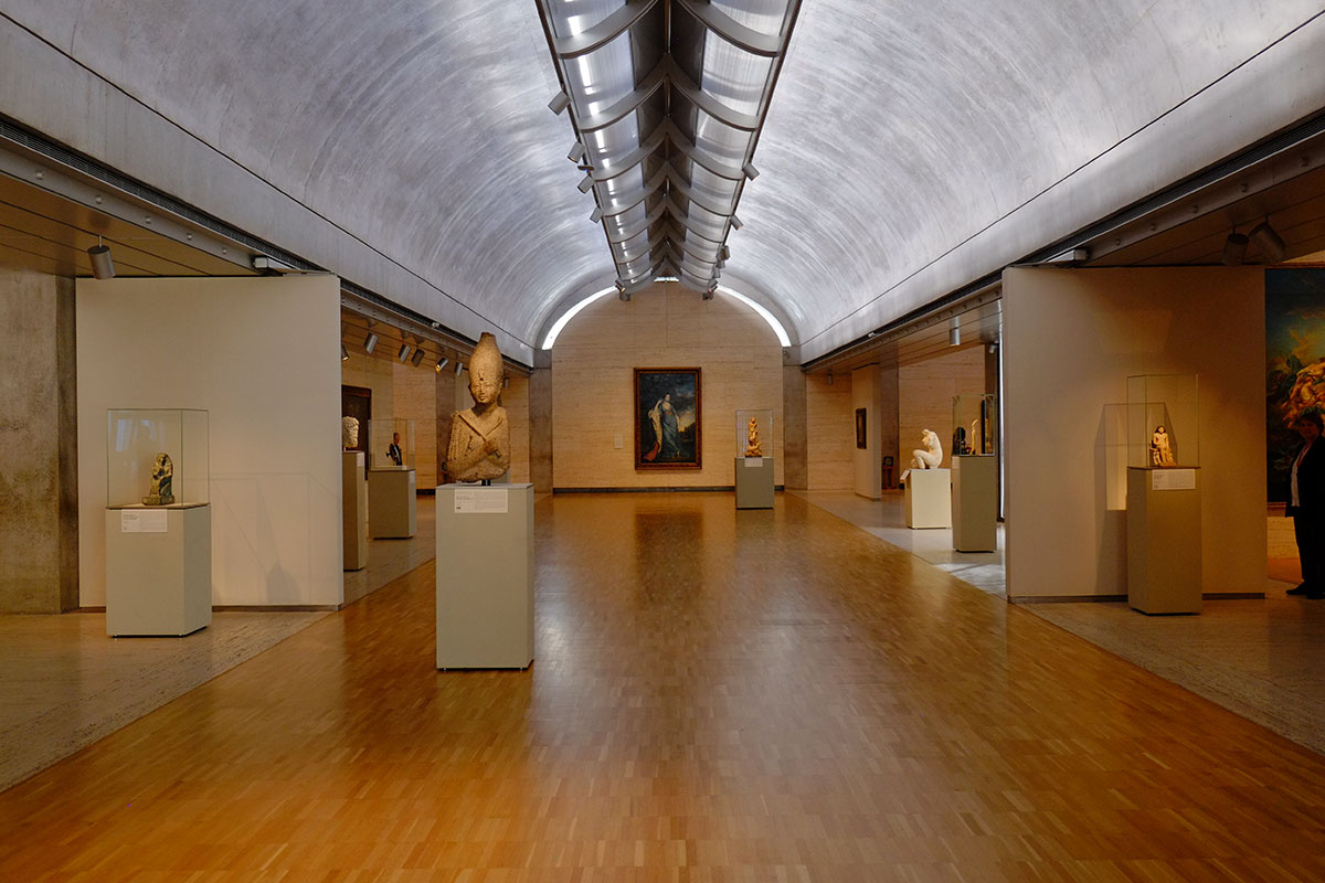 Of all of Kahn’s major works, the Kimbell was the one I always found least interesting. It just seemed too simple – come up with a bay cross-section that’s supposedly good for daylighting, extrude it to an absurd length, then repeat that bay module in a slightly-varied way. Of course it’s rigorous, it’s subtle, it’s beautifully-detailed, but I thought the spatial experience would just be too uniform. I was wrong. It is the perfect example of how playing within a strictly-controlled system can lead to a lot of richness and experiential variety. The modules are used to make long rooms and short rooms, narrow rooms or wide rooms, they open up at the end or the side, they are left out and so create spaces not strictly within the system – such as the entry court or the small internal courtyards. Or walls are left off and it becomes a loggia.
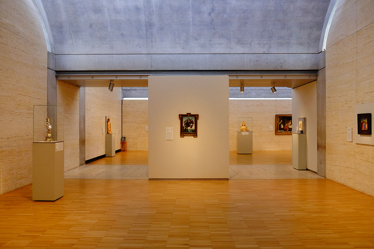
Of course, the building is about the light, something you have to go there to see. My prior reaction was entirely too conceptual, thinking about this parti versus the partis of other Kahn buildings. Kahn buildings seem simple when you study them, but when you visit you are overwhelmed by the experiential richness. The Kimbell is the most extreme example of this.
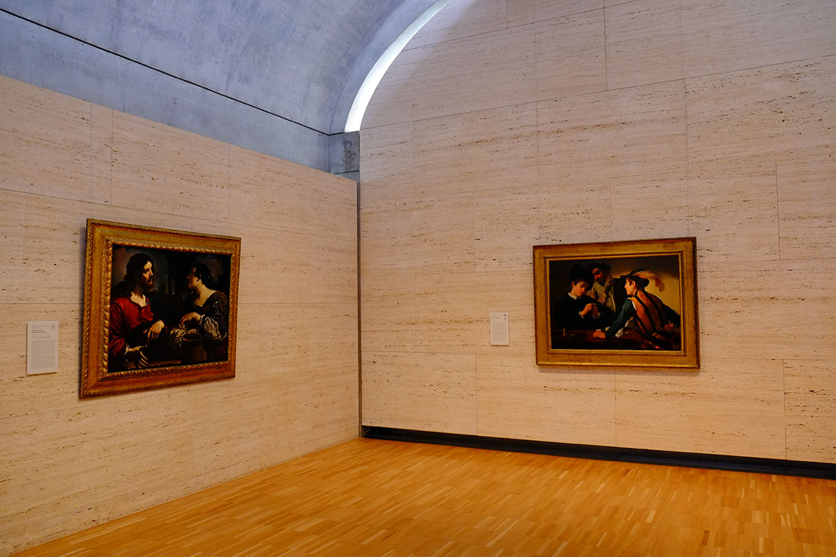
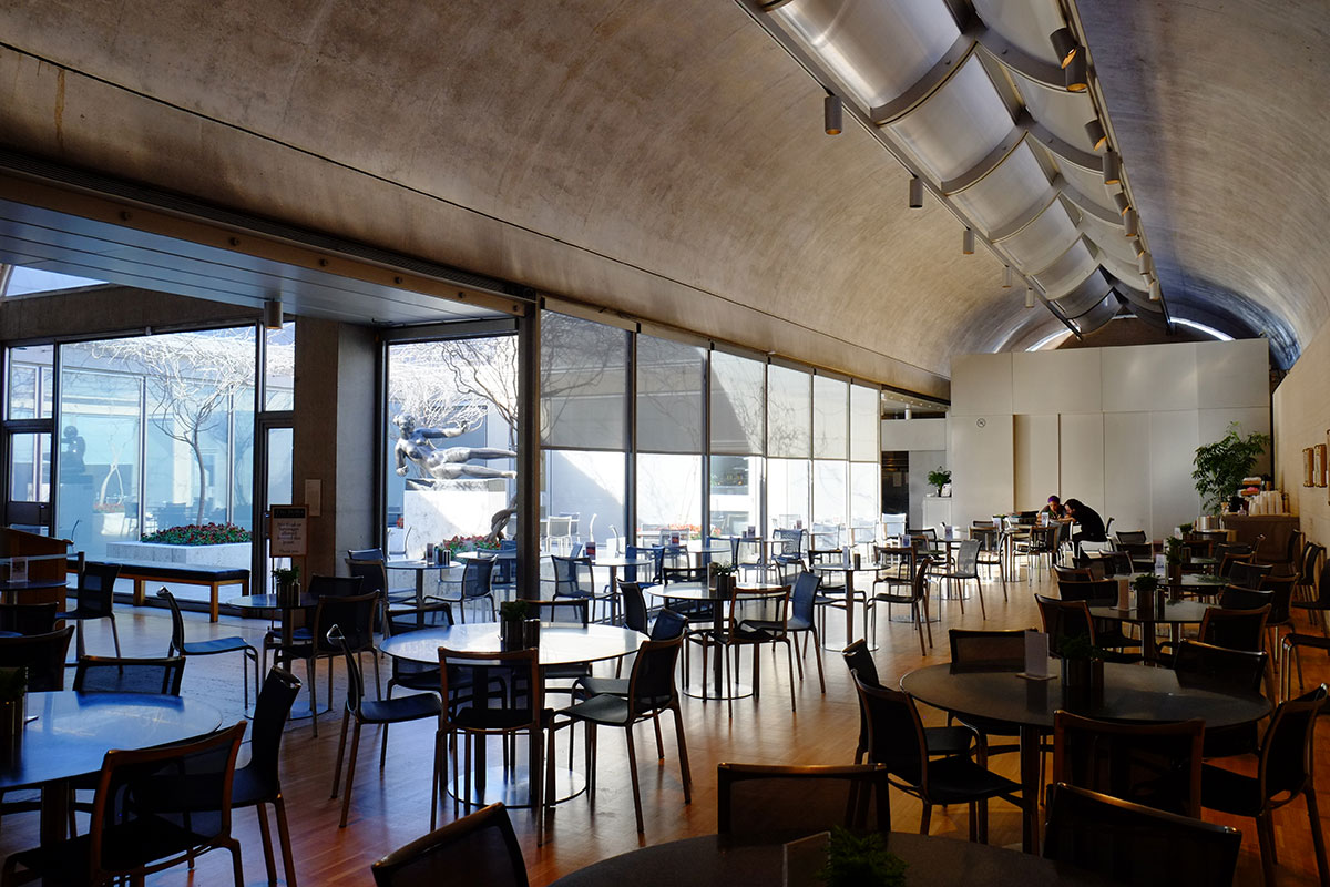
it’s a remarkably calm building, and even though it’s brilliant, it can recede into the background, allowing you to focus on the art – the spaces are comfortable, bathed in the wonderful light, and movement among the galleries is clear and effortless. So here is the biggest problem I had with the Kimbell, compared to the Yale British Art Center – the collection is just too good. The British Art Center is full of ghastly English paintings, all giant Stubbs with horses, etc., nothing to distract you from looking at the building except the Turners. The Kimbell collection is superb – who else has a small painting done by the 12-year-old Michelangelo? The Renaissance art is great, as is the modernist work – I now have a new favorite Munch. As much as I wanted to think about the building, the art kept pulling me away.
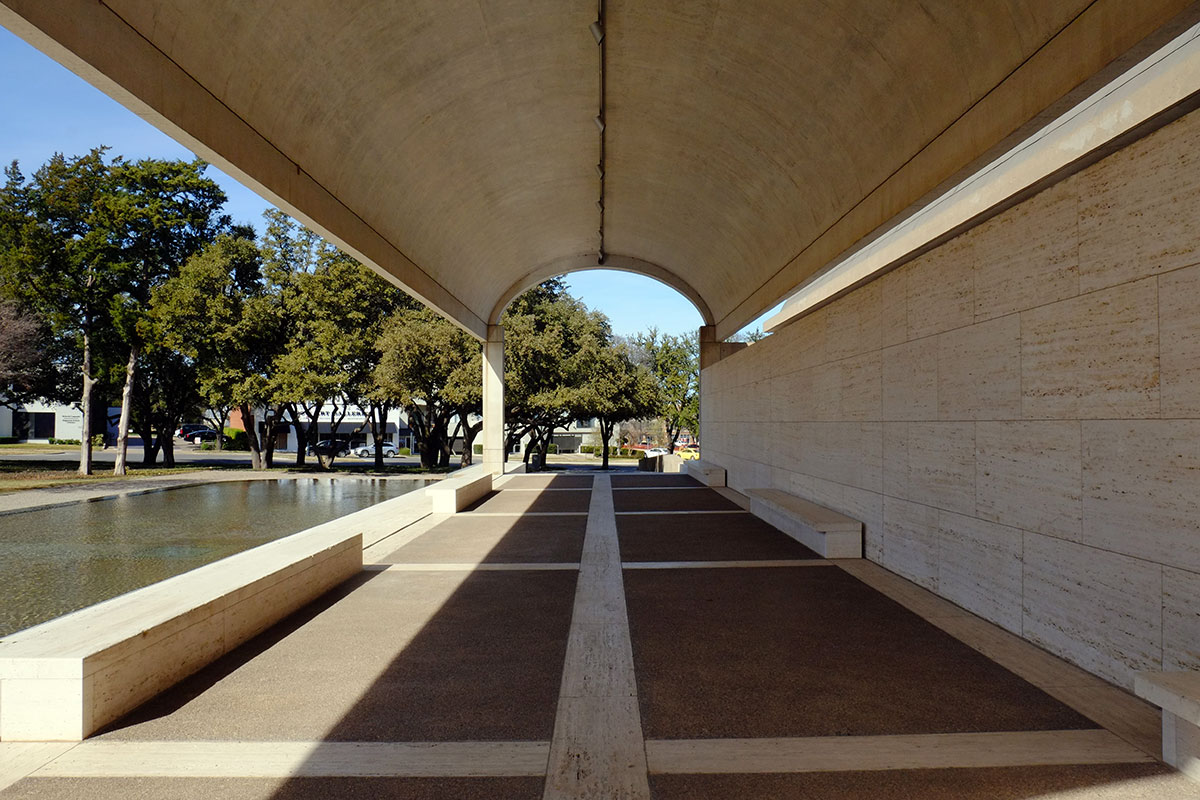
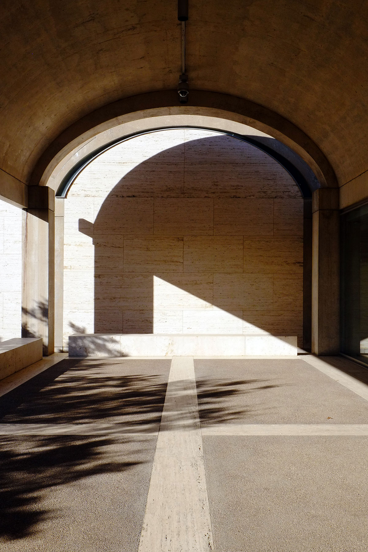
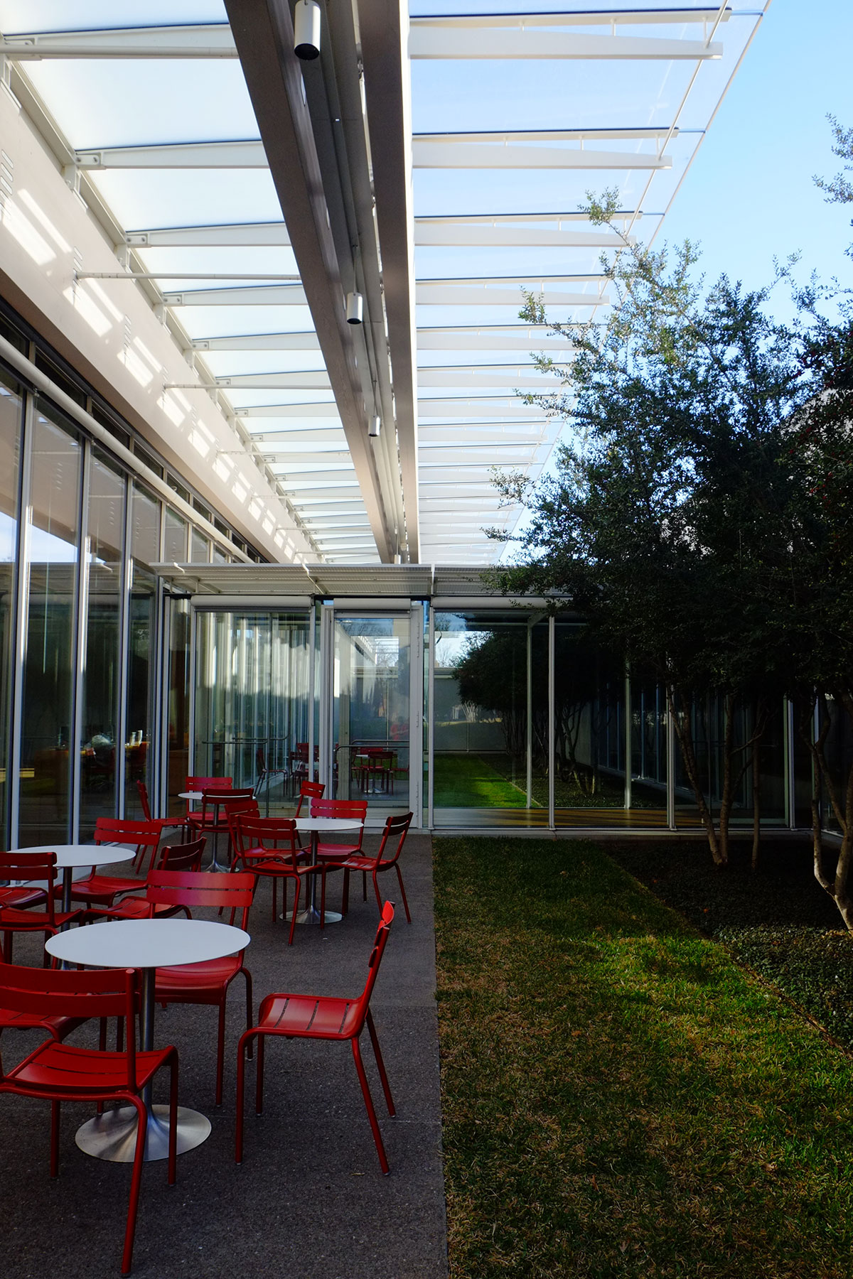
I do have some niggling problems with it. The intended main entry was from the lawn and grove on the west side, but I bet it wasn’t much used. In a car-dominated environment like Ft. Worth, the entry sequence is from the car. It is like the current American house – you’re supposed to enter through the grand entry hall, but everyone comes through the garage door into the kitchen. The default entry, from the small car court, is pretty uninviting – and this is the street facade. It is severe, almost like a service entry. The sculpture doesn’t even help.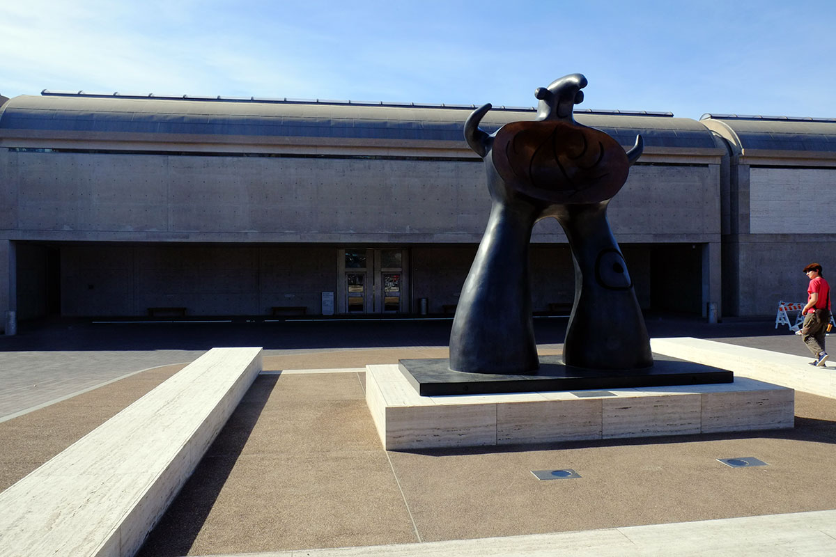
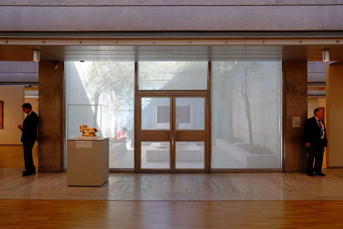
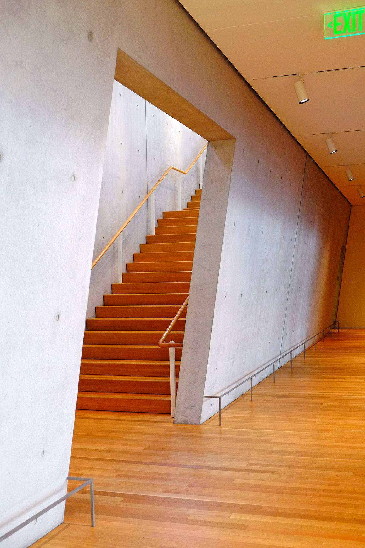
The stairs from here up to the gallery level are okay, slowly revealing the essence of the design as you ascend, 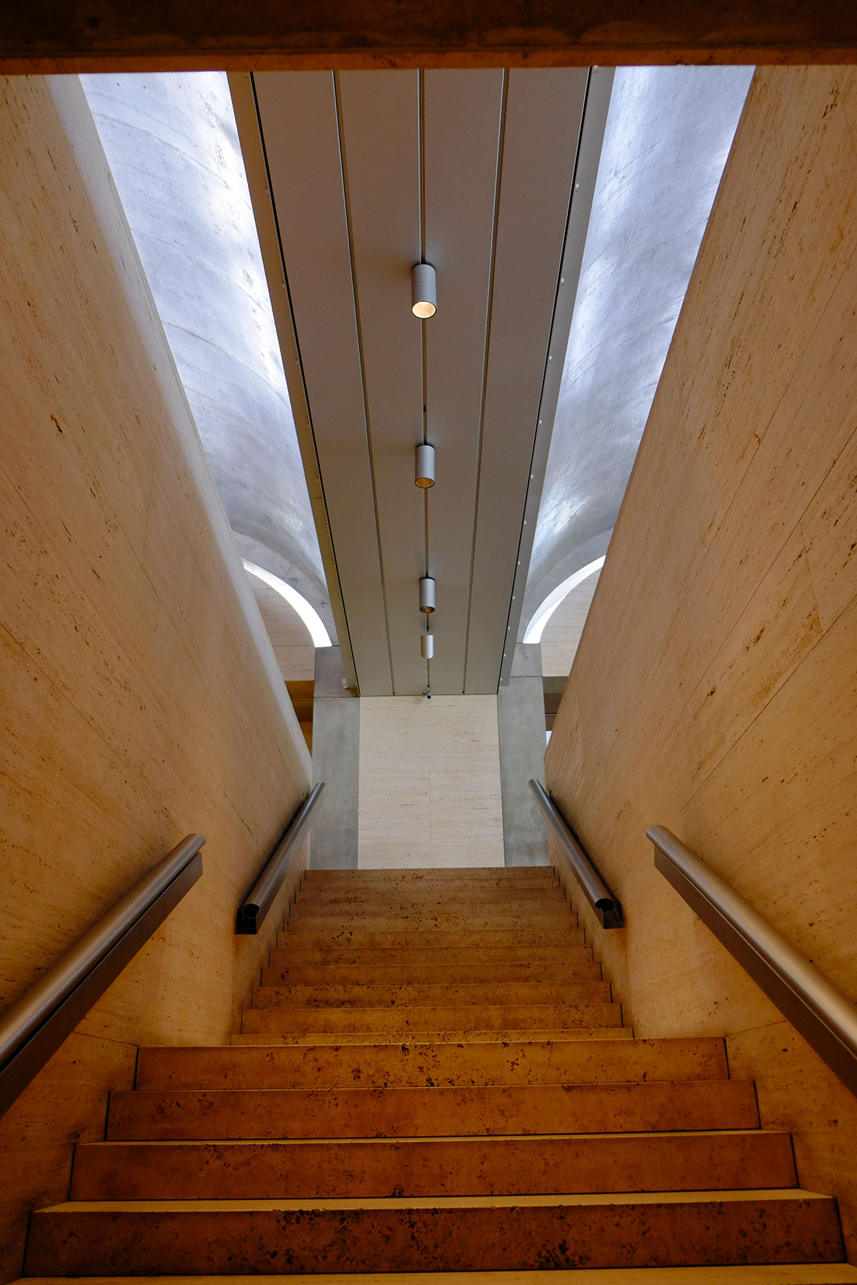
but they then drop you at kind of a funny point – facing a wall not quite in the museum, sort of in the bookstore, looking across to the courtyard area facing west. It’s a problem with a modular building – how do you emphasize entry or centrality, when every bay is equal? The new entry sequence from the Piano building is much better – after parking under the building, you head up a new funny little stair, not unlike Kahn’s, then turn, and see the Kahn building across the lawn. This is the intended main entry, but it took the Piano addition to get you there. 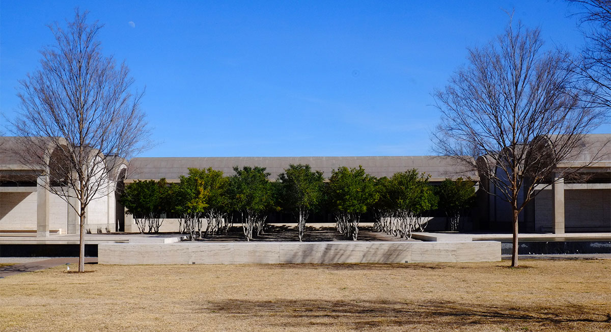
This movement across the lawn and through the grove / allee is wonderful. Entering either building from its own parking area below is bad, so the sequence now should be: park under Piano, come up the Piano stairs, see the Kahn building and go there, and then later recross the lawn to the Piano building. They probably wouldn’t let Piano design a stair up that was any nicer than Kahn’s.
There are a few things that seem a little unsystematic, such as the fire stairs. The vaults meet at a relatively narrow channel/beam, which doesn’t provide enough width for services such as fire stairs. So Kahn sticks the stairs at the end of the building, poking out a bit, and then tries to hide them with travertine. 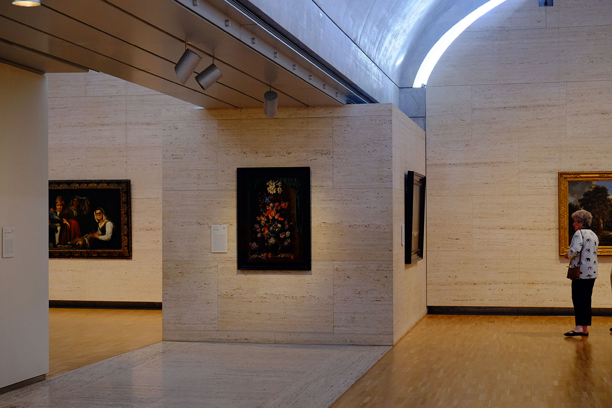 They just bugged me – kind of awkward, and not in the system of how he’s using travertine in other places. Also not in the vocabulary of how he’s using this in-between zone elsewhere.
And be aware that if you make big reveals between parts in your system, the staff will pile things in these places that theoretically should be empty.
Kahn had the advantage here of working sui generis, whereas everything Piano subsequently did has to be seen in relationship to Kahn’s building. The basic dichotomy is great, and plays to Piano’s strengths: if Kahn’s building is about mass, walls and vaults, Piano’s building will be about frames, panels, joints and beams. His building mirrors Kahn’s across the lawn in its north-south linear bays, its use of the east-west cross axis for entry, and in its symmetry. But then everything about the tectonics is different, and in the typical Piano vocabulary. 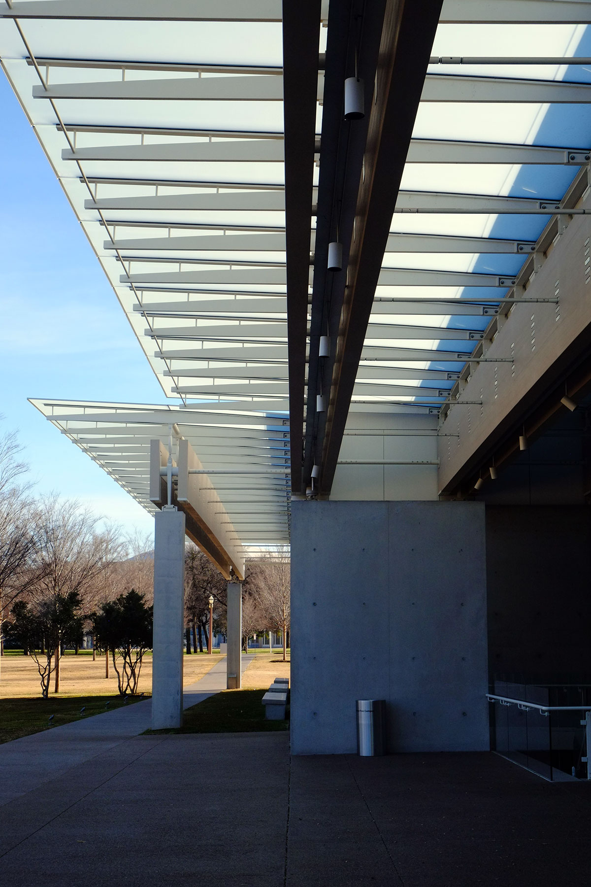
Neither building can be said to have a facade that really addresses the lawn between – the north-south walls are the side elevations where the logic of the linear bays plays out. The Piano entry hall also mirror Kahn’s across the axis, but this time done with paired glu-lam beams instead of post-tensioned vaults. 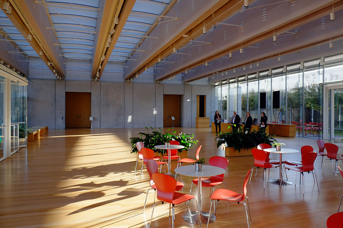
The Piano light scoops and shades are in full play, fitting in a building which plays off the iconic American daylighting masterpiece across the way. The main galleries are to the north and south, and are beautifully lit and proportioned. 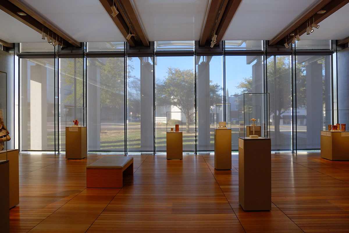
The east-west axis is very transparent, with a glazed corridor continuing the axis to the second part of the building between two small internal courtyards, which separate the building into two bars. The view is terminated by a daylit concrete wall. 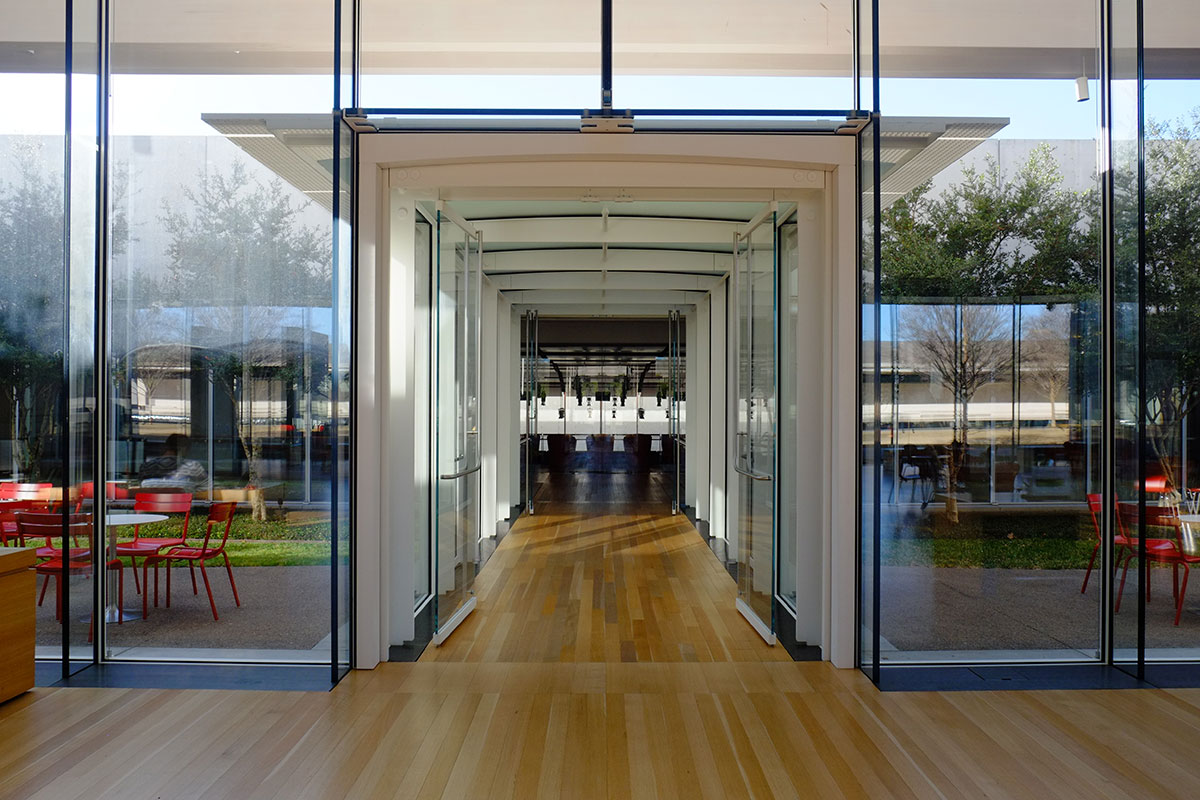
The second bar of the building contains some more gallery space, offices and support spaces, and a large auditorium. Most of these spaces are at the lower level, which is reached by symmetrical stairs on the longitudinal axis. 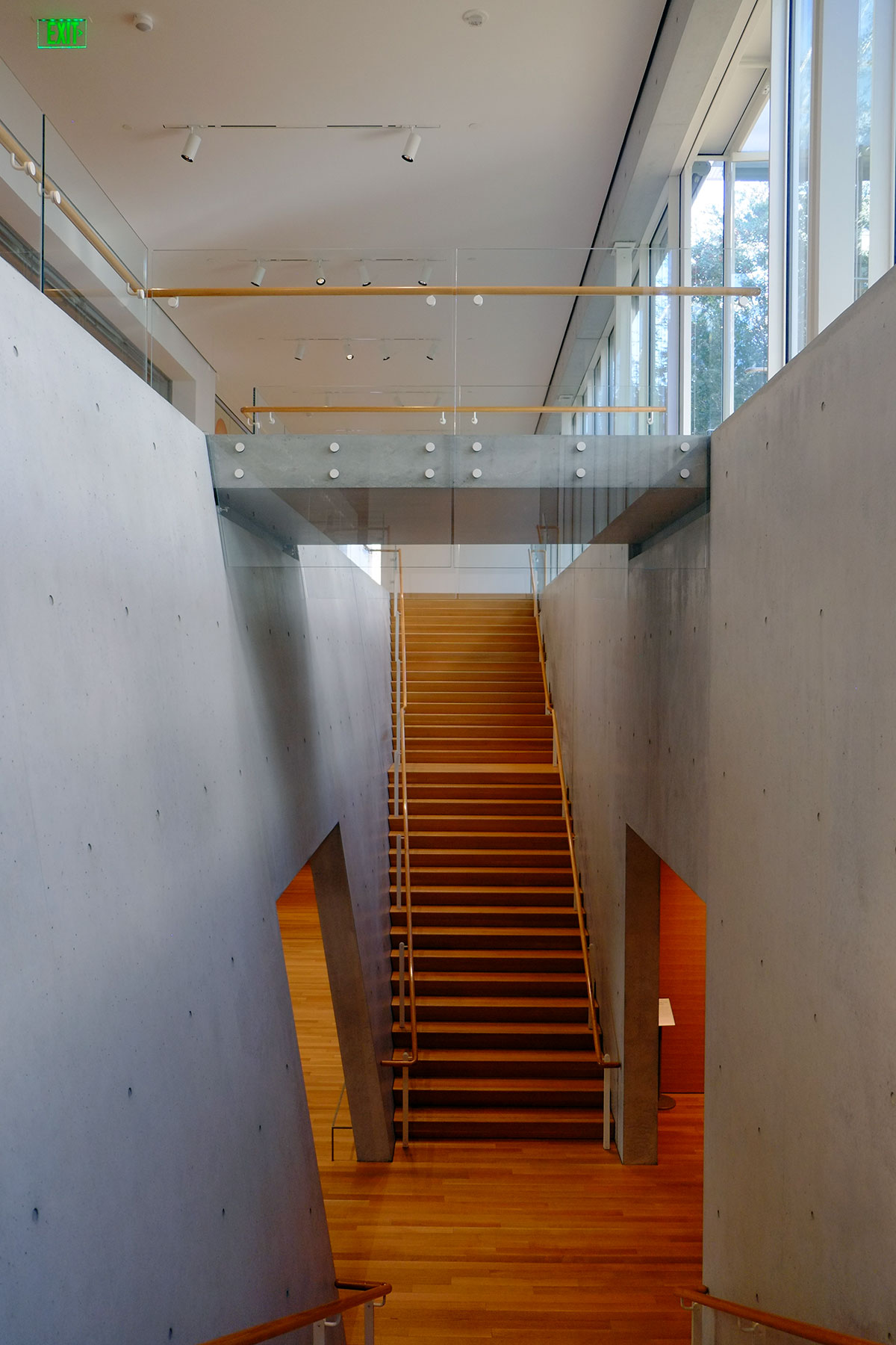
They are bound by two massive concrete walls, one of which is tilted. This being Renzo Piano, there must be reason for it (with most other architects these days, I wouldn’t even bother to ask why), but I couldn’t figure out what the reason was.
The auditorium is a two-story volume, the west wall of which is completely glazed, with light bouncing off another concrete wall outside. 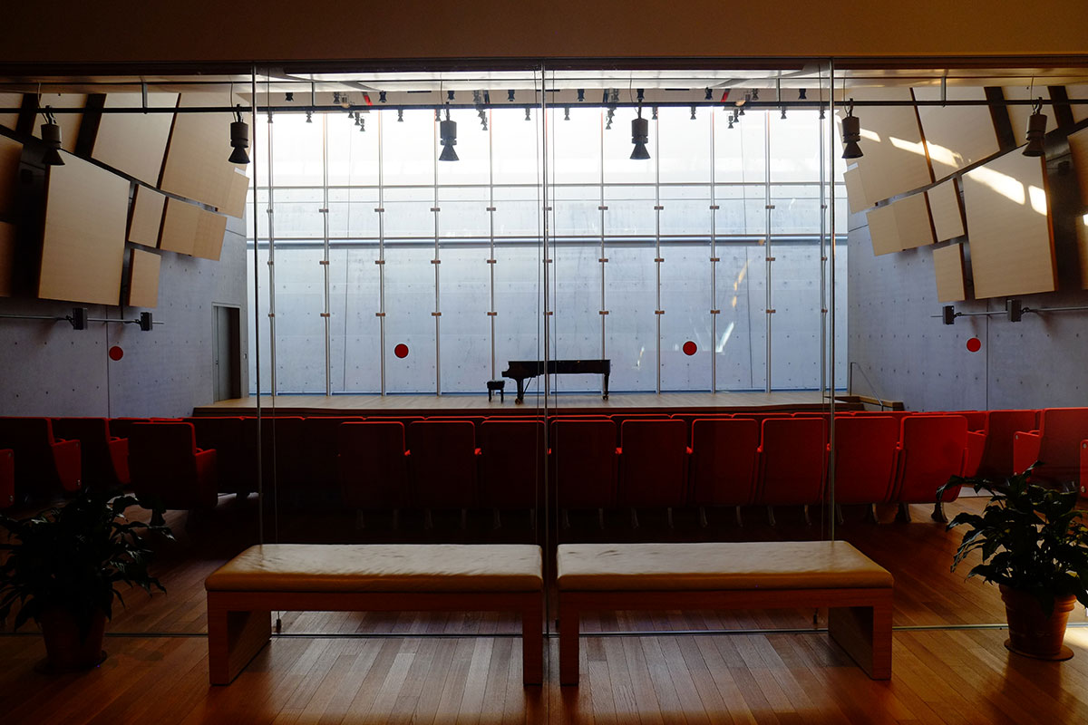 I was curious about the space between the glazing and the concrete, so I went around the back and found that a sloping lawn extends over the roof of this bar, and you can look down into the most elegant dead-pigeon space ever built.
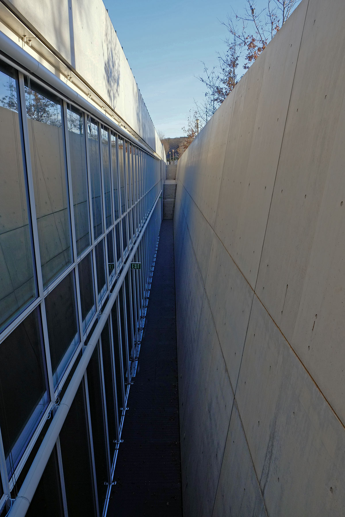
This green roof also allows you a close-up view of the roof structure of the front bar. I wish Simpson would bring out a Renzo Piano line of framing connectors. 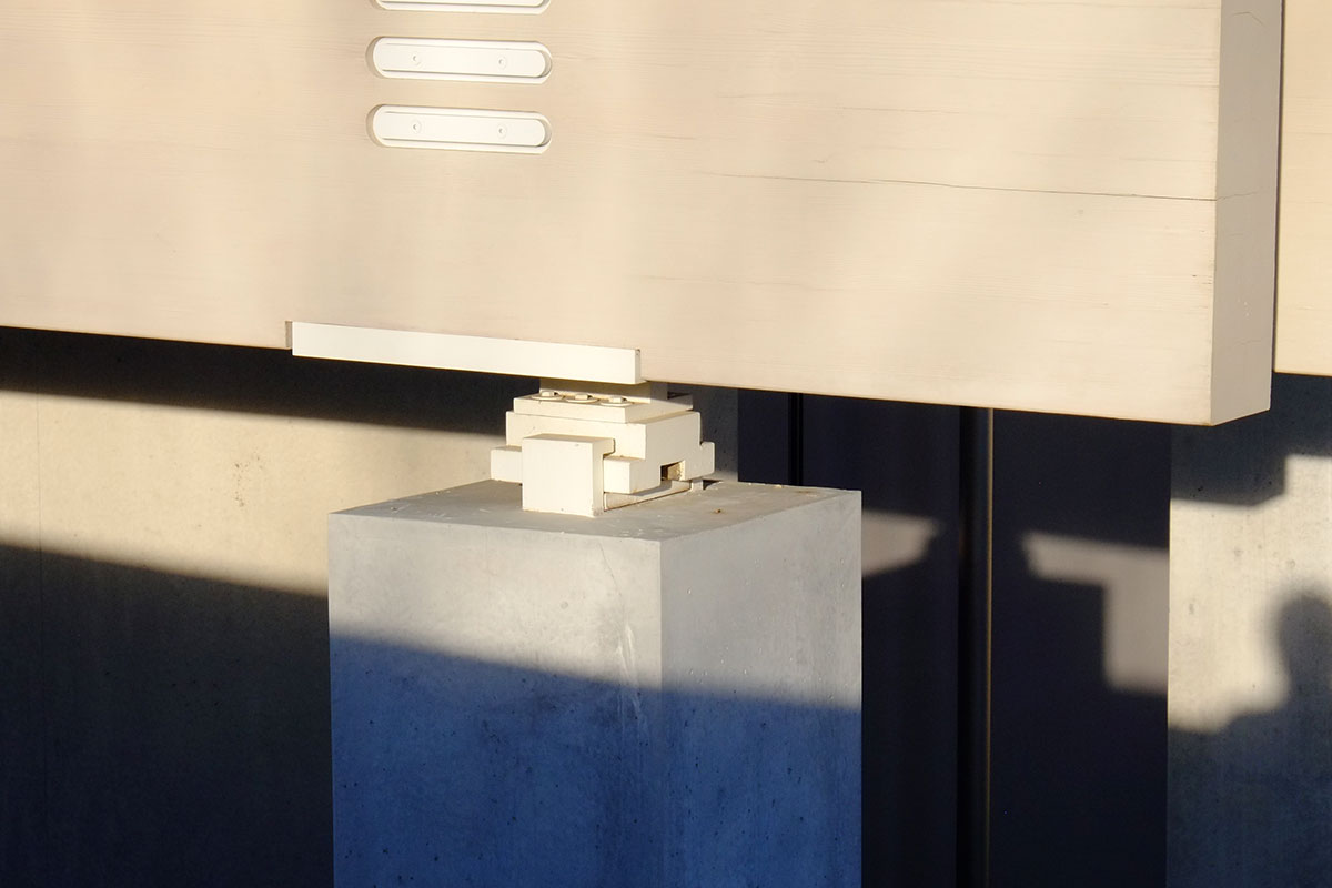
There are also some antennae on the roof, which they clearly did not want to anchor through the roof membrane, so they attached them to metal pans which are then weighted down. Notice that the one on the left is weighted with standard concrete blocks with the cells facing upward, the one on the right uses concrete blocks with the cells facing sideways, and the one in the middle has thinner, solid blocks (probably concrete pavers). The amount of care that Piano’s office takes with such detailing decisions is truly staggering – every different condition is thought through carefully and resolved. 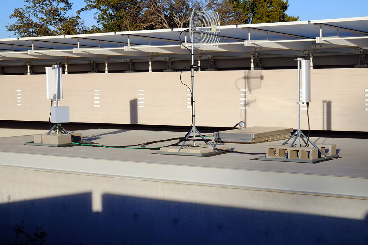
As always, all the detailing is scrupulous. The logic of each piece is worked out to the nth degree, and then no expense is spared to fabricate the perfect element. This is the detailing at the entry vestibule upper corner: 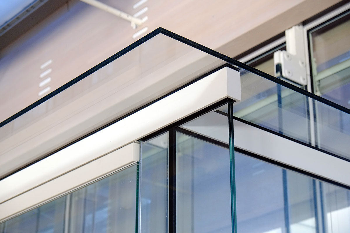
Ordinarily I revel in Piano’s detailing – following the logic to understand the form is an intellectual pleasure that really only we architects get to share, eh? But something was nagging me here; after seeing Kahn’s building, parts of Piano’s seems a little fussy, perhaps baroque? 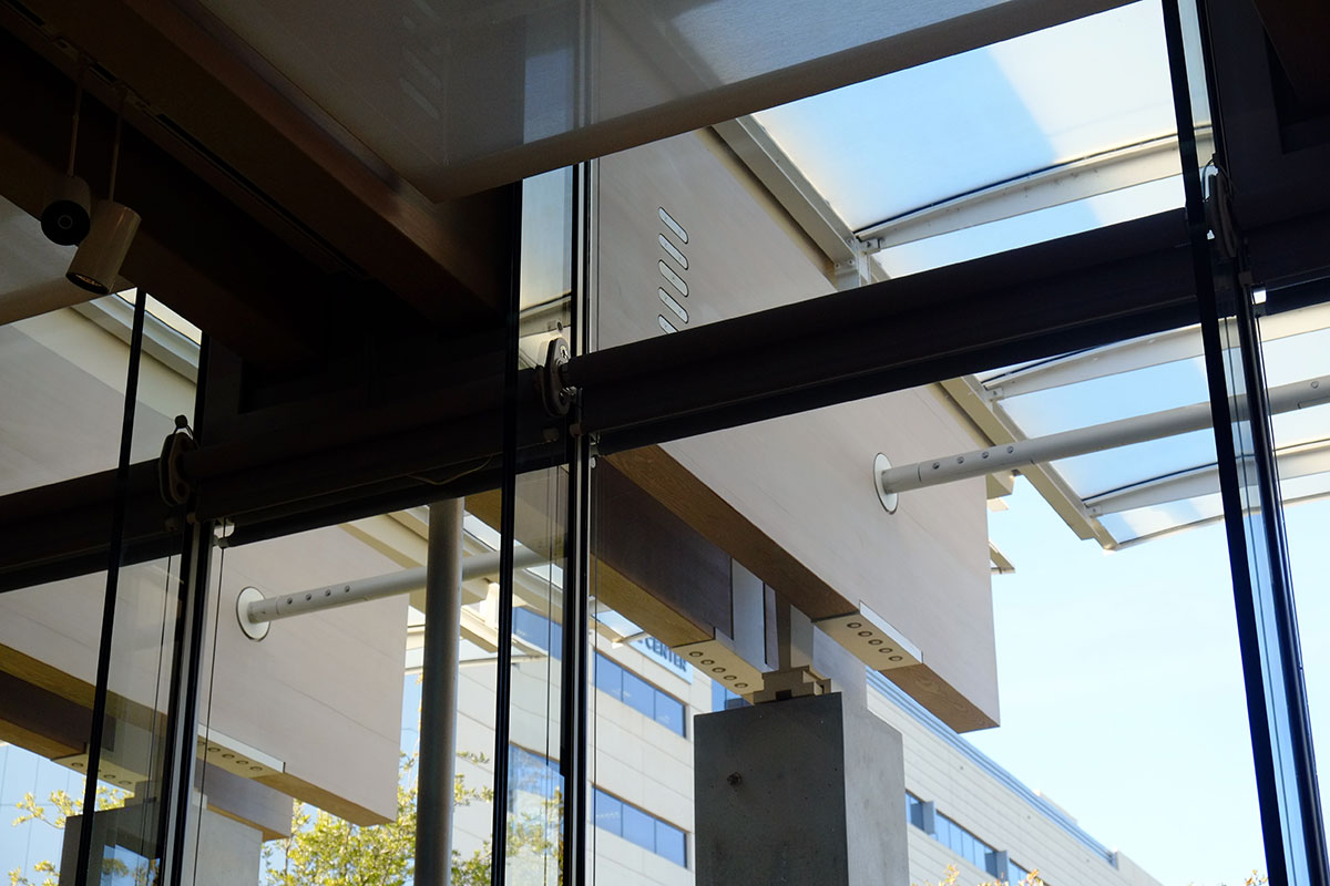
Compared to: 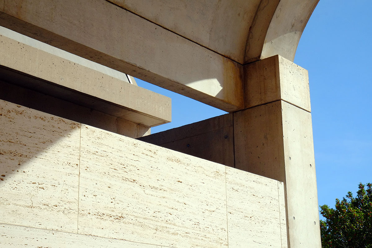
The contrast is revealing. Kahn’s work may be tectonic, in that the columns, vaults, infill panels, etc., are all expressed and articulated, but when you look closely, you have to admit that there is a lot going under the skin that you don’t see. That isn’t a travertine wall, it is a concrete block wall covered in travertine. He is not trying to fabricate a completely abstract surface, such as in the work of other architects the period, but neither does he want you to see the real guts of the building.
Piano wants you to see the guts, but actually only the really good-looking guts –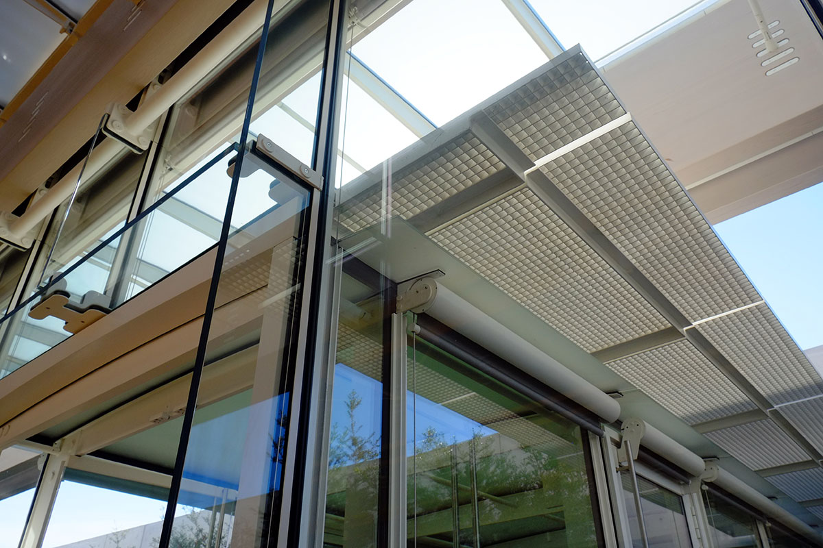 you certainly don’t see any conduit running around – in fact, you don’t even see any ductwork.
Kahn is reducing the complexity of the tectonics to the big, elemental, iconic pieces of Architecture, while Piano is taking those big iconic pieces and breaking them into as many little beautiful parts as he can. They are both masters at what they’re doing, and being able to see these buildings together makes you think about the two approaches much more than if you saw one at a time.
A comparison of the end elevations is also revealing. Each has the problem of how to end a modular building – essentially you are chopping it off at the bay line, revealing the cross section. The Kahn building is more elegant than I thought it would be – the rhythm of the vaults and the interstitial spaces is is powerful, like an aqueduct running across the landscape.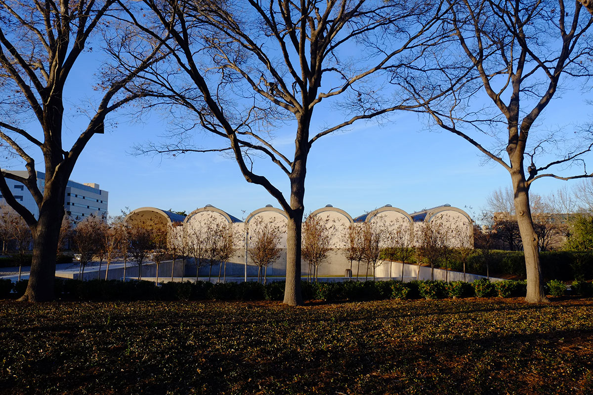
In constrast, I thought the end elevation of the Piano building was its weakest point. 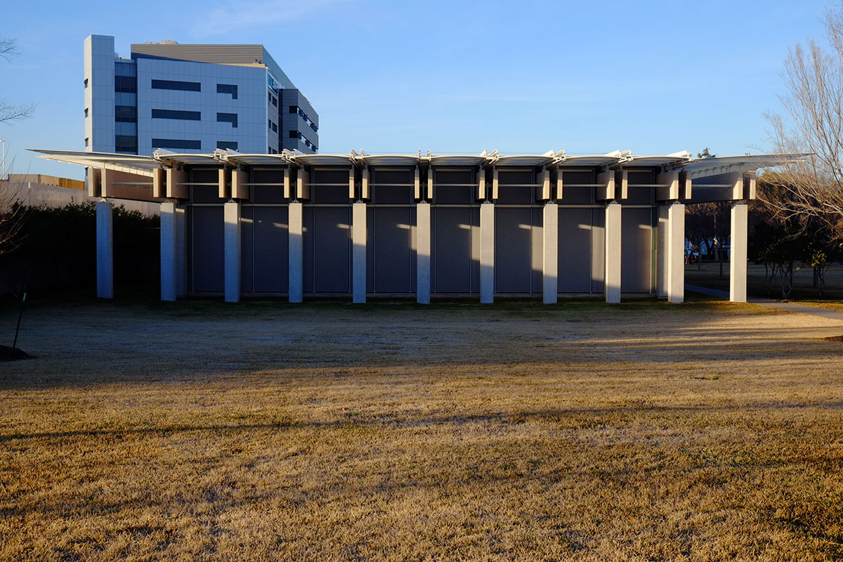
It feels lugubrious and too dense, with too many big pieces too close together. Paradoxically, Kahn, the master of mass and masonry, uses concrete and stone to make a facade which feels light and reflective, while Piano, the master of transparency and ethereal steel fabrications, uses frame elements to make a facade which feels heavy and clumsy.
The Kimbell was always an important destination for architects, but with the Piano addition, it has an even stronger attraction, as a complex which makes you think, and not just enjoy.

Pingback: Stanford art buildings | Peregrine nation