 As San Francisco had already used its Renzo Piano coupon on the California Academy of Sciences, and the Herzog & de Meuron retainer on the deYoung, they turned to Snøhetta for the expansion of the Museum of Modern Art (SFMOMA), perhaps another indication of which firms will be seen as filling in the next generation of high-profile firms as the older generation of starchitects disappears. Snøhetta is an international firm based in Norway, best known for their Oslo Opera House. Tine Hegli, one of their lead architects in Oslo, was the visiting Belluschi Professor at the UO in 2015, where she taught a studio designing net zero houses. She also gave a lecture on their recent work, so I had some idea what the SFMOMA project was about. Perhaps the greatest change is that while the next generation is still obviously concerned with formal and spatial ideas, attitudes about environmental design and sustainability are fundamental to their work – in the DNA of the firm from the beginning – and dictate basic design moves, rather than being a secondary concerns.
Luckily, our timing on this trip was such that we arrived in the Bay Area the week it opened, and we spent a long afternoon exploring it, which turned out to be nowhere near enough time. I have read that SFMOMA is now the largest museum in the country (which in this age of Trumpian hyperbole I will double-check), but it is undoubtedly gigantic. However, given the clarity of the design, it doesn’t feel overwhelming, the way the Met or MOMA often do. Perhaps this is due to the nature of the pieces, and hence the galleries: as a modern art museum, there are many very big pieces, hung with lots of space around them in very big galleries. So although the square footage of the museum may be huge, the number of pieces may not be that large, and that may cut down on the cognitive overload. The other factor which may make it seem smaller is that it is very vertical museum, with seven stories of public space. The Met is basically two stories with some mezzanines, so it sprawls into Central Park, and getting to distant wings is a hike. SFMOMA has a very compact vertical circulation core, so you never have to traverse whole districts full of 18th century decorative arts to get to where you want to be.
The circumstances driving the new addition were remarkably similar to those which drove the addition to the Seattle Art Museum, designed by Allied Works. Previously, both Seattle and San Francisco were cities not noted for the size of their museums or the quality of their collections – I was shocked in 1978 to see how dinky and unimpressive the museums in San Francisco were – I had thought it was a big, culturally-important city. After travelling around the country more in the 1980s, I realized that the quality of a city’s museums was pretty much determined by how early the fortunes of the city had reached a threshold – the great museums were in cities that had acquired serious concentrations of wealth early enough in the 19th century to still buy great European works. I regarded the Nelson-Atkins in Kansas City as the most western great museum (disregarding the anomalies of Los Angeles). As economic power shifted to the West Coast, it seemed likely that the cultural capital and philanthropical urges of the wealthy would someday reach that threshold where they would endow new or expanded museums. This then happened in two stages. Both Seattle and San Francisco built new museums in the early 90s, designed by architects who were at the top of their reputations in the 1980s – Venturi Scott Brown, and Mario Botta. Both firms designed museums that were formally a bit precious, and clearly demonstrated their roots in historical architecture and Postmodernism, while reflecting their designers’ particular takes on that tradition. They were also both pretty small; I even taught a design studio looking at an expansion of the SAM the year it opened, as a second phase had certainly been anticipated.
What changed before the next round of expansion was that the wealth and aspirations of the elites in these two cities grew far beyond anyone’s expectations, with the concentration of the computer software industry in these two locations. (I remember driving across the 520 bridge when Greta was small, pointing out a cluster of trees on the shore of Lake Washington, and saying to her, Do you know how lives there? The Richest Man in the World!) West Coasters grew their collections of art, but focussed more upon modern and contemporary works – probably a combination of most of the greatest works from earlier eras already being in museums (or still not affordable with even large fortunes), and the character of the new money – which was much more attuned to the trajectory of the modern world, and not caring to validate their status through the acquisition of Old World trophies.
So as the inadequacies of both museums were addressed, the sizes of he planned additions were able to expand exponentially. The Seattle Art Museum was able to secure the first few floors of most of the block on which it was located (with a commercial tower rising above), rather than just the 60-foot wide slot next door. SFMOMA was a bit more hemmed in – the vacant lot to its southeast had been filled with a new tower – so the expansion had to be deeper into the block. This led to some interesting opportunities for engaging with the neighborhood fabric, but it also dictated the footprint of the expansion – a tall slab perpendicular to the axis of the original museum.
While the cultural circumstances of SFMOMA resemble those of SAM, the site conditions resemble those of the Guggenheim. Both original museums were small, iconic, and with a central cylindrical piece. In both cases, the addition had to be a wall rising behind the original museum; with the Guggenheim, this was famously likened to the tank behind the toilet bowl. At SFMOMA, the front is on a major axis from Yerba Buena Gardens across the street by the convention center, originally forming a composition with the terra cotta (now Pacific Bell) tower behind. The contrast between the red brick and the white tower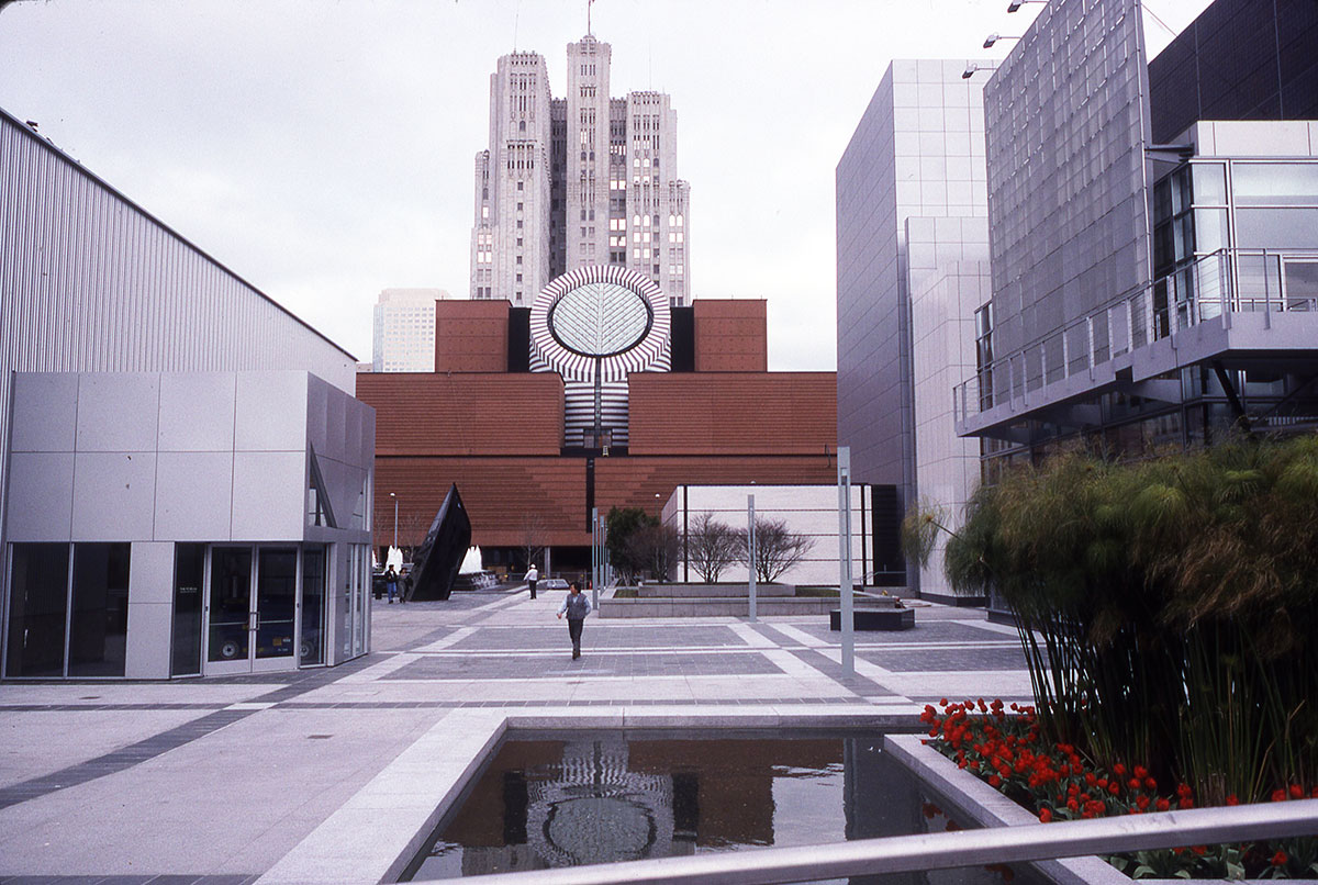
is maintained by the wall of the new addition. This façade is mostly flat panels, with a slice at the top left corner which gives a hint of the swoopy rear façade.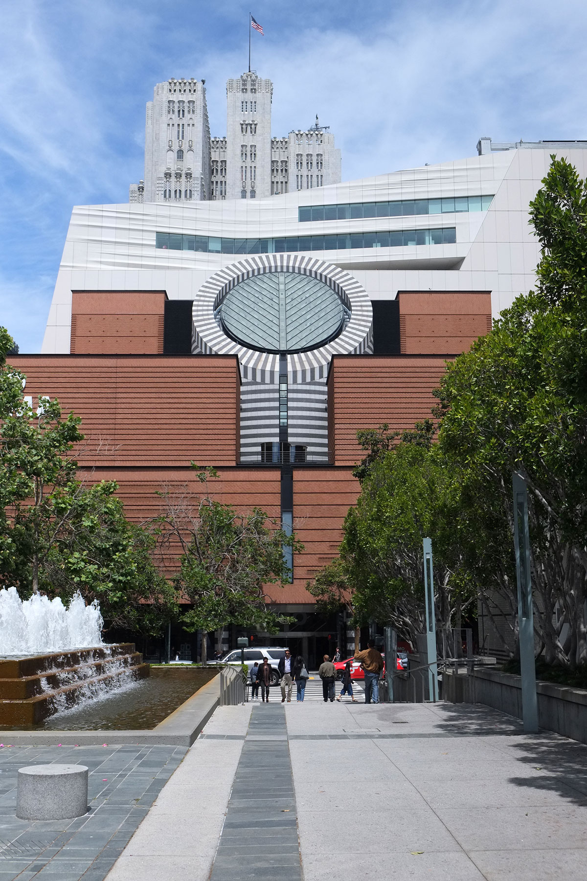
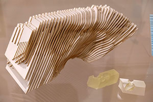
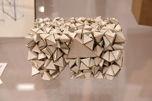
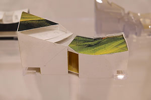
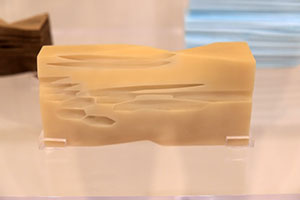
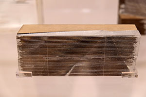
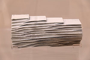
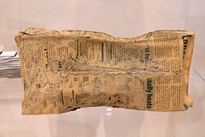
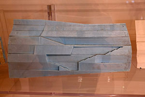
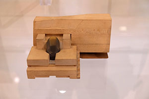
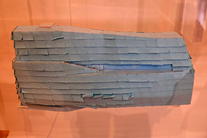
There was a great little exhibition of 50 conceptual models which were part of the design process. I photographed all of them, as they show how many different ways a a fairly set parti can be conceived. What I find interesting here, in contrast with the DSR building at Stanford is that the parti models move the design process along, but they don’t have t be explicitly present in the final building.
The biggest change is in the entry hall / atrium. Botta’s compact design had this space at the center, with a massive granite staircase rising into the light from the oculus. It was the most Bottavian feature of the building, taking the strict geometries and symmetries of his house designs to a grand scale. It provided an imageable center to the scheme, to which you always returned after circulating around the galleries, and it encouraged people to take the stairs instead of the elevators.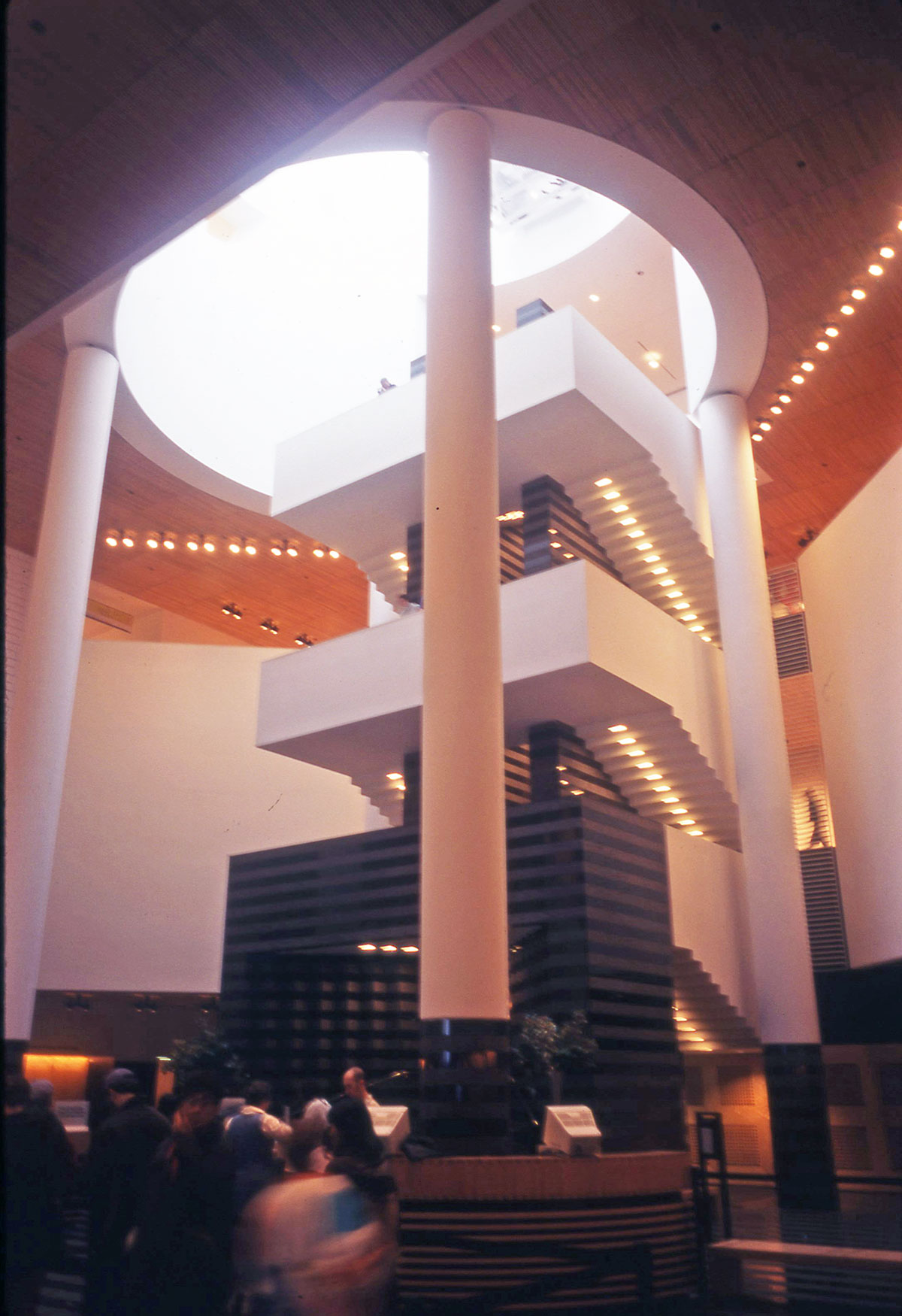
That stair has now been removed, replaced by an asymmetrical wooden stair which leads you deeper into the building, rather than spiralling you around this point. I have read an interview where they allude to (but never specify) many reasons why the stair had to be removed. I’m sure there was not really a technical reason why it had to be removed, but it seems clear that its retention would have conceptually and experientially divided the museum into two distinct parts, the tiny original and the big addition, with an awkward circulation zone between. The center of gravity of the building has shifted much further back into the block, and this new cascading stair is used to move you back and up into what is now the heart of the museum.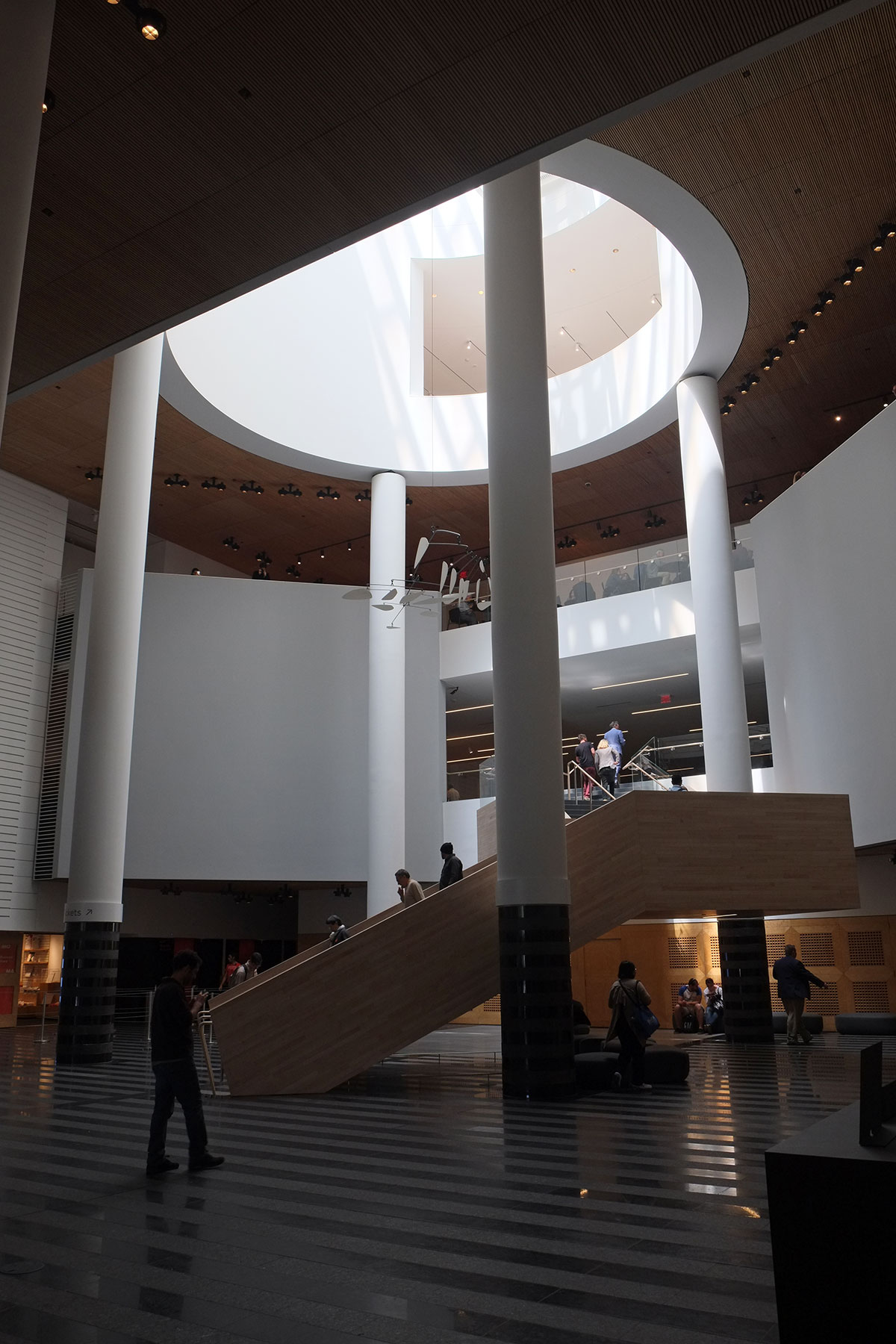
I also like it formally. While we old architects may still appreciate the formality of 1980s Postmodernism, this stair always felt a little bombastic and overwhelming to me. It filled the space, although the tension between the cylindrical space and the square stair was not really resolved. You felt quite compressed being on the stair, with the next run right above you, and the pressure of the crowds around you keeping you from stopping or enjoying the space. It was a powerful move for a tight footprint, but I like the oculus now more as a moment on a processional, rather than the culmination. And from a practical perspective, I bet that the old stair would have been completely inadequate to handle the large crowds coming to the new museum. If you’re going to build the biggest museum in the country, you need a grand stair like the Met’s. This new stair is the first visible move of the addition, putting a finger out into the original space, and drawing you in to the more free-form geometries of the 21st century.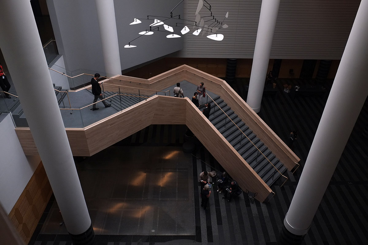
Once you get above the ground level, the atrium now becomes a light-filled space, opening to a new café, and still at the center of the original galleries. The Snøhetta remodel has been incredibly respectful of the original building – the spatial relationships have been preserved, and there is still an integrity to the piece – you can still understand Botta’s building as a whole, not just as some remaining rooms stuck off in a strange corner. The contrast here is with MOMA in New York. I’m old enough to remember when that was just the original Edward Durrell Stone building and the Philip Johnson remodel/addition. Both of the major remodels since (and certainly the one underway now, which has expanded MOMA’s zone of devastation down the street to the Folk Art Museum), have almost obliterated any sign of what came before. I remember coming upon a little stair from the Stone building that remained after the Pelli remodel, but that must be gone now too. MOMA seems to need to rebrand itself with every remodel; it’s nice to see SFMOMA engaging with its past.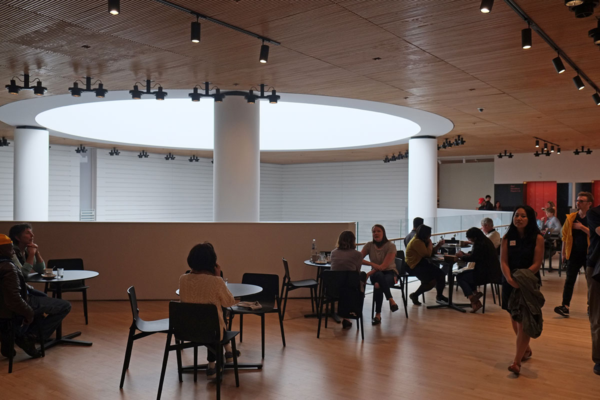
The little tight courtyard still exists on the front façade at the fourth level,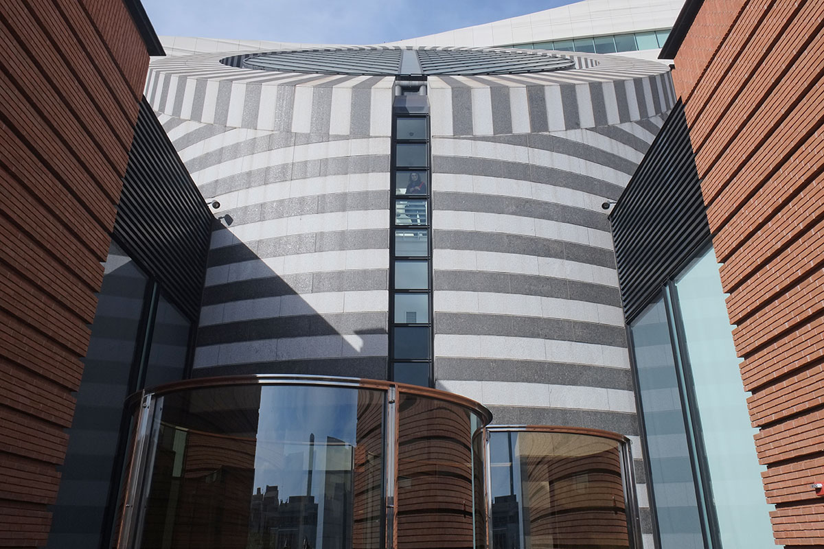
as well as the stairs shifting to the perimeter of the oculus, leading to the famous and (seemingly) perilous bridge across the top. This was the iconic, memorable part of the circulation system for most people, and its preservation shows the care that has been taken with the remodel.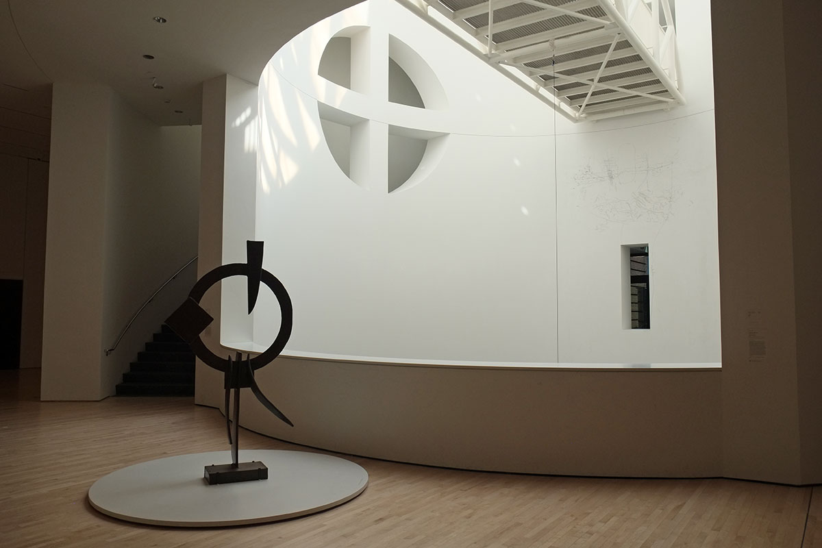
Greta spotted two inconspicuous windows in a wall, and came across this – a view inside thewall, showing where the original rear façade of the museum now faces the partition wall of a new gallery. This is not a building which has much tectonic expression, and this little view perfectly illustrates something Bob Stern once said. We were all enamored of the clarity of the exposed systems in Kahn buildings, and Bob asked, do you have any idea how much round stainless steel ductwork costs? His proposal was that the rational way to make a building was to design the spaces you want, enclose them with steel studs and gypsum board, and then leave lots of poche space where the engineers can insert anything they want. So in a building where that is basically the model, it is instructive for Snøhetta to give us a glimpse behind the curtain.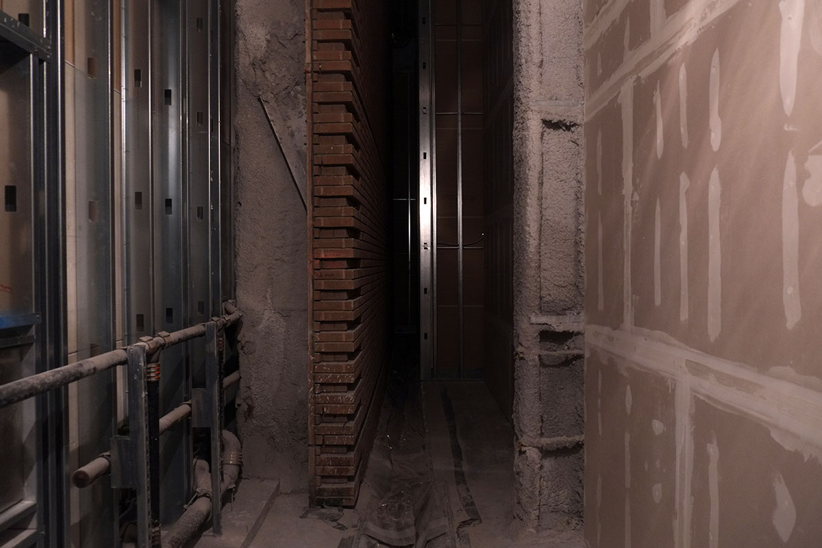
At the top of the kinked stair, you arrive at the big lobby, with ticketing, a main stair up through to the next floor, and lots of room for crowd circulation. To the southeast you can see toward another entry off Howard St.,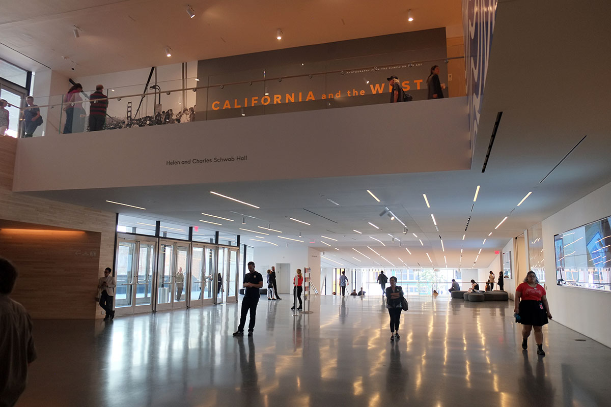
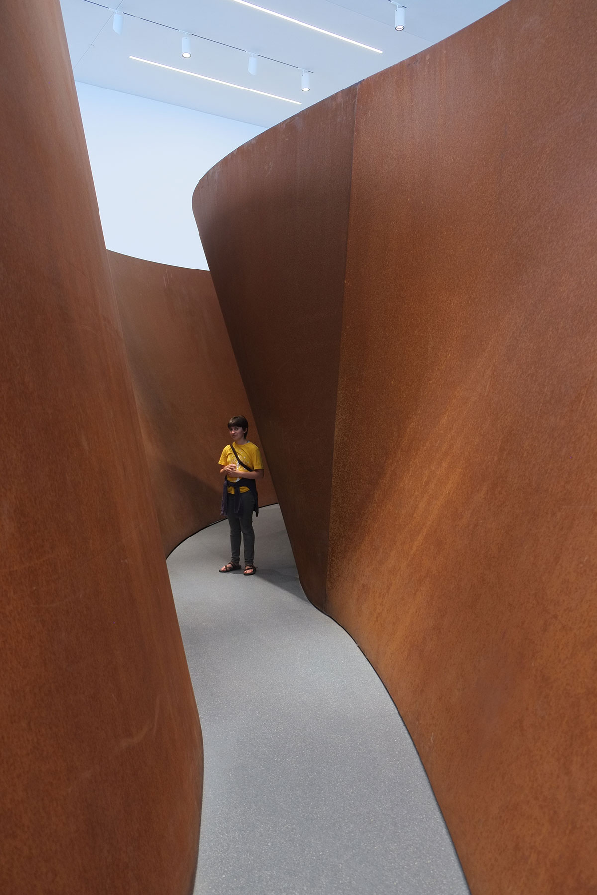
which when you approach it becomes an amphitheater filled with a complexly-spiralling Richard Serra piece. It’s a wonderful space, outside the ticketed area, and you can just wander in and sit here any time.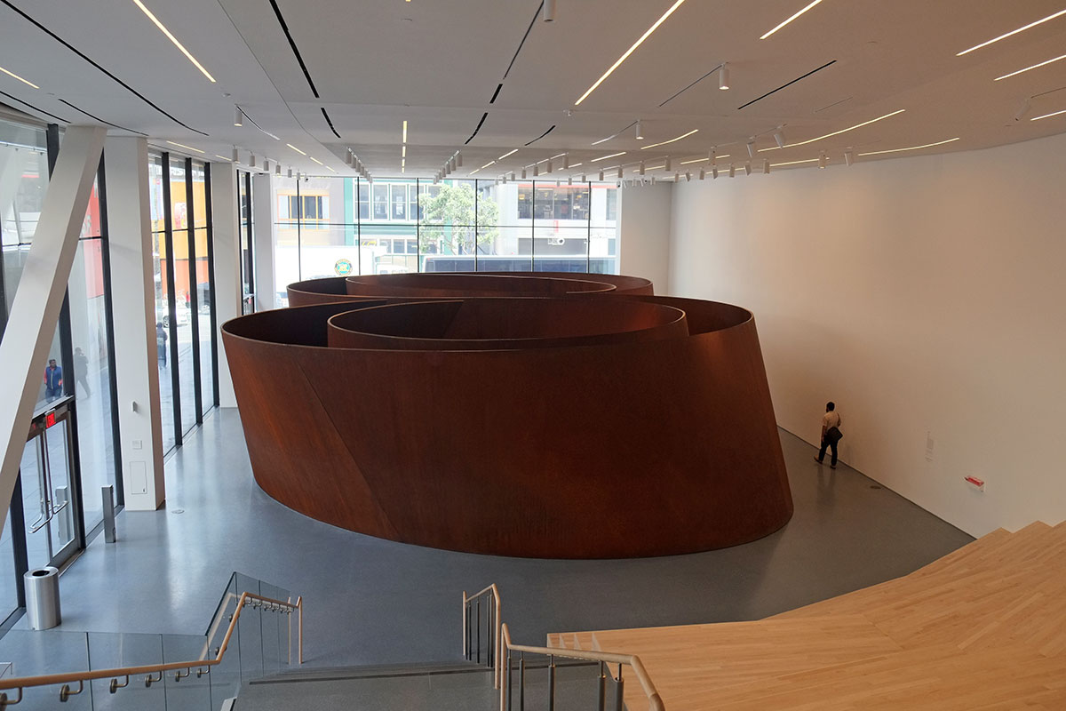
It also begins to establish the dynamic of the museum interacting with the city. Whereas the Botta museum is a centralized, internally focussed building, the new addition brings San Francisco into the mix, in a way similar to other new museums we’ve seen, such as the new Whitney in New York, the Perez in Miami, or the Perot in Dallas. It’s a movement I appreciate – while there are good reasons to make galleries completely-controlled boxes that focus on the artwork, using the non-gallery spaces of a museum to engage with the city outside provides a change in scale, a way to refocus your eyes and attention, and an opportunity to reorient yourself in space and time. Museums are not shopping malls or casinos, there is no need to confuse and trick the patrons into staying. In these new museums I’ve found the opposite to be true – taking a break from the artwork after a couple of hours refreshes you, and allows you to dive back in.
Taking the big stair to the third level, the museum expands out even more. There is a sculpture terrace with a living wall across the rear of the building,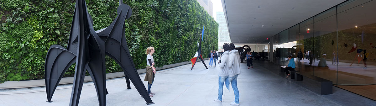
and among other small galleries, a large space devoted to Calders, with sculpture terraces on two sides. It’s a fantastic sequence of spaces, and the collection is extraordinary, with many atypical early pieces. Later in the afternoon, when I was spending too much time looking at architecture, Greta just came back and sat here.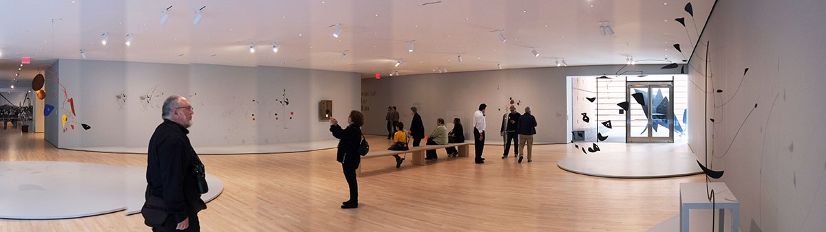
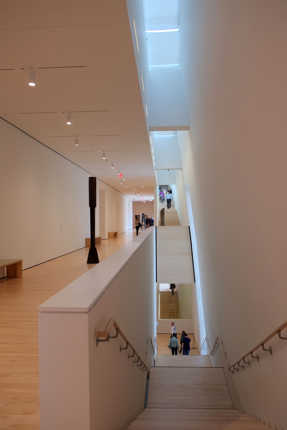
At any point one could just decide to take an elevator, but I prefer to walk everywhere. Going from the third to the fourth floor is the one point where the intuitive circulation/spatial system of the addition gets muddy. In from the street and up the two distinct stairs to the third level feels like a natural progression, with glimpses of spaces and light ahead moving you forward. And the system that links the fourth to seventh level is beautiful. But the third/fourth transition is this hard-to-find stair tucked between walls. It may be due to the need to separate the vertical space of the building into two distinct three-story atriums (1-3 and 4-6) for fire code reasons, but I wish there had been a way to accomplish this that didn’t leave you leave you at a wayfinding dead end. The transition from the original to the addition is so seamless that it makes the bifurcation of the addition feel very abrupt.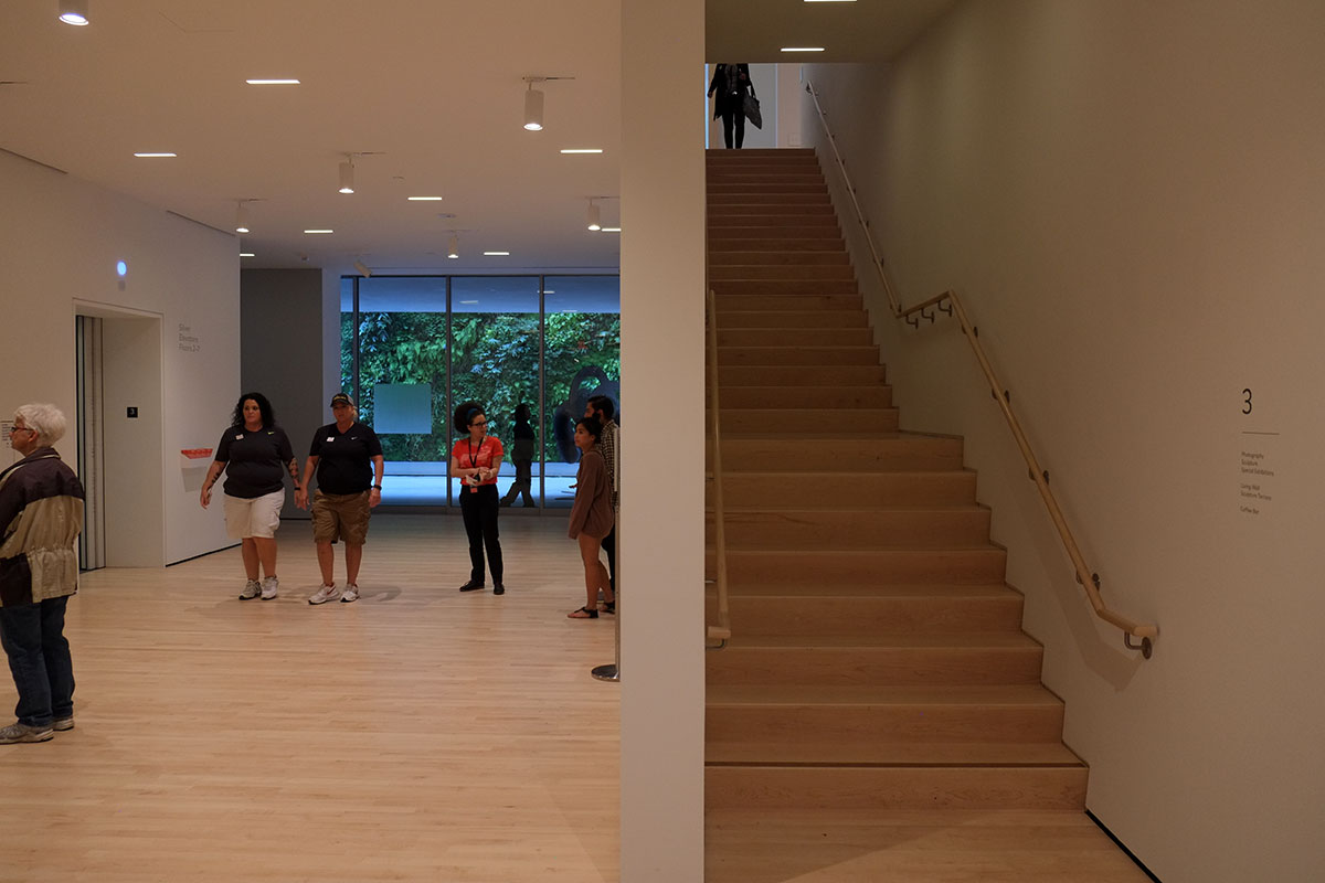
But once you get past that, you get to the stair / corridor / double-height system that runs along the rear façade. It reminded me of the stairs at the Alte Pinakotek in Munich, where the central axis take you to a large cross-axis hall at the back, with symmetrically diverging stairs. This linear system is certainly not symmetrical, nor could I probably draw its spatial permutations accurately, but it feels completely intuitive and engaging. There are tall stairs which draw you up to the light.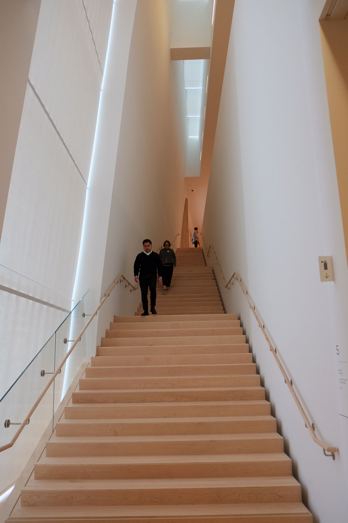
There are layers with the large corridors that provide glimpses of other zones.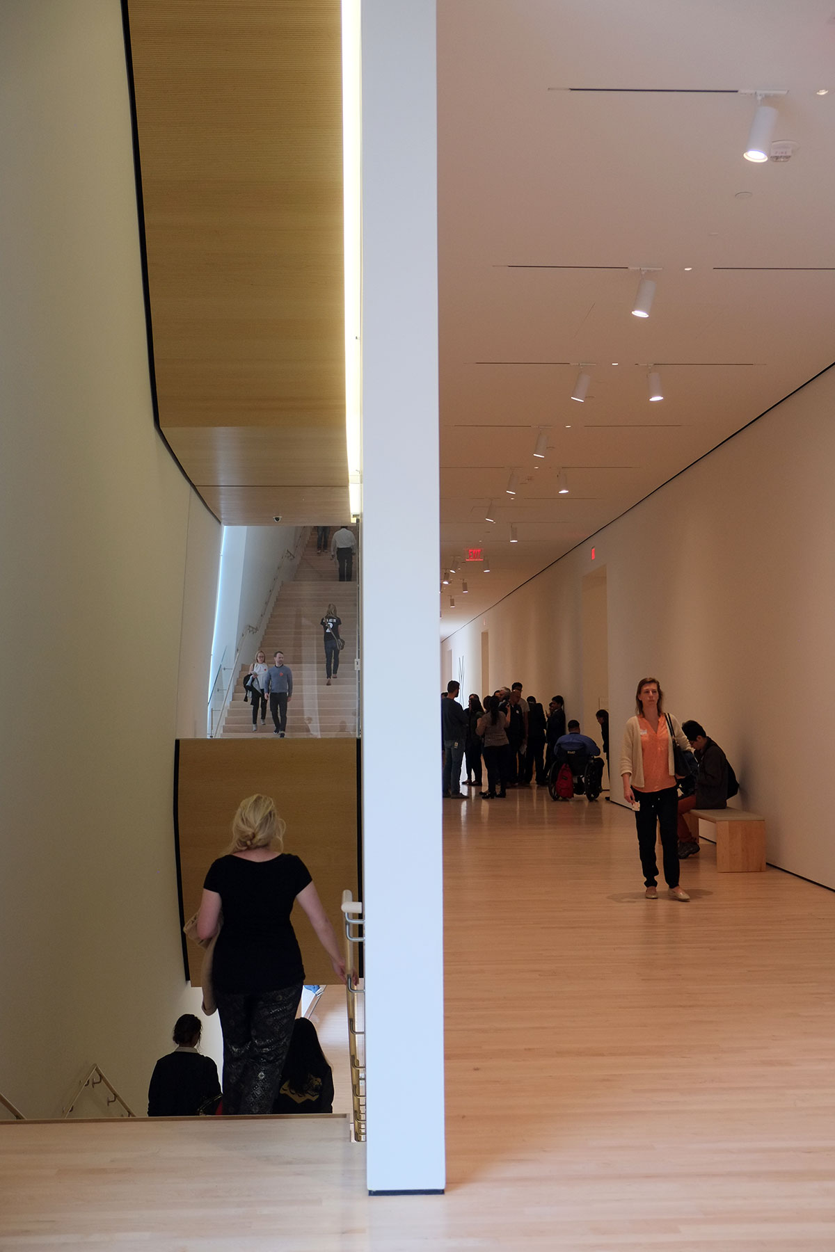
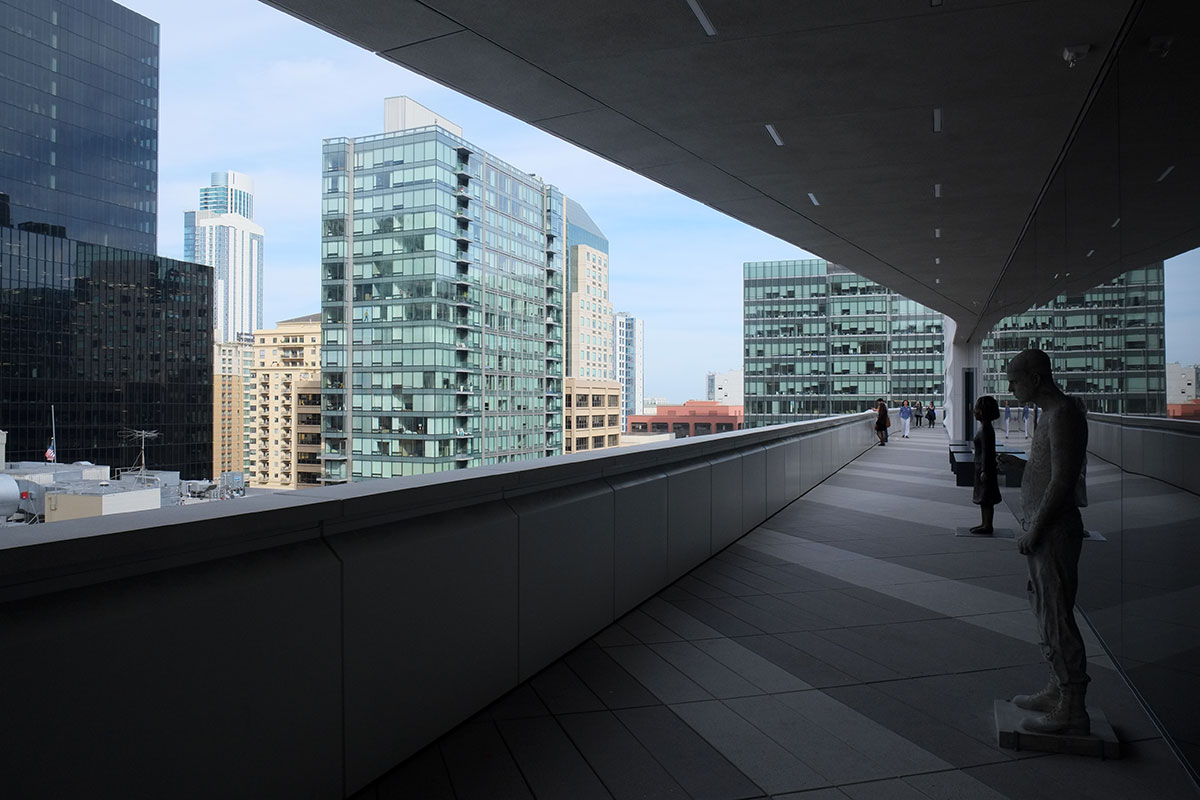
There are views out to the city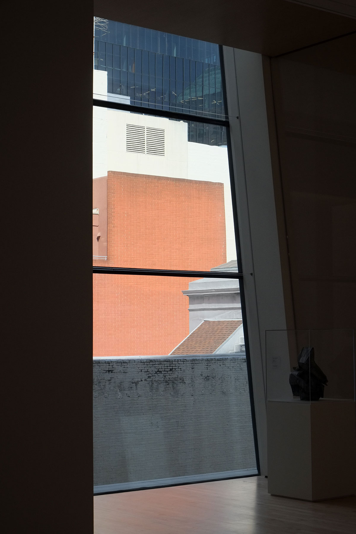
and places to sit and rest (or pose for photos).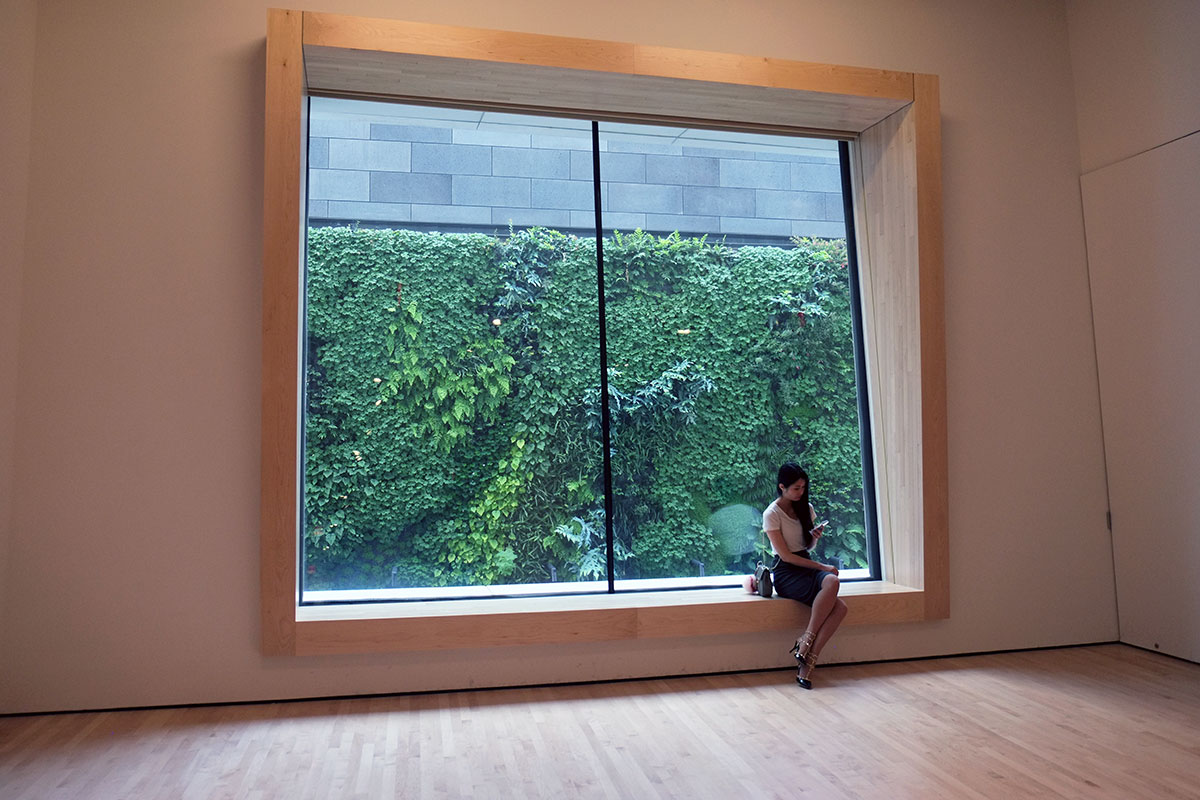
This whole system is tucked up against the free-form façade, which provides gaps and openings for light and movement.
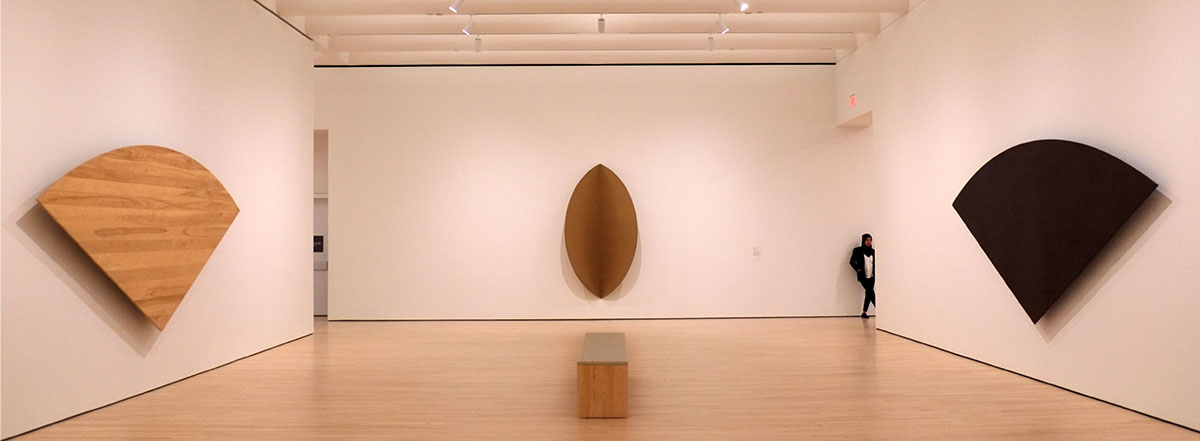
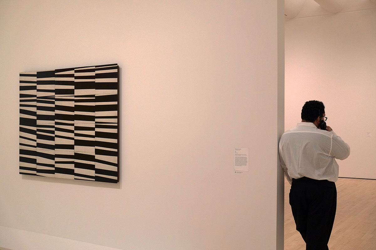
The galleries themselves are ordered yet flexible. They are two rooms deep off the rear corridor, so you have a choice of an irregular enfilade system or the corridor for circulation. While the walls are on a grid, the way the galleries open to each other is highly varied,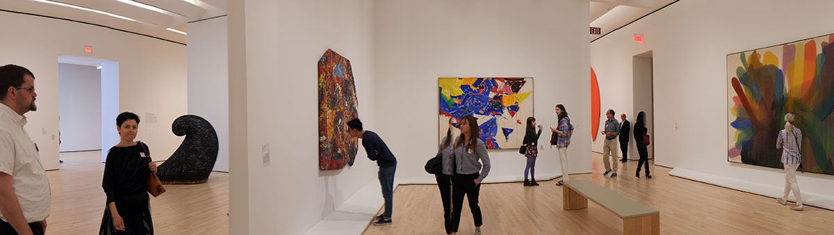
such as here where four galleries open to each other at a corner.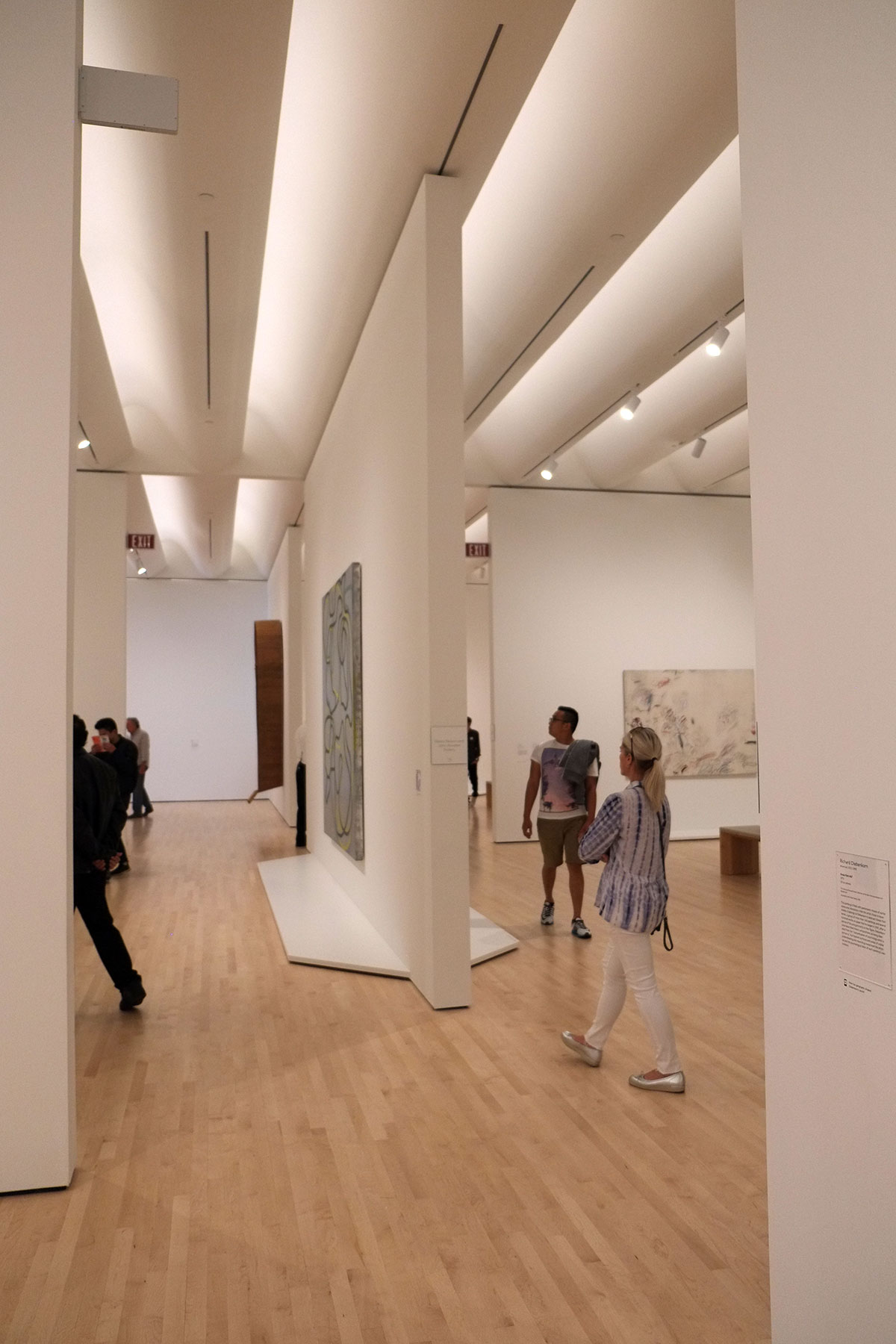
The lighting is a combination of coffered indirect lighting in the galleries, with windows poking through the rear façade into the corridors.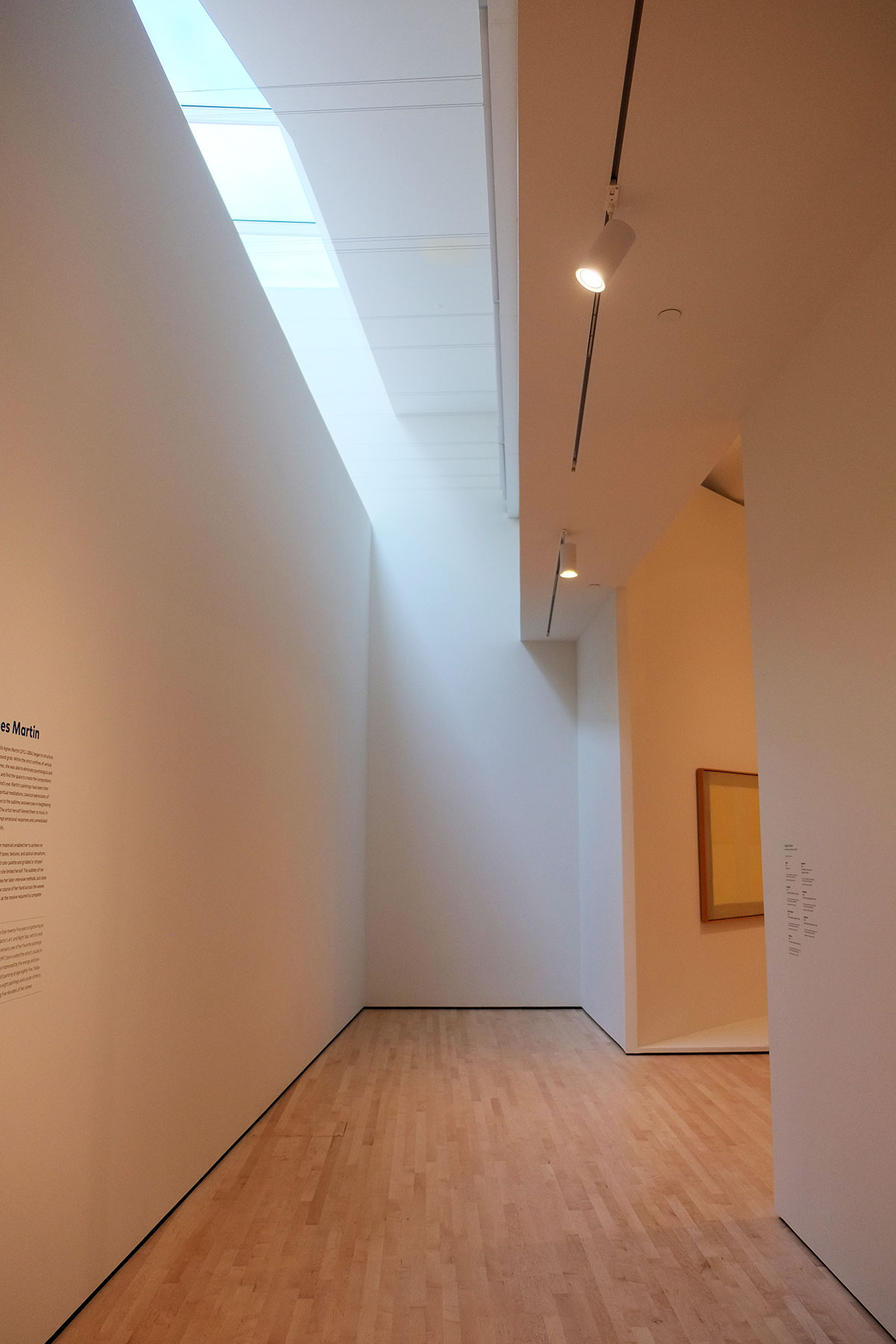
On the seventh floor there is a small balcony where you step outside into a fold in the thick space of the exterior wall. This is where the white wall loses the restraint imposed by backing up Botta’s building, and becomes a blob, floating in the city.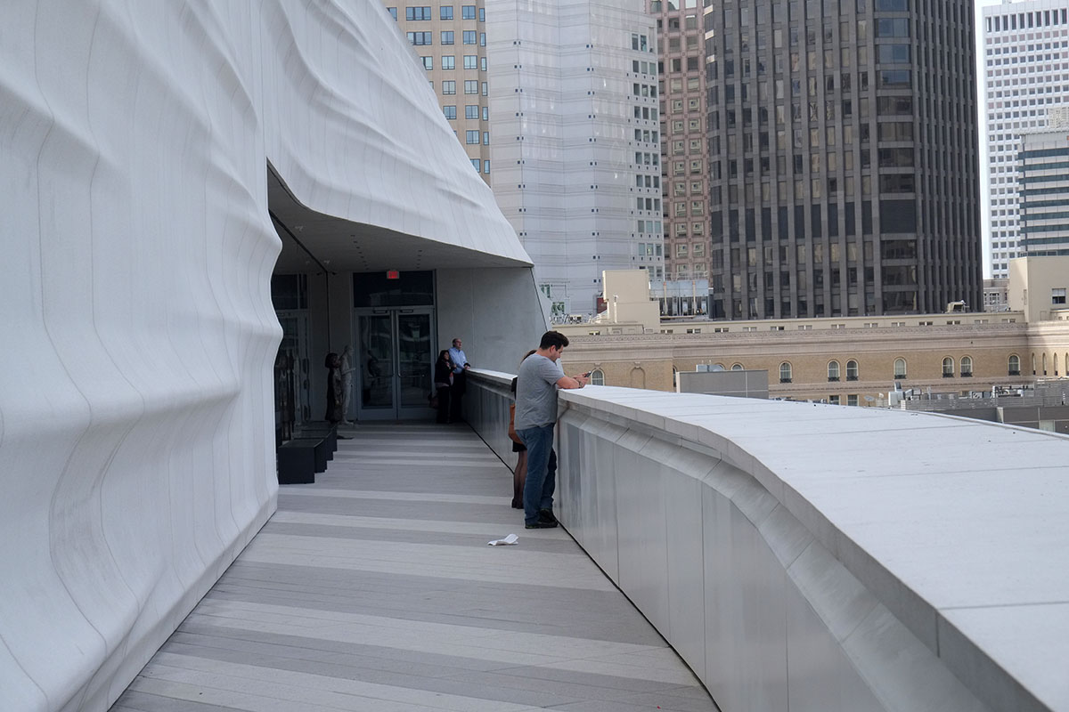
I’ve read that this form is a reference to the rolling topography of San Francisco, or even a fog bank rolling in between the hills. It is white and reflective, so I can imagine that the view of it glowing on a foggy day must be extraordinary. 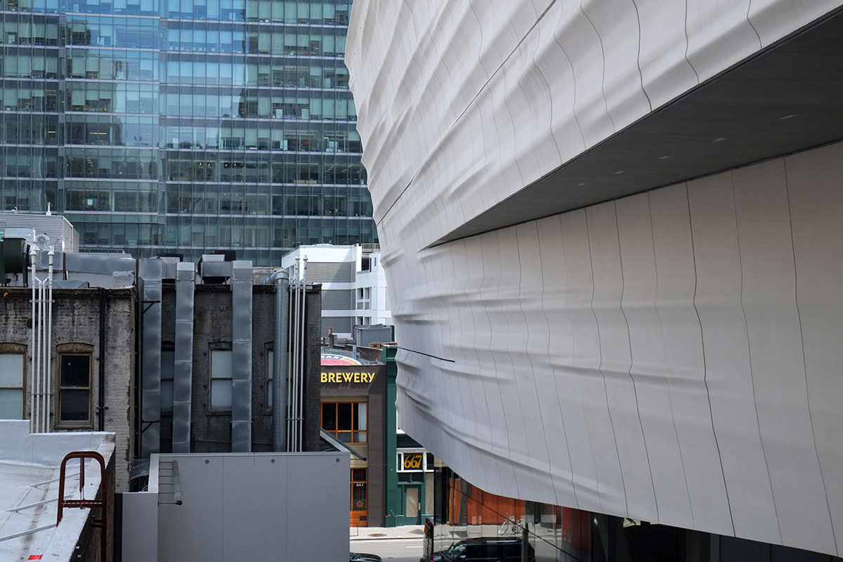
We were there shortly after the opening reception, and were able to spot the remains of the confetti, collecting in drifts on the rooves.
At the fifth level there is a glass bridge out the blob, which leads across to a restaurant pavilion and much larger sculpture terrace.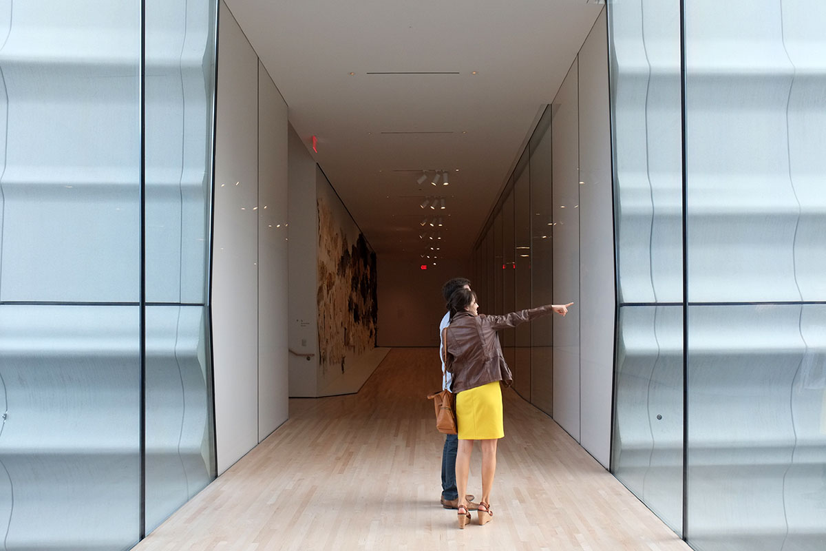
This is the one place where you can sense the whole of the addition, which looks like an iceberg that descended into the city. (These Norwegian architects just can’t stop themselves.)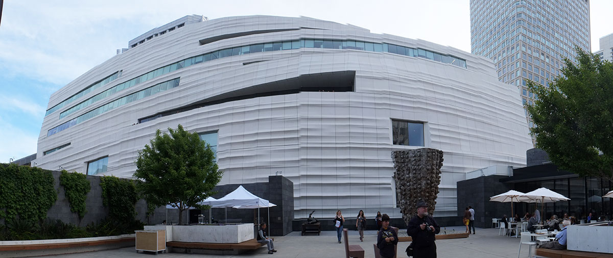
The restaurant is a straightforward glass and steel box, the only problem being you have to walk through the end of the restaurant to get to the terrace.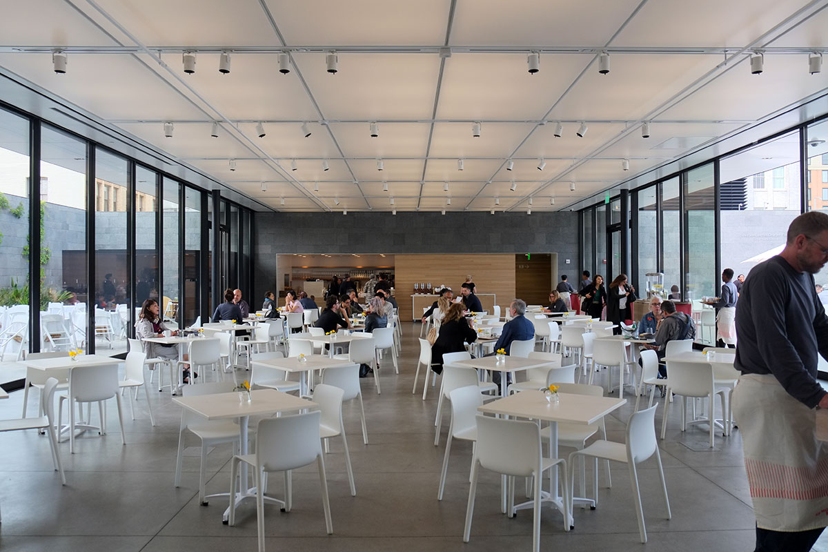
On the terrace the city forms a backdrop for the art. It’s a secluded little cavern in the middle of the block, and you feel enclosed by the buildings all around you.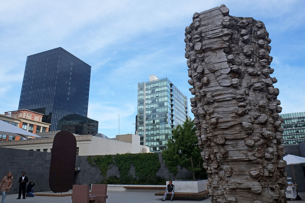
We did find some strange moments. A highly ambiguous sign, which I posted on Facebook and immediately received about 25 different likely interpretations. Maybe this is a standard sign in Norway,referring to some common social arrangement which has not yet made it to our shores?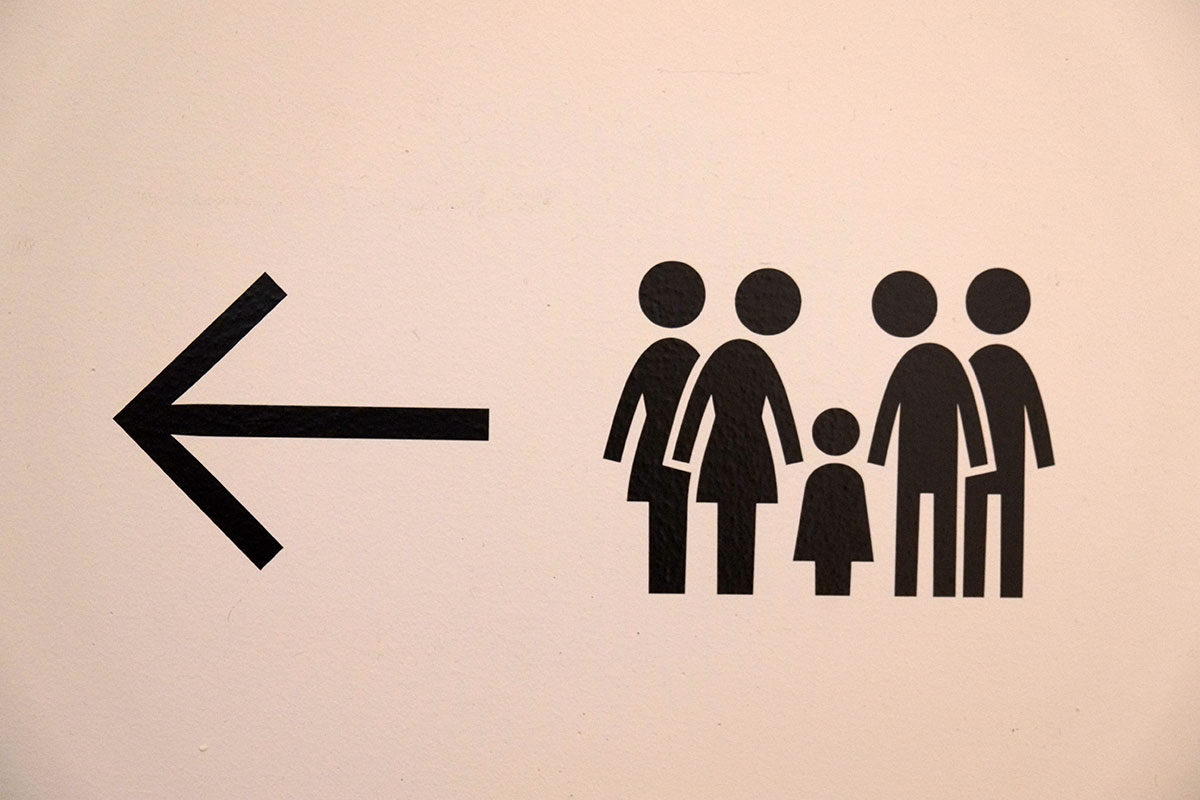
More evidence that European architects and American building code officials do not play well together. Here, where the curving façade slopes in above the top of the stairs to the seventh floor, someone noticed (probably very late in the game) that if you stood right up against the handrail, you could bump your head. So the solution is a lower guardrail which keeps you in the zone where there is legal headroom, perhaps the clumsiest solution to an ADA problem I’ve seen since the Seattle Public Library. If the EU would pass a Europeans with Disabilities Act, we wouldn’t have these problems.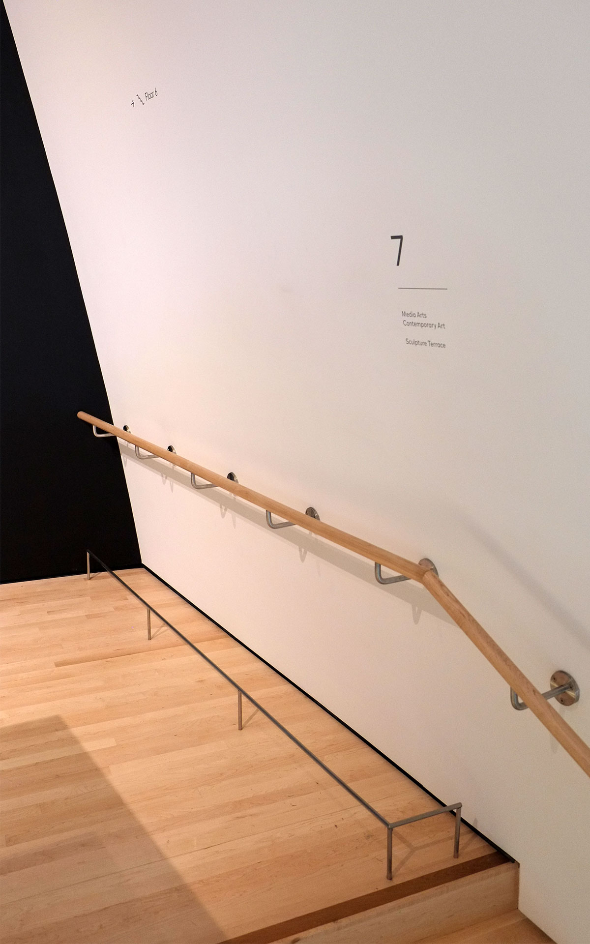
And walking down from the seventh floor, where the most recent conceptual contemporary art is displayed, we came across this assemblage. The relationship between the basalt column and the push-broom, where the similarity in coloration contrasts with the dichotomies of vertical/horizontal and hard/soft, along with the ambiguous negative space between the angles of the handle and the wall, caught our attention, as it provided a subtle critique of the compositional laxity of the conceptual work on the seventh floor. We photographed while the people behind us looked for the label. And this was a few weeks before the high school student from San Jose put his eyeglasses down on the seventh floor and watched visitors photograph the installation.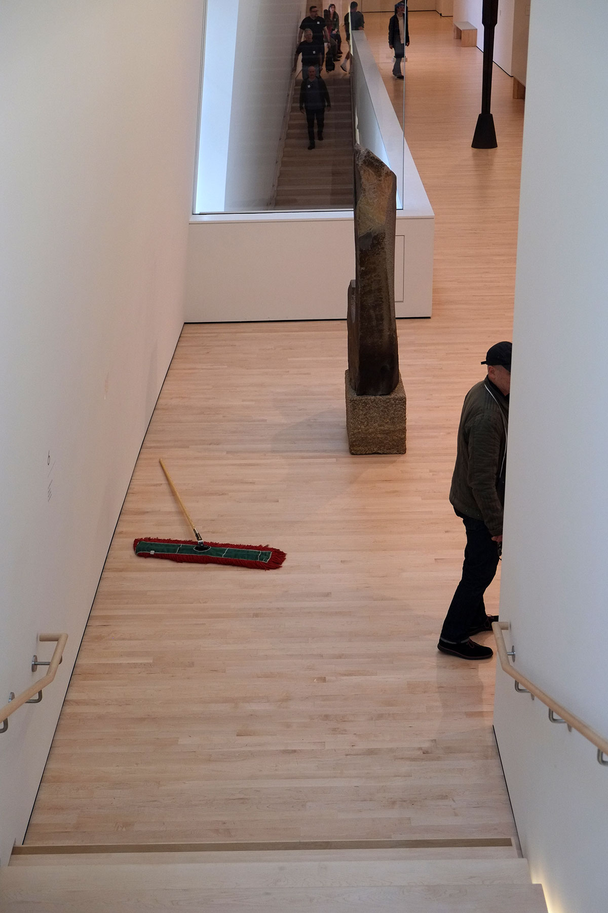
This has turned into a long post, as it is a very big museum, with many different parts and experiences, some central, some peripheral. I think it is remarkably successful overall – a huge museum which doesn’t intimidate you, an addition which shows great respect for the original building and draws it into a coherent whole, a strong parti which facilitates rather than destroys good spaces, a connection to the surrounding city, a circulation system which is a pleasure to occupy, and a series of galleries which show the collection well. The only serious problem for the visitor is that it would take about a week to do justice to all that is exhibited.

Very cool, can hardly wait to go there in October when we are back in SC again….
LikeLike