How does one design a major university from scratch? The University of California system dealt with this question in the 1960s, as it expanded its number of campuses. The Santa Cruz campus is an interesting example, as it shows the influence of a few different strains of American campus design. The first American colleges were located in cities and towns, roughly following the urban European approach, but in America the campuses and towns usually grew simultaneously. In the 19th century, the model changed, partly reflecting the agrarian American distrust of the city, and benefitting from the land-grant system which provided support for state universities. The huge growth in universities after WWII reinforced this isolated campus approach, and most campuses reflected the same development pattern that was seen in suburbia – isolated buildings set in an open landscape, with much room set aside for cars. (This campus model was then adopted in the design of office, and even industrial “parks”.) One aspect they all had in common was seeing the landscape as a fairly neutral, “natural” background for the buildings, and seldom designing the outdoor space as a bounded space; even the earlier campus planning strategies of quadrangles and malls were largely abandoned as being too formal.
The Santa Cruz campus reflects this trend – the site was a vast undeveloped area of forest and ranchland, up in the hills above Santa Cruz, but miles from the city center. The master plan reflects what was considered best practice planning then – separate clusters of development, linked by ring roads, with some accommodation for pedestrian movement among the clusters in the center. It was an overwhelmingly decentralized (or maybe multi-centralized) approach, one which responded to the anti-urban “environmentalism” of the day, and one which supposedly reflected the state government’s concerns about student revolts: student demonstrations would never be able to achieve a critical mass, as gatherings could be isolated in the different clusters by security forces. Dan Solomon has written about this development pattern (which he somewhat facetiously blames on Magic Markers) – he says that planners stopped drawing blocks and streets and just drew bubbles.
As we drove around the campus, this was indeed the feeling. We followed road signs and directions to the various clusters – it was impossible to intuitively grasp any spatial order, more like driving in the rural countryside than in a settled area. It reminded me of Columbia, Maryland, the new town built in the 1960s by the Rouse corporation, where you drive through the woods on curving roads, directed to the named residential clusters by signage, which are otherwise invisible in the woods as you pass. However, some of the pedestrian connections through the center of campus are quite amazing – you are often in a redwood forest, and ravines are bridged so that you are walking up in the tree canopy.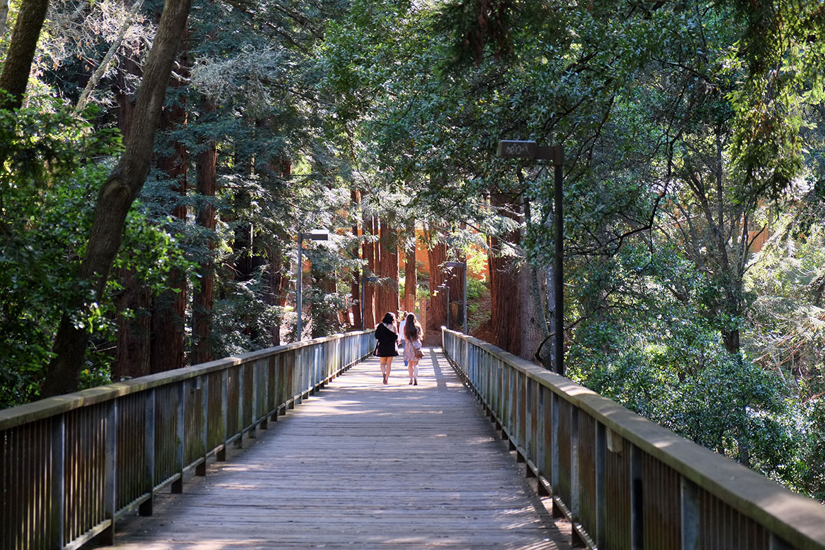
The campus does show the best side of cluster development, in its intention to preserve special natural open space by focussing higher densities in specific locations, rather than spreading density uniformly across the whole site.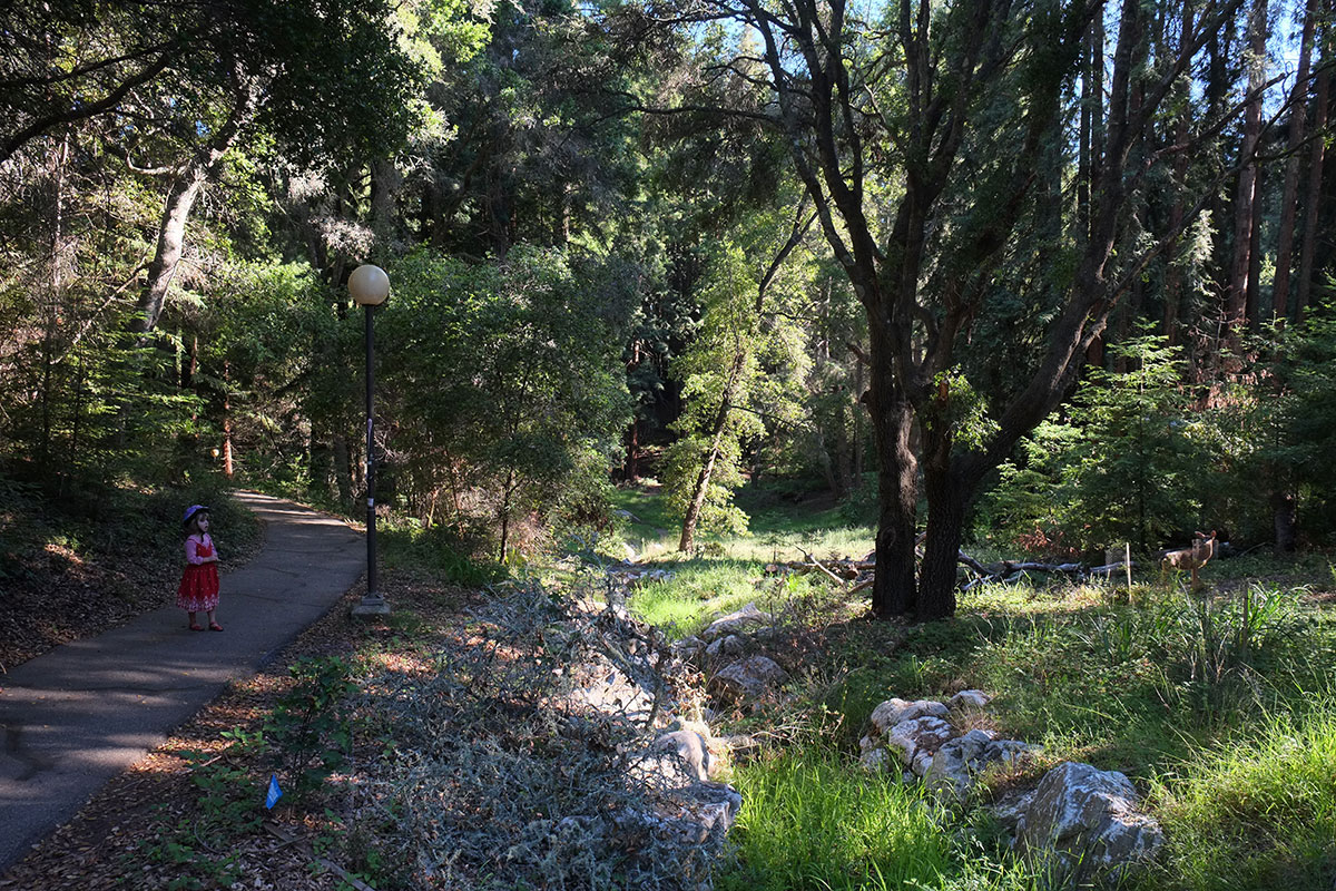
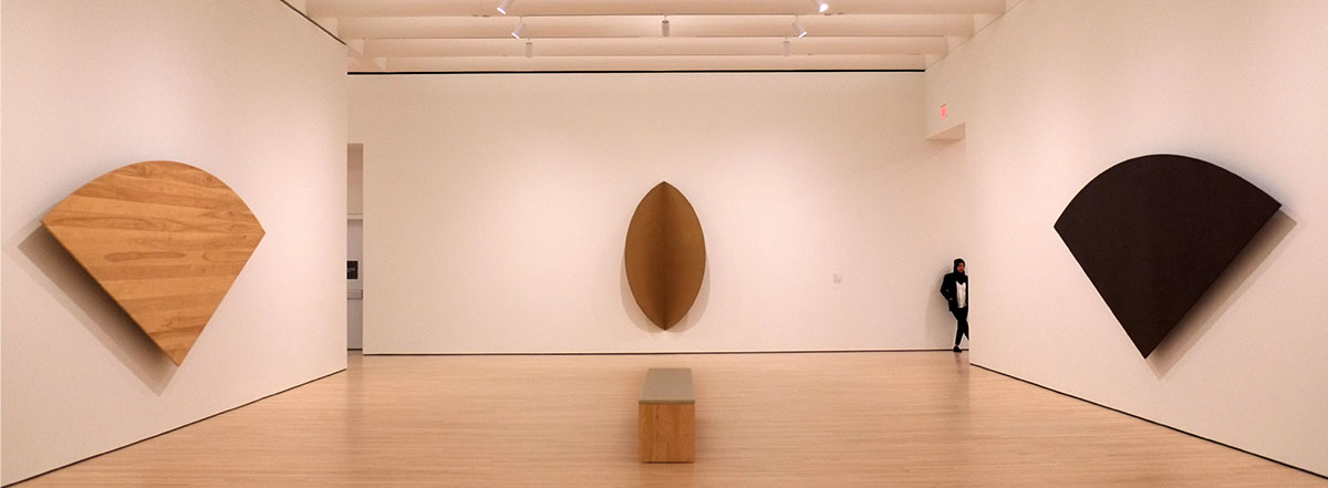
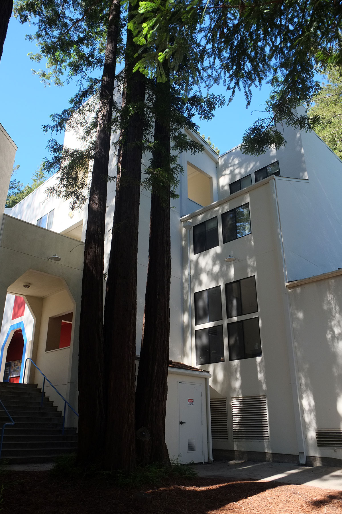
Some of the buildings from the period are quite fine. This is the main library, designed by John Carl Warnecke and later remodeled by BOORA. A classic Brutalist institution set in the landscape, but with the simplicity and clarity that typified the best work of the era.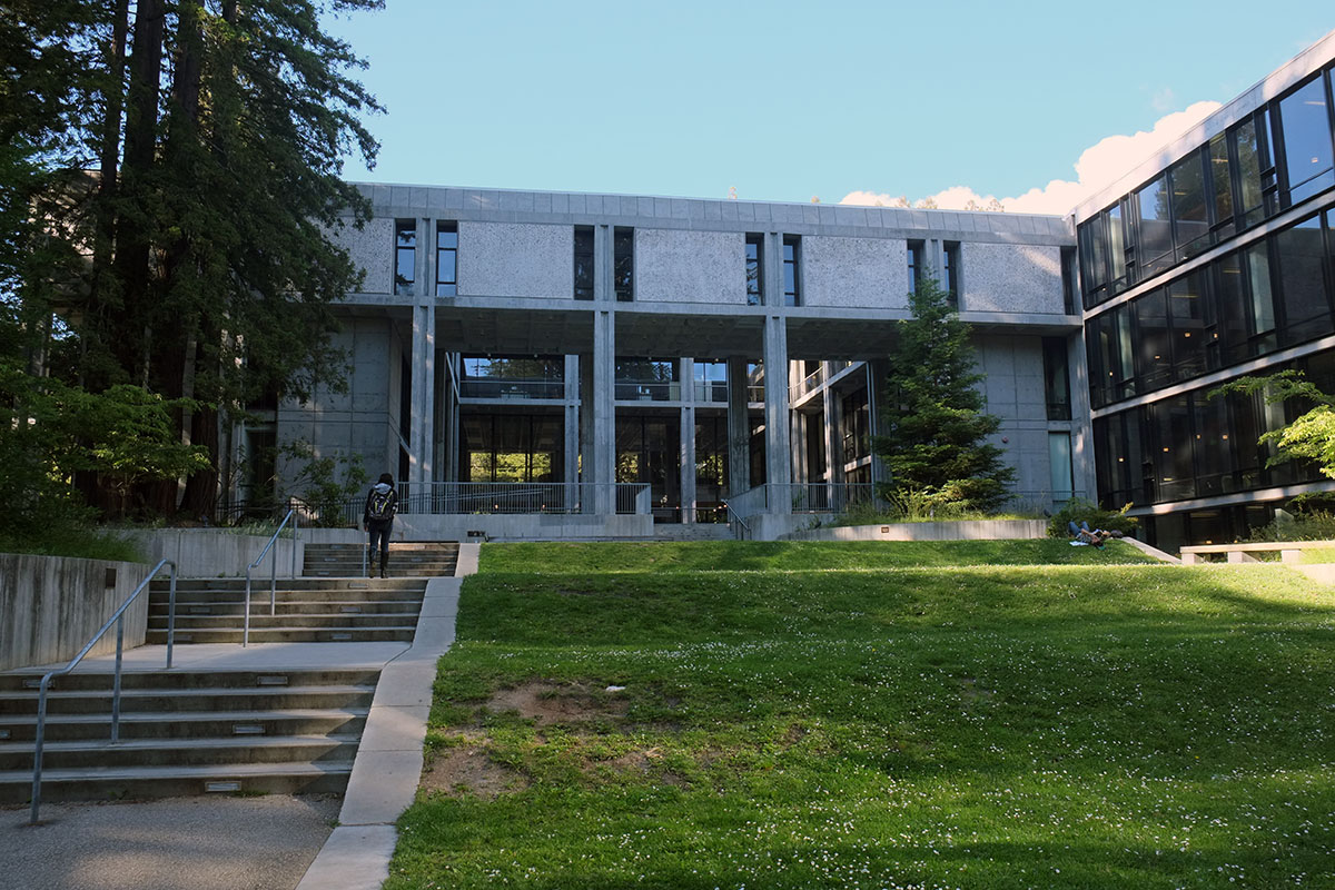
Jolie and Albert explained how as ideas on campus design have changed, recent projects have adapted. There is more of an academic center emerging, countering the initial scattering of buildings in the woods. It is also literally beginning to emerge, out of the woods and onto the meadow which has views over Santa Cruz out to Monterey Bay. This ecotone is magnificent, a spot in the landscape which captures what is unique in the spectacular California coastal landscape.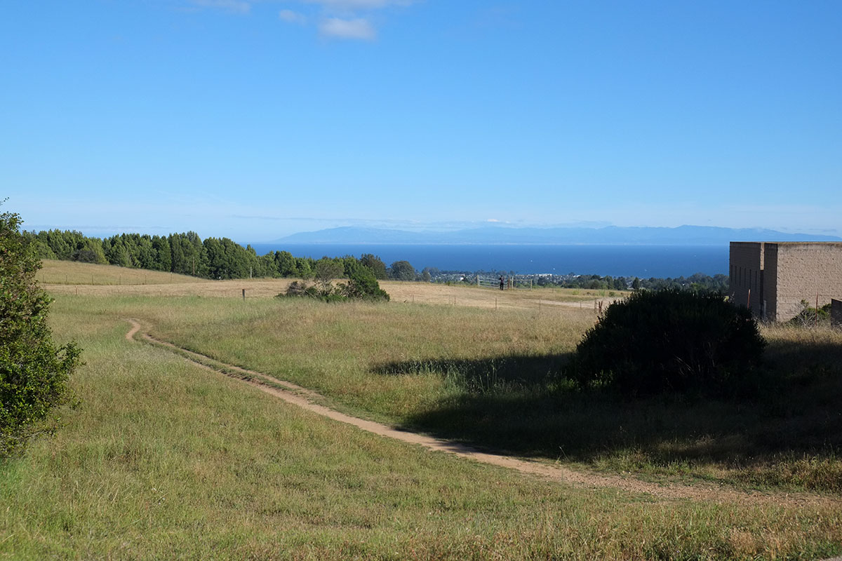
So I was perplexed by one of the more recent signature projects, a music complex by Antoine Predock. We had spent much of a day looking at some wonderful Predock buildings in Albuquerque, and he strikes me as one of the best regionalist modernist architects (similar to Erickson in the Northwest), able to integrate the universal imperatives of the modern movement with the peculiar qualities and demands of strong local context. The Predock buildings work beautifully in the desert, and I just couldn’t figure out how one had gotten to Santa Cruz. The open spaces were rather stark, preserving grand vistas, but not doing much for the humans huddled in the shade.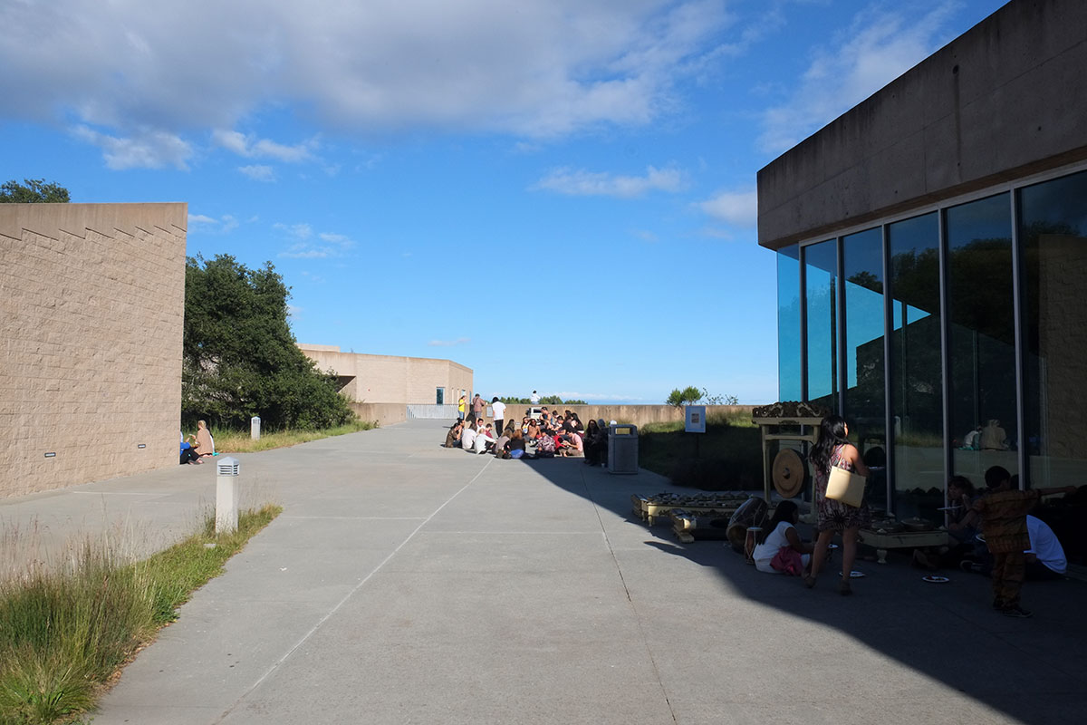
Rather than making a building in the landscape, Predock did one of his normal moves of making a building that is landscape, and you walk over and across and around the pieces. I glanced down into this oasis canyon. Was this his reference to Tsegi? Where were the horses?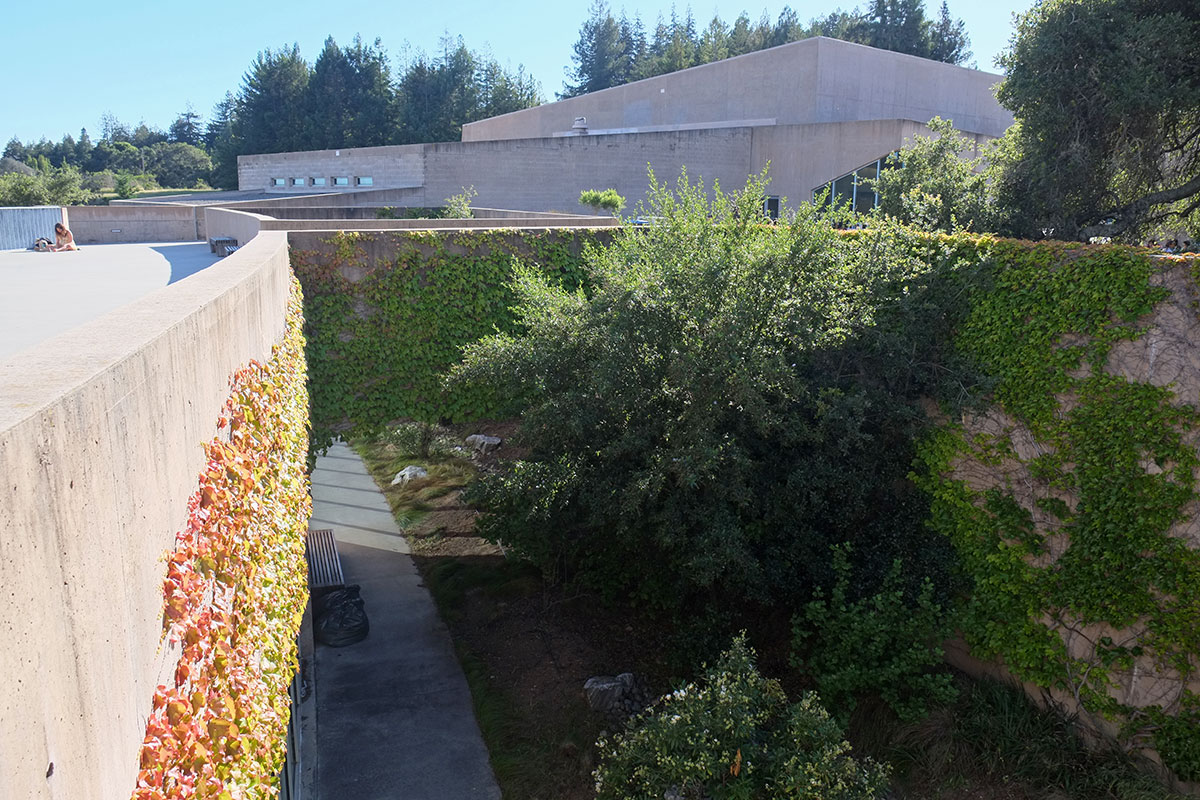
Then looming ahead of us was the mesa. I know that concert halls want to be blank boxes, but I just couldn’t see how this had anything to do with this site. I think this points out the problem as the campus tries to move away from the models of the 60s – they recognize the need for a center, an actual build-up of density at the core of the campus, but they’re still stuck in the 60s paradigm of the building as object, not creating the important public spaces between buildings. This is especially surprising, as right on their own campus they have one of the best precedents around which could show them how to proceed.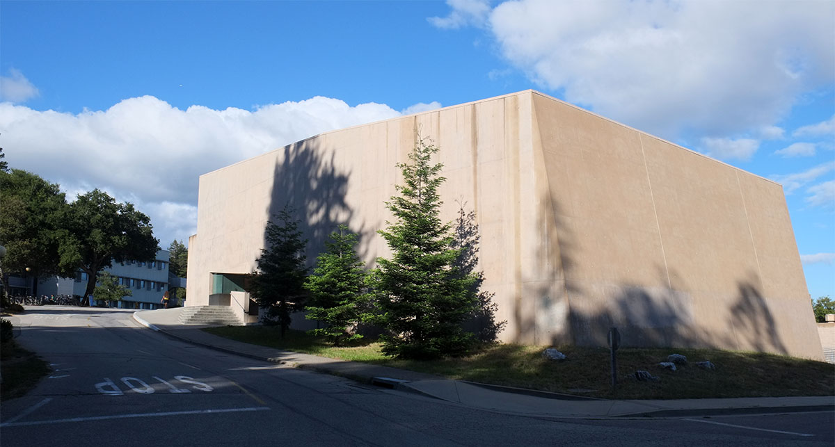
While the Santa Cruz campus took the mid-century, decentralized-in-nature, American campus approach to a new extreme, it then also circled back to the older, English university system of residential colleges, which had been adapted in the early 20th century by some American universities, such as Harvard and Yale. The college broke down the overall scale of the large university to a smaller unit, which would have its own identity, reinforced by its own physical location. A student supposedly isn’t just an individual floating around in a huge, impersonal institution, but has an affiliation with an intermediate-sized entity, which allows them to become part of a identifiable community. Each of the residential pods at Santa Cruz becomes its own village, in this case set out in the wilderness, versus the dense urban locations of its predecessors.
Charles Moore was at the peak of his renown in 1970, having designed many brilliant buildings in California as part of MLTW, and having taught at most of the distinguished design schools in the country, including his stint as dean at Yale. The design for Kresge college works within the campus concepts of open landscape and residential colleges, but then he brought in yet another precedent from the past – treating the college as a small piece of dense urban fabric, rather than as a collection of individual buildings in the landscape. The other residential colleges, designed by other architects, do often try to establish a spatial identity to reinforce the institutional one, using a hierarchy of courtyards, irregular quadrangles and common open spaces, as well as a consistent formal vocabulary for the buildings. But overall, they do look much like other college dorm districts from the era.
Kresge College is totally different. From the exterior, it presents as a walled village – the buildings form an assemblage for the enclosure of the residents within. To enter, you must walk along the perimeter to one of the gates. Architecturally it also reinforces this idea of being a village or town, rather than one large building – the various forms are juxtaposed, and even collide – it intentionally avoids the uniformity that you expect when seeing one large complex deigned by a single architect, even though the vocabulary is consistent.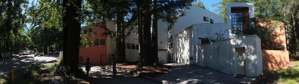
The boundaries and gates are emphasized, simply but powerfully. The wall plane is interrupted by a few large openings, through which you can glimpse the dense interior. Color plays an important role – on the exterior, there are often darker hues which allow the complex to recede into the forest. On the inside, white walls prevail, almost as in a Greek village. Though large trees have been preserved within the new townscape, it is clear that by crossing the threshold you have entered the domain of human settlement, protected from the dangers of the wild.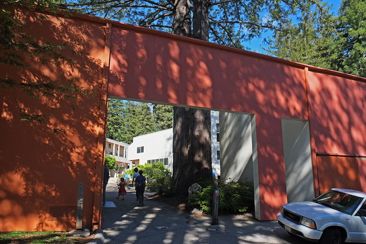
Your view is shaped by the frame of the gate and the tree, and you are presented with a forced perspective up the pedestrian street. As you proceed,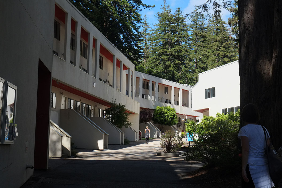
the view opens up, and you are greeted by an entry plaza. These two views set up the pattern for the rest of the complex – there are streets, and there are plazas – spaces through which you move bounded by linear buildings, and places where you are encouraged to gather. The architecture around the plazas is more imageable, with certain forms reading as iconic buildings, even as they maintain their role as part of the streetwall defining the plaza.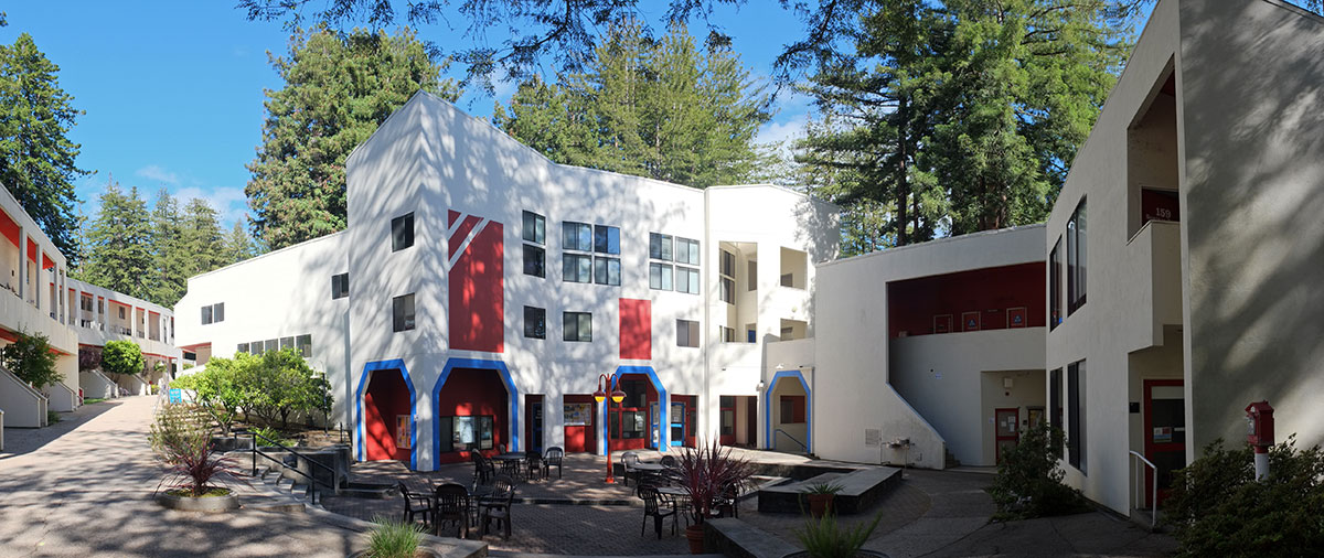
The architecture along the streets is more uniform, mainly rows of housing. Here again, there is a harkening back to older types – rather than the typical dorm type of rooms along corridors, there are suites and maisonette (rowhouse) units which are entered either off a porch zone, or from gallery circulation. The street becomes the hallway for the housing, and the buildings open to it, rather than being internally oriented. This also provides a pattern for the housing which is now sometimes seen in higher-density exurban housing – one side of the unit is oriented to the shared, public entry side, while the other faces out into the larger world. In this case, that larger world is the forest, which paradoxically, is quieter, darker and more private than the street side.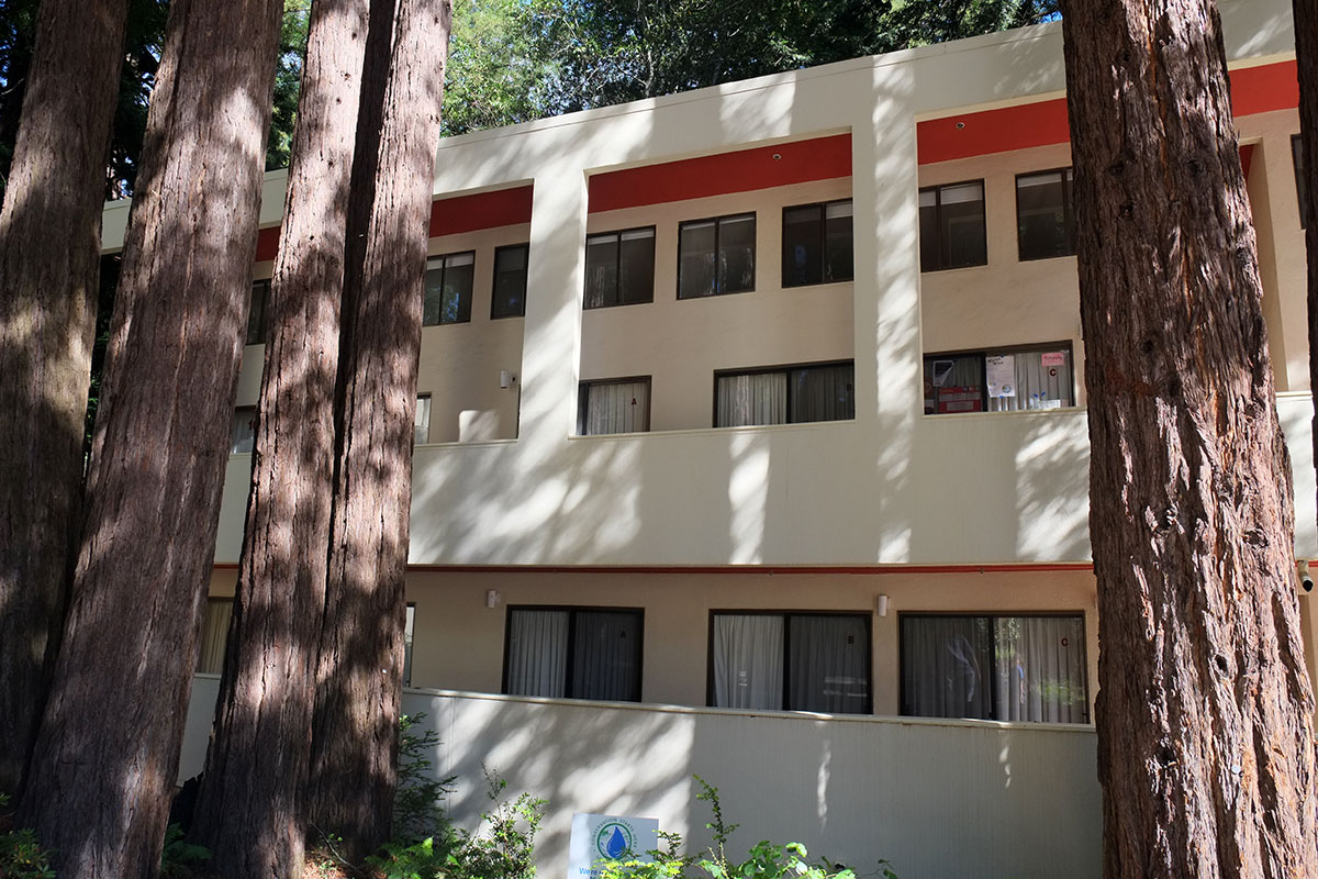
We were lucky to come across a large gathering on a Saturday afternoon, in this case, a university-wide gay pride event being held in one of the plazas. The containment within the space certainly contributed to the vitality of the festival, making it feel more intense than if it had been held in a large field somewhere else on campus. Jolie was interested to see this, as one of the current issues with the college is that the public spaces are not generally very lively (which I would guess is due to the students spending all their time indoors with the blinds drawn, surfing the internet).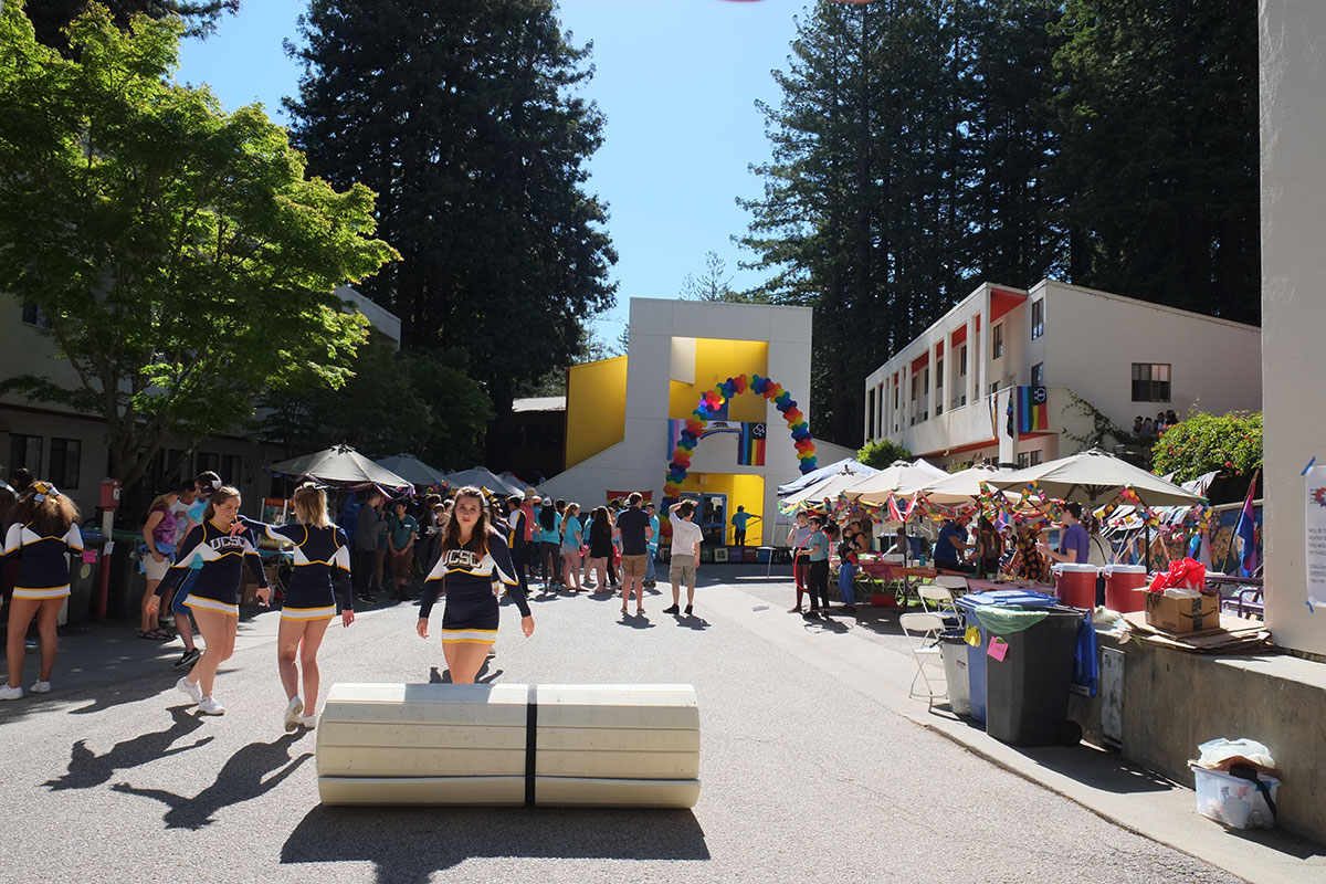
The architecture is straightforward, yet expressive of its nature. The construction is simple and cheap – lightweight wood frame, covered with stucco, and accented with color. The repetitive, modular housing doesn’t try to be anything it isn’t (such as trying to manufacture a picturesque cuteness, or agglomerating the pieces into some grandiose statement), and the simple rhythm of the units established a sense of order along the streets.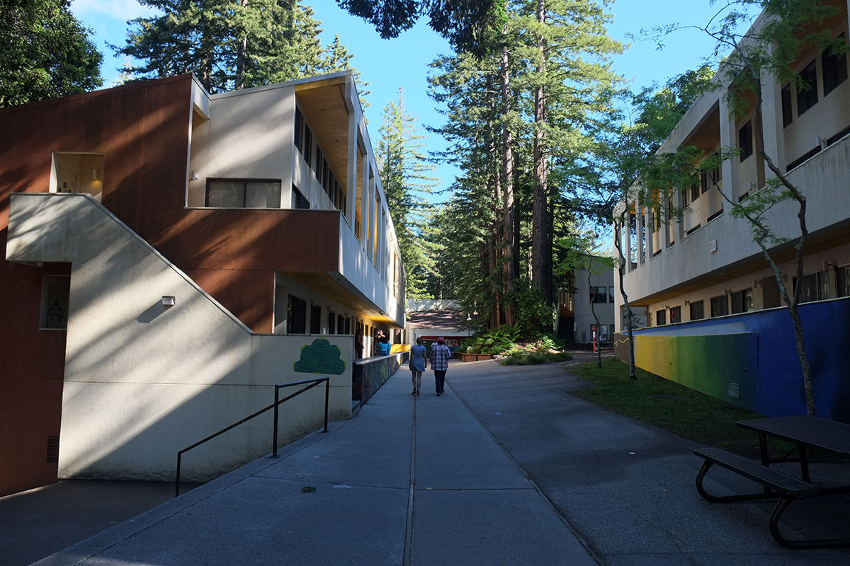
At the end of the linear buildings, the section becomes the façade, and a little bit of playing with planes and colors makes a vivid elevation, where the inside- and outside-the-village vocabularies are integrated.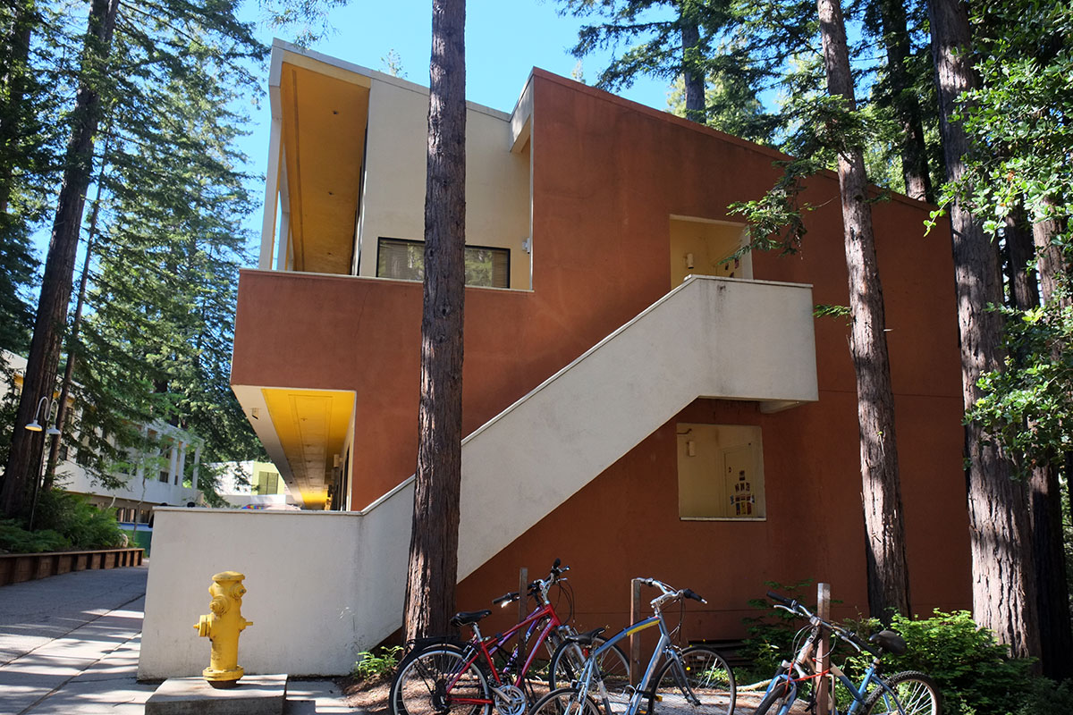
These regular types set the stage for the special effects, the iconic buildings where their special function is emphasized by non-typical designs. This is the view up the street, where the vista is terminated by the library. The forms are simple, the symmetry is not rigid, yet by the location, perspective, hierarchy of tumbling forms, use of color, solid and void, light and shadow, the library is established as an important, unique building, one which stands out from the background buildings. Moore has clearly been paying attention to the Rationalists such as Rossi and Krier, whose analysis of historical urban fabric emphasized this distinction between the private and the public in constituting the city. He also catches a certain moment in architectural history, where the forms of modernism are being inflected towards what became known as postmodernism. Without the self-conscious copying of historical forms, which postmodernism quickly devolved to, the lessons of history are being incorporated here, with the design of individual buildings supporting the overall urban design intent.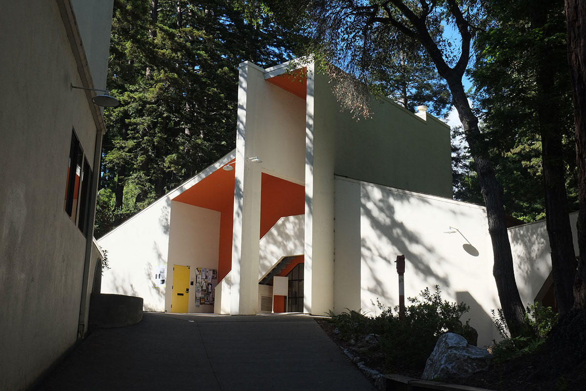
Inside, the building is defined by walls as relatively scale-less, abstract planes, crashing into each other to define spaces between, with relatively little structural expressiveness, but again with reference to iconic building elements, such as windows being cut into planes.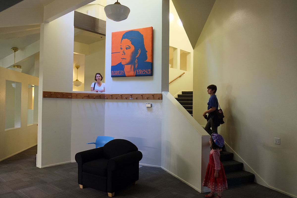
This building also emphasizes one of my favorite aspects of Moore’s design approach at this point. Lightweight wood frame is a remarkably flexible system. We tend to build in straight lines and repetitive dimensions with it, because that is simpler and cheaper, but we don’t have to. Here we can see Moore having fun within the parameters (not going to great lengths and expense to flout them) of the system, creating unexpected spaces and elements in an abstract spatial composition, which doesn’t mimic any historical or even conventional precedents. He is limited only by his spatial imagination, and the wood frame system gives him a wide degree of freedom.
Fifty years later, we find ourselves in a period where many architects feel the need for unrestricted and nontraditional spatial expression, but they achieve by very different means. Here is Gehry’s museum in Biloxi, which I think is achieving not dissimilar effects to Moore’s library (although on a grander scale):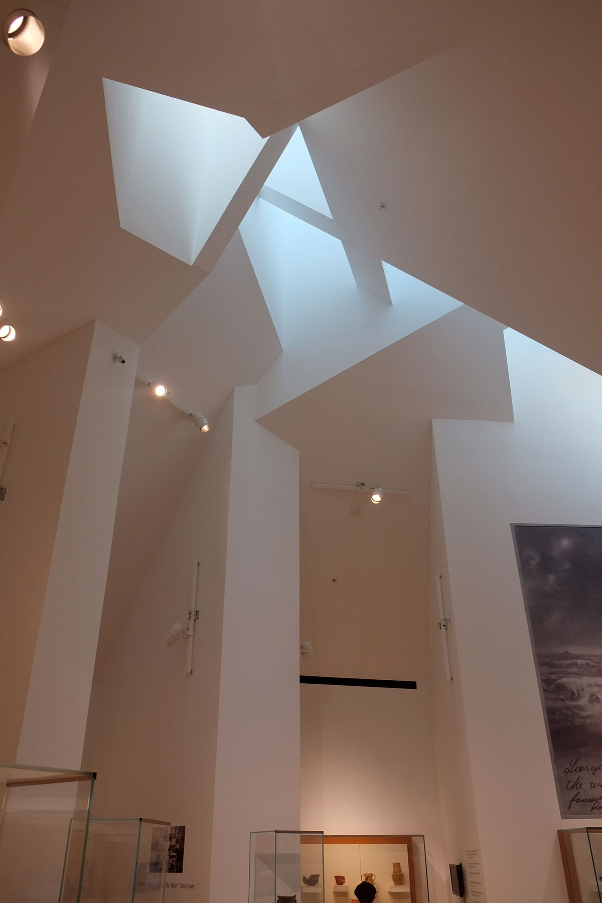
Gehry’s building is made up of colliding brick and steel forms on the exterior, and seems to have an independently-framed interior of studs and gypsum board within that shell. This building probably cost ten times as much as Moore’s on a per square foot basis, and I’m not sure that the difference in cost is that noticeable in the final result. Many of today’s starchitects demand huge budgets to accomplish their visions (the late Zaha Hadid springs to mind), and much of that budget goes into cutting-edge technologires that let materials be twisted into forms that don’t come naturally to them. It is just very satisfying to see Charles Moore achieving his vision with some 2x6s and plywood sheathing.
Kresge College is almost fifty years old, and Jolie Kerns has the job of managing its renovation. It’s an interesting, yet daunting proposition, from many perspectives. An old woodframe building with stucco sheathing is definitely going to have issues with water and rot. The building was built under energy codes that are nothing like our current ones, and how could the envelope, including the windows, be brought up to code while maintaining any of the architectural character? College students now are pretty different form those in the 60s, much more used to more personal privacy, space and amenities, and more focussed on their online lives, rather than a collective existence in the analogue world. What are features of this college that can be preserved, and which will have to be adapted to modern life. The library also presents what might be the most difficult challenge: accessibility.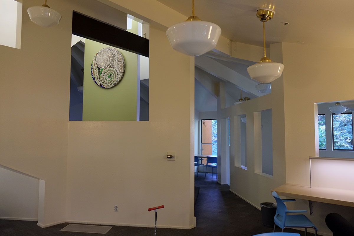
Here is a building whose whole premise is a series of levels and platforms and quirky little spaces. Can any of this character be preserved while making it accessible? If it can’t, it’s hard to see how in a strapped university system, spending the money to renovate it would be justifiable, or even legal. The university has hired Jeanne Gang’s office to come up with a master plan for the renovation of the college; Jolie was going off the next day to show her around the campus. I think that their approach will be a good fit; I recently saw her office’s proposal for a major remodel of the Baltimore aquarium, and it appeared to be a very good blending of new ideas and approaches (architectural, functional and environmental) with a recognition of the quality and importance of the existing buildings. I hope the same approach can work here. Kresge College is a really important and beautiful complex, and it illustrates a critical moment in our recent architectural history. It also has many lessons for our current world, as we still confront the problem of making humane places which draw from our traditions, within a largely placeless and soulless modern context.
