We’d been wandering around in the desert for over a month, camping in National Parks, Indian reservations, and strange, raw cities like Gallup and Page, so we were looking forward to getting back to civilization. When we got to Albuquerque Greta immediately tracked down a banh mi restaurant, the first thing we’d eaten in a month that wasn’t either our own minimal cooking, or Mexican. Albuquerque turned out to be the kind of medium-sized, complex city that we enjoy, and we were looking forward to the two other urban outposts in northeastern New Mexico – Santa Fe and Taos – which we knew would be very different. I had briefly been to Santa Fe once before, and was anticipating that it would have some things in common with other places we’d seen on this trip – small, beautiful destination cities for the well-heeled.
Santa Fe has an extraordinarily beautiful landscape, where the high desert runs into the Sangre de Christo Mountains. It is surprisingly small – with a population of about 70,000, even though it is the state capital. Perhaps this reflects the unusual statistics of New Mexico – it is the fifth largest state in area, but has only 2 million residents (half of whom live around Albuquerque). So there probably just aren’t that many state employees, leading to the happy circumstance whereby the city is not dominated by massive, boring boxes of bureaucrats.
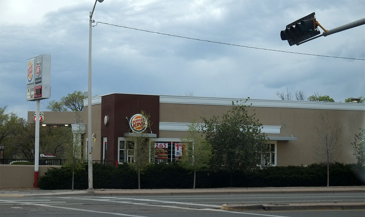
Driving into town from the southwest, we passed through the moderate amounts of recent sprawl, and then saw our first tip-off of what was to come: normal sprawl, except in style. A Burger King in tasteful, earth-toned stucco, with some historicist detailing. Years ago, I had read a Calvin Trillin article about Santa Fe, focussing on how all these Anglos moved there from the East and then tried to out-Hispanicize each other – reporting their neighbors if they could see stylistically non-conforming parts of their houses – but I hadn’t realized the extent of this hegemony.
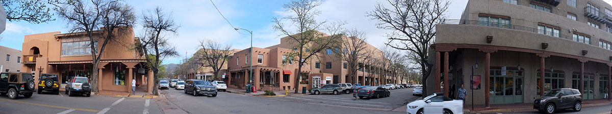
We arrived in the historic center of town in a thunder snowstorm (at the end of April), and were immediately struck by how different it was from every other small city we’d seen in the past three months.
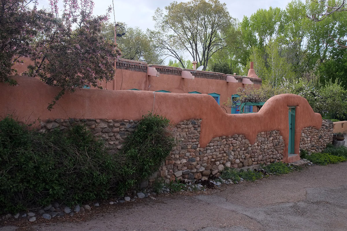
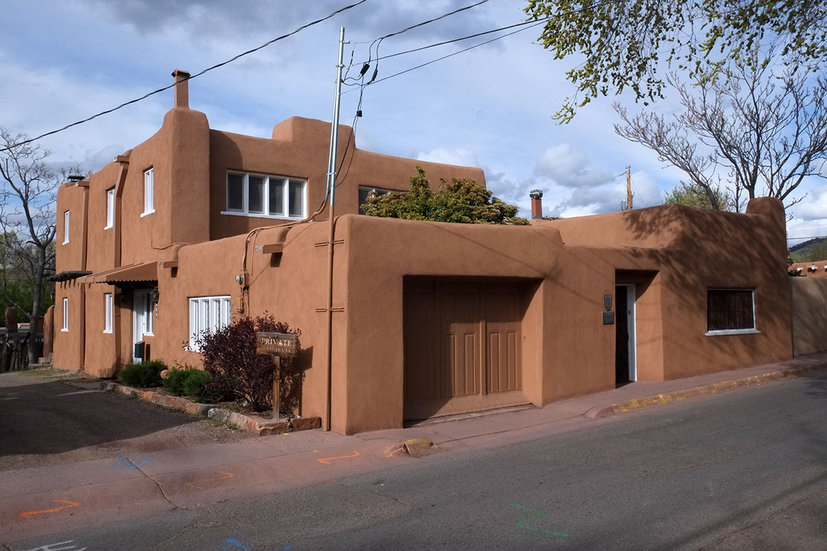
There were no jarringly bad modernist buildings – but there were no good modernist buildings either. Everything was low in height, covered in stucco within a narrow color range, and detailed in a Puebloan manner. We subsequently learned that this style is sometimes called Faux-dobe, and this conformity was written into local law when New Mexico became a state, in 1912. (Interestingly, this was one year before the first zoning ordinance in the country was adopted in New York.) At that point Santa Fe only had about 5000 residents, so this regulation has been in place for virtually all of its growth. In the 1930s the “Territorial” style was also included, incorporating those white-painted elements we’d seen on the Burger King.
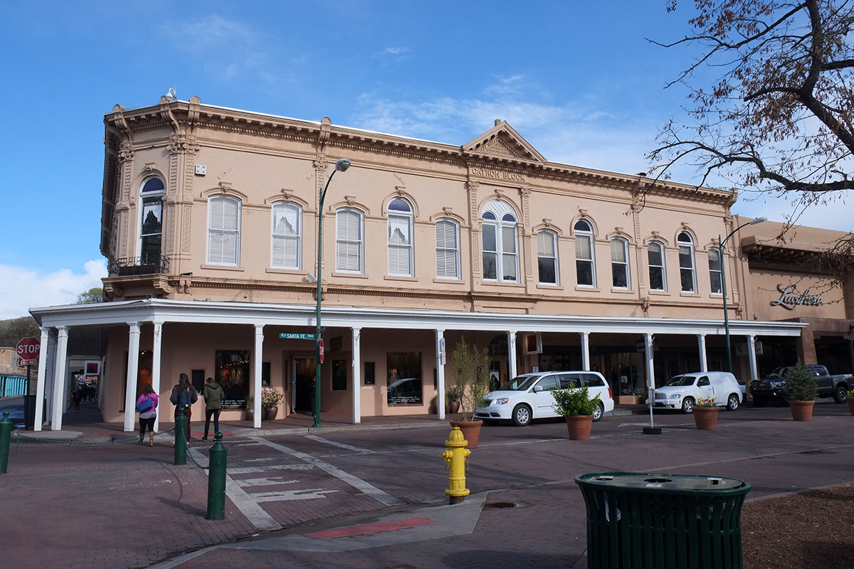
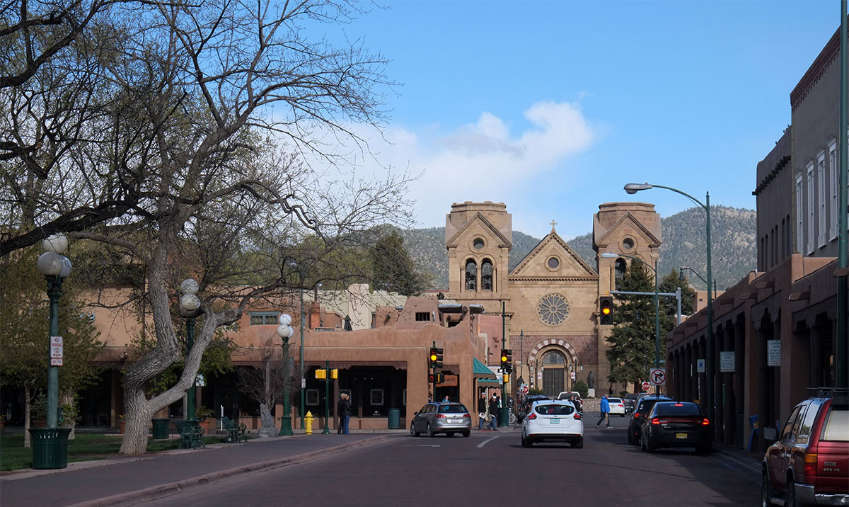
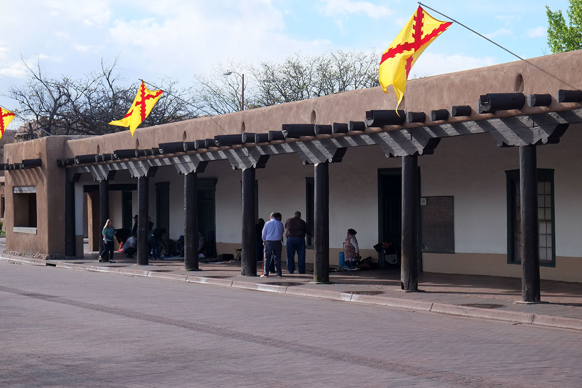
The town is centered on the historic plaza,
with the restored Governor’s Palace along one side – the historical source of the required look,
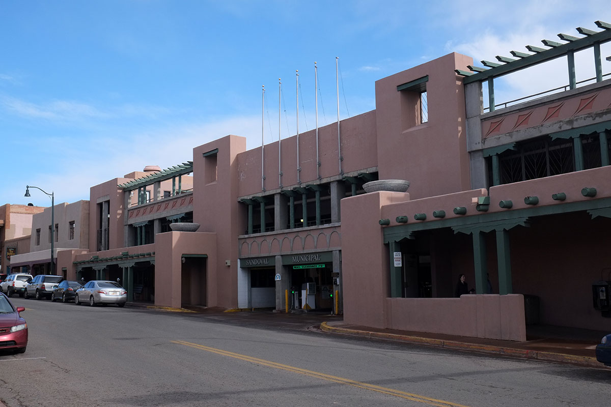
which is even applied to parking garages.
Santa Fe is uniform, but not just stylistically: everything is also neat, clean, well-tended, and expensive-looking. We hadn’t seen a town like this since Seaside, Florida, and it was particularly noticeable after three months back travelling in the West. As a transplanted Northeasterner, it took me a while to get used to the ad hoc quality of the built environment in the West – everything is new, most of it built rapidly during booms, when very little attention was paid to its quality. This was undoubtedly true of much new construction in the East also, but there has been enough time for subsequent waves of redevelopment there, with many of the crappy old buildings being replaced, and a few good old buildings preserved. Most western cities are still composed of predominantly first-growth buildings, (often badly remodeled).
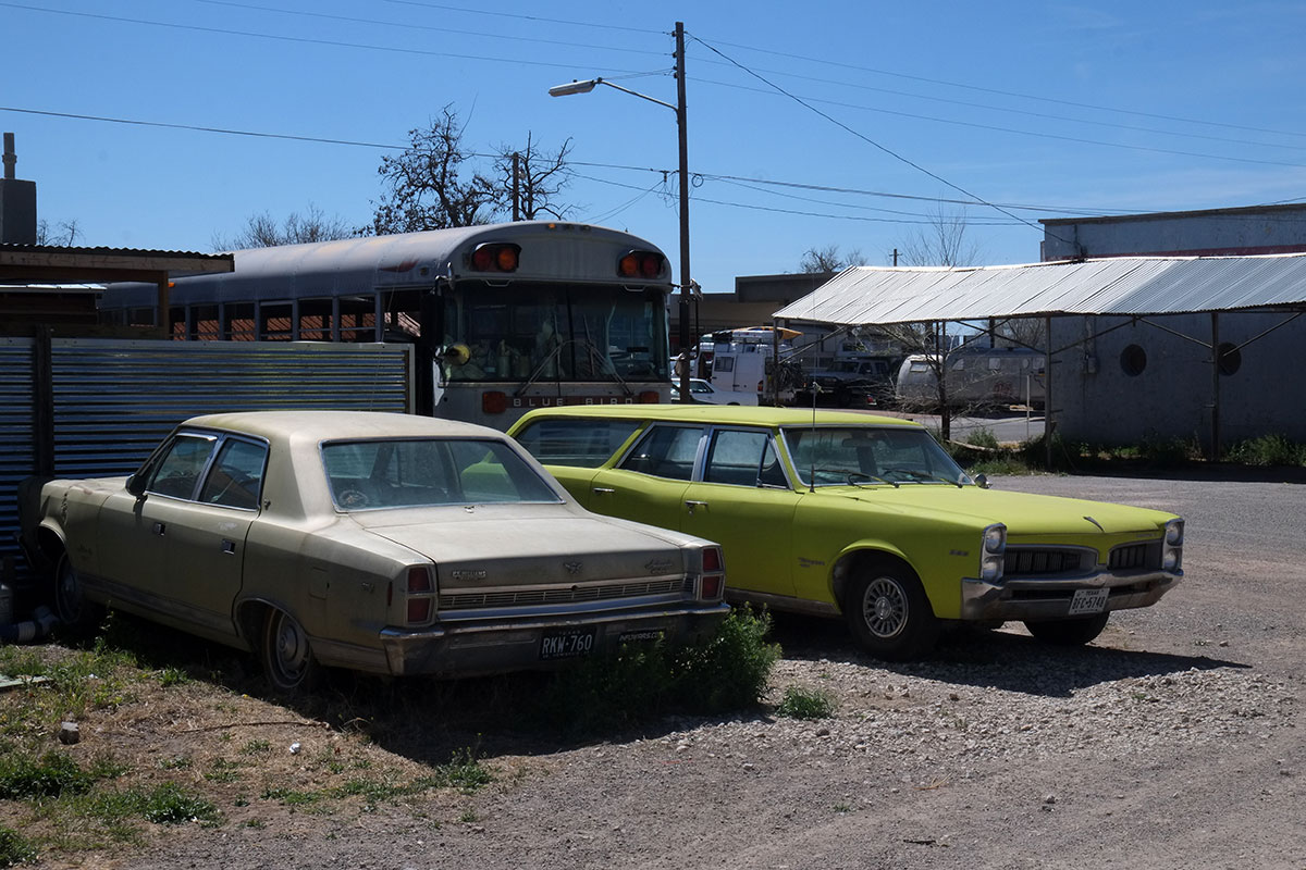
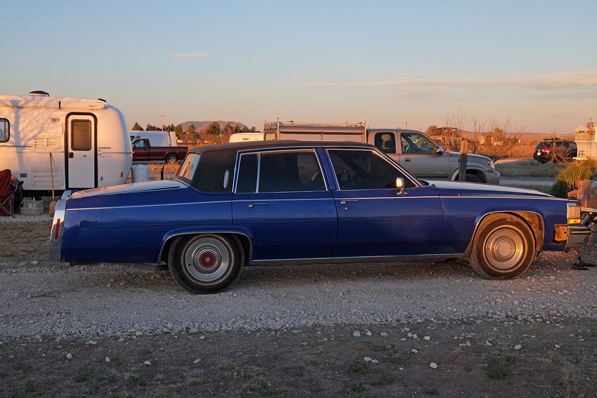
This casual, haphazard quality can be seen in individual buildings, but also in the overall appearance of the landscapes and cityscapes. Driving through the rural South, we were surprised to see that every highway was lined with litter and even larger discarded items, something you just don’t see anymore in other parts of the country. In the Southwest, where nothing rusts or rots, it became extreme – it seemed that most yards were full of discarded cars, appliances and furniture. I’ve always attributed this lack of concern for the built environment to a sort of environmental Manicheanism – Westerners have grown up in this huge, amazing natural landscape (which they either want to exploit or preserve), and the built world is just instrumental – it exists to support human life, but it is otherwise not worthy of attention. After a while travelling in the West you stop noticing the quality of the settlements, just nasty little smudges by the side of the highway.
Santa Fe doesn’t have this quality. The environment may look more causal and “authentic”, without the hyper-manicured fussiness of much recent, edge city development, but it clearly has been considered and tended. This is largely due to the intentional planning and architectural rules put in place over a hundred years ago. Not only did they establish stylistic uniformity, but they show that Santa Fe is a city which has always cared about how it looked. These rules, based in ideas coming from the City Beautiful movement, consciously guided development in Santa Fe throughout its whole subsequent history, while most of the West just sort of happened. The “Santa Fe Style” may be visually apparent, but Santa Fe would still look different from the rest of the West, even if they had picked a different style – the presence of codified intention is what mattered.
More recently, one can see the same approach playing out in Seaside, Florida, where a clear and rigorous set of development rules and standards produced a well-considered and tended environment, notably devoid of all the standard, tacky seaside development seen everywhere else in the Panhandle. These are harmonious, planned environments, where people have thought about the qualities of the whole, and not just a few individual buildings. After 30, or 100 years, the effect of these rules is very clear in the physical, built world, and perhaps less obviously, also in the social and economic worlds: these kinds of planned, controlled environments attract rich people, from the very rich down to the upper-middle professional classes. I’d guess the top 5%.
Rich people live in nice places, and if you’re travelling around the periphery of the country, looking for good architecture and towns, you see a lot of them. There are obviously big cities and metropolitan areas, where the wealthy neighborhoods are part of the overall mix, but then there are these smaller places where rich people have decided to go be rich together – Martha’s Vineyard, parts of Maine, Charleston, Naples, Seaside, Carmel. There is a concentration, a disproportionate amount of affluence in these places, which dominates many aspects of the local culture, including the built environment. Some of these places are old, where well-off people have recognized pre-existing qualities, but a few are relatively new. In Santa Fe, you can see the interaction between the planning context and the stratification of the real estate market playing out: the design regulations produced a harmonious, integrated environment, which eventually attracted rich people. Then the environment evolved to accommodate the lives of the rich.
These places have a few common characteristics: beautiful natural environments, probably the main factor attracting the wealth originally. They usually had a more vernacular existence before the wealth arrived – a fishing village, an artists’ colony, ranches near big mountains. Compared to other locales in the area, everything is very well-tended. As time goes on, and as the culture of the elite becomes more widespread and global, these places are becoming more like each other – the same expensive stores and essentially similar houses are found in all of them. We are used to seeing the placelessness of the American mass market spreading across the landscape, but the same process has happened with the ecological niche market of the wealthy. They may have been attracted by the unique qualities of a certain place, but that has often now been overwhelmed by the universal culture of wealth and consumption. We visited many of these places hoping to see the particular nature of each one, but we found ourselves first having to plow through the sediment deposited by the river of wealth, to find what lay beneath.
Downtown Santa Fe has the same expensive stores (mostly housewares and clothing) found in all these other places, but is overlaid with the local shopping specialty – Southwestern art. The downtown is full of native art galleries, where the work ranges from cheap souvenirs to extraordinary. We had been buying art in the pueblos and reservations from the artists, so we largely ignored all the downtown shopping, but we gladly partook of the other retail focus – good restaurants. Even more than in Albuquerque, there was a variety of food beyond Mexican, and we sated ourselves with excellent Italian meals, anticipating our imminent return to the desert and campground cuisine. I am often bemused by the consumption preferences of the well-off, but that doesn’t mean I don’t share more than a few of them.
The same goes for my appreciation of the built environment. In Santa Fe I missed the messy vitality of Albuquerque, but I appreciated the consistent, understated beauty of the place. It was so uniform that it felt Disneyfied, but as in Disneyworld (or Las Vegas), I had to admit that the formal quality of much of it was quite good. The stylistic vocabulary allows for quite a bit of expression within it. And compared to the pseudo-Craftsman allusions that have overtaken most of the Northwest, I prefer the elements of the Santa Fe Style. There are the predictable romantic excesses, but many good architects have worked here, and the language of simple volumes and flat planes punctuated by crisp openings, highlighted by thoughtful craftsmanship, and based upon a vernacular with actual historical and environmental roots, is vastly superior to our recent national stylistic homogeneity, with its pretentious proliferation of superfluous gables and its cacophony of materials.
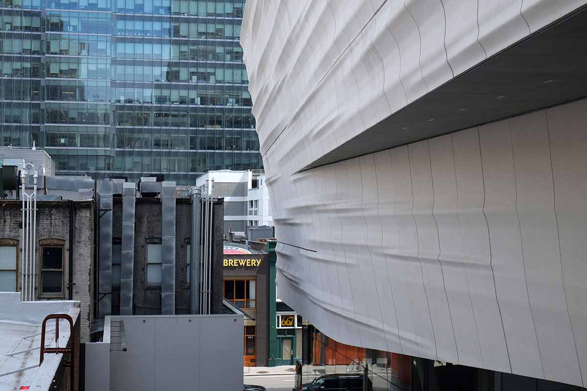
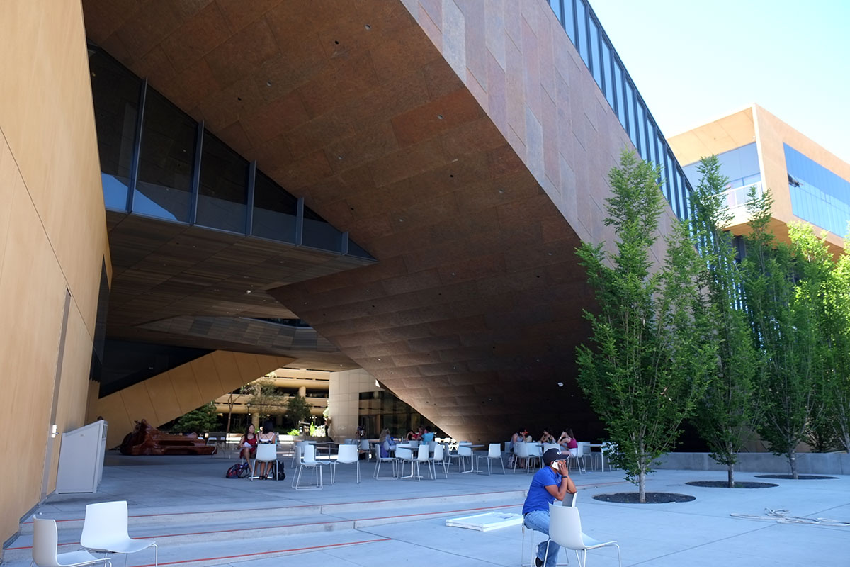
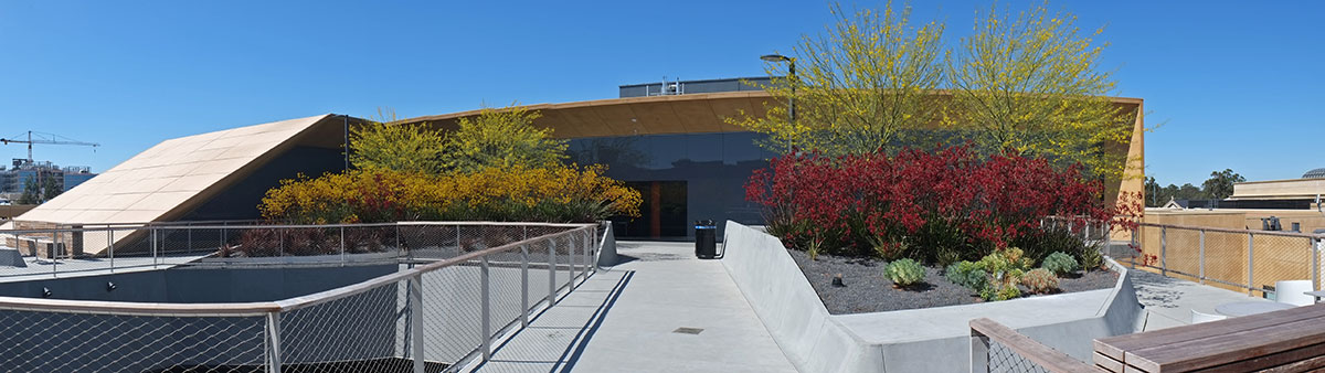
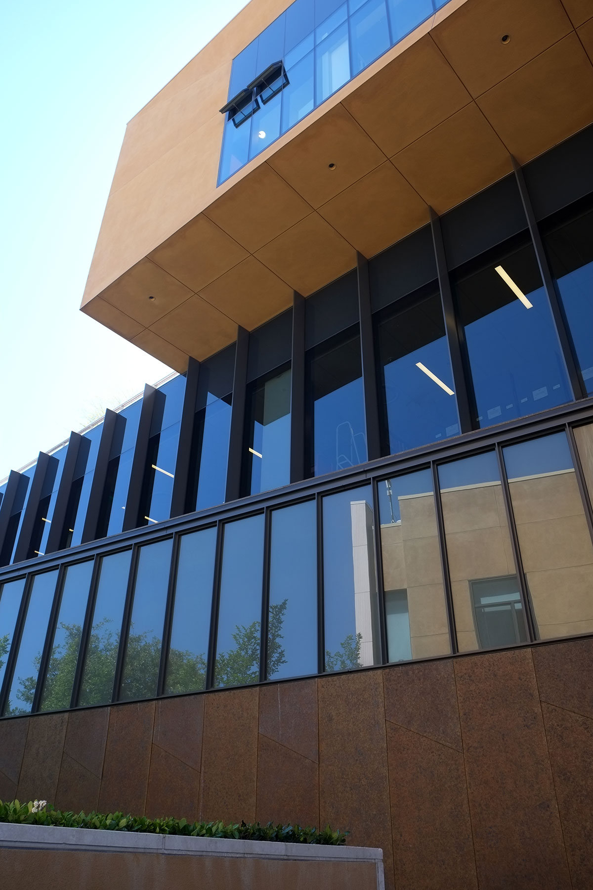
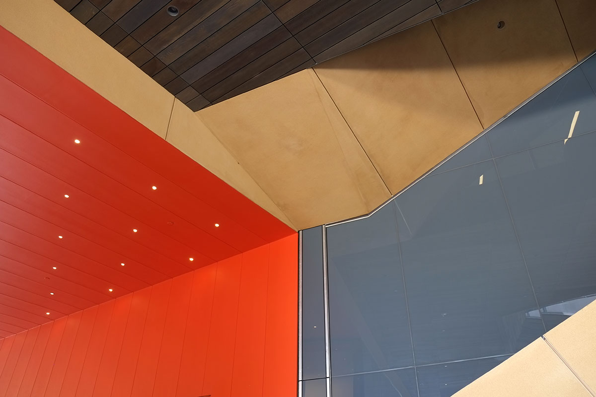
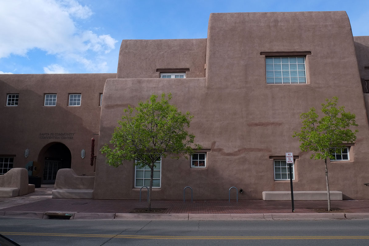
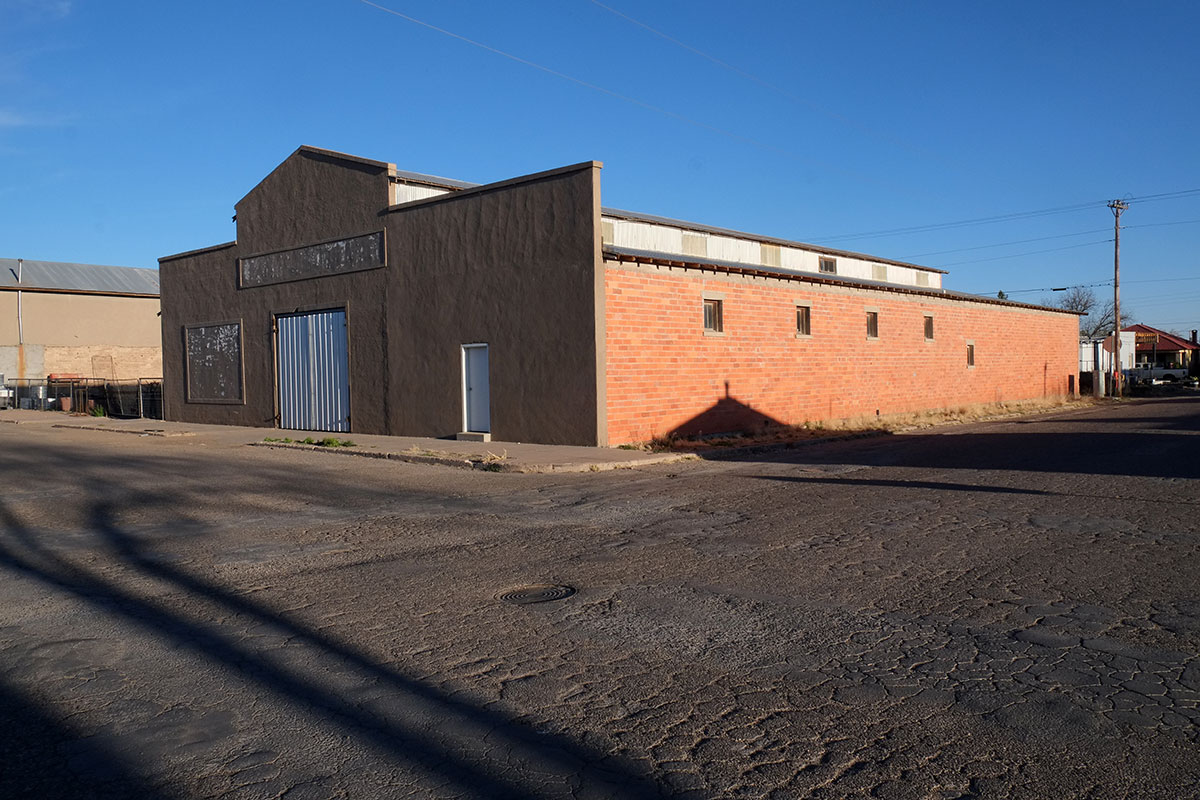
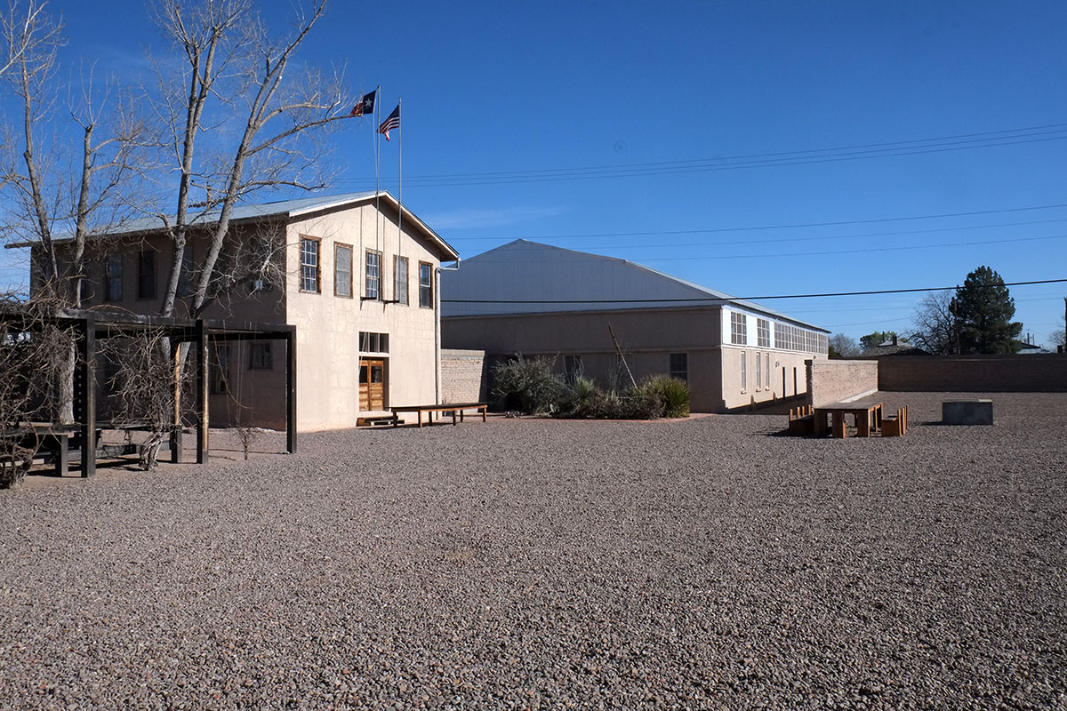
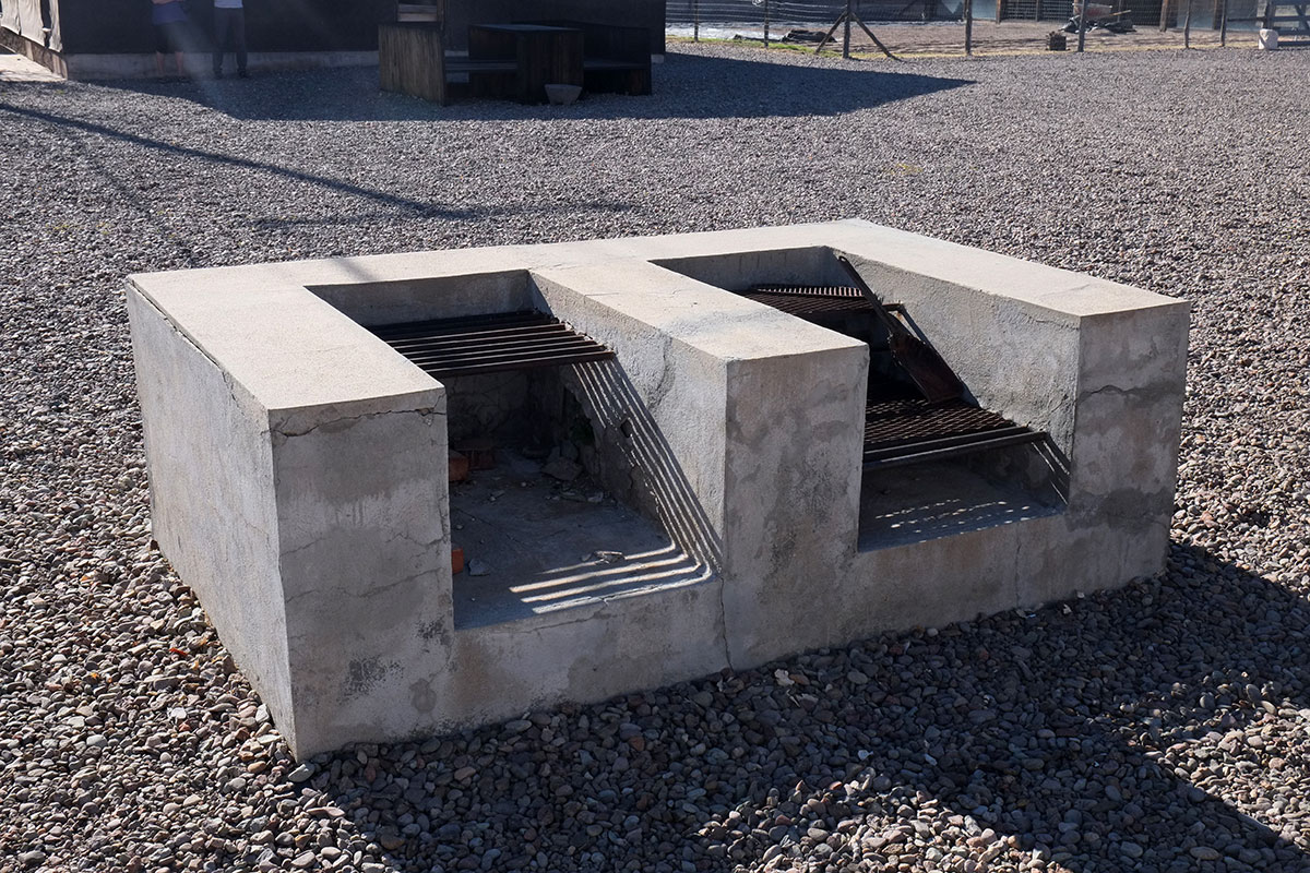
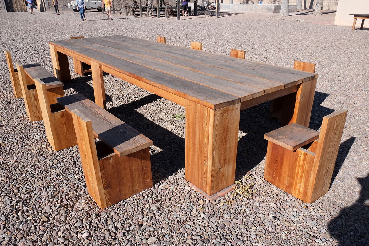
A convention center wants to be mainly big rooms with blank walls; here is a convention center that manages to not blight the downtown:

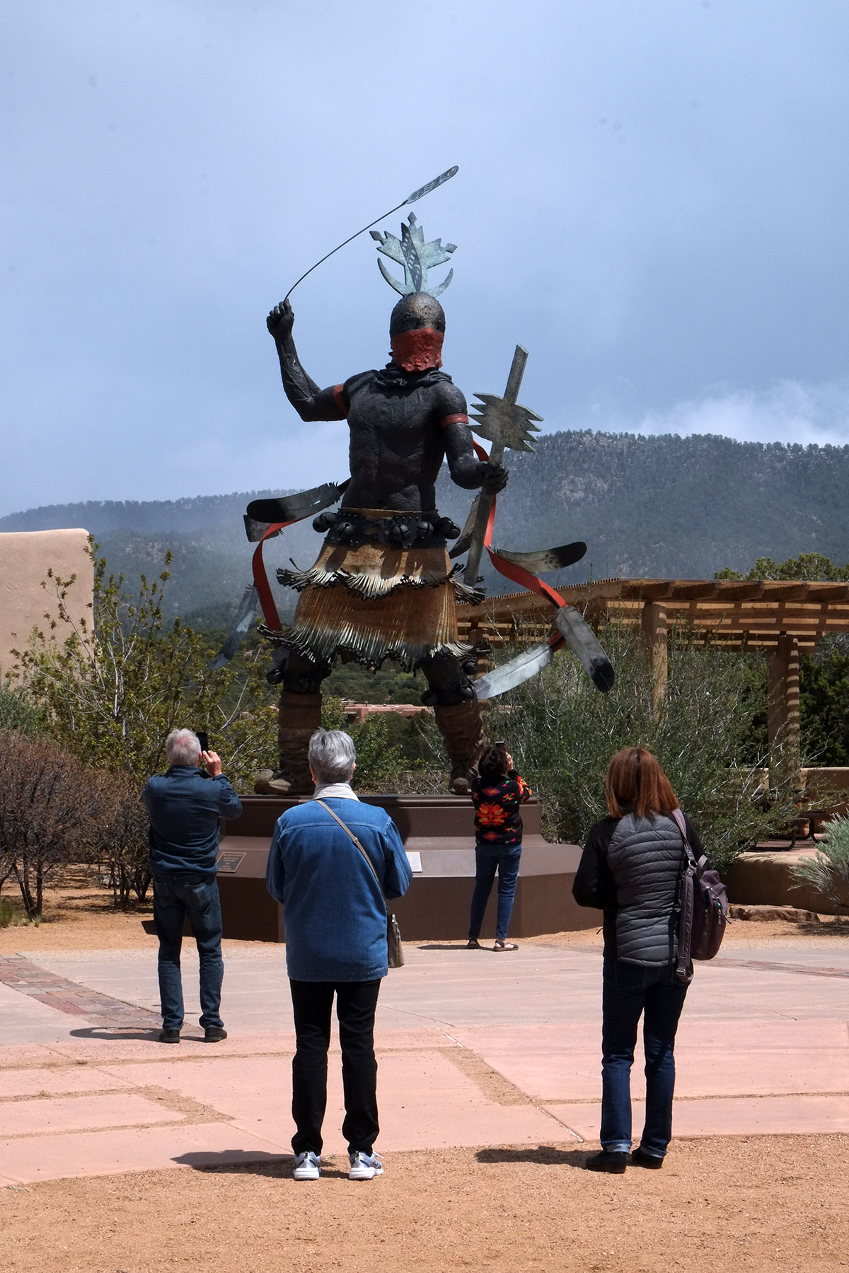
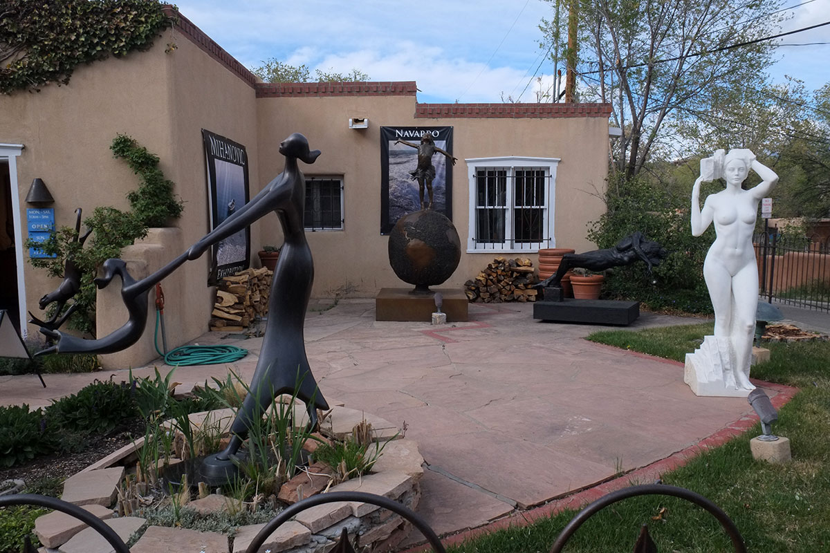
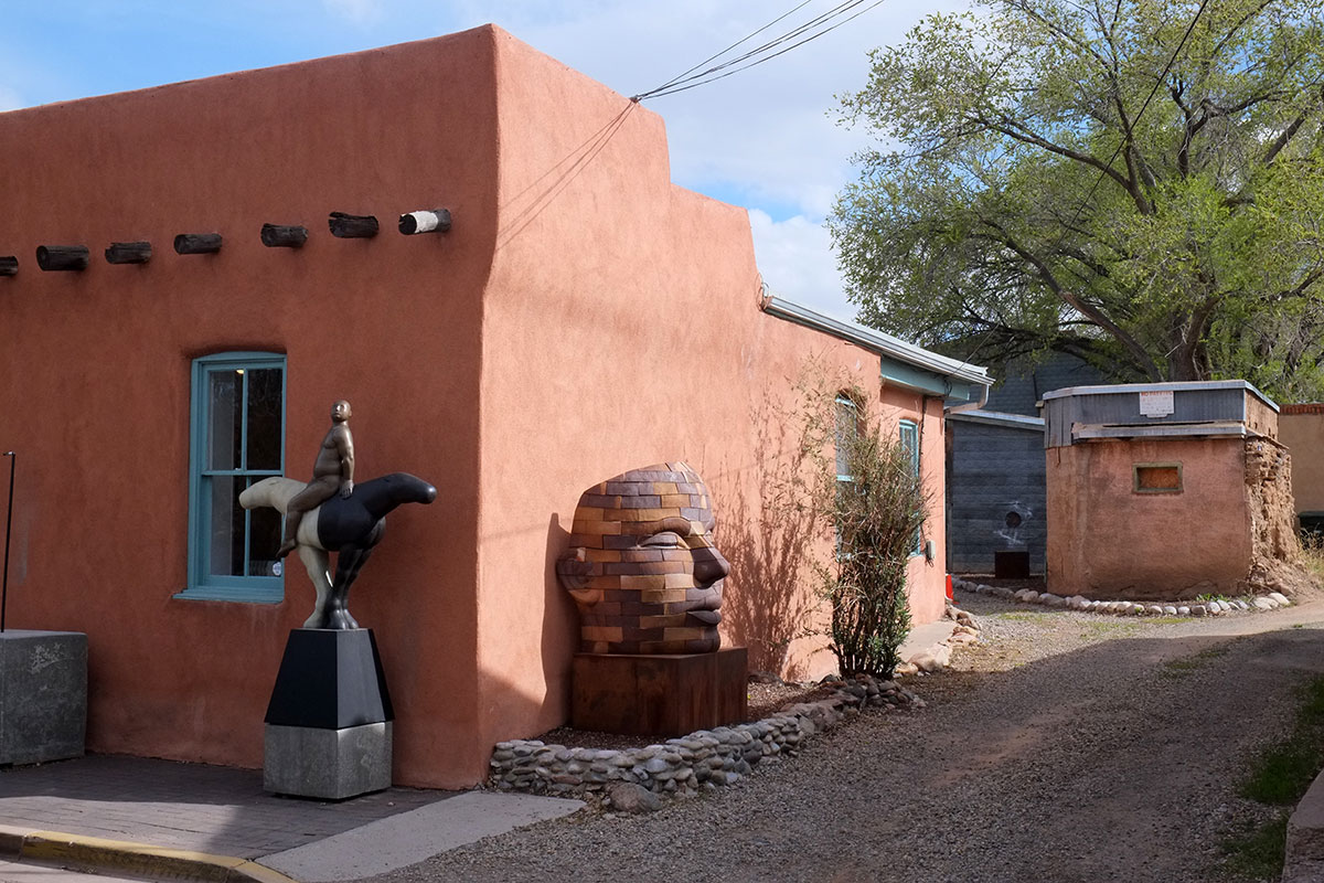
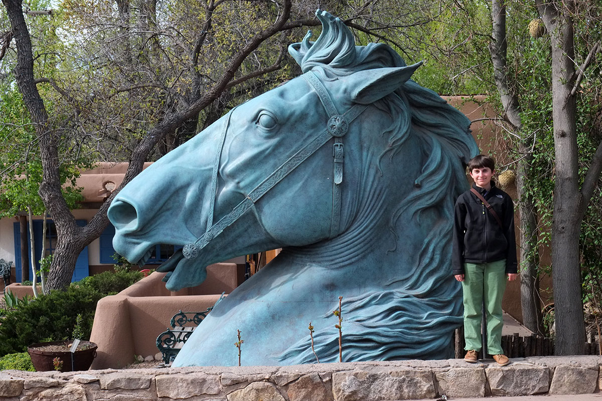
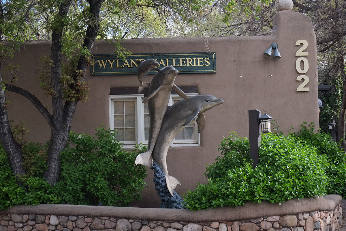
Another notable, and peculiar, wealth effect in Santa Fe is the art market. We were told that it is the second largest in the country, which I found hard to believe, until a stroll up Canyon Road, past the 100 plus galleries, made me reconsider. The work is what you find in all places where rich people need to furnish their homes, ranging from silly through tastefully titillating, solemn and ponderous, to quite good; most of it figural, and all of it expensive.


The sheer amount (and size) of it was amazing, and much of it must end up somewhere else; rich people must buy art while they are in Santa Fe, and then ship it to their other houses. I’m hoping this is the case, because the idea of having dolphin sculpture on your terrace in the desert is just too weird.
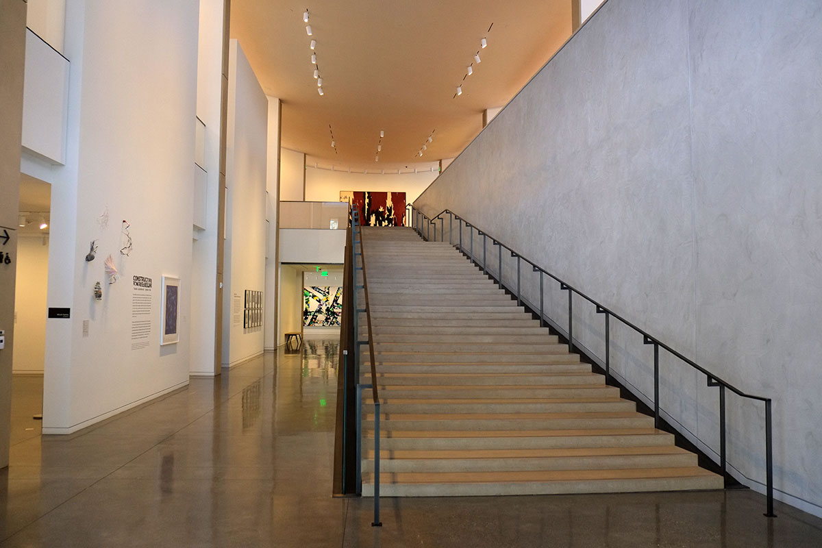
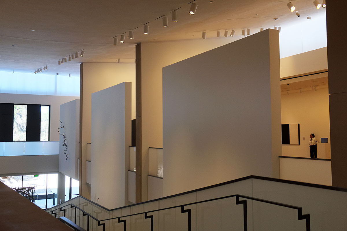
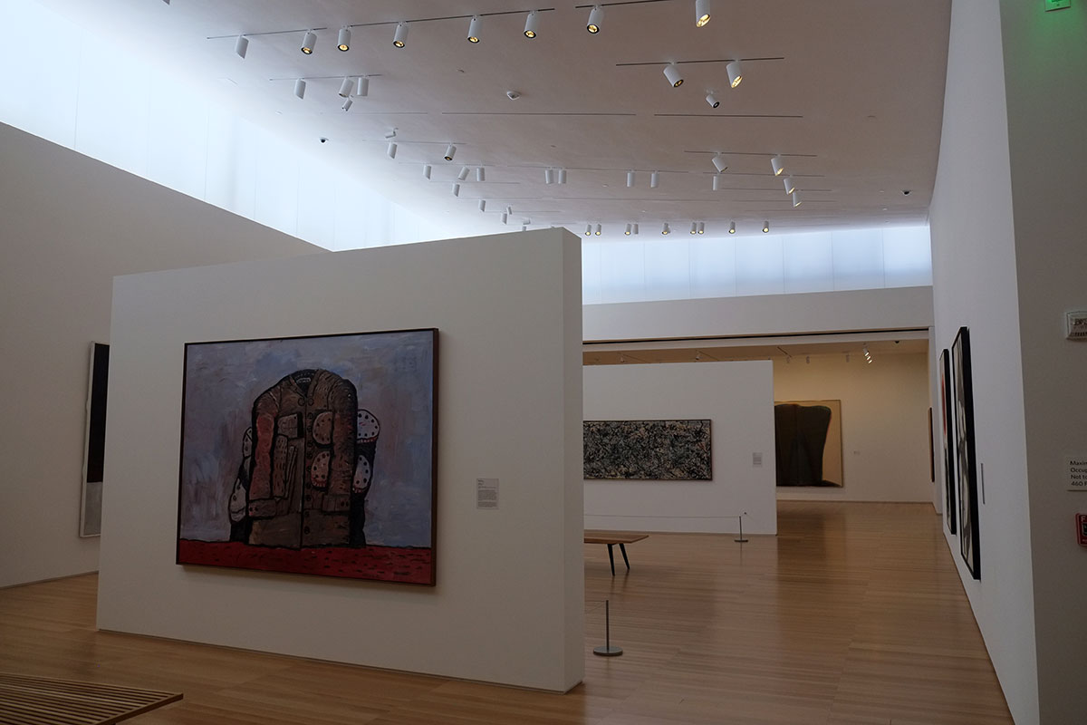
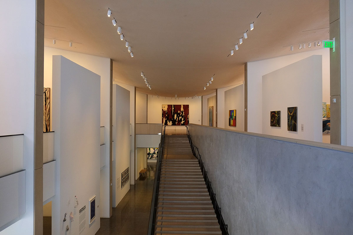
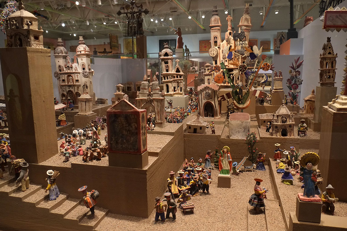
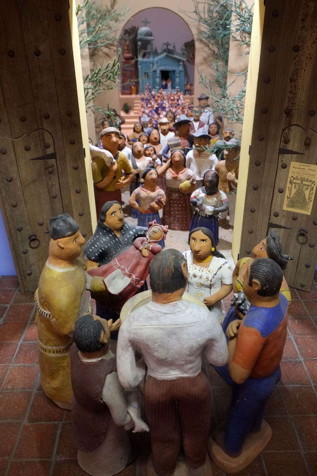
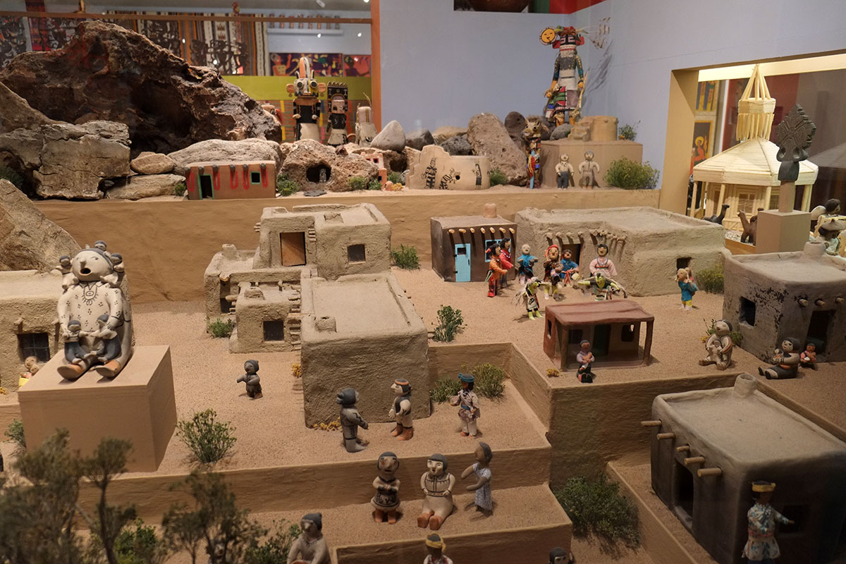
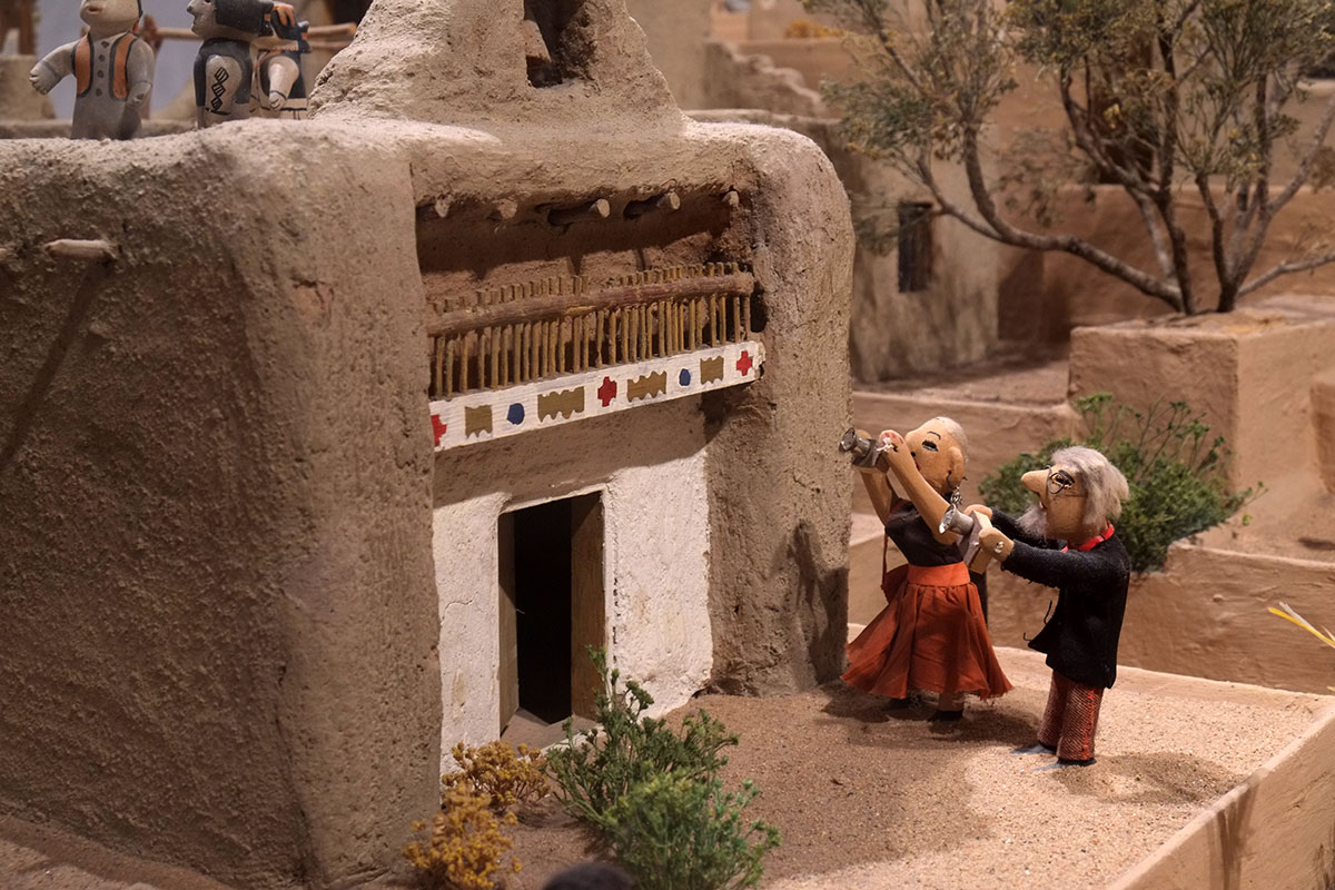
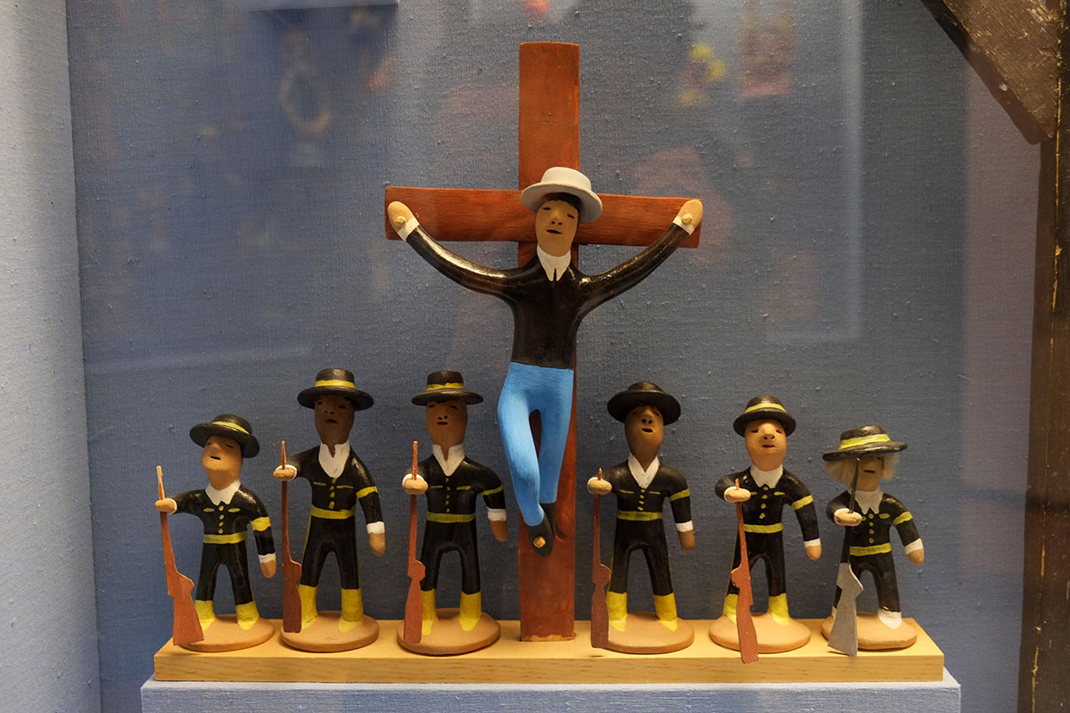
The best part of the art scene are the museums, which are clustered in an area called Museum Hill. There are two museums of Native American art and culture, and the Museum of International Folk Art. This contains the collections of several donors, the centerpiece of which is the wing housing the collection of Alexander Girard. Girard was the great modernist interior designer (who worked with Charles and Ray Eames and other mid-century designers), and who collected extensively on his travels, all around the world. The works are fantastic, and the installation was designed by Girard himself, in a manner which emphasizes how a visual designer would be inspired by, or make use of the imagery and ideas he’s collected. It’s not an overly scholarly installation – pieces are sometimes grouped by country, or time period – but the overwhelming principle seems to be what fits together visually, and how larger installations be assembled from many parts, often creating a narrative tableau.

His sense of humor is evident, as where he constructs a pueblo with figures from different cultures,
Including the serious cultural tourists.
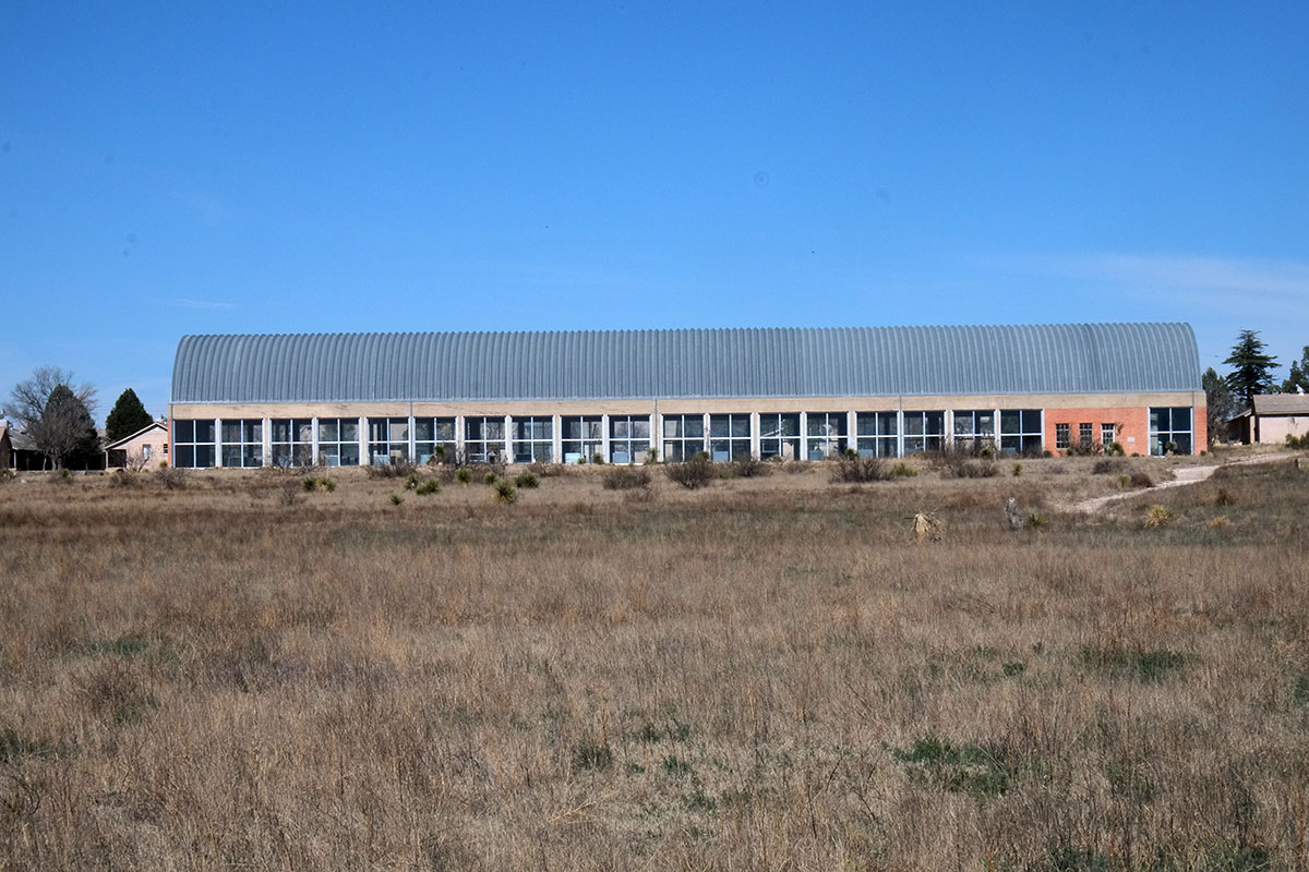
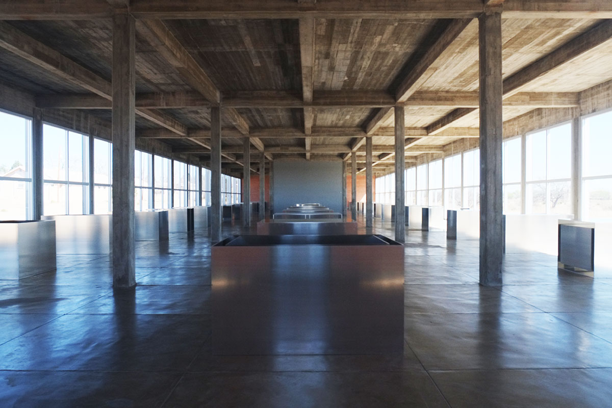
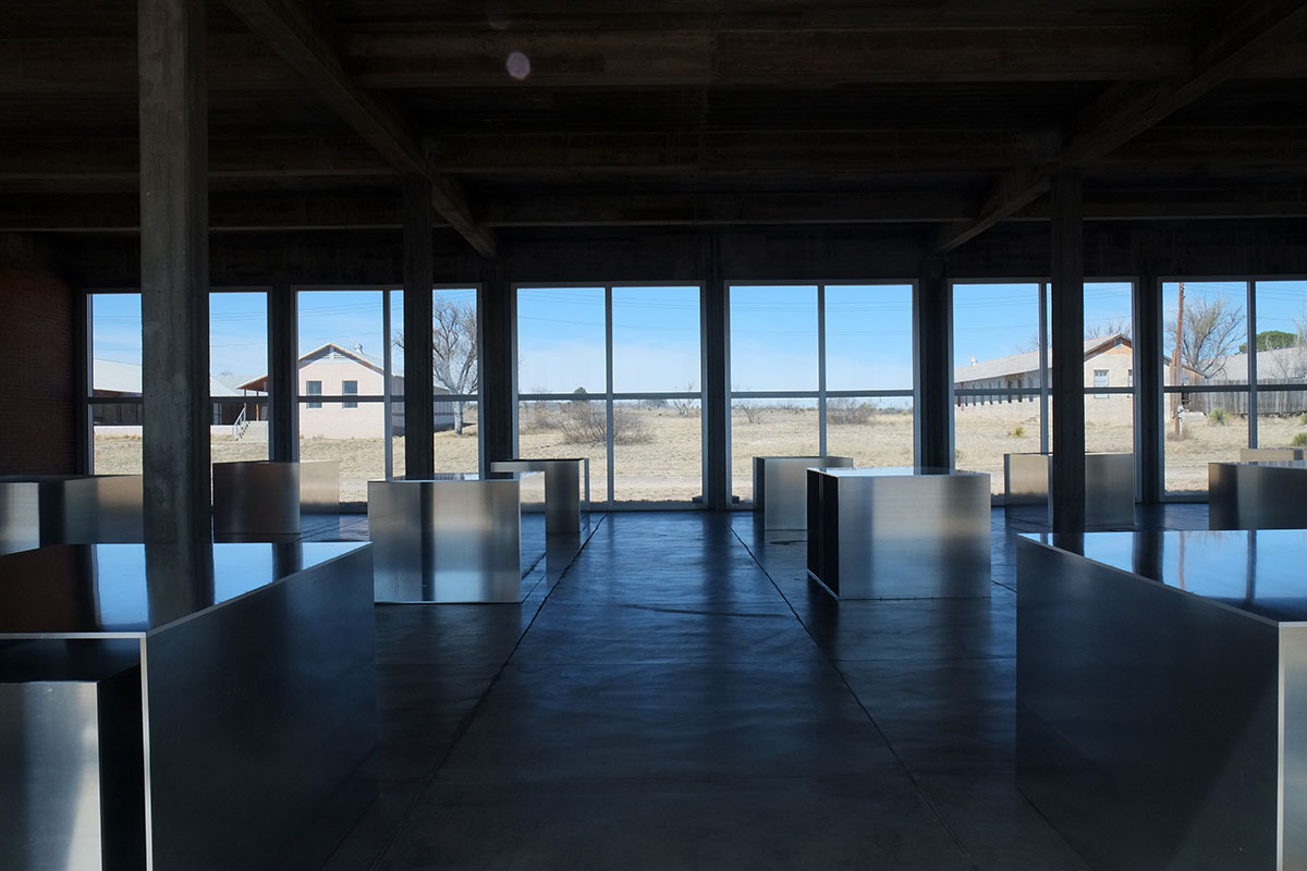
There are no labels on the walls – you pick up a spiral-bound booklet when you enter, and you can look up the origin, date and name of the numbered pieces (if known). In general I like this approach – as at the Judd museum in Marfa, it puts the emphasis on looking at the art, and not on reading about the art. However, there were a few pieces which could probably use a bit more explication.
But then there are the pieces you just really like, and don’t care that much when or where they are from. Like much great art, there is a direct and immediate appeal through the image itself, making interpretation or analysis unnecessary.
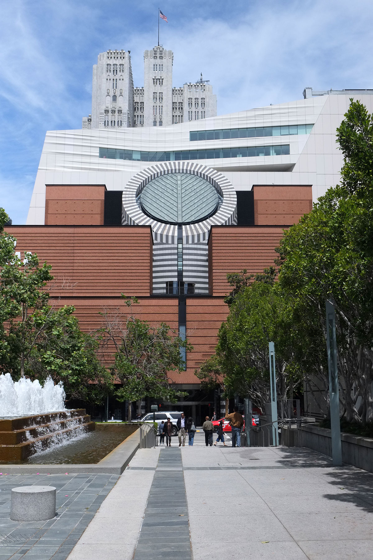
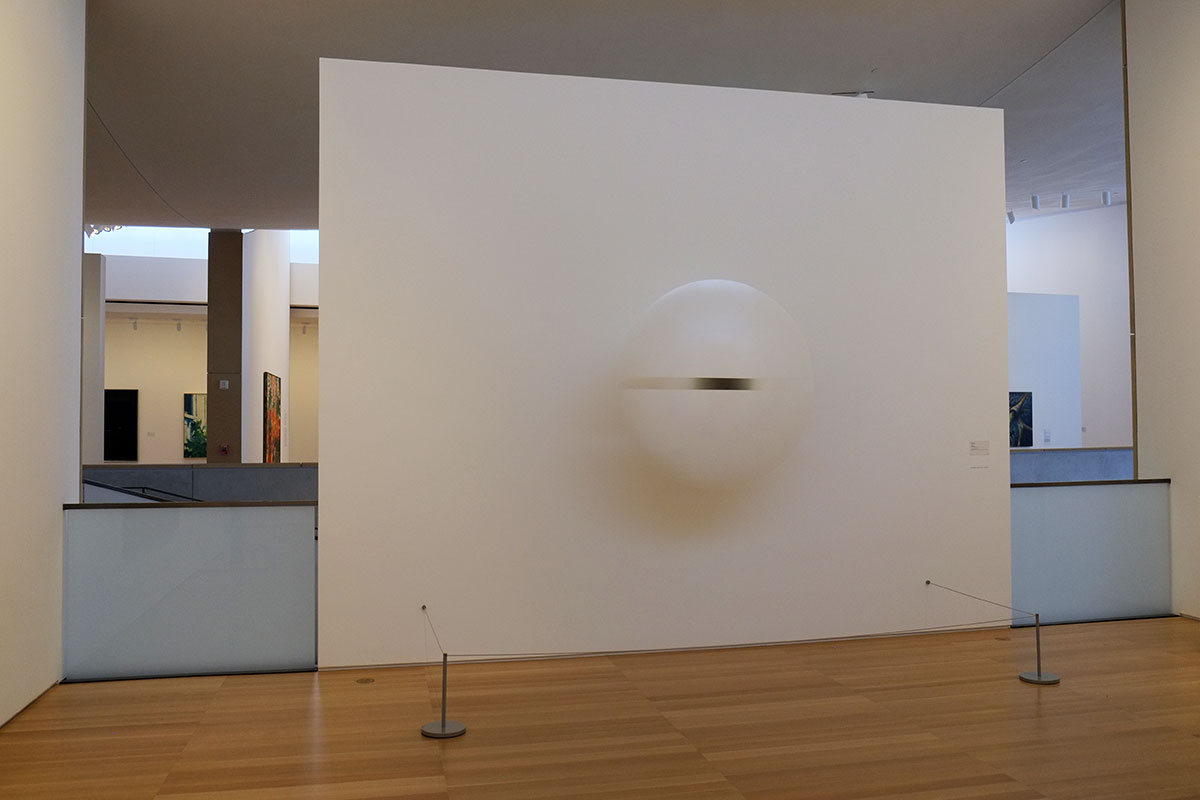
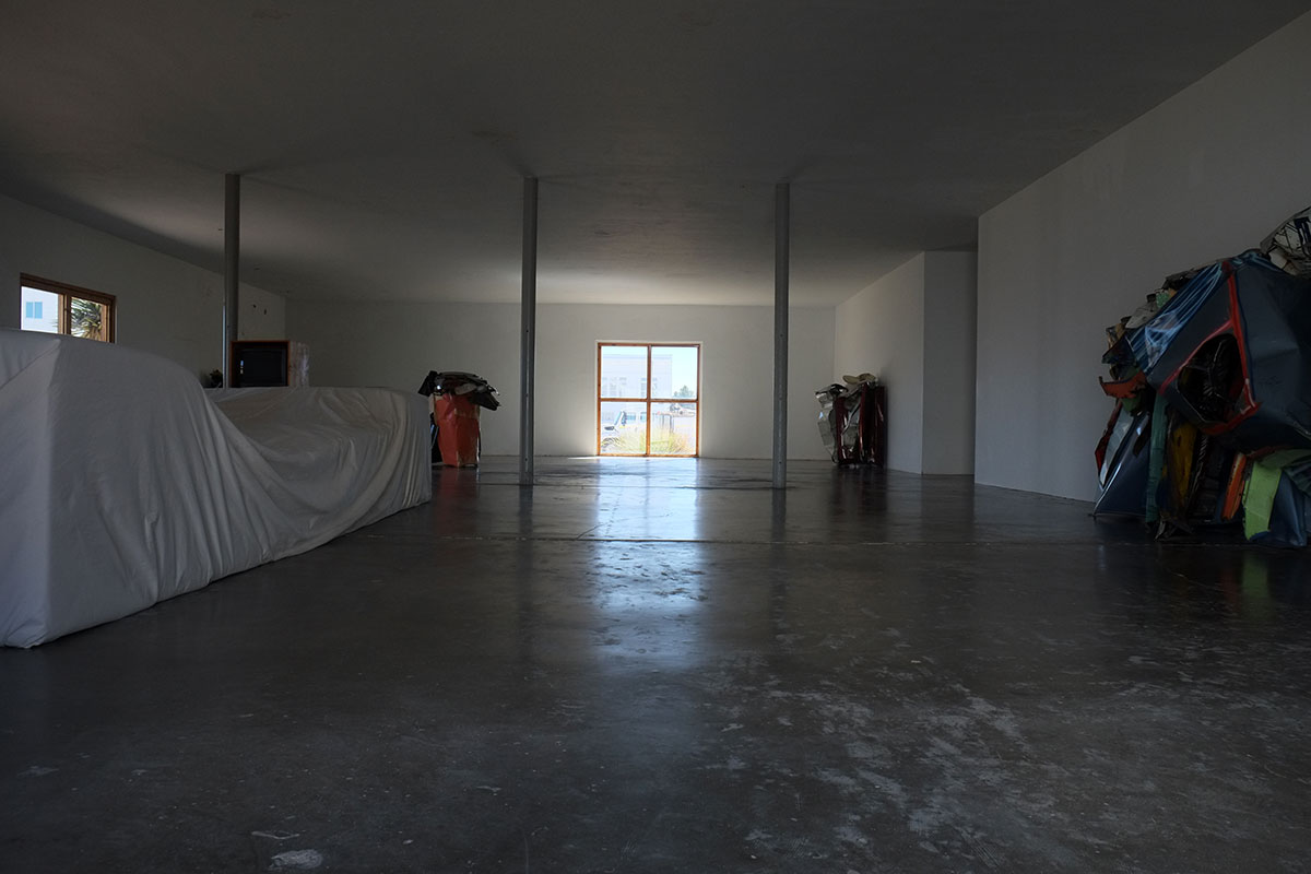
The contemporary art world appears at SITE Santa Fe, an arts center in the railyard district. It is a big warehouse building, seemingly designed by a succession of architects, and it has a history of working with well-known architects and designers to produce its installations. There were several installations in place when we visited, of which we understood about half, the other half being of the type where you’d have to read a long discursion on the history of the artist’s work and how this particular piece fit into that oeuvre and the current art scene in order to get it.
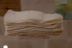
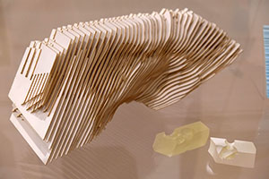
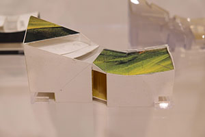
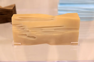
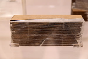
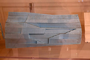
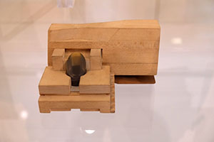
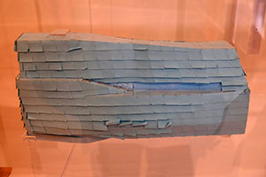
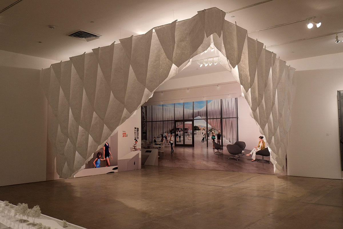
Much of the gallery was taken up with an exhibit about the New York-based design/build firm SHoP architects (which caused Greta to audibly moan when she realized she’d been sucked into architecture-world again.) The focus was on the materials, detailing and tectonics of their work (rather than completed buildings) and the ideas that have developed through their work could be traced in the parti models,
detail models, and full-size elements exhibited. SHOP has just designed an extensive remodel /addition for SITE, and the new entry piece was mocked-up full-scale in the gallery.
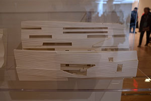
The design looks very good – keeping large, flexible gallery spaces, while inserting some special-use rooms, a courtyard and a stair to a rooftop terrace. Strong, abstract spatial organization, and much attention paid to materials and detailing.
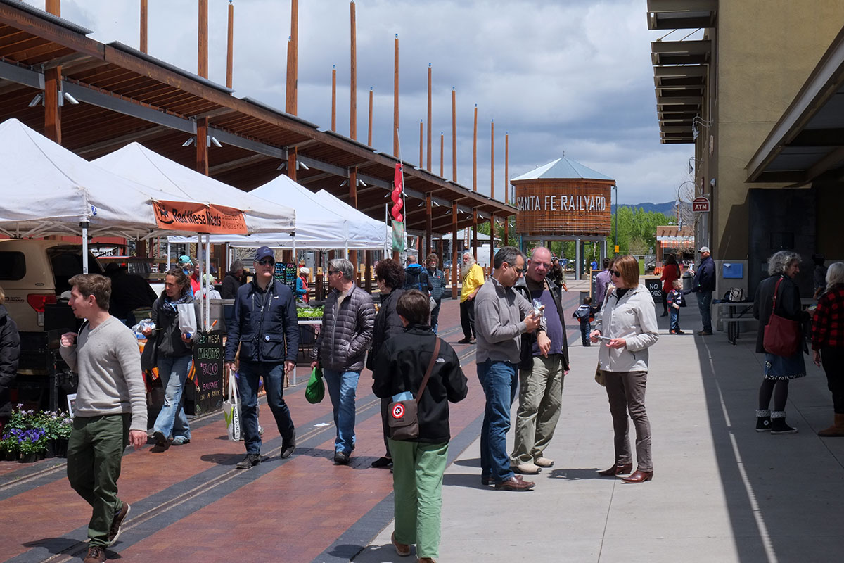
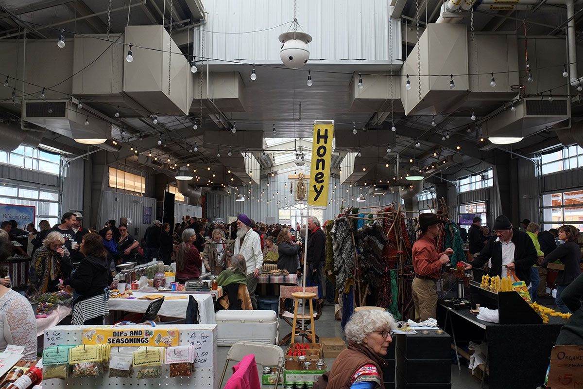
The railyard district is the one place in the center of Santa Fe where modern and industrial buildings are allowed, reasonably reflecting the historic character of that part of town and providing some relief from Adobe World. We went across the street from SITE to the Santa Fe Farmers market, and immediately felt that we’d stumbled into another one of those wormholes in the space/time continuum that we’ve been finding occasionally on the trip: we were clearly back in Eugene. It had the same range of organic foodstuffs, funky handcrafts (but with more turquoise), aging hippies (though better dressed), and new-age silliness that we were used to.
We did dig through all the turquoise and silver jewelry at the market to find something we knew Linda would like, a bowl formed from a mild steel sheet that had TIG-welded surface patterning applied and had then been formed in a hydraulic ram, by an artist who grew up on a farm in North Carolina and had then spent 20 years in Brooklyn. She said Bernie Sanders’s daughter is her best friend, and she’s been selling her bracelets online to raise campaign funds, at Bangles for Bernie.
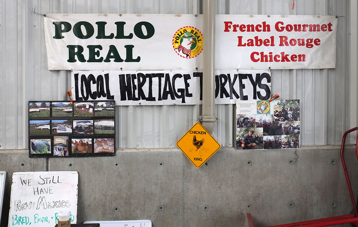
We’d never seen local heritage turkeys before in Eugene, but we probably could have. Only eating a green chile croissant grounded us back in Santa Fe.
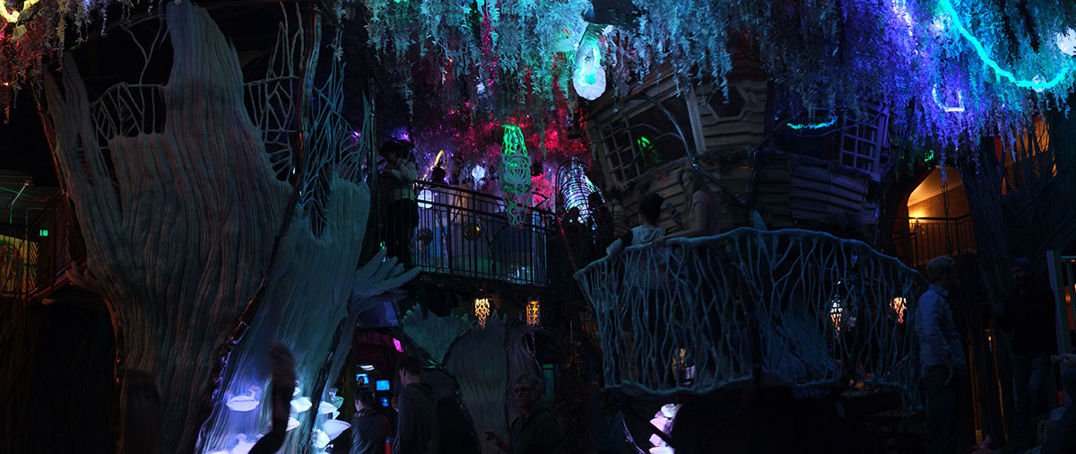
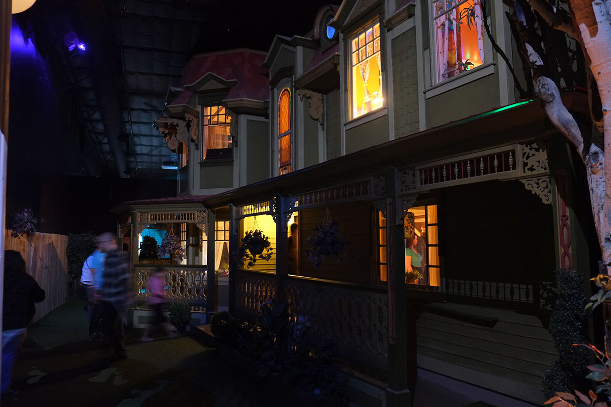
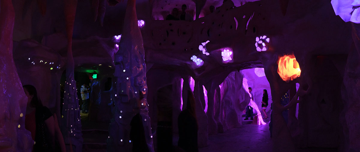
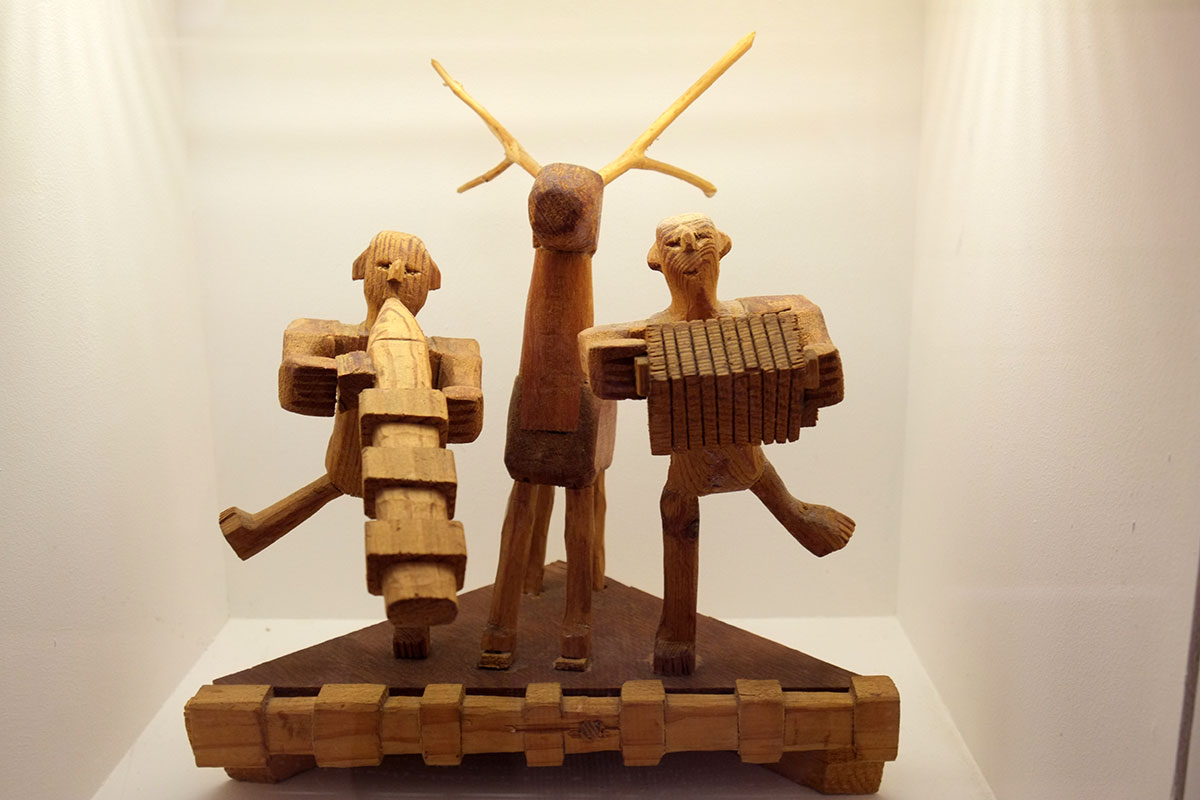
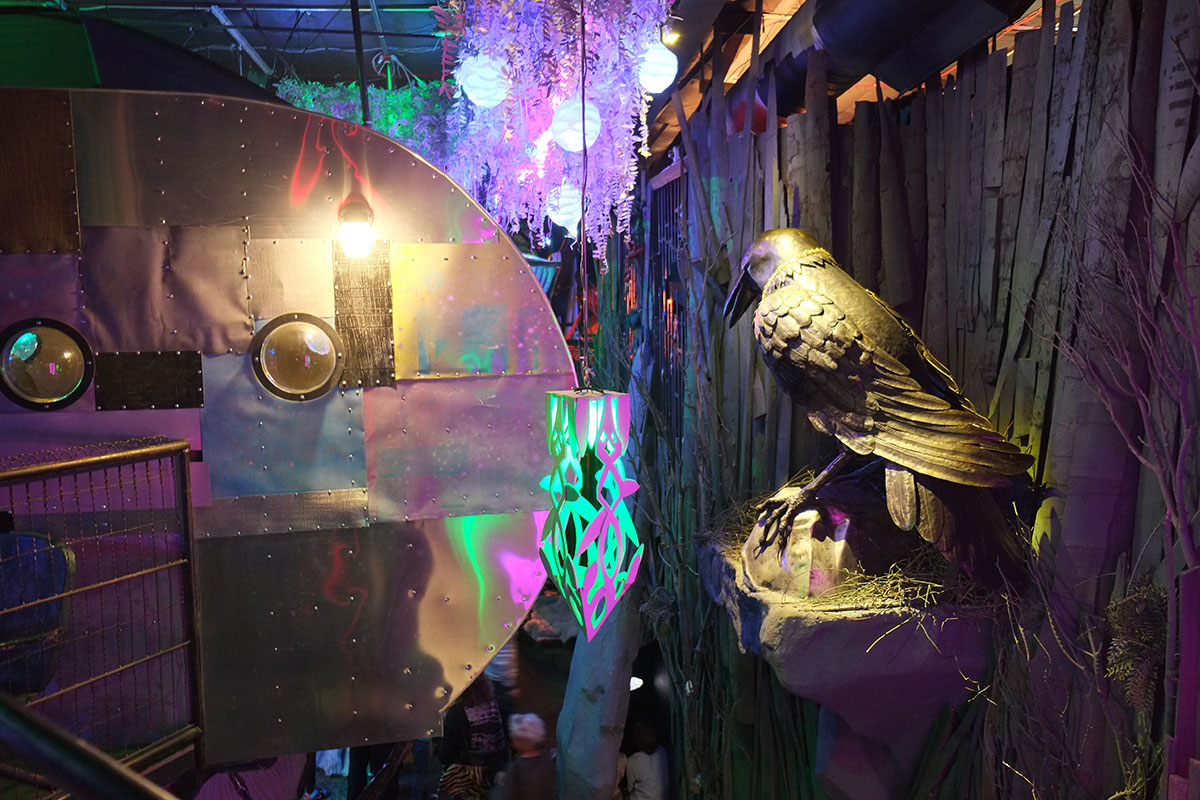
Continuing with the cosmic dislocation /art scene theme, we ventured to a new art space we’d heard about, the House of Eternal Return, a 20,000 square foot installation in a former bowling alley, produced by the local art collective, Meow Wolf, and funded by George RR Martin. Greta loved the whole afternoon we spent there and has blogged about it here.
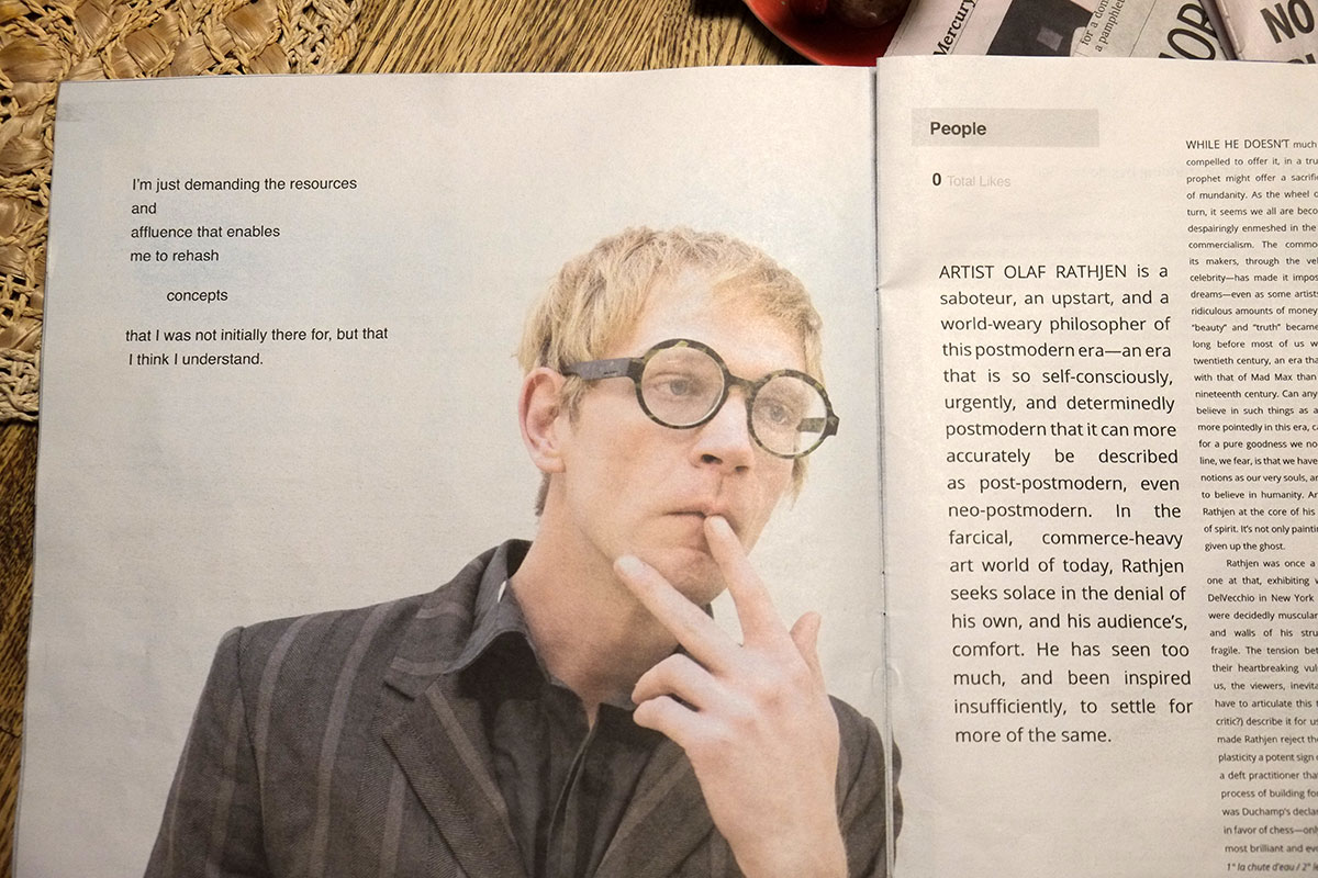
The project has a loose conceptual framework, upon which individual rooms and installations (probably by individual artists) have been hung. I enjoyed some of the installations, but found others to be of the overly obscure and self-referential variety, full of imagery that could only be meaningful to the artist. But I particularly liked the self-aware artist’s sensibility that showed through from time to time, as in this parody of a local alternative newspaper / arts section, where the interviewed artist states “I’m just demanding the resources and affluence that enables me to rehash concepts that I was not originally there for, but that I think I understand.”
I found it intermittently cool, but had to retreat outdoors a few times, suffering from dizziness probably caused by a combination of outgassing new materials, and recovered memories of too many Saturday afternoons spent at six-year-olds’ birthday parties in bowling alleys and paintball emporia.
For a small city, Santa Fe has an incredibly wide range of culture (high and middle-brow), places, activities, populations, and contradictions. It can feel overwhelmed by wealth from elsewhere, but at least here (compared to every other small wealthy place we’ve visited), that wealth has spawned some remarkably serious institutions, and not just an orgy of private consumption. There are art venues for the commercially successful, for the critically acclaimed, and for those who aspire to one or the other. We didn’t have time to visit all the museums, and we were in the wrong season to attend the noted opera, so we’ve got a few good reasons to return someday.
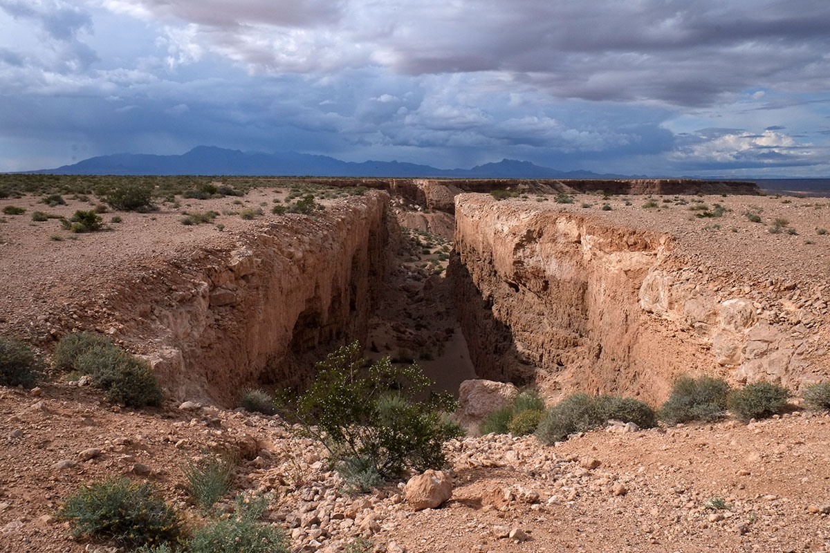
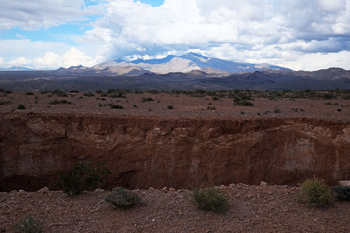
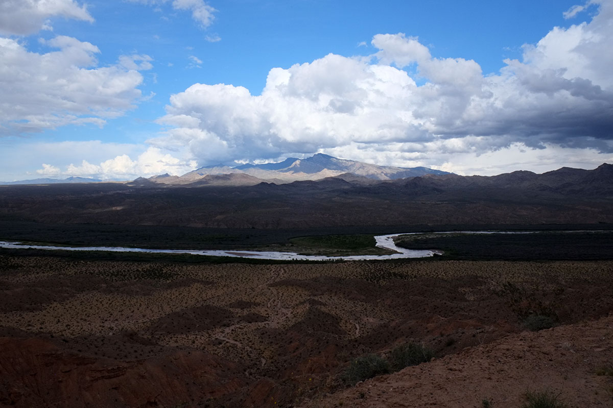
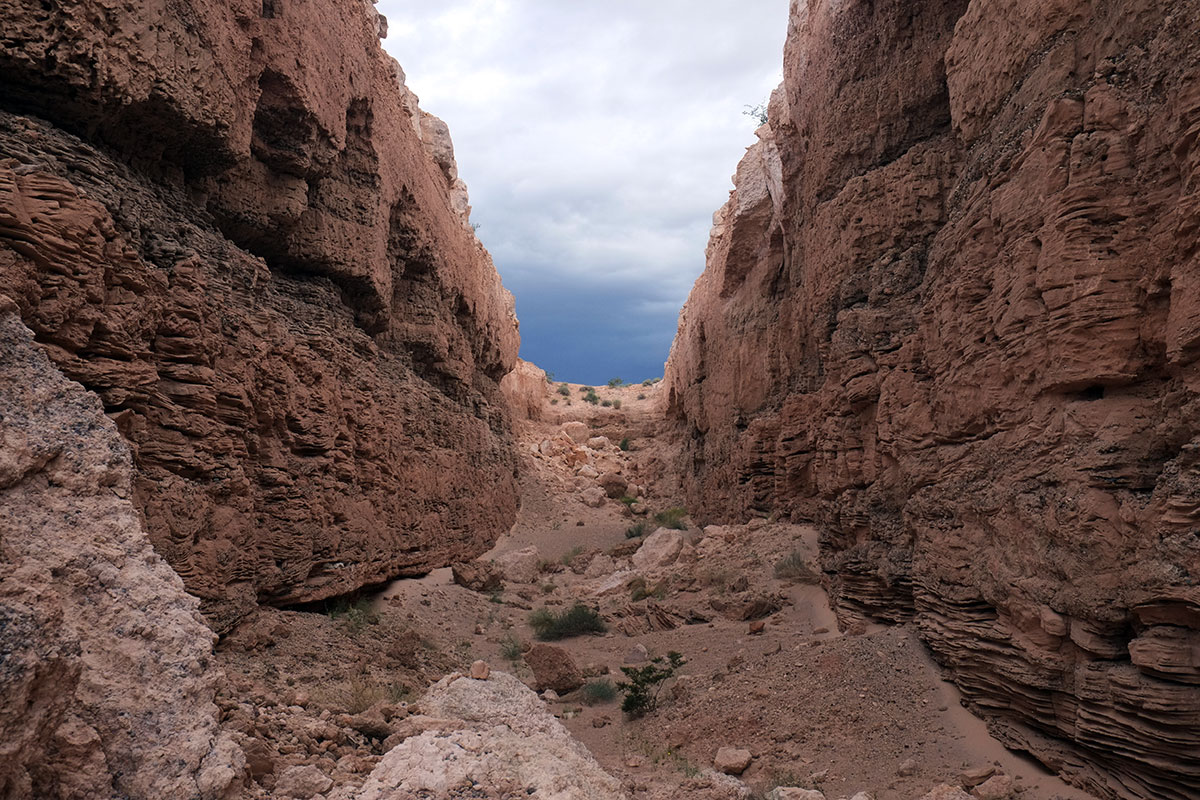
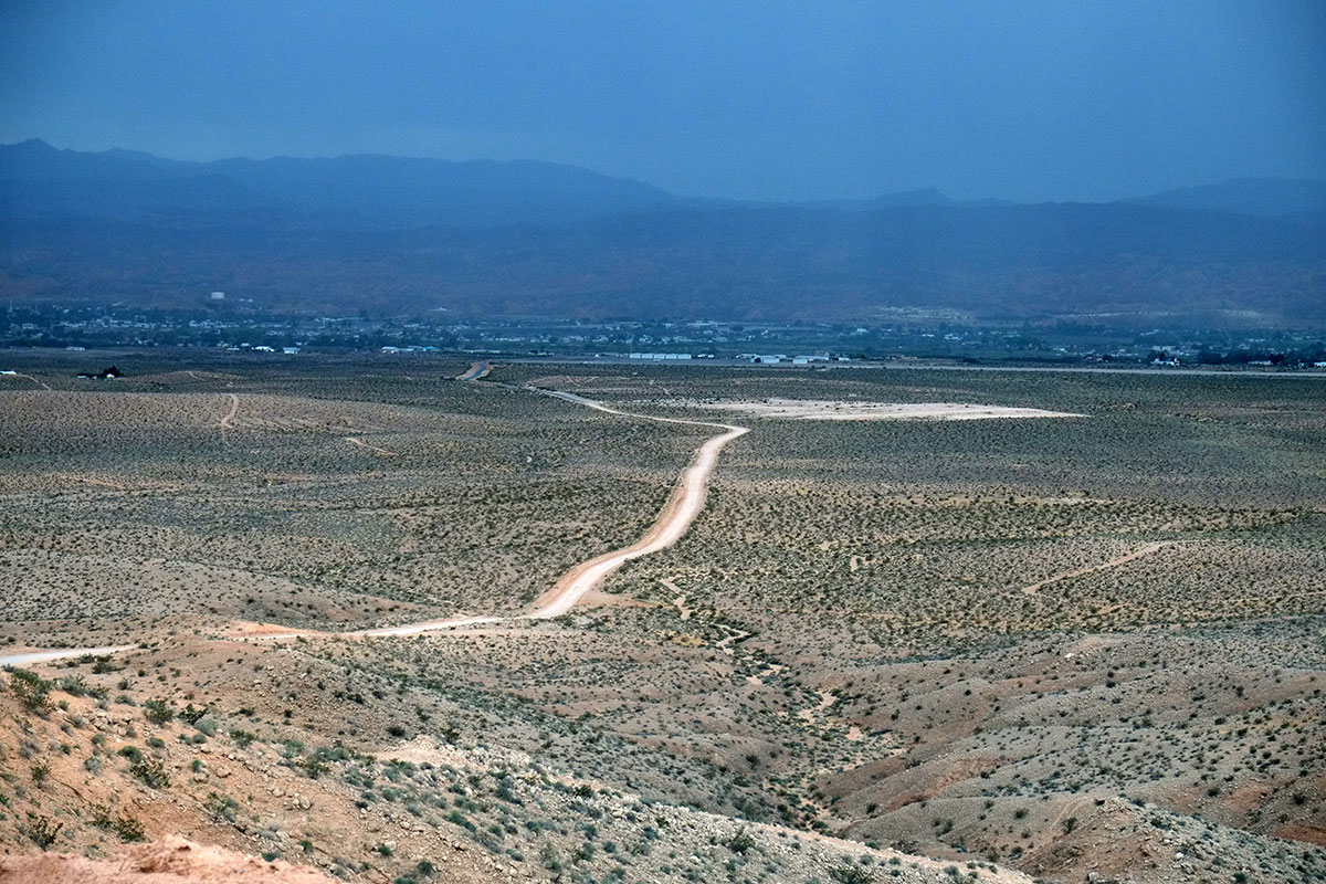
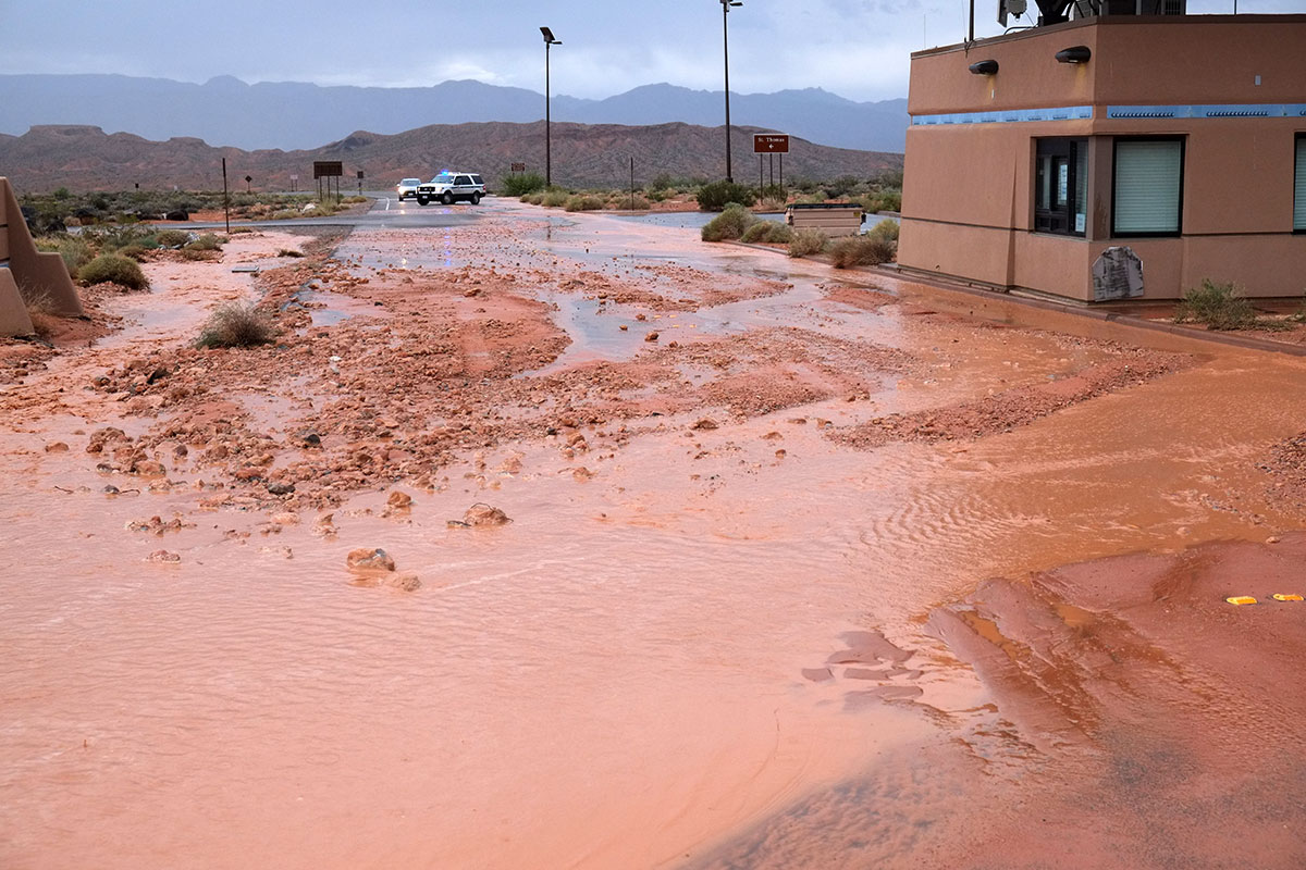
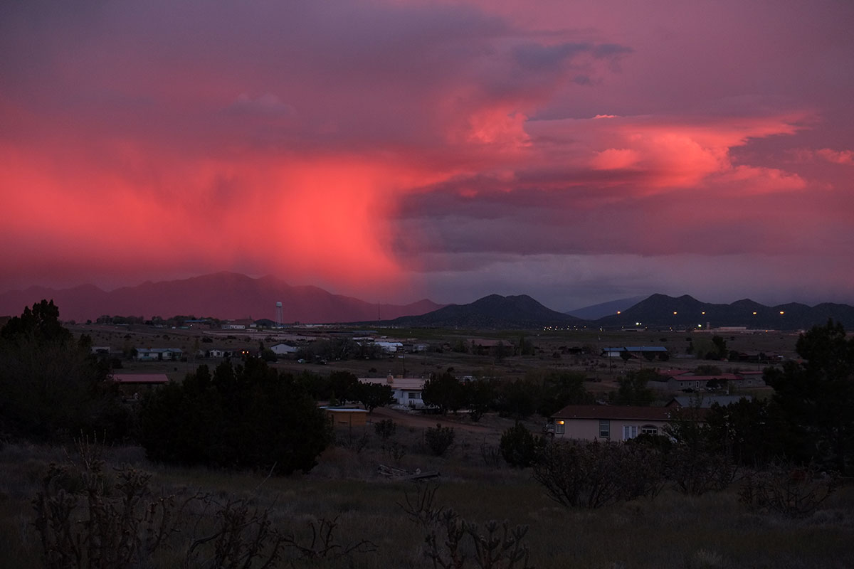
We ended up with a feeling similar to what we felt in Marfa – part of the attraction to the place was the official institutions, sights, art, culture, etc. But part of the attraction was just the weirdness and gestalt of the place – the genius loci, to be pretentious. I’m not sure how that came about in Santa Fe – the landscape is literally awesome and sometimes terrifying (as in this view southwards from our campground, of a distant thunderstorm that Greta was convinced was the Glow Cloud from Welcome to Nightvale),
but much of the rest of the environment is not mysterious at all, or unusual in its origins: the city was rationally planned and controlled throughout its development – it is not the product of deep ancestral roots, centuries of organic growth, and cultural blending. It attracted an economic and cultural elite, whose way of life has pretty much overwhelmed the local culture everywhere else it has touched down. It has many ridiculous aspects, such as pseudo-historical architecture and acres of pretentious art. It has a dense core, but everyone lives out in car-based suburban sprawl of varying degrees of interest. Somehow out of all that not-very-special background, a unique place has emerged, and it’s a lot more interesting, engaging, and worthwhile than I would have predicted.
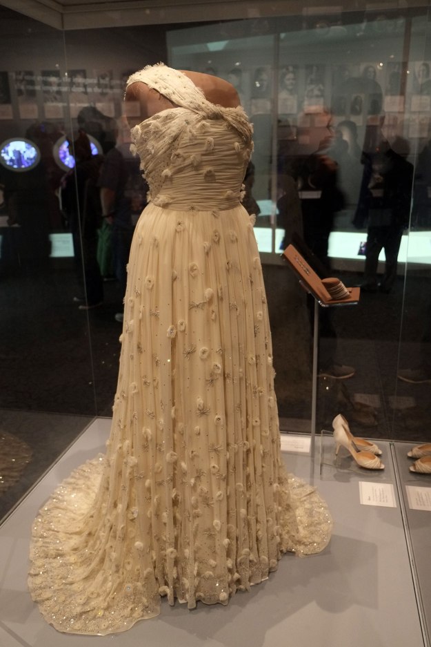 I thought Michele Obama’s was quite overdone, and much too sparkly where I liked the simple elegance of Nancy Reagan’s.
 I wonder if next year, the President’s Inaugural outfit will be added to the collection.
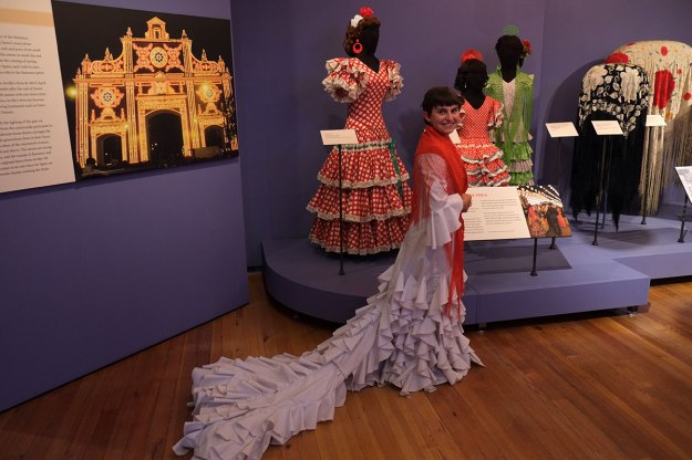
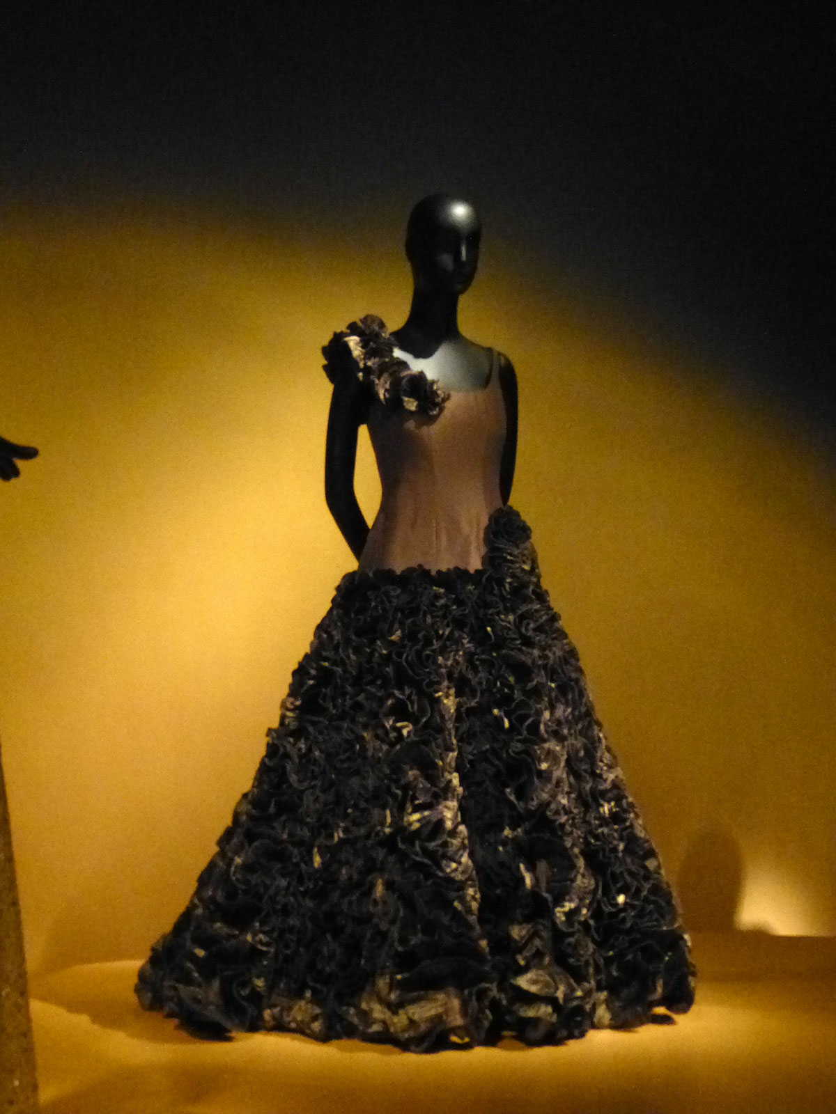
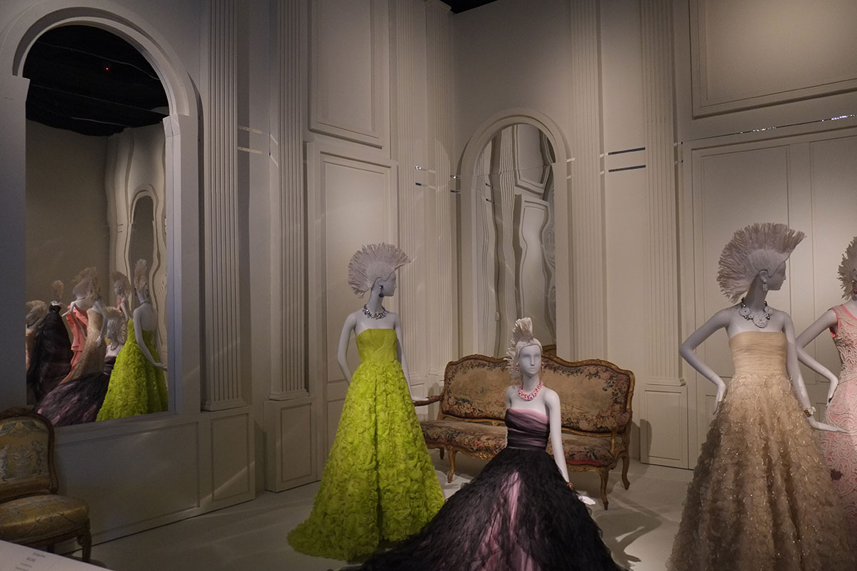
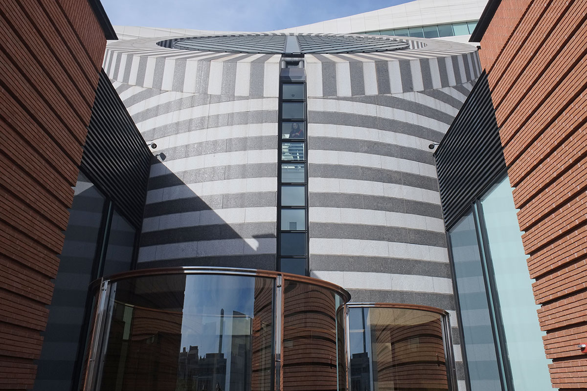
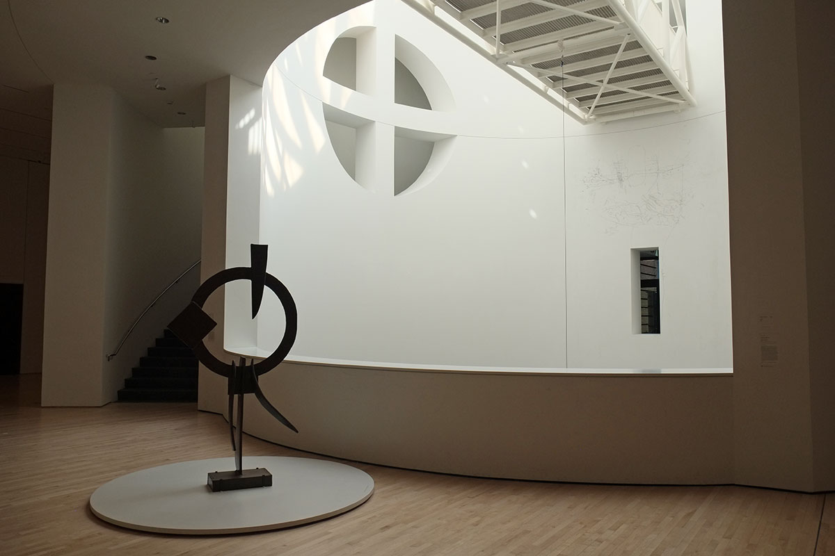
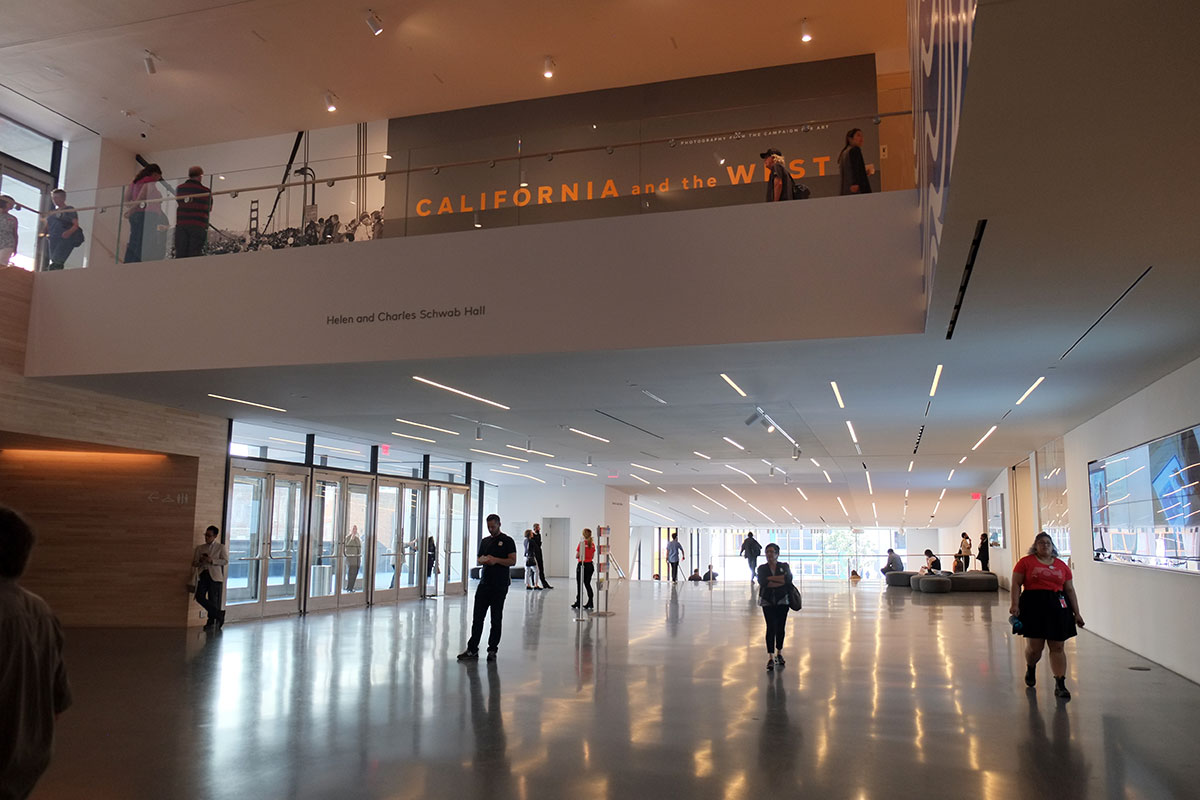
 By the time we reached California, I was beginning to acknowledge my newfound interest in fashion, so when the Oscar de la Renta Exhibit at the DeYoung in San Francisco was recommended to us, I was raring to go. It was especially praised for its exhibit design, which was truly exquisite. In the entry hall, wooden skyscrapers lent backdrops to what was considered everyday wear, though the plainest among the outfits would be sure to turn heads.
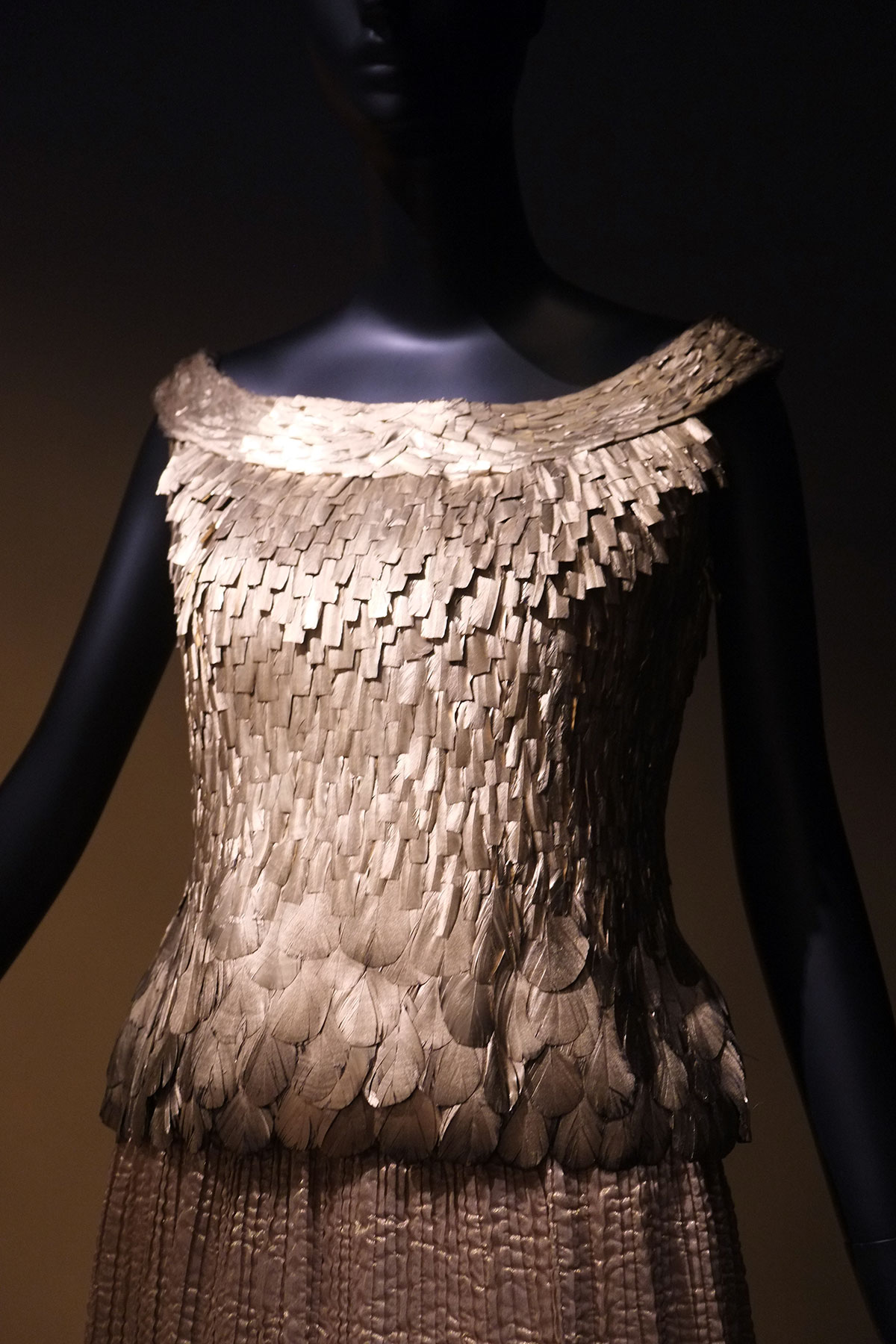
 The fabric layers were reminiscent of the scales on a butterfly’s wing, and part of me wondered whether I would rather have spent the hour in the science museum next door. Fashion may be a new passion, but it won’t outweigh my old interests.
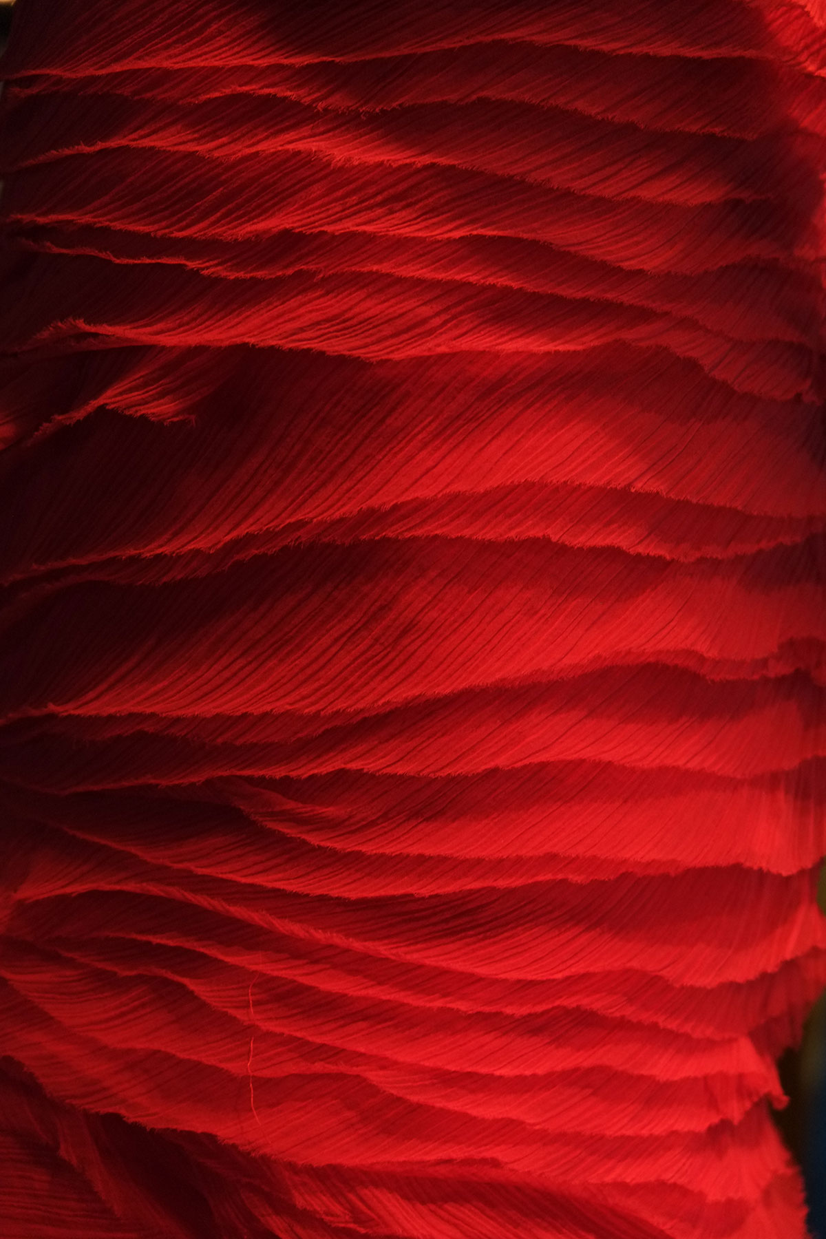


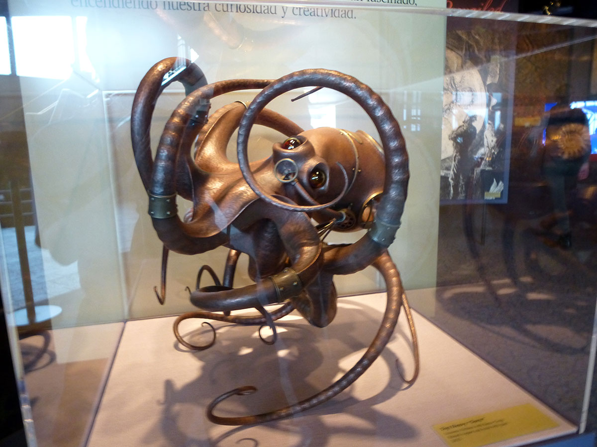


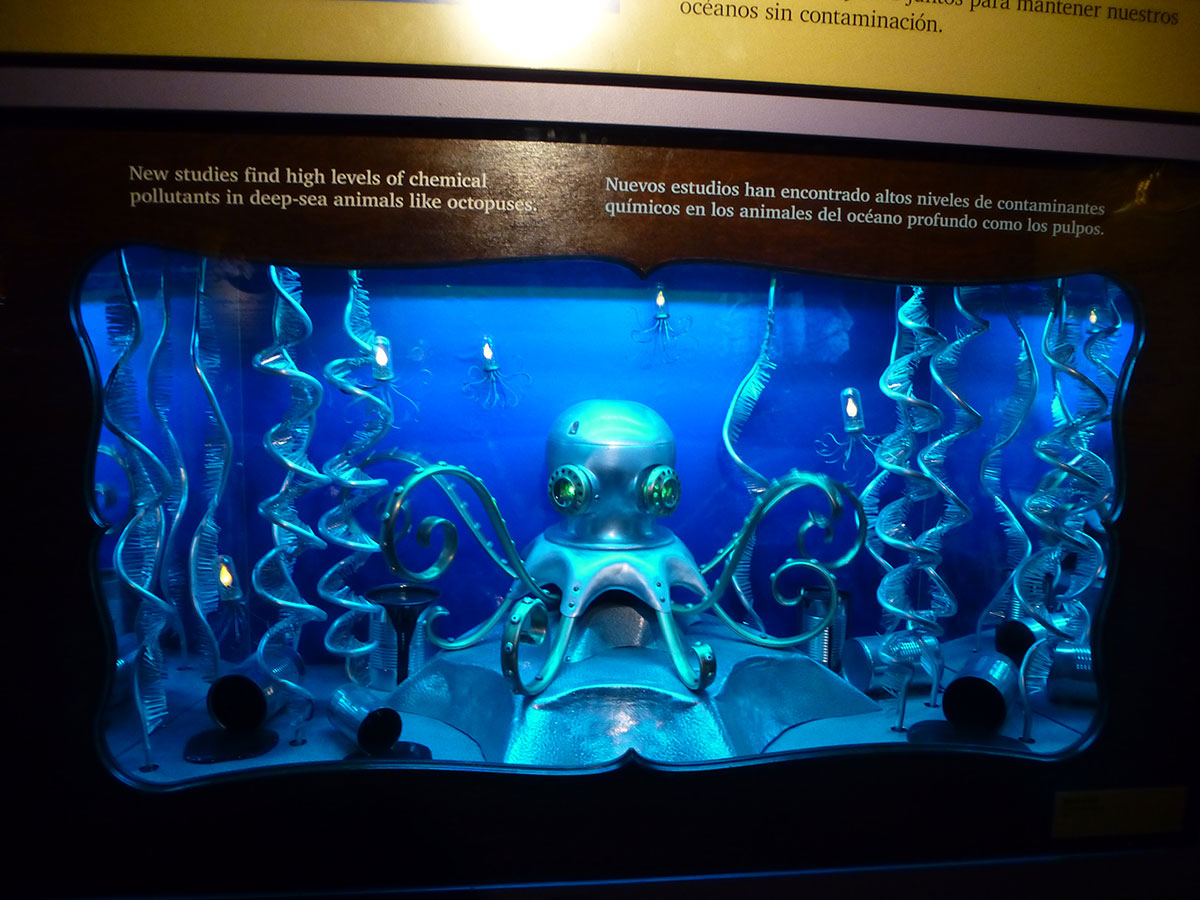
 Their eyes only added to the alien qualities, W-shaped pupils observing us as they wait patiently for the takeover.
  Flashing patterns can be used for communication, as well as hiding from predators andstunning potential prey, so it isn’t unreasonable to assume that cephalopods have an ocean-spanning network of spies and soldiers waiting to swarm into our cities when they flood.The most interesting things in the world are often also some of the scariest, and these ancient, plotting, shapeshifting buglers who can grow to enormous sizes are no exception. It’s no wonder to me that sailors feared the Kraken.


 Most of the animals in the exhibit showing how these giant water monsters evolved were found in the Southwestern United States, which was once covered by an inland sea. It was called the Western Interior Seaway, which provides backing to Keyes’s Law. “Anyone with the authority to name anything by definition lacks the creativity to call it something cool.”