All of Boston’s venerable museums have had major renovations since I lived there – the Museum of Fine Arts by Foster + Partners, and the Gardner and Harvard’s Fogg, by Renzo Piano. I couldn’t get to the Gardner, but I was able to see the other two in some depth. As I ended up as an art history major in college, I knew both of these museums down to the smallest detail, and so have a good baseline for comparison.
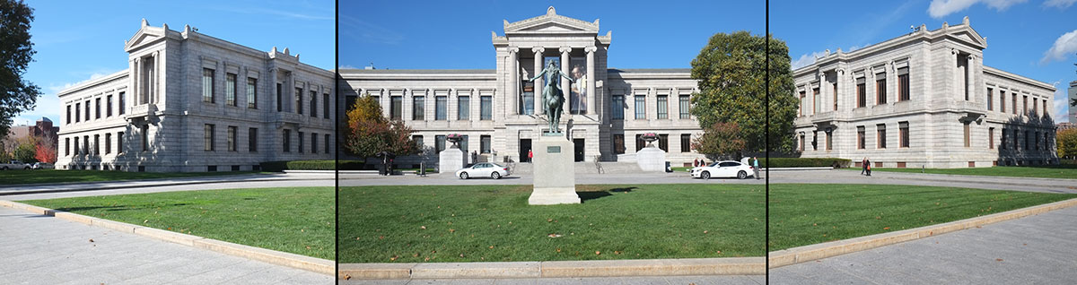
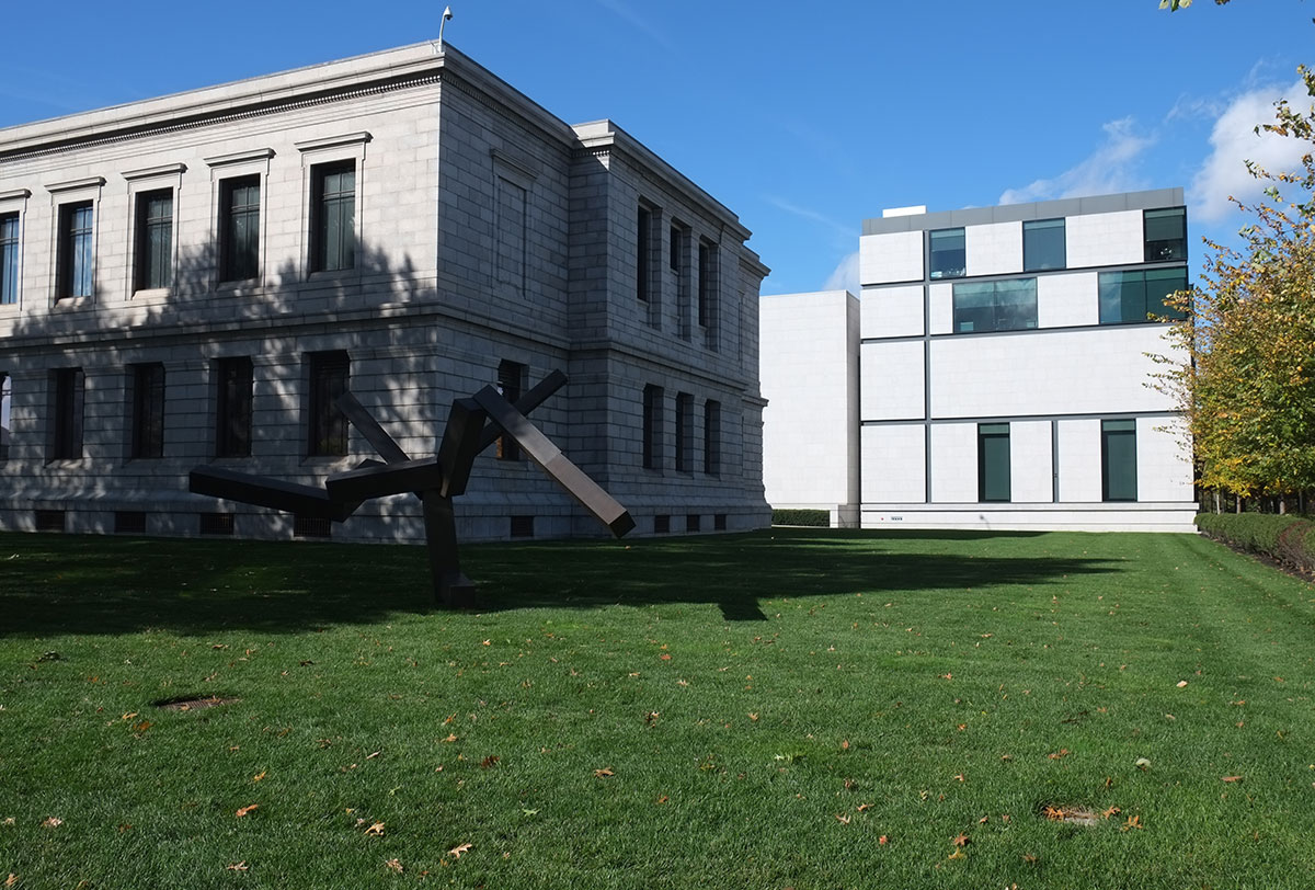
The most impressive thing about the Foster remodel of the MFA is that they didn’t mess up the original Beaux Arts building. In fact, they significantly improved the overall organization. IM Pei’s addition from the early 1980s had confused the plan, shifting the main entry to the southern side facing a parking lot, and demoting the Huntington Avenue entry on the central axis. The current state opens up this axis from Huntington back to the Fenway, and once again the building makes sense.
Pei’s addition is looking a little dated. There are some commodious spaces and good galleries, but the detailing seems overlay flat and gypsum-boardy. Mark Rylander just pointed out that the Pei buildings that are on the interface between late modernism and brutalism have worn better, with strong tectonic qualities (I had recently seen a good example of this at the Columbus Indiana library). The MFA wing is hiding all of its guts, covering all with a pure white surface.

As the wing has been repurposed, it now includes an innovation that should become standard in museums: inside the high-end restaurant, there is a bar, where I repaired for a little pick-me-up after a long, intense afternoon looking at art. Refreshed by the best Manhattan I’d had in six weeks, I spent the rest of the evening checking in with all the galleries. 
Foster’s addition includes administrative offices and a new wing for American art, which grow off the north end of the existing building. The exterior is an exercise in the current style – random variations within a grid. It’s very tight and crisp, with the solid/void relationships handled well.
The big move is a large glazed court/atrium set between two wings of the original building. It’s a huge space, with a scale that seems more like an exterior courtyard. There is a cafeteria set up, which was whisked away in the afternoon so the space could be used for an evening event. It connects the central axis of the museum with the entry to the new American wing, but is otherwise not accessible from the two flanking wings. It supplies a necessary function within the museum – a place of relief from the intensity of galleries, with light, space, and a way to let your focus wander. 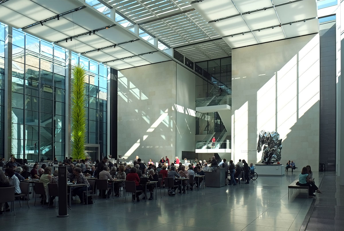
It reminded me of a modernist version the courtyard at the Nelson-Atkins in Kansas City.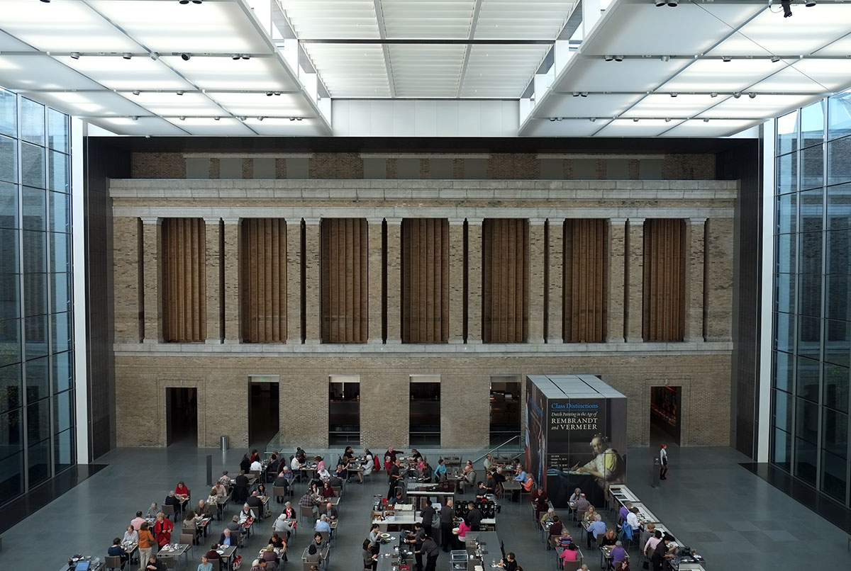

The big stair at the end of the atrium organizes the whole new wing. From some hallways on the sides you can see the clear differentiation between the old and the new.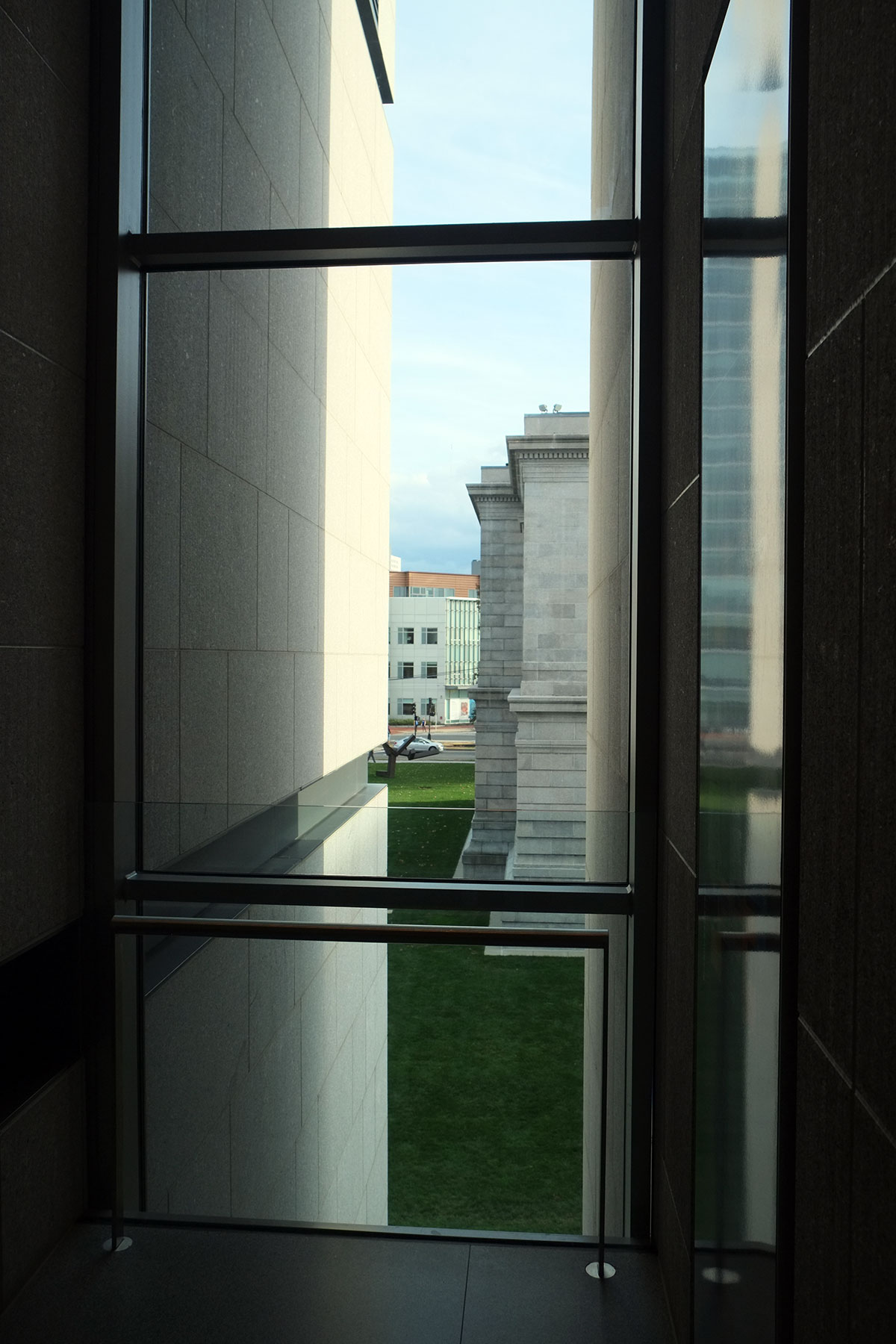
The new galleries are excellent – some are in the normal modernist vernacular of paintings floating on blank walls, but some are hung salon style, similar to 19th century practice. The light is controlled very well (the only mistake being the hanging of Sargent’s The Daughters of Edward Boit facing the atrium stair, where the glare makes it hard to see the dark painting). 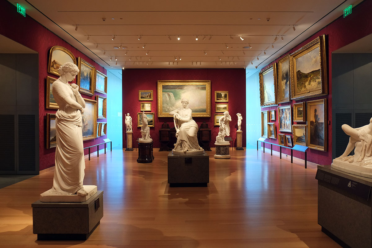
The gallery building is wrapped by a double-envelope / walkway on three sides. I’m not sure of the purpose of this – it has a few sculptures that can sit in the sunlight, but it seems like a lot of trouble for what it provides. 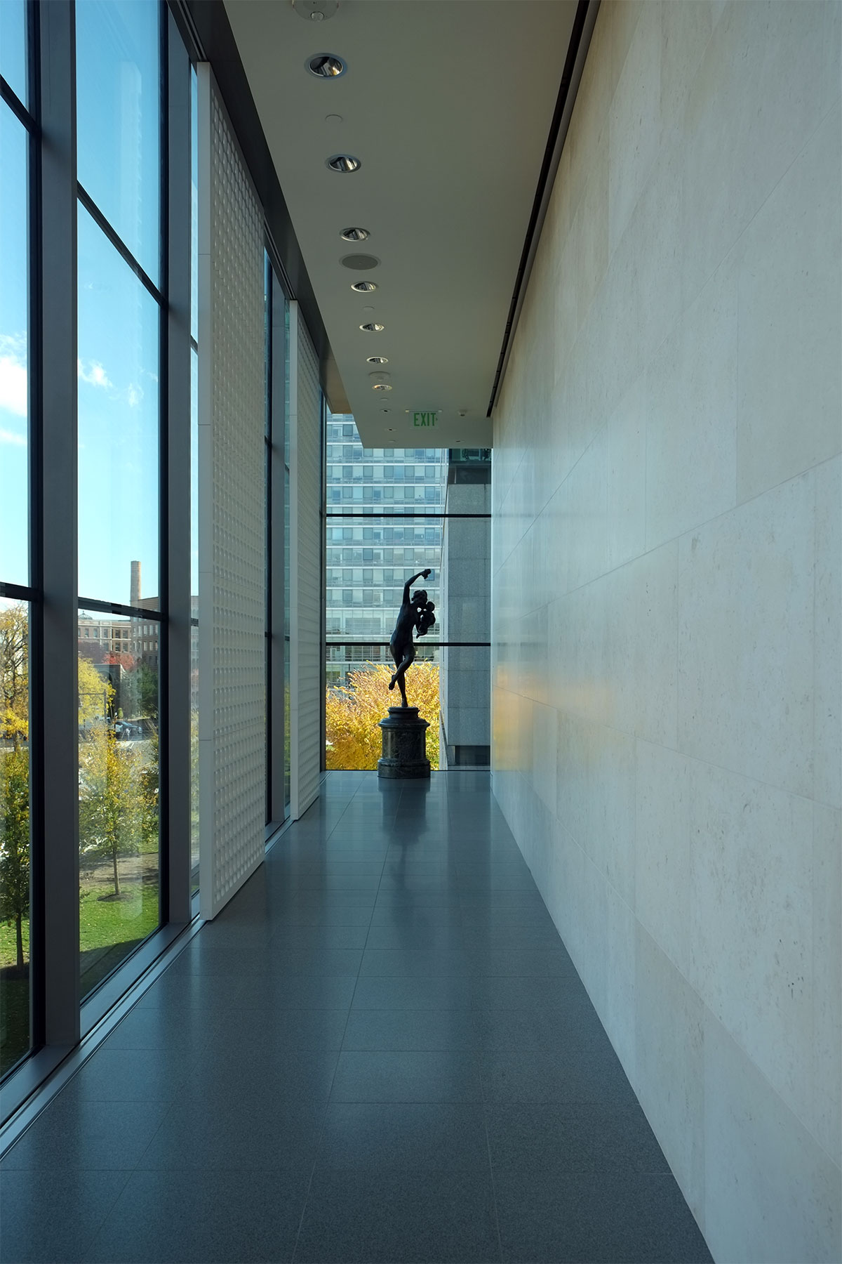
The top floor galleries are skylit, working very well for the large modernist work there.
Overall, it’s a very successful, sensitive and simple remodel. It seems more like a Piano building than a Foster.
Which brings us to the Piano building at Harvard. It is more than an addition to the Fogg. The Fogg used to house galleries, classrooms, the art history department (which they call Fine Arts, just to confuse people), and the art history library. Now the departmental spaces have moved over to the Stirling building across the street, and the collections from the Sackler and the Busch Reisinger have been consolidated, so it is now called the Harvard Art Museums, and is a much larger museum with an art study center.
From the street, the juxtaposition is striking, and not bad at all. Let’s face it, the large flat wall of the Fogg went beyond the limits to which Georgian should be pushed, and the addition provides a much higher degree of articulation which reads well.
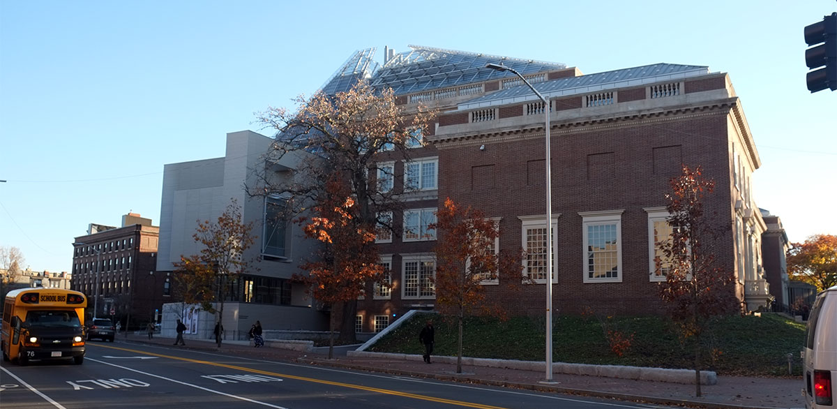
The reveal between the two is clear, while the big new roof ties them together. 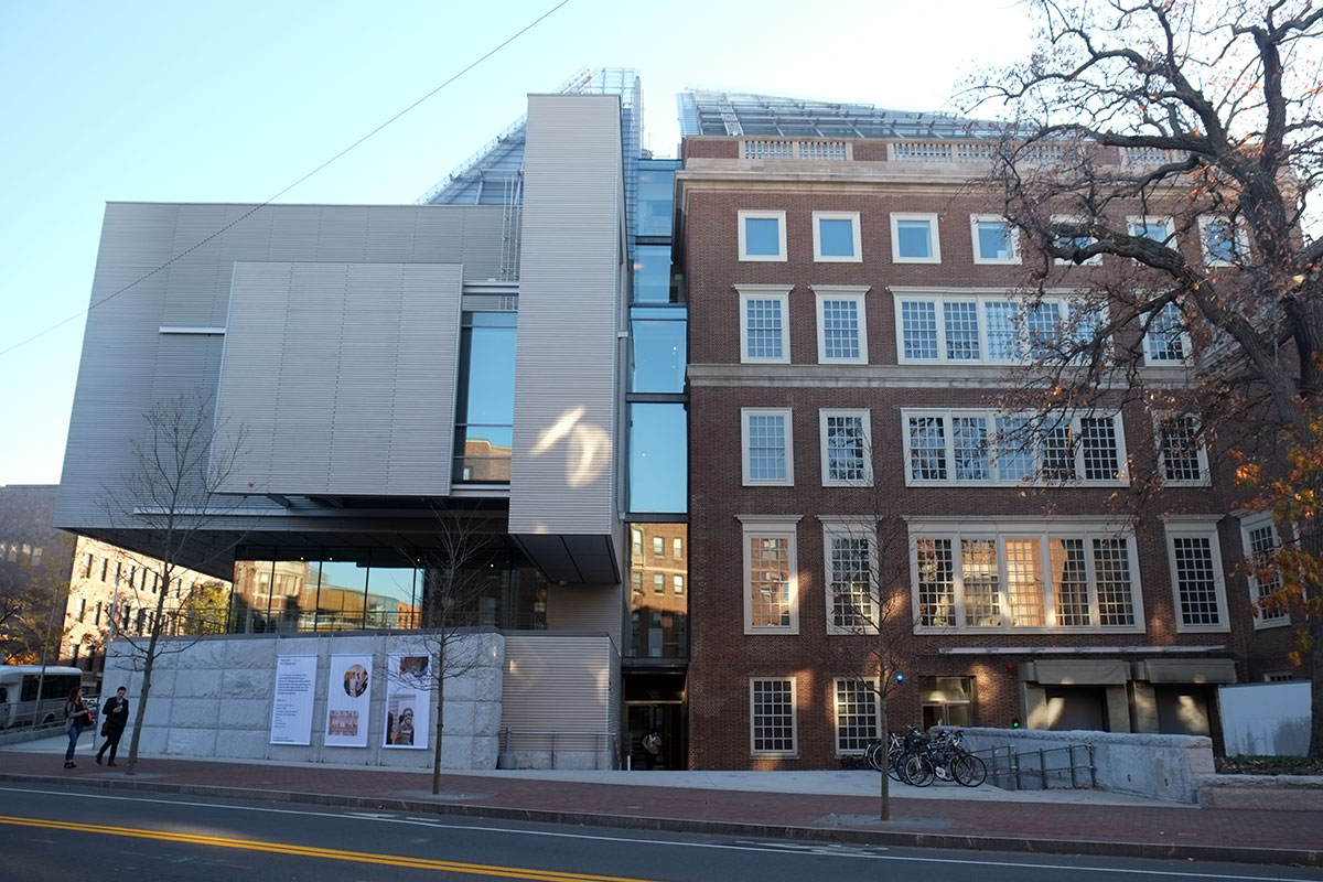
The Prescott St. corner is massive but pleasing. A wood(!) screen wall above a stone base. Robert Campbell thinks the base is clunky and not necessary, and I’m inclined to agree with him. 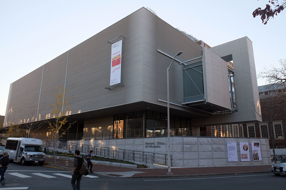
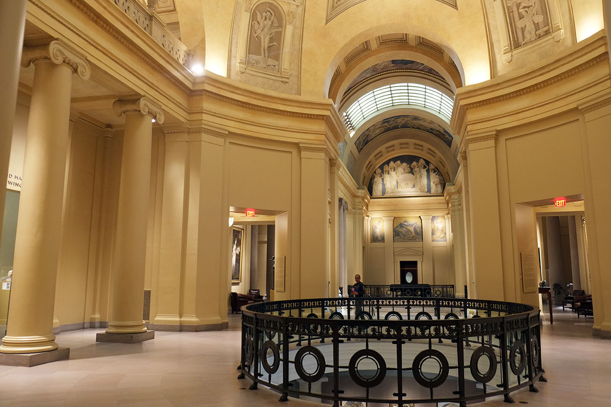
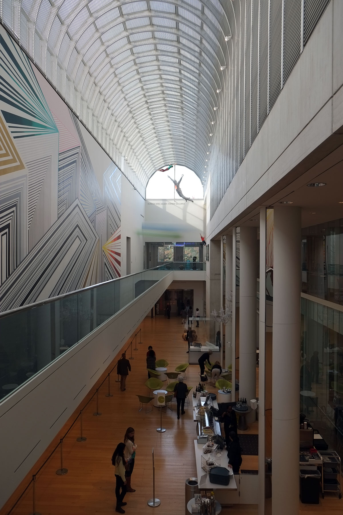
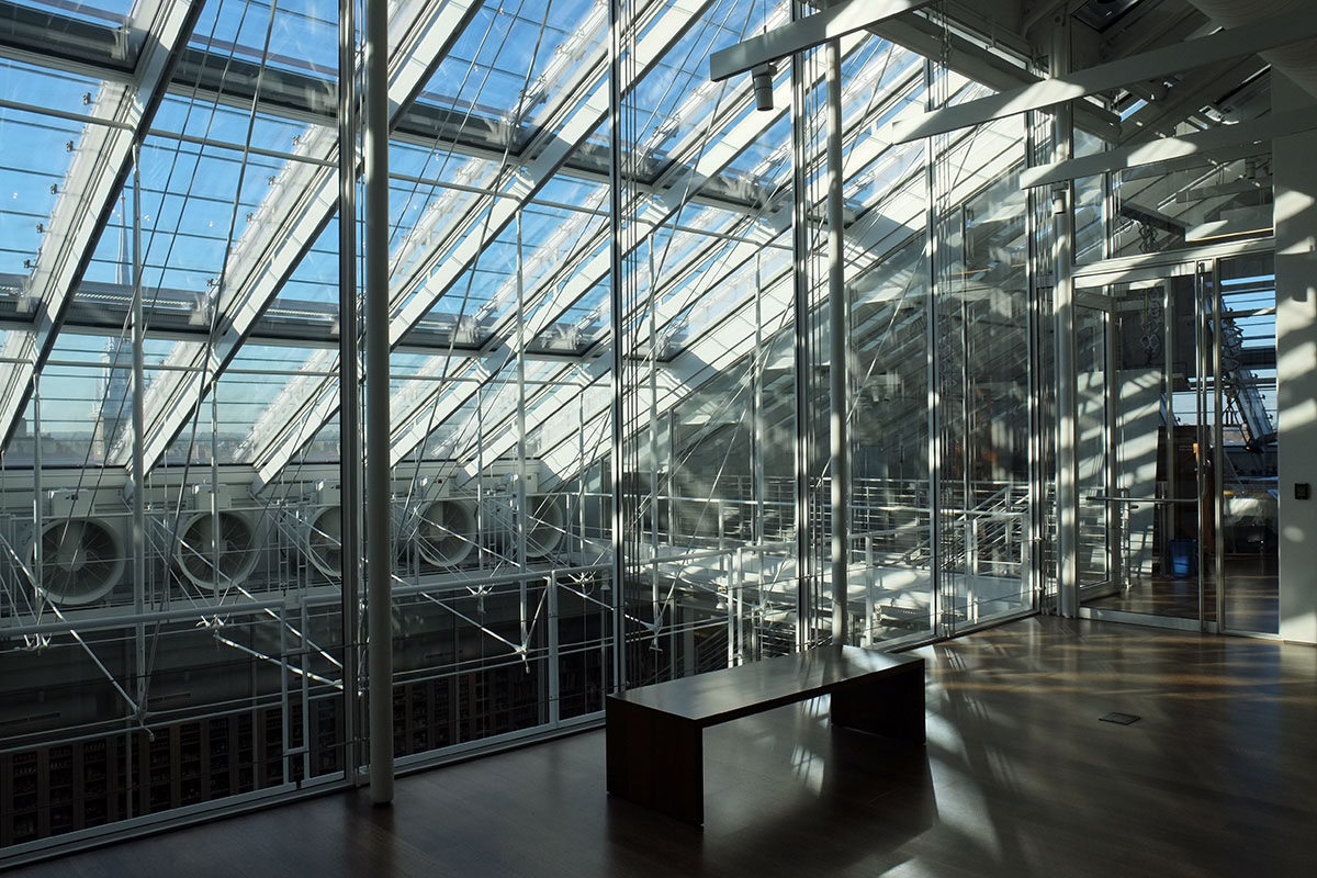
The big move is the central atrium. The Fogg had two levels of a Renaissance palazzo court, with a third attic story with small windows on a hallway. Piano always seems to respect these Beaux Arts schemes (such as at the California Academy of Sciences) and he does so here. The big question is how do you keep this parti, while doubling the height of the building, without making it a dark shaft. The masonry at the third level was removed, and that becomes the start of a glass curtain wall addition, exquisitely detailed. 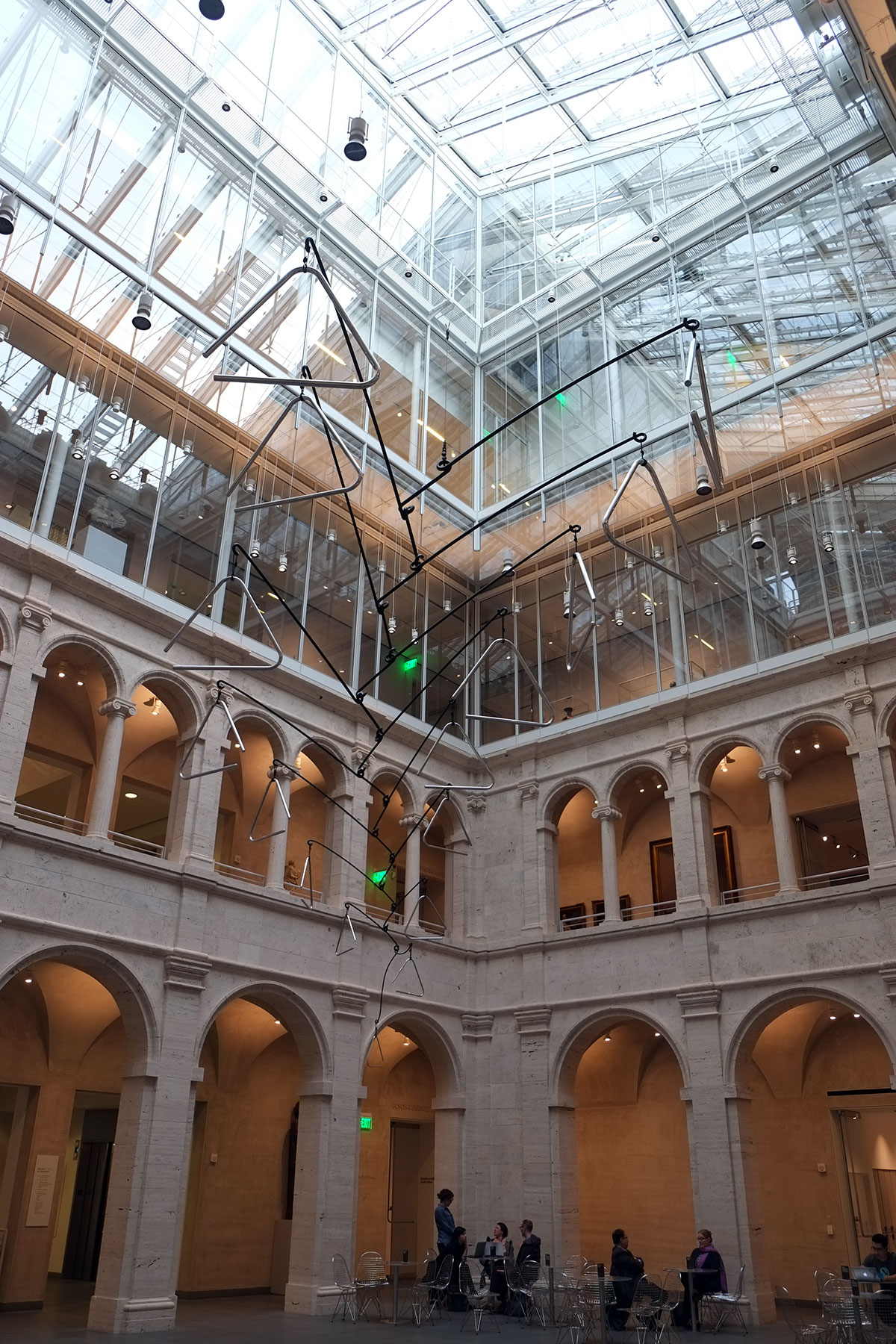
The third floor gallery circulation had been one of my favorite spaces – you got glimpses into the court through the small windows, as you were surrounded by pre-Raphaelite paintings on your way to class. It was fine, but I like the new corridors much better. Similar to the double envelope at the MFA, sculpture that can be in strong light is located here, with paintings set back in shielded galleries. 
The galleries are less spectacular, just plain rooms with track lighting. I think this quality is due more to the layout of the original Fogg – the footprint is not big, and these rooms are simply fit in. The circulation scheme relieves any possible claustrophobia – you’re not caught in an endless warren of galleries (as sometimes happens at MOMA), but can readily jump back to the atrium for light and space.
There are new galleries which pop through the solid wall of the museum and engage the streetscape. These also house sculpture, and the contrast with the painting galleries is strong. 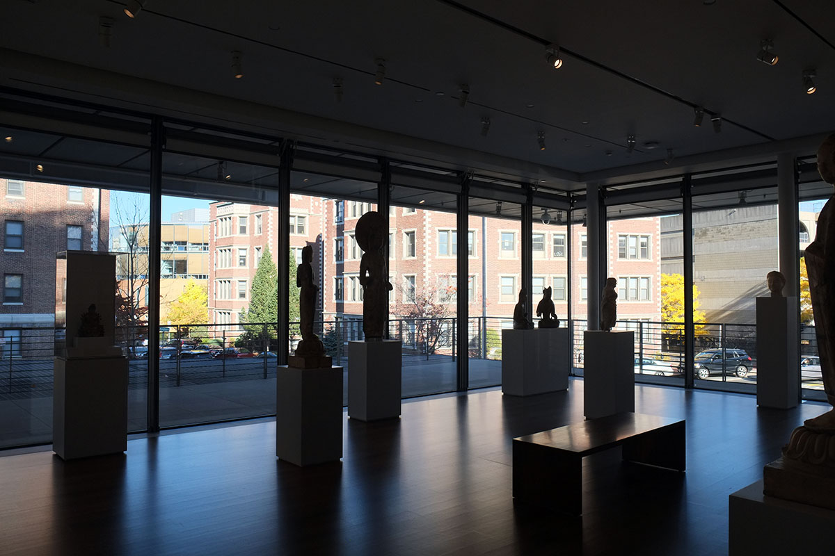

These also provide an excuse for the massively articulated, movable shading devices on the exterior. I’m not sure all of this was necessary; perhaps as with Foster’s double envelope, the alleged function just provides an excuse for doing something which looks really cool. 
On the fourth and fifth floors there is the conservation space and an art study center, with rooms which van be reserved so items in storage can be retrieved and examined.

There are quite a few big rooms like this, only one of which I saw being used. I asked about excessive daylighting, with its attendant glare and damage to art work, and was told that there are multiple levels of automatic and controllable shading devices in place. The rooms are beautiful, with great views of the city, but again I’m not convinced that this over-the-top high tech approach couldn’t have been accomplished with simpler and more passive techniques. 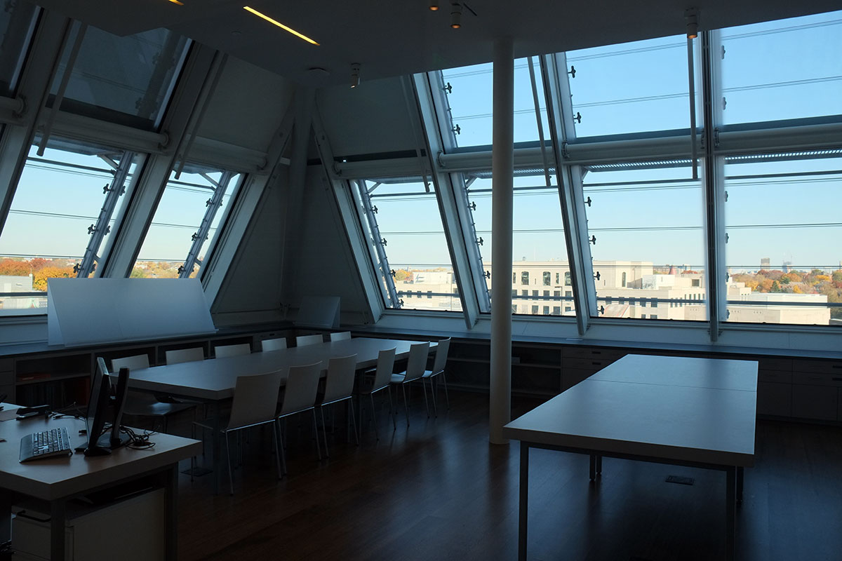
The relationship to th Carpenter Center is great. I’m not sure, but I think the whole Gwathmey Siegel remodel must have just been throw away. 
The ramp now plugs into the rear entrance to the museum.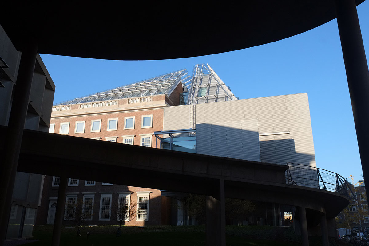
The top floor is an homage to Piano-tech (not to be confused with Pinakothek). The curtain wall starts at the third level, in a fairly simple manner, but it seems to accumulate more and more little metal pieces as it ascends, and the top is a high-tech apotheosis. At this point I don’t care if it is at all necessary – the dematerialization of structure, the play of light, the modularity and repetition, the transparency, it is all just gorgeous. No one can detail like Piano, and it’s nice when he’s able to just run amok.
But I did find one embarrassing detail: I asked the brick what it wanted to be, and it said, an infill panel on an access door!
i’ve liked every Piano museum addition I’ve seen, mainly for their good sense, simple partis, contextual sensitivity, attention to the demands of the art and exquisite detailing, but in this museum, the architectural experience of the atrium is the dominant element. I found myself returning to it again and again, just to enjoy the light and the tectonics. It’s a very different museum from the one I knew, but the sensual and intellectual pleasure of the space more than made up for my displaced nostalgia.

