Category Archives: architecture

Radburn, New Jersey

DSCF5178There are iconic buildings and places that everyone knows, but remarkably few people have actually visited.  In my lectures I try to stick to places where I have been, as the understanding one has of a place is greatly inferior if your whole knowledge of it comes only from books or media.  However, there are some places that are so important that you need to present them even if you’ve never seen them.  Radburn is such a place, one that I show to my students constantly, so actually seeing it was on the top of my list for this trip (even though I knew it would drive Greta crazy).  And I’m happy to say that it was an even better place than I expected it to be.

Planned communities, and planned suburbs, grew in importance and influence in the 19th and early 20th century.  A radical change came with the spread of the automobile to the middle class – how could the built environment cope with the spatial and organizational demands of cars?  Corbu’s various schemes pointed in one direction, but a more realistic and thoughtful approach was taken by progressive designers in the 20s.  Clarence Stein and Henry Wright collaborated on many important developments (such as Sunnyside in Queens), but Radburn laid out a new model for organizing suburban developments to emphasize community, safety and privacy.

The basic premise was that pedestrian and car circulation should be separated, with the dwelling units situated between the two.  Children should be able to walk or bike safely around the neighborhood, and all the way to school, without having to cross a street.  It sounds difficult and expensive, but the solution turned out to be affordable and at a remarkably high density.  And like all great solutions, it was also elegant and beautiful.

The through streets in Radburn that connect to the larger street system are for cars only.  Notice that they have no sidewalks – they don’t need them.  Some houses enfront these streets, and they have modestly-scaled yet formal front yards.  DSCF5187

They look like village roads, although in the site plan below, they look quite large in comparison to everything else. site

Branching off these streets are the dead end streets for accessing the houses – courts, cul-de-sacs, whatever.  They are even smaller, and allow for car access to driveways and a small amount of on-street parking.DSCF5189

Units have their front doors on these streets, with a small yard setback for privacy, and driveways long enough for one car.DSCF5165

Some of the house are detached, and some are semi-detached (duplexes or two-family houses, depending on which coast you live on).  DSCF5170

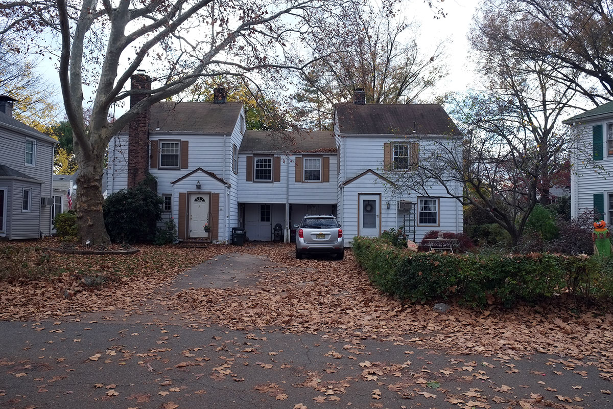
There are carports and garages between the units.  At the end of the cul-de-sac, a sort of court is created, with detached houses tucked into the corners.DSCF5166

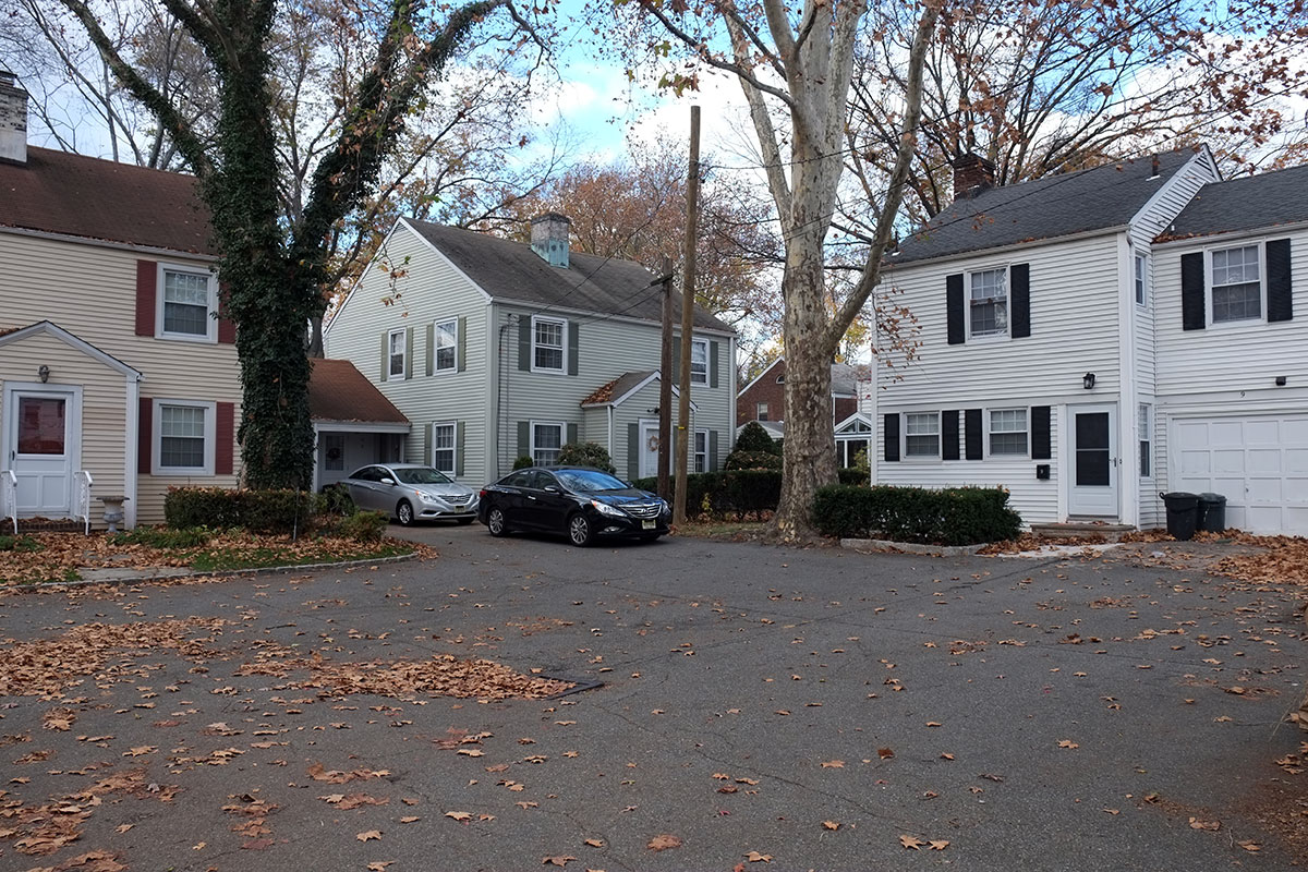
it is a remarkably efficient solution to the parking demands, and one that still seems to function well, almost 100 years later.cluster

The next innovation is that on the other side of the houses, across pleasant backyards, there is a narrow pedestrian path that provides access from all houses to the common outdoor space.  These pedestrian paths are really quite agreeable – you can look into your neighbors’ backyards, but it’s not a large enough space where one would linger (although small children would probably find them to be a great environment for exploration).  This pedestrian path idea was later used by Duany and Plater-Zyberk in their design for Seaside, Florida.  DSCF5232

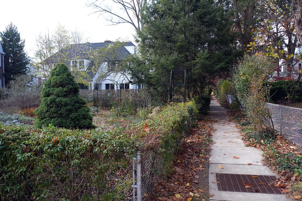
These paths connect out to a beautiful large field, where gatherings can be held, and games can be played.  DSCF5242

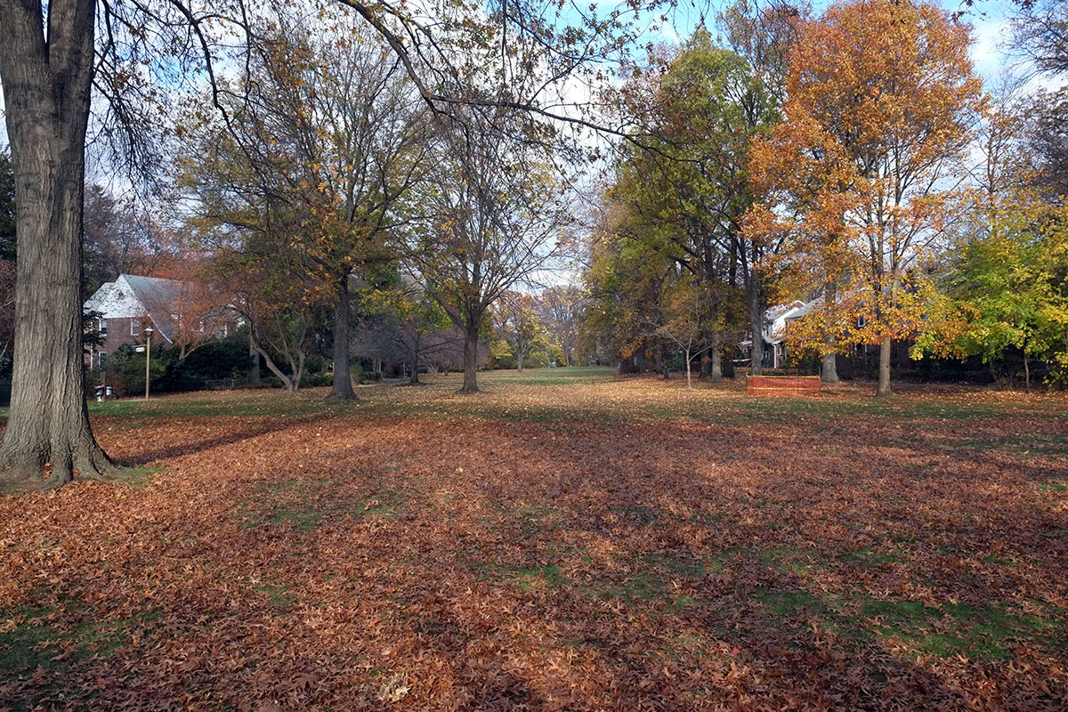
The paths connect to the field between houses.DSCF5230

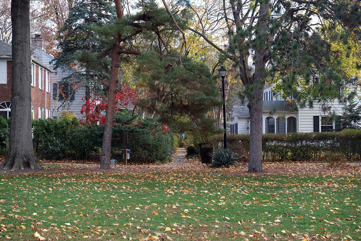
There is actually another path system which doesn’t show up on the site plans – it runs parallel to the large common, one house in from it, and so connects the parking court and the pedestrian path systems.  I don’t know whether it was a later design revision, or whether it evolved organically, but it provides another layer of complexity and connection on the property.DSCF5240

The pathways on the common connect all the houses, and converge on tunnels beneath the through roads,DSCF5203

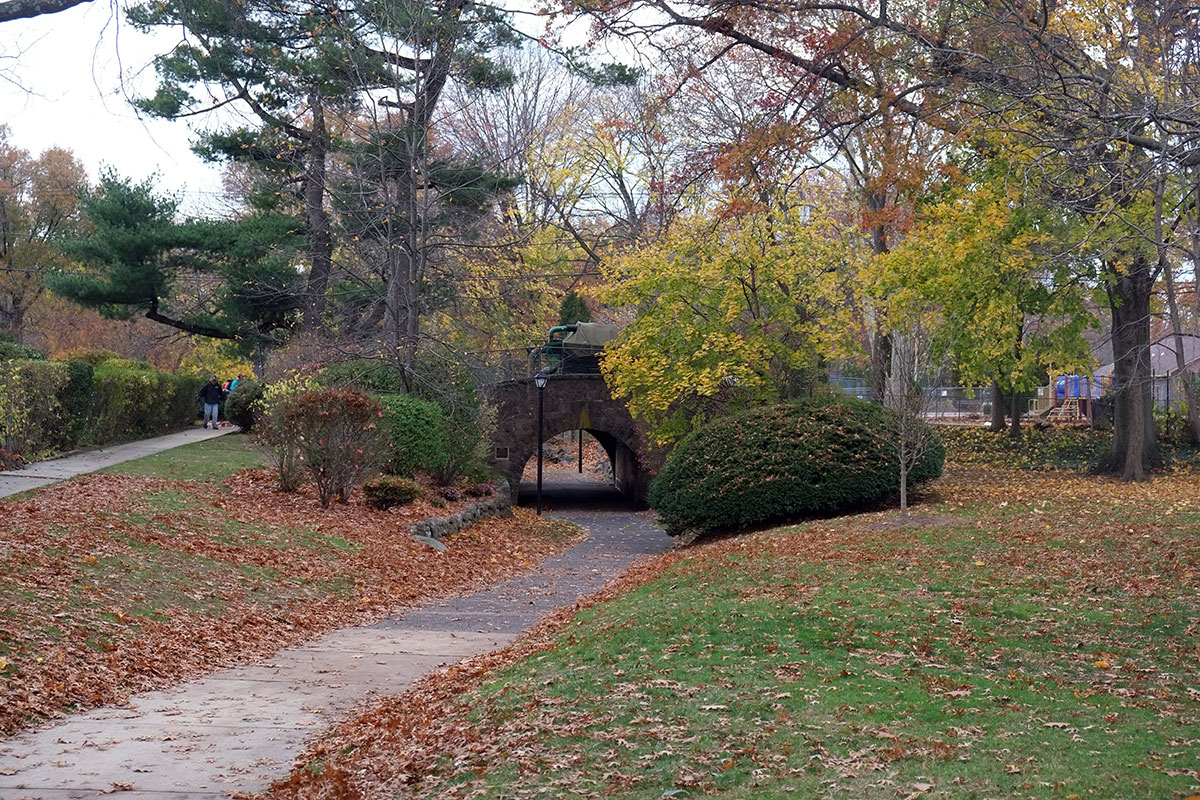
so that children may safely get to school.DSCF5195

The architectural style issue is intriguing.  The houses reflect the preferences of the 20s – there are many “early American” houses, some Craftsman-y, some Tudor-y, etc.  The houses vary from pretty small to pretty generous, DSCF5190DSCF5215
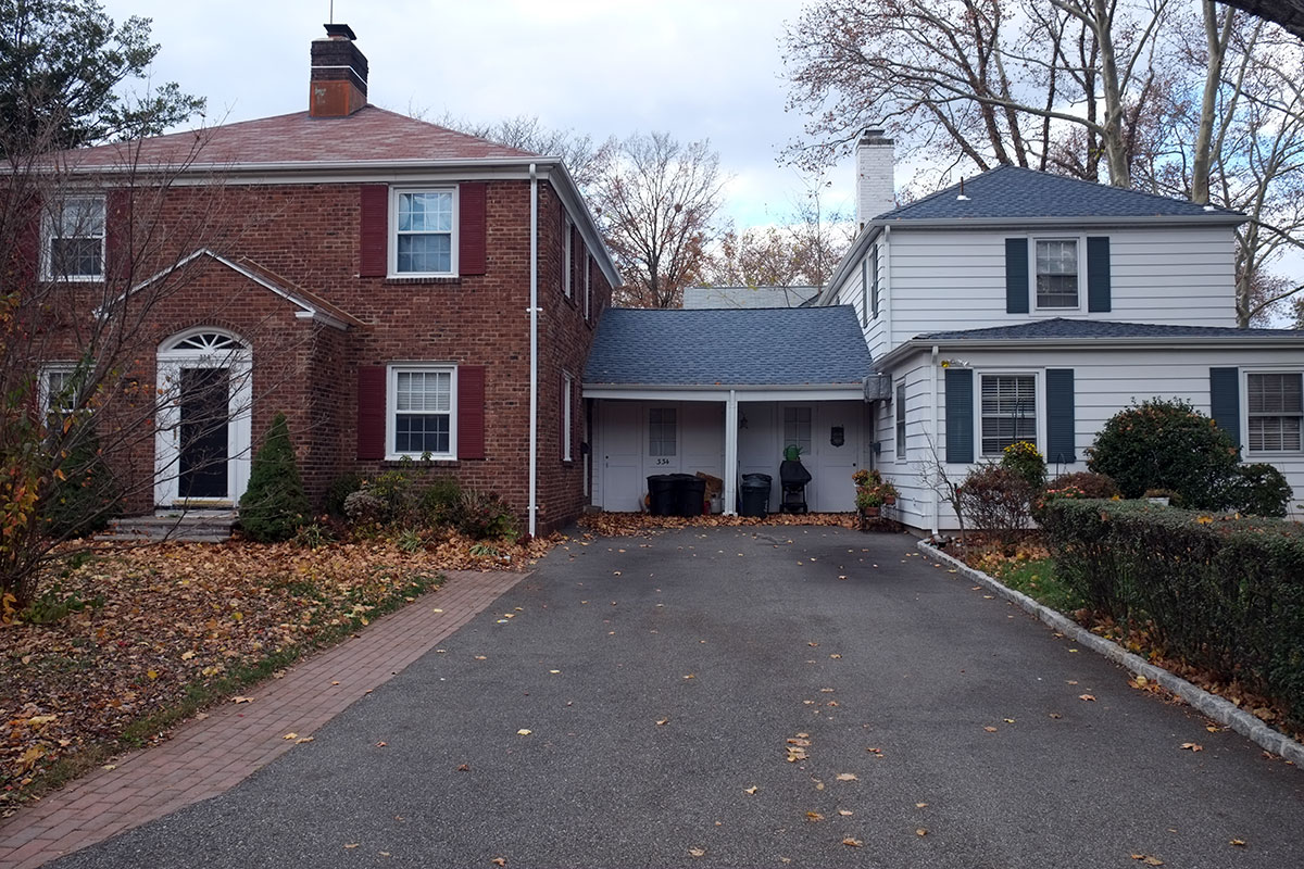
illustrating that the concept of the site plan is independent of the architecture.  Like many good diagrams, it can assume a variety of scales and absolute dimensions, and accommodate a wide variety of needs and site conditions.

Greta did the normal zoning-out when confronted with yet another piece of architecture that her dad was running around excitedly photographing, but I tried to get her to imagine life in this  neighborhood.  Suppose that when you were a little kid, you didn’t have immediate access to just the one other kid who lived next door to you, having to rely on your parents to facilitate any other engagements?  Suppose your backyard connected to a world of kids, not just a private, fenced-off dead end?  Suppose you could safely wander out from your house at any time, and find your cohort, with your allowable range naturally increasing as you aged?  What if all the places where you could go were visible from your neightbors’ houses, and access to this shared world was pretty tightly overseen from those same houses?  She began to see that Radburn was designed to accommodate cars, intending to limit their damage, but at the same time fundamentally improving the quality of life in suburbia for all.

You’ve probably noticed that this fantastic model was not followed very often in the intervening century. What happened?  A Depression followed by a World War, and we really didn’t build much housing for 20 years.  Then during the postwar boom, all this knowledge was forgotten.  Market forces drove all development, and the emphasis was on quick, efficient construction and the amenities of the house.  These ideas were resurrected in the New Urbanism movement which started in the 80s, and there are a very few places where they are being implemented.  But if we ever get serious in the future about creating extremely attractive, higher-density residential neighborhoods, the Radburn model will always be there for us to copy.

History: Mill towns

DSCF4594Travelers are often obsessed with history.  Many major tourist attractions are historical sites, and we’ve noticed that people we’ve met on this trip often focus on historical minutiae.  But in planning out a truck-schooling curriculum for Greta this year, we ran into a problem:  history was Greta’s least-favorite subject.  I was taken aback – wasn’t it my responsibility, as a parent, to drag her on a tour of historical sites and monuments (everyone should see Gettysburg, dammit, even if I hadn’t)?  I asked her if there were any part of history she’d enjoyed, and she mentioned the history of the railroads.  Further discussion clarified that she was interested in seeing historical stuff, artifacts from the past that showed how things were made or economies and regions organized. She wasn’t at all interested in staring reverently at a field where a battle had taken place 150 years ago, and I realized, neither was I.  Being in a place where something happened long ago is kind of cool, but going out of your way to visit such a place didn’t make sense to either of us.  Our historical agenda derived from this insight;  we would visit historical places where there were substantial, tangible remnants of history (and preferably cool, Steampunk-looking ones with lots of gears and parts), and avoid places with people in period dress.

a carding machine in Lowell

a carding machine in Lowell

Mill towns jumped to the top  of this list.  Our friend Dan prepared an exhaustive map of every mill town in New England he could find, and we set out to find a few.  North Adams was interesting, especially as a large mill had been converted to the Mass MOCA museum.  But clearly the main goal was to be Lowell National Historical Park, which preserves the mill district  where the industrial revolution really took hold in America.  It was an early planned, industrial city – a group of Boston investors scoped out possible sites for development, and settled on Lowell because of the drop in elevation of the Merrimack River, and the opportunity to build canals and waterways off it. DSCF4611

Lowell also continued our trip theme of Cities Which Were Really Important 100 Years Ago, but Aren’t Anymore.  Except in this case it was 150 years.  At its peak Lowell had 55 major mills, and dozens of smaller ones.  Lowell took the cotton from the South and turned it  into cloth.  The original work force was New England farm girls, and a highly controlled, paternalistic system was put in place to ensure their respectability while living in the city.  Within a few decades the work force shifted to immigrants, and Lowell was the site of early labor organizing in this country.DSCF4619

The National Park Service has preserved much  of this infrastructure.  The historical area is an interesting mix of remnants of the waterways, a few preserved mill buildings, such as the Boott Mill complex, where you can walk through rooms with operating looms:DSCF4666DSCF4648

and other parts of the district, where privately owned sites sit vacant, or are available for redevelopment. DSCF4627DSCF4590

In this way, Lowell is similar to our experience at Ebey’s landing National Historical Reserve on Whidbey Island, where 90% of the land is in private ownership, and the Park Service provides an overall organization and focus.

DSCF4582Once you get away from the renovated buildings, Lowell is pretty depressed and depressing.  Some mill buildings have been turned to other uses – such as a large medical clinic or loft housing for artists and yuppies – but let’s face it, the supply of old mill sites is much greater than any foreseeable demand for redevelopment.  It’s a story we’ve seen repeatedly on this trip, cities which peaked economically 100 years ago, and there hasn’t been much new investment.  I remember an Atlantic article a few years ago, where Bernard-Henri Levy visited Buffalo and said that this was inconceivable to a European, that one of the most important cities from 100 years ago could be allowed to decline so precipitously.  But the economy moves on, technologies and transportation systems change, and when a city has lost its primary economic raison d’être, what really can be done?  Architects tend to focus on the potential of the amazing building stock left behind, but this supply-side view ignores the lack of demand to fill those buildings up.

The next important mill town we visited was Paterson, New Jersey, located on the Falls of the Passaic River.  Although Paterson is a short trip from New York City, I had never been there before;  the average New Yorker just can’t conceive of voluntarily visiting New Jersey.  Paterson also didn’t have the best reputation – when I recently mentioned this visit to a friend, he was astonished that we drove through the center of Paterson without having our trailer stripped while waiting at a red light.  (This may be a slightly outdated view – we drove through the center of Paterson and it seemed like a depressed, but not necessarily dangerous place to me.)  DSCF5274

The Paterson mill district is even older than Lowell.  The initial group of developers included Alexander Hamilton and it was the first substantial manufacturing area in the country.  The mills centered around the Great Falls of the Passaic River, a 77-foot drop into a narrow canyon.  A very cool spot, and one that you might have seen in the Sopranos, as people sometimes get thrown off the bridge pictured here:DSCF5266

A really knowledgable historian who grew up in Paterson and now works for the NPS gave us the rundown on Paterson, which was surprisingly important – most of the early steam locomotives in the country were manufactured here, it was the center of the silk industry, an it was the site of the first Colt factory.  There are a few remaining mill buildings in the district near the Falls, as well as a museum (which we didn’t have time to visit, as we got stuck in horrific traffic jams in Paterson, and then missed a turn to the parking lot and had to circle around narrow streets with a trailer, and then ended up in front of an elementary school just as it let out).  DSCF5289DSCF5312DSCF5299Despite its gritty reputation, Paterson didn’t see as depressing as Lowell.  Perhaps we just saw a lot more street life, with a clearly vibrant immigrant population.  Perhaps it was because dreams of urban redevelopment don’t seem so unlikely when you’re within an hour of Manhattan and you have some great building stock.  We wished we had more time to investigate the city further, as the downtown has many remaining civic and cultural buildings from its era of prosperity.

New York

DSCF4911 In New York,  we decided to focus on cool new stuff we hadn’t seen.  And pastrami.  Our pastrami quest was thwarted as we trekked up to Carnegie Deli, only to discover that it was closed for repairs.  (And while we considered our next move, a dozen other people came along to be equally disappointed. Someone should set up a pastrami cart there.)  We did see Alwyn Court (even if we couldn’t afford to eat at Petrossian).

DSCF4820We only had two days to spend in New York, less than we did in Cincinnati. The focus on this trip has been on places where I haven’t been in a long time, places where we’re not likely to go to again soon, and places that you need a car to reach.  We had just been in New York last winter, and it’s likely we’ll be back soon, since we have a lot of family and friends there.  Then Greta and I came down with colds while staying with my brother in Mamaroneck, so our time in City got cut in half.  We decided to not spread ourselves too thin, and missed a lot of places and people we wanted to see (including an abortive attempt to schedule a Facebook-based meet-up with a lot of friends).  It was disappointing, but we’ll be back soon.

We wandered through the Park, and felt the full impact of the new residential tower at 57th and Park.  It’s kind of unbelievable, the tallest residential building in the western hemisphere, and a portent of things to come. DSCF4828

The Century used to be considered a tall building.  DSCF4833

On to some favorite blocks on the West Side.DSCF4843DSCF4845And over the the 79th St.Boat Basin, where the rotunda is looking a lot spiffier than it did when I kept a boat there in the 80s.DSCF4849

The redevelopment and park extension at Riverside South was interesting.  The new apartments were a tiny bit less banal than most of their era.DSCF4855cropped-dscf4860.jpg

But the real pleasure was in the park.  Back in the 80s, I was one of very few people who ever roamed into this territory – some homeless people managed to find gaps in the fence, and I would come from the river side in a row boat.  I was especially drawn to the remnants of the wharves that were there, as seen in these photos from the late 80s:Hudson-yards34Hudson-yards31I expected that some day this would all get swept away in a real estate development, so I was pleasantly surprised to see that the park design, by Balsley Studio, incorporated these pieces into a sophisticated design that covers the range from hard to soft and industrial to natural.  DSCF4865DSCF4876DSCF4894DSCF4888

And at the end of the park, there’s something else new to see:DSCF4907DSCF4915Bjarke Ingels’s new condo  building is his usual showstopper.  Once again, he lets the building form be driven by the site conditions, and doesn’t worry about conventional ways of making buildings.  I think this has worked really well in some of his projects, such as the 8-house, and less well in some others, such as the Mountain, where the concept may be strong but the execution is flawed.  It may be too early to tell with “Via 57West”, but I do wish they had hired a Danish branding consultant too and come up with a better name.  (Maybe they’re trying to attract Italian residents, and want to distinguish it from the buildings full of Russian oligarchs down the street.)  I haven’t seen the plans, but we spoke to a construction worker who said there were lots of weird, unusable spaces, which has certainly happened in some of his other projects, and seems like a natural result when you let the building volume drive the scheme.  I’ll withhold judgment.

But I think this may be a real New York building at heart, with the form driven by real estate economics.  One way to look at the massing is that it provides a graceful transition from the 57th St. canyon to the open space of the River:DSCF4932

Another interpretation arises when you find out that the whole block is being developed by the Durst organization.  The more conventional building further back on 57th St., seen to the right in this photo,DSCF4914now has a view of the River because the Ingels building slopes back.  So instead of one building with a view of the River and one with a view of 11th Avenue, you now have two buildings with river views.  The first one may be inefficient, not maximizing its potential floor plates and with funny unit designs,, but you can sell the units to hipsters who want to be in the cool building with great views, regardless of functionality.  Then you can have conventional units with normal floor plans in the second building, which will be bought by more pragmatic people.  The origin of this building is similar to that of Central Park – it may be a good design, but it would never have happened without the financial rationale.  I just wish it had a less cheesy name.

Whitney Museum

I thought the main capital-A Architecture focus of this trip was going to be out-of-the-way buildings by Lou Kahn, but then Renzo Piano hijacked our agenda.  We’ve only seen one recent museum that wasn’t by Piano, and I think the MFA addition is really Norman Foster in Piano drag.

The new Whitney is superb.  Anchoring the High Line at Gansevoort St., it consolidates Chelsea’s status as the new zone for hip galleries, since Soho became a shopping mall and the East Village seems to have gone back to being the East Village.  Tectonically, the building picks up on the High Line and other buildings in the area – it stands out as an institution, but it complements the older technologies beautifully.DSCF5126

The superstructure at the top of the picture is the key to how the building fits into the context.  Every other museum in New York is a solid box which you enter to view the treasures within.  (The Met has some views of the city from the large atrium areas in the new wings by Roche Dinkeloo, but that is all.)  In a museum of American art – which necessarily means lots of art in and about New York – the Whitney pulls in the City as an essential part of the experience.  Being in Chelsea, surrounded by low buildings, the views of midtown and downtown are unobstructed, and going back and forth from the galleries to the city is exhilarating.  DSCF5032

I am a big fan of museums which allow easy access to large open areas where you can shift the focus of your eyes to a distance, get some spatial relief from the necessary introversion of galleries, and let your mind wander a bit;  the Whitney does this better than any museum I’ve ever seen.  The large space isn’t just a relief from the galleries, it is a complement which intensifies the experience while providing a change.

The parti is classic Piano – simple, legible and appropriate.  Each level has a big east-west bar of galleries, with a fairly solid wall to the south, and filtered openings to the east and west.  The staff spaces are mainly on the north side, accessible from the gallery levels, but tucked away behind the circulation core.DSCF4978

These filtered ends are tunable –  allowing for a directly daylit space at the end for sculpture,  DSCF5034while using a series of screening elements to block direct light from reaching the galleries within.  This layering strategy is being employed in many museums now, but this makes more sense to me than Foster’s MFA – it is both more flexible and less extravagant.DSCF5036

Movement through this building is directed, but not constrained.  The staff suggests that you take the elevator to the top, and then walk down.  Interestingly, this is the same processional as was suggested at the old Breuer Whitney.  That building had gigantic elevators, which were also used as freight elevators after hours, and one notable interior stair, which was a sculptural and spatial experience, despite having only one window;  Piano seems to pay homage to that.  The elevators are the coolest glass elevators this side of Lloyds of London, and there is a central stair that is perfectly located and visible,  a pleasure to use, again despite being completely internal.  DSCF5117DSCF5044

Every floor has an entry space at the top of the elevators and stair, orienting you and facilitating the introduction to the exhibit.DSCF5042.jpg

You can us this stair, but why wouldn’t you head outside?  The steel structure relates to the High Line below, and contrasts with the slick envelope of the gallery volumes. DSCF5105DSCF5088

The view to the northDSCF4993

and to the southDSCF4994

Museums can be disorienting rabbit warrens (Pelli’s remodel of MOMA was one of the worst, thankfully now somewhat mitigated.)  This museum not only allows you to be oriented within the museum, but within the whole city.  For a city with great views, it is remarkable how few of them are immediately accessible to the public.  I took views for granted when I worked in the Empire State Building for seven years, but now returning as a tourist, I am annoyed at how I’m always in a canyon, only able to get the big view by standing in line for an hour and paying a lot of money.  The Whitney offers a view of the City that is actually better (though less spectacular) than from the tower decks, and reflective of real life in the City, not the prospect of a master of the universe.  DSCF4997

The various spaces are all commodious and comfortable. The ground floor lobby is transparent and open to the street.  The scale is wonderful, as opposed to the lobby at MOMA, which has the proportions of a parking garage.  DSCF4979DSCF4980

As in all Piano buildings, you can grasp the layout without looking at a plan, the main elements being visible from each other. DSCF5120

The top floor galleries have Piano’s usual attention to daylighting, in this case a nice balancing of high-tech systems and traditional gallery room design.  DSCF5007

I left with the same feeling I get from many Piano museums – a wonderful museum experience, where the architecture didn’t scream for attention, but supported the art without being at all neutral.

DSCF5131


Boston museums

MFA

All of Boston’s venerable museums have had major renovations since I lived there – the Museum of Fine Arts by Foster + Partners, and the Gardner and Harvard’s Fogg, by Renzo Piano.  I couldn’t get to the Gardner, but I was able to see the other two in some depth.  As I ended up as an art history major in college, I knew both of these museums down to the smallest detail, and so have a good baseline for comparison.

The most impressive thing about the Foster remodel of the MFA is that they didn’t mess up the original Beaux Arts building.  In fact, they significantly improved the overall organization.  IM Pei’s addition from the early 1980s had confused the plan, shifting the main entry to the southern side facing a parking lot, and demoting the Huntington Avenue entry on the central axis.  The current state opens up this axis from Huntington back to the Fenway, and once again the building makes sense.

DSCF3814

Pei’s addition is looking a little dated.  There are some commodious spaces and good galleries, but the detailing seems overlay flat and gypsum-boardy.  Mark Rylander just pointed out that the Pei buildings that are on the interface between late modernism and brutalism have worn better, with strong tectonic qualities (I had recently seen a good example of this at the Columbus Indiana library).  The MFA wing is hiding all of its guts, covering all with a pure white surface.

DSCF3769

DSCF3781

As the wing has been repurposed, it now includes an innovation that should become standard in museums:  inside the high-end restaurant, there is a bar, where I repaired for a little pick-me-up after a long, intense afternoon looking at art.  Refreshed by the best Manhattan I’d had in six weeks, I spent the rest of the evening checking in with all the galleries.  DSCF3765

Foster’s addition includes administrative offices and a new wing for American art, which grow off the north end of the existing building.  The exterior is an exercise in the current style – random variations within a grid.  It’s very tight and crisp, with the solid/void relationships handled well.

DSCF3728DSCF3841

The big move is a large glazed court/atrium set between two wings of the original building.  It’s a huge space, with a scale that seems more like an exterior courtyard.  There is a cafeteria set up, which was whisked away in the afternoon so the space could be used for an evening event.  It connects the central axis of the museum with the entry to the new American wing, but is otherwise not accessible from the two flanking wings.  It supplies a necessary function within the museum – a place of relief from the intensity of galleries, with light, space, and a way to let your focus wander.  DSCF3736

It reminded me of a modernist version the courtyard at the Nelson-Atkins in Kansas City.DSCF3740DSCF3824

The big stair at the end of the atrium organizes the whole new wing.  From some hallways on the sides you can see the clear differentiation between the old and the new.DSCF3820

The new galleries are excellent – some are in the normal modernist vernacular of paintings floating on blank walls, but some are hung salon style, similar to 19th century practice.  The light is controlled very well (the only mistake being the hanging of Sargent’s The Daughters of Edward Boit facing the atrium stair, where the glare makes it hard to see the dark painting).  DSCF3744

The gallery building is wrapped by a double-envelope / walkway on three sides.  I’m not sure of the purpose of this – it has a few sculptures that can sit in the sunlight, but it seems like a lot of trouble for what it provides.  DSCF3749

The top floor galleries are skylit, working very well for the large modernist work there.DSCF3850

Overall, it’s a very successful, sensitive and simple remodel. It seems more like a Piano building than a Foster.


Which brings us to the Piano building at Harvard.  It is more than an addition to the Fogg.  The Fogg used to house galleries, classrooms, the art history department (which they call Fine Arts, just to confuse people), and the art history library.  Now the departmental spaces have moved over to the Stirling building across the street, and the collections from the Sackler and the Busch Reisinger have been consolidated, so it is now called the Harvard Art Museums, and is a much larger museum with an art study center.

From the street, the juxtaposition is striking, and not bad at all.  Let’s face it, the large flat wall of the Fogg went beyond the limits to which Georgian should be pushed, and the addition provides a much higher degree of articulation which reads well.

DSCF4551

The reveal between the two is clear, while the big new roof ties them together.  DSCF4549

The Prescott St. corner is massive but pleasing.  A wood(!) screen wall above a stone base.  Robert Campbell thinks the base is clunky and not necessary, and I’m inclined to agree with him.  DSCF4543

The big move is the central atrium.  The Fogg had two levels of a Renaissance palazzo court, with a third attic story with small windows on a hallway.  Piano always seems to respect these Beaux Arts schemes (such as at the California Academy of Sciences) and he does so here.  The big question is how do you keep this parti, while doubling the height of the building, without making it a dark shaft.   The masonry at the third level was removed, and that becomes the start  of a glass curtain wall addition, exquisitely detailed.  DSCF3587

The third floor gallery circulation had been one of my favorite spaces – you got glimpses into the  court through the small windows, as you were surrounded by pre-Raphaelite paintings on your way to class.  It was fine, but I like the new corridors much better.  Similar to the double envelope at the MFA, sculpture that can be in strong light is located here, with paintings set back in shielded galleries.  DSCF4451p

The galleries are less spectacular, just plain rooms with track lighting.  I think this quality is due more to the layout of the original Fogg – the footprint is not big, and these rooms are simply fit in.  The circulation scheme relieves any possible claustrophobia – you’re not caught in an endless warren of galleries (as sometimes happens at MOMA), but can readily jump back to the atrium for light and space.DSCF4424

There are new galleries which pop through the solid wall of the museum and engage the streetscape.  These also house sculpture, and the contrast with the painting galleries is strong.  DSCF4418 DSCF4435

These also provide an excuse for the massively articulated, movable shading devices on the exterior.  I’m not sure all of this was necessary;  perhaps as with Foster’s double envelope, the alleged function just provides an excuse for doing something which looks really cool.  DSCF4531

On the fourth and fifth floors there is the conservation space and an art study center, with rooms which van be reserved so items in storage can be retrieved and examined.

DSCF4470

There are quite a few big rooms like this, only one of which I saw being used.  I asked about excessive daylighting, with its attendant glare and damage to art work, and was told that there are multiple levels of automatic and controllable shading devices in place.  The rooms are beautiful, with great views of the city, but again I’m not convinced that this over-the-top high tech approach couldn’t have been accomplished with simpler and more passive techniques.  DSCF4462

The relationship to th Carpenter Center is great.  I’m not sure, but I think the whole Gwathmey Siegel remodel must have just been throw away.  DSCF4430

The ramp now plugs into the rear entrance to the museum.DSCF4530

The top floor is an homage to Piano-tech (not to be confused with Pinakothek).  The curtain wall starts at the third level, in a fairly simple manner, but it seems to accumulate more and more little metal pieces as it ascends, and the top is a high-tech apotheosis.  At this point I don’t care if it is at all necessary – the dematerialization of structure, the play of light, the modularity and repetition, the transparency, it is all just gorgeous.  No one can detail like Piano, and it’s nice when he’s able to just run amok.

DSCF4477

But I did find one embarrassing detail:  I asked the brick what it wanted to be, and it said, an infill panel on an access door!DSCF4461

i’ve liked every Piano museum addition I’ve seen, mainly for their good sense, simple partis, contextual sensitivity, attention to the demands of the art and exquisite detailing, but in this museum, the architectural experience of the atrium is the dominant element.  I found myself returning to it again and again, just to enjoy the light and the tectonics.  It’s a very different museum from the one I knew, but the sensual and intellectual pleasure of the space more than made up for my displaced nostalgia.

DSCF4495

Cambridge

If being in Boston felt familiar, Cambridge and Somerville felt much more so.  I was at Harvard for four years, and then spent two years living in Somerville while I worked for an architecture firm in Boston.  In retrospect, I spent the vast majority of my college years on campus, as it was intense and time-consuming, venturing into Boston for frequent field trips and museum visits related to my major in art history.  After college I spent a lot more time wandering around Boston, due to more free time, being in Boston every day anyway, and living in a crummy apartment in Somerville that encouraged one to get out more.

If Boston seems to change less than other places, Cambridge is even more extreme.  Returning alums bemoan the loss of old standbys like Cronins or Elsie’s, but there were certainly more than enough nostalgia-triggers around to drive Greta crazy, as she had to listen to stories in front of each (although I restrained myself from breaking into Illegitimum non Carborundum).  Random highlights follow:

Harvard Square struck me as much the same, thought perhaps more sedate.  Certainly the pedestrians are less militant than they were.  DSCF3550

DSCF3415
While Joyce Chen’s was arguably one of the first restaurants to introduce authentic Chinese food to America, Yenching will always be remembered as the harbinger of the Great Szechuan Revolution in Cambridge, the place which inspired our subsequent lifelong predilection for excellent Chinese food.

DSCF3521
Pinocchio’s pizza is still going strong, although it now has pictures of Mark Zuckerberg prominently displayed.  I had forgotten how much Boston pizza differs from New York – not least in that it is made by Greeks – but I’ll leave the review of it to Greta.  But perhaps the most inexplicable survivor was:DSCF3525
Charles Kitchen, purveyor of thoroughly mediocre double cheeseburger specials and cheap beer.  I know that the culinary proclivities of undergraduates probably haven’t changed that much, but I was still surprised that it hadn’t been displaced by a higher-end establishment, until a local informant told me that it is owned by the Mafia and probably fills some other role in the underground economy.

DSCF3555
Harvard Yard is of course the same, except for the now huge crowds of international tourists and the chairs scattered around.  Crowd control has become an issue, and there are signs everywhere telling you not to enter the buildings or bug the students.  But once you get out of the Old Yard, the Tercentenary Theatre and the small courts are still relatively sedate.DSCF3409

Massachusetts Hall, the oldest survivor on campus, from 1720.

Massachusetts Hall, the oldest academic building on campus, from 1720.

The President's House

The President’s House

The window in Emerson, from which I gazed during Soc Stud 10 lectures on Marx (when I was a Soc Stud major before switching), and the tree I gazed upon.

The window in Emerson, from which I gazed during Soc Stud 10 lectures on Marx (when I was a Soc Stud major before switching), and the tree I gazed upon.

Architecturally, we went by old favorites to photograph them, as I just hadn’t taken enough slides back in the pre-digital days.

the Lampoon and Adams House

the Lampoon and Adams House

the alley by Lowell House. An interesting development has been the replacement of the Fly Club garden by a new building for Hillel.

the alley by Lowell House. An interesting development has been the replacement of the Fly Club garden by a new building for Hillel.

the view of Mem Hall from the GSD library, my preferred reading and late-afternoon dozing spot.

the view of Mem Hall from the GSD library, my preferred reading and late-afternoon dozing spot.  The tower has been reconstructed, and it is now used as the freshman dining hall, after the desecration of the Freshman Union 20 years ago.

Becoming an architect has given me a new appreciation for buildings I didn’t particularly like as a student.  I still understand their shortcomings as seen by laypeople, but as an architect I am bound to defend their architectonic qualities.  First there is Sert:

the Science Center

the Science Center

Peabody Terrace, which I no longer feel the desire to bombard with paint balloons.

Peabody Terrace, which I no longer feel the desire to bombard with paint balloons.

the Holyoke Street side of Holyoke Center, which is extremely nuanced in how it addresses its different orientations.

the Holyoke Street side of Holyoke Center, which is extremely nuanced in how it addresses its different orientations.

and of course Corbu’s Carpenter Center, which I now appreciate much more, and find its stand-off with Piano’s new museum quite entertaining (more on this to come).
DSCF4534

Perhaps the most striking place was the pedestrian alley and courtyard at 44 Brattle Street, (behind the Design Research building designed by Ben Thompson).  The buildings were by Sert, Earl Flansburgh and TAC, who all had offices there, and collaborated on the design of the passage to the interior of the block.  I have never seen another pedestrian passage in this country that is this successful – the materials, the scale, the spatial sequence – all have combined to create a vibrant, pleasant and well-used alley.  It has become a commonplace that modernist object buildings ignored the context and destroyed the city;  it is instructive to see spaces like this and understand how the best modernist architects were highly sensitive to these issues.DSCF3530DSCF3533 DSCF3534

At the end of the day, Greta was more taken with Cambridge than she had thought she would be, and immediately fell into the role of serious author writing in a crowded cafe.
DSCF3544

New things in Boston

Boston does change, and it has probably added as many new buildings as other cities its size in the past 30 years, but the percentage of change seems smaller, since so many old buildings remain.  There have been two big changes, and many more localized ones:

There are small changes to existing building, such as the art installation on the Hancock.DSCF2628

And at dusk you can see other changes, such as how the various tenants have designed their lighting:DSCF2950c

Boston may preserve its pre-modern heritage, but its lack of affection for some modernist classics is becoming evident.  Paul Rudolph’s complex at Government Center was never finished, and now it looks like it’s falling apart. We used to throw frisbees on the plaza, and watch in dismay as they fell through one of the large holes into the netherworld of the parking garage below.  That plaza is now full of chain-link fences – perhaps in our insane post-9-11 security mania someone decided that the holes violated the security perimeter, so they have been enclosed.  Between the fences, weeds and general lack of maintenance, the building looks like a wreck.  Maybe it is Boston’s attempt to catch up with Detroit as a center for ruin porn.
DSCF2773

Even more surprising is what has been done to the City Hall.  It is a building Bostonians love to hate, similar to our scorn for the Portland Building.  I’ve always saved my scorn for the pointless, overscaled, empty plaza, thinking that the building itself is a pretty rigorous Brutalist icon.  But it is now suffering the death of a thousand cuts.  The big ramps and access points to the building have been closed off, no doubt in another security frenzy.DSCF2794

What was once an awe-inspiring interior formal stair hall has been strewn with junk – a random potted plantDSCF2799

garbage cans at important points, brightly colored tape on all the brick stairs, a painted blue tarp which obscures the stair to the council chamber, and a truly crappy coffee bar right in the middle.DSCF2814

It’s just depressing.  I know the building has problems, but it would be nice to deal with them in a systematic and thoughtful way, rather than letting everyone add whatever junk they wanted to.

And of course we can’t blog about crappy new things in Boston without revisiting the master of kitsch, Philip Johnson.  HIs 500 Boylston building is appalling, the kind of embarrassing banality that caused the downfall of postmodernism.  I can’t decide whether I hate this or his PPG Place more.
DSCF2666

There have been many new towers built downtown in the past decades. Most of them are awful – under-detailed and overscaled, the same as has happened to every other big city.  But once again Boston’s heritage comes to the rescue – there are enough good old buildings that the new ones don’t overwhelm it.  The old ones certainly make the new ones look bad, but the counterpoint between them is not unpleasant.DSCF4345

It does look much better at night.
DSCF4359

One big new thing is the redevelopment of the harbor edge of Southie.  This has a new meaningless developer name, the Seaport District, probably because SOuthie NOrth (SONO) was already in use somewhere else.  There’s a new gargantuan convention center, a bunch of monstrous hotels, and now condos are popping up everywhere. DSCF4301

The one good building is Pei’s federal courthouse.  Not a stunner, but a simple parti with historicist leanings.  It was the first new building in the area, but it had no impact upon what followed.
DSCF4352

Diller Scofidio’s Institute of Contemporary Art is just trying too hard.  DSCF4337Is anyone else getting tired of giant cantilevers for no reason?  I guess it shelters the seating below, an amphitheatre for Boston Harbor, but frankly, looking across the water to East Boston is not a view that should be emphasized. Maybe the district will grow up around it it, but right now it looks like every other piece of starchitect branding.

The general level of work in the district is not promising, but no worse than this stuff in every other city.  And maybe that’s the saddest part – Boston has always been a distinct place, with its own character, style, history, etc.  Even when it got its festival marketplace, Quincy Market, it made use of fabulous older buildings.  But this Seaport District looks like it could be in Orlando, Dallas, Indianapolis, or Miami.
DSCF4338 DSCF4323 DSCF4328

The other big new thing in Boston is the Big Dig – the removal of the Central Artery and its replacement with tunnels carrying the traffic. DSCF4303 It is now called the (Rose Kennedy) Greenway, and it took me a while to get my head around it.  You know how hard it is to remember what exactly was in a certain place when it’s gone?  The Greenway is that to the nth degree. You recognize the old buildings and streets that were there before, but the relationship among them is totally different.  You try to figure out where the nasty little tunnel to the North End was.  Then you realize you have a view out to the harbor that was never there before.

The Greenway doesn’t seem to have much of an identity, and I mean that in a good way.  There isn’t a grand formal vision for the whole.  It is a series of connected, but not totally unified pieces;  the whole is not necessarily greater than the sum of the parts.  The Greenway is not a thing, it is the absence of the horrible thing that was there before.  I think the designers wisely decided not to replace it with another thing, but rather to create a number of smaller-scale pieces, each of which can relate to its immediate context, and try to pull the pieces together.  Once you get away from the Common, downtown Boston never had a lot of open space, and with the advent of giant new buildings, it might have been overwhelming, without the giant new open space.  To be hurrying through the financial district’s winding canyons at rush hour is intense, then stepping out into the Greenway on the way to South Station is a contrast and a relief.DSCF2896

There are some very good parts.DSCF2842 DSCF4371

Of course it was way over budget, and of course it took way longer than predicted and created a lot of controversy, but in the end, it is a Very Good Thing.  Perhaps it says something about Boston – what other city would spend billions of dollars on a project that made the city better, but didn’t produce a big shiny object that jumps up and screams look at me!  New York couldn’t do it – the urban design downtown at the World Trade Center is a disaster, with gigantic, pointless open space and preening object buildings.  The Greenway is Boston at its best, a simple, understated, classy solution.

Shores, South and North

The towns on both the South and North Shores of Boston are some of the oldest settlements in the country, mostly founded in the 17th century. The centers of these towns preserve that original character and spatial arrangement, at the core of what have since become suburbs.  The juxtapositions between old houses and modern strip development can be jarring, especially to someone from the West Coast, where everything has been built in a shorter time frame.

Cohasset

Cohasset

When I lived in the Boston area I never got to explore the environs as much as I wanted, as I didn’t have a car,  So staying with friends both in Scituate on the South Shore and Boxford near Ipswich on the North Shore was a great opportunity to see these places.  What made it even better was that my friends are long-time residents of these areas, and showed me around to places and buildings I would never have known about.  (Greta missed most of this as she was back in Eugene visiting Linda.)

Scituate, Lighthouse Road

Scituate, Lighthouse Road

The South Shore has an intricately varied shoreline, with many small coves and larger harbors.  The historic town cores are on the harbors, with later houses filling along the shore between them, and 20th century development spreading to the interior.  Scituate has four “cliffs” that stick out into the bay (we have the northwesterner’s amusement for how topographical terms are used here) which have highly clustered houses on small lots by the water.

Scituate, Lighthouse Road

Scituate, Lighthouse Road

Places that are this old accumulate interesting artifacts, such as this former water tower that was made to look like a Rhenish tower, as the rich person living nearby didn’t like looking at the ugly water tower.

the very interesting water tower in Scituate

the very interesting water tower in Scituate

The Trustees of Reservations is an organization that owns more than 100 significant properties in Massachusetts, from the famous to the obscure.  We visited World’s End, which Olmsted designed as a residential development on a neck in Hingham, but it was never built out. It is now an open space reserve owned by the Trustees.
Olmsted designed a residential development on a neck in Hingham, but it was never built out. It is now an open space reserve, called World's End.

World's End, with Boston in the distance.

World’s End, with Boston in the distance.

We visited Ipswich (where Updike live and worked) and Topsfield on the North Shore, finally seeing the famous Parson Capen house from 1683, which is from that period when settlers built what were essentially English houses, having not yet adapted them to the New England conditions.
the Capen house in Toppsfield, from 1670.

A Classical Revival church spotted on a trip north to Exeter, so technically not on the North Shore, but too good to not post.
actually somewhere in southern New Hampshire, but close enough

Newburyport, at the mouth of the Merrimack River, with well-preserved downtown and residential areas.

Newburyport

Newburyport

Newburyport

Newburyport

Driving around on the winding roads, past the estates of the North Shore, we headed towards Crane’s Beach, a beautiful landscape of drumlins (there’s a word I want to find more opportunities to use) and marshes.
the marshes near Crane's Beach

The Crane Estate, by Shepley Rutan Coolidge etc., sitting on top of Castle Hill, is the leading example of how much money there was to be made in plumbing fixtures.
the Crane Estate on Castle Hill, by Shepley Rutan Coolidge etc.
Crane Estate

The spectacular landscape was designed by the Olmsted brothers.

the landscape by the Olmsted brothers. Notice the framed view on the axis.

Notice the framed view on the axis.

the allee running north from the house. I don't know what the flags signify, but I wish they weren't there. Louis XIV had a nice allee too, but his just ended in a can, not the Atlantic Ocean.

the allee running north from the house. I don’t know what the flags signify, but I wish they weren’t there. Louis XIV had a nice allee too, but his just ended in a canal, not the Atlantic Ocean.

A few days of exploring these shores just wasn’t enough – I could have happily spent a day in each town.  What struck me the most was just how many beautiful old towns there are, so close to Boston.  The summer resort venues of the Cape and the Islands tend to be better known, but these small towns in the Boston area are just as wonderful.

Exeter Library

ExeterAnother building crossed off on the Lou Kahn’s Greatest Hits tour.  Another building that exceeded my high expectations in every way.  As with all Kahn buildings, a simple parti with extraordinary development and detailing.  A visit to a Kahn building is always a sensual pleasure – light, materials, space – at the same time that is an intellectual satisfaction – your mind is racing as you see the relationships among the parts and the logic of the building drives all the smaller-scale elements.

The Exeter campus is in the standard Academic Georgian mode (we are seeing a lot of that these days), and it fits in beautifully, even though it is much taller, obviously modern, and has no pitched roof.  It is a good illustration of Howard Davis’s idea that in order to fit in, a building needs to overlap 30% with its neighbors.  (Howard now swears he said 50%, but I think he’s just getting more conservative in his advancing years.)

DSCF4161DSCF4154

The exterior shows Kahn’s normal interplay between masonry and wood, within an ordered matrix that allows for much local  variation.DSCF4144

The colonnade on the ground floor causes the periodical room and other secondary spaces to be set back from the facade.  This raises the main body of the library up to the piano nobile, and the voids of the colonnade mirror those of the attic story at the top, while the facade of the main floors is relatively planar.  DSCF3979DSCF4127

This also helps the four walls read as brick planes, with the corners eroded and the screenwall extending above the building volume.  The corners are the one part of the building I found not entirely convincing – they are inaccessible voids – strangely shaped terraces with locked doors – while continuing the brick across the corner on the diagonal obscures the contrast.  Maybe those corner screenwalls could have been wood (but who am I to be telling Lou Kahn anything)?DSCF3972No one walks in the colonnade, except while entering the building.  The entry is effectively hidden, not celebrated, as all four facades read exactly the same.  References to everyone from Palladio to Wright abound.

The concentric layering of the building drives everything.  Right inside the thick exterior wall is the study zone, matching the depth of the colonnade below.  Each student has a carrel, four in each bay between piers.  The zone is double-height, with carrels on the mezzanines too.DSCF4028DSCF4034DSCF4006DSCF4002

Inside the ring of carrels is the ring of stacks, with the aisles perpendicular to the facades and leading into the center.  This area has the highest structural loads, so the massive concrete structure is very evident, with the shifting of the structure towards the corners visible on the main floor.  DSCF4058.jpg DSCF4110

The next layer is palazzo-style circulation around the central atrium, but still within the stack structural system.  The slab is pulled back from the atrium, and the guardrail is cabinetwork, a bookcases with a tilted reference book shelf above, a concept other architects have been imitating ineptly ever since.  DSCF4020DSCF4051The central atrium is magnificent.  You ascend a curving travertine stair (the only curve in plan in the building) from the ground floor into the center of the building.  The concrete walls pierced by enormous circles rise on four sides, leading up to the massive diagonal roof beams. Daylight from the clerestories bounces off these beams and floods the building below.  I’m assuming that this concrete box acts as the trussed moment frame for the building, with the shear moving around the circular cut-outs.  Structure and light, simple symbolic forms, color and materiality.  It is simple and perfect, beautifully-proportioned, and you can sit and look at it endlessly.

DSCF4061DSCF4084DSCF4105DSCF4024

Throughout the building, every detail is perfect.  There are two fire stairs, this larger one is also the main circulation.DSCF4140

The best nosing detail I’ve ever seen.DSCF3993

The walls around the entry staircase.  Every function articulated and developed.  DSCF4096

The unity of the building is shocking.  We’re now so used to buildings which are a collision of elements, where every piece is unto itself, and the intersections among them are simply managed by the architect.  Here is a classical building where the complexity is integrated and purified, illustrating what Venturi calls The Responsibility to the Difficult Whole.  It is seemingly simple, but everywhere you focus, there is more to see.

Visiting the library is a very easy and pleasant experience;  Exeter just asks visitors to sign in, and not photograph the students.  Other than that there are no restrictions and you can wander around freely.

The Boston that hasn’t changed

the Common

the Common

Revisiting a city where you’ve spent a lot of time is always a strange experience.  On the one hand, you immediately notice how it’s changed, all the new construction and the lack of familiar faces. It doesn’t seem like the city you knew, and you realize it is no longer yours, that life here has gone on without you and that it now belongs to a whole new generation of people.  But then you start to see beyond that, and you’re surprised by how many things you knew still remain.

I lived in the Boston area for six years, leaving in 1980, and I hadn’t been back since 1997.   I’ve gotten used to western cities, where everything is new, and to New York, where change is more rapid and extreme.  Boston has many new things (more on this in a later post), but all the old streets and places felt very familiar – I didn’t need a map, I always knew what would be around the next corner.  This is the first place we’ve visited on this trip where I had lived, and it was strange to be in these old places with Greta, who belongs to a very different part of my life.

perhaps the most beautiful state house in the country

perhaps the most beautiful state house in the country

Beacon Hill, the pleasure of a quiet, Federalist neighborhood in the center of the city.

Louisburg Square

Louisburg Square

the second Harrison Gray Otis house

the second Harrison Gray Otis house

Mt. Vernon St.

Mt. Vernon St.

one of my favorite houses, at the corner of Mt. Vernon and Joy Streets

one of my favorite houses, at the corner of Mt. Vernon and Joy Streets

the third Harrison Gray Otis house, on Cambridge St.

the first Harrison Gray Otis house, on Cambridge St.

The newer houses on Pinckney looked very good – as the rules were relaxed and architects had some fun.

Pinckney St.

Pinckney St.

Pinckney St.

Pinckney St.

Greta has remarkably little interest in conventional history, and we intersected with the Freedom Trail once in a while rather than following it.

the Granary Burying Ground, on Tremont

the Granary Burying Ground, on Tremont

the Old City hall

the Old City hall

DSCF2919

Marshall St., one of the few near Dock Square left unscathed by the Central Artery and Government Center

Marshall St., one of the few near Dock Square left unscathed by the Central Artery and Government Center

Copping Hill burial ground

Copping Hill burial ground

DSCF2890

Boston's unwillingness to discard the old was very evident at the Boston Sailing Center. Even though they had added some new boats, it appears that all the Solings I sailed when I belonged in 1979 are still there

Boston’s unwillingness to discard the old was very evident at the Boston Sailing Center. Even though they had added some new boats, it appears that all the Solings I sailed when I belonged in 1979 are still there

Quincy Market, with the same bunch of tourists

Quincy Market, with the same bunch of tourists

on Comm Ave

on Comm Ave

the Boston Public Library, McKim Mead and White

the Boston Public Library, McKim Mead and White, one of the greatest public buildings in the country

the Abbey mural room at the BPL

the Abbey mural room at the BPL

the BPL reading room

the BPL reading room

And then there are many parts of the city which are not really that old, but they were there when you were, so they too are bathed in the glow of memory.

the Richard Haas mural at the BAC

the Richard Haas mural at the BAC