Lou Kahn buildings are really hard to see. There aren’t very many, and they are all in hard-to-reach places, like Bangladesh, or Ft. Wayne, Indiana. I’d only managed to see six before starting this trip and I hope to catch four or five more this year. At the top of the list is the Unitarian Church in Rochester.
Because they are so hard to visit, we all know these buildings from publications, and so our images of them are pristine and perfect – brand new architecture, before the weather or human habitation has had a chance to have an impact. Many of Kahn’s buildings are also maintained in fairly pristine condition – art museums, important institutions – so it is quite amazing to visit one of his masterpieces, and see how it looks after 55 years years of hard use. 
From both the exterior and interior, the quality of the design is most apparent in the rigor and clarity of the parti. An entry axis, a longitudinal axis that links the major spaces, and the classrooms clustered around the sanctuary. That is pretty much it, and the development of the idea in the section and the tectonics is what makes the building extraordinary.
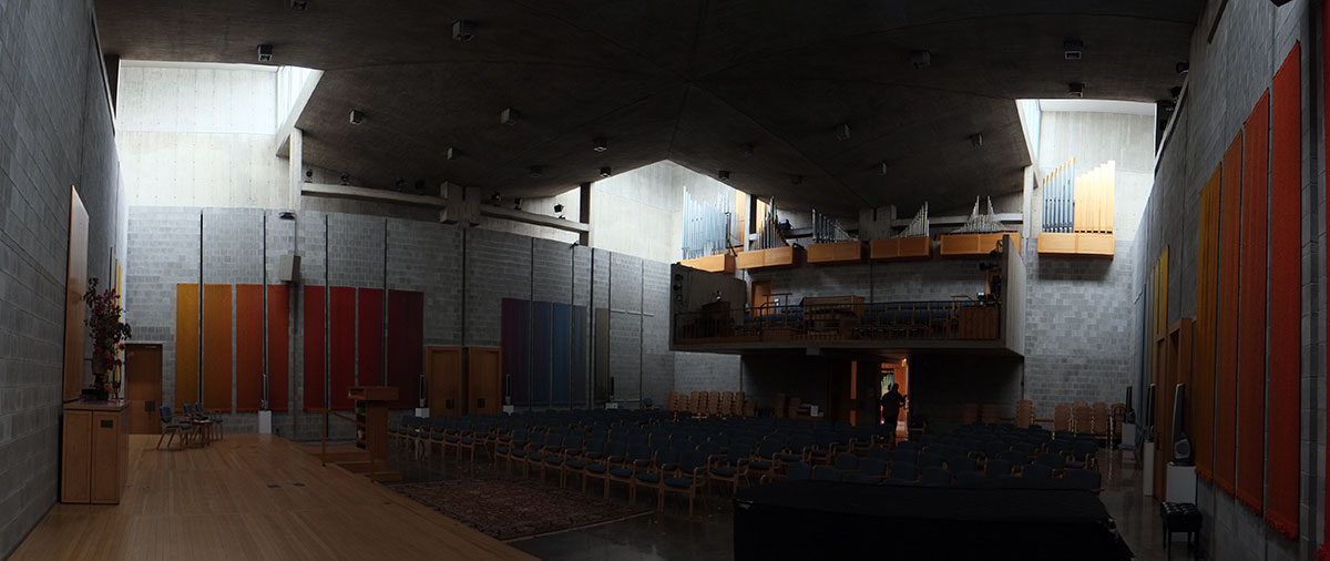
The big spatial/symbolic idea is in the sanctuary. The four corners are voids under towers with clerestories above. The concrete lower ceiling is a cross, referring back to the ideal of centralized churches. 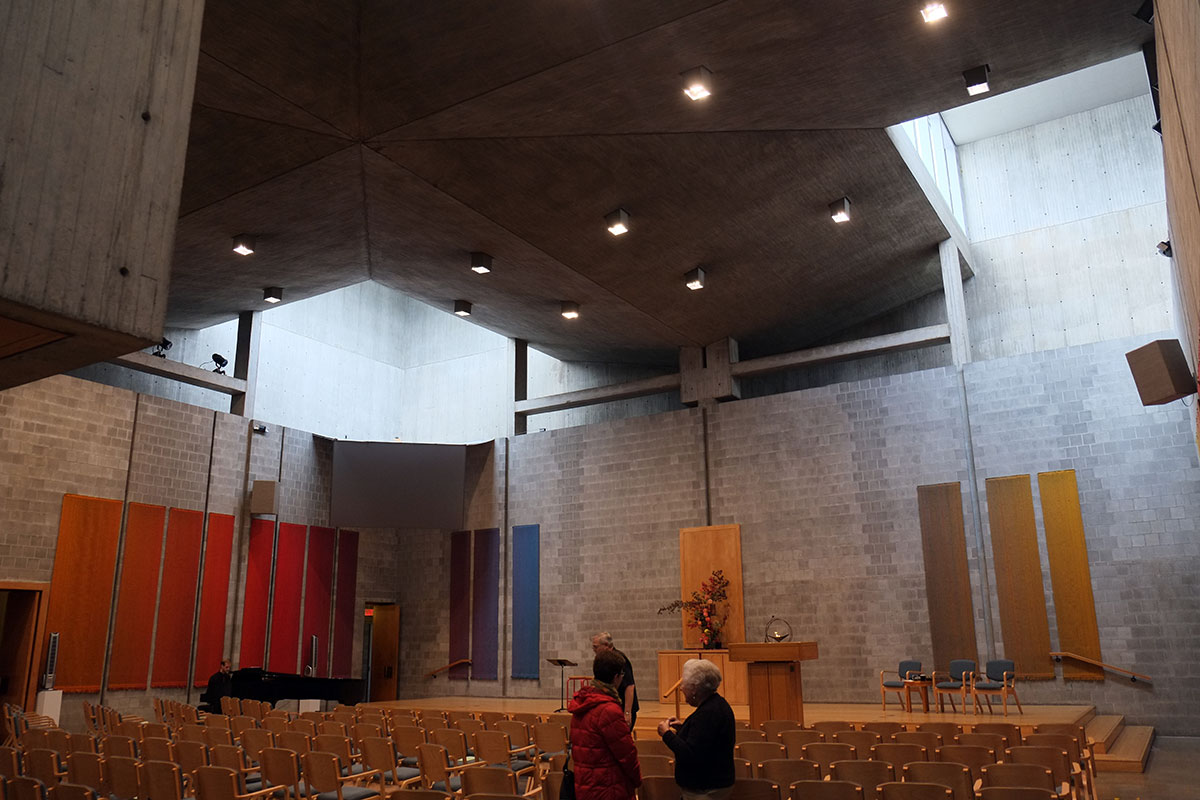

 The plan and section are simple and powerful – big idea, beautifully articulated.
The rest of the interior mirrors this simplicity – the lobby, meeting rooms, transition spaces, classrooms.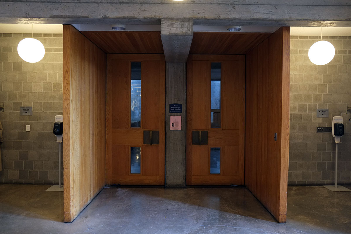

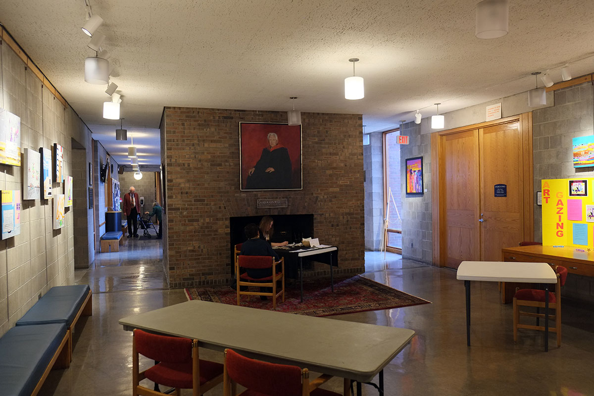


a classroom
The Miller house in Columbus would have been an austere modernist exercise without Alexander Girard’s furnishings; here you could argue that when new and empty, the church was severe and perfect, but now there is a relationship between the building (concrete, wood, masonry) and the colorful small-scale stuff (some of which – acoustical panels and space heaters – were necessitated by the materiality of the building fabric ) that the congregation has added. It’s noticeable that the order of the design is maintained, despite the random stuff that accumulates in any building that is being well-used.
The exterior looks much as it did when built. The square plan of the sanctuary is apparent, with the four towers rising up from within the mass of classrooms.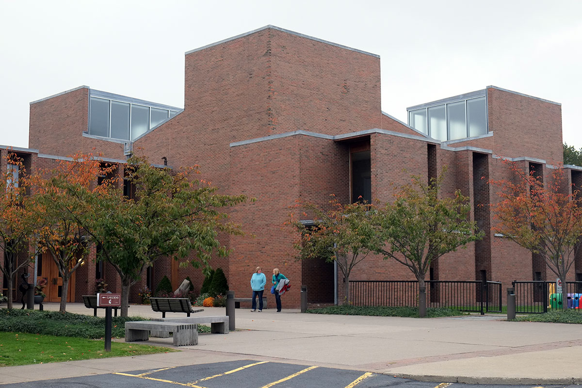
The entry shows something Kahn is always playing with – seemingly symmetrical, but not quite – the off-center center. Tempering the formality of the axes, showing an inflection towards accommodation.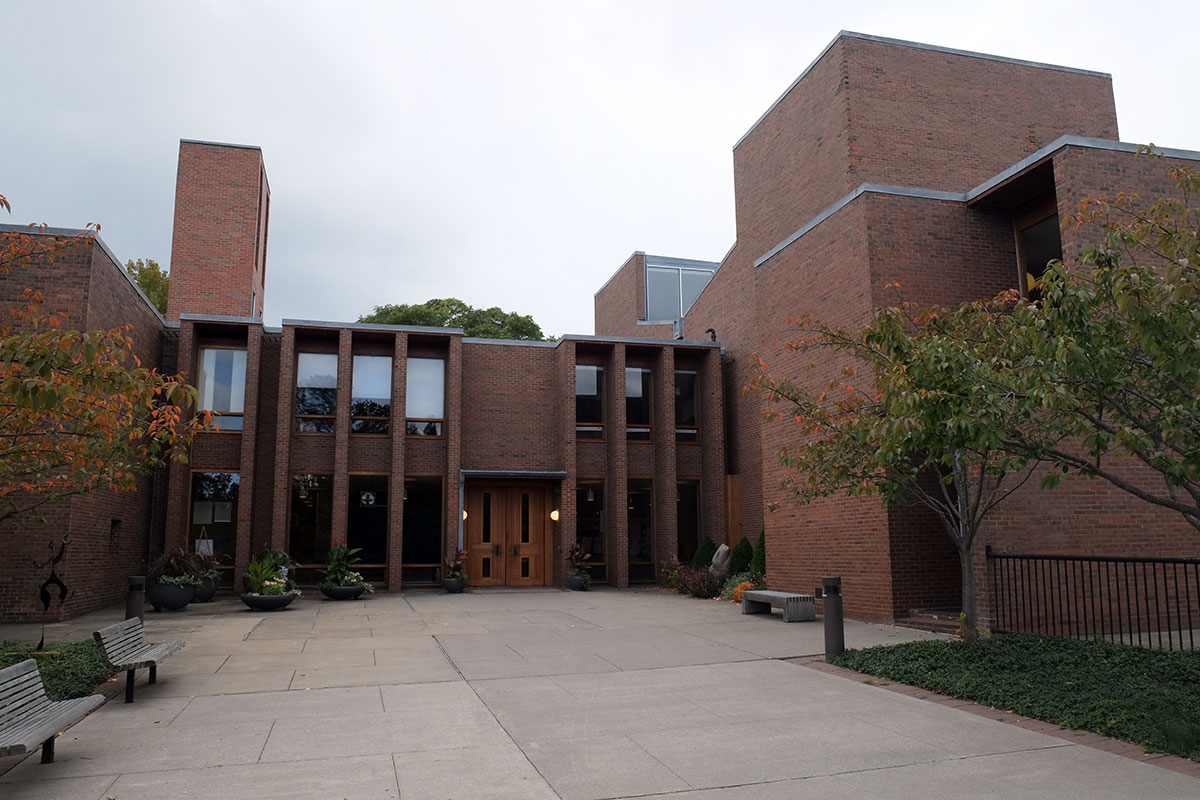
The integration with the landscape is not something I’d thought about before. It’s remarkable when seen from down the hill, the soft green of the landscape playing off the severity of the brick.

the office / meeting room wing
Has a fire exit ever looked this good?
It was instructive to see this the day after the Darwin D. Martin house. There are similarities – the axiality, the use of massive brick piers/towers instead of walls, the solidity of corners – but the big difference is in the development. Wright articulates the articulations, with an ever-cascading sequence of scales at which the idea can be developed. Kahn goes about two levels of articulation down from the parti. Wright looks for every opportunity to play with the idea, Kahn boils it down to just the essentials.

Have you ever seen the theater barge he designed? I’ve seen it a couple times on the Hudson in Troy, NY, we lived there.
LikeLike
I haven’t but where is it now? I might have read some reference to it.
LikeLike